
A new book for December 2023; a guest post by the book’s author.
Your host, guy.lawley@btinternet.com
[If you’re looking for the History Of Ben Day Dots, about the printing of colour in comics from the 1890s to the 1980s and more, please click here for links: https://legionofandy.com/2021/04/06/ben-day-dots-part-9-1950s-to-1980s/ ]
[The Secret Origins of the Multiverse, featuring the work of Michael Moorcock, can be found here: https://legionofandy.com/2019/08/15/secret-origins-of-the-multiverse/ ]
This article is adapted from the introduction to A Cultural History of the Punisher: Marvel Comics and the Politics of Vengeance, by Kent Worcester, published by Intellect Books on or around December 1st, 2023.

The premise is high concept. A decorated veteran and his family are shot – gunned down by mobsters in broad daylight in Central Park. The husband survives and becomes a vigilante. Rather than merely seeking retribution against those who murdered his wife and children, he turns a blood feud against organized crime into a war on criminality. His family was ‘killed by criminals, and so I hunt criminals’ [footnote 1]. Expert in all forms of combat, he is shrewd, motivated, and impervious to pain. He operates far beyond the confines of morality and the law. Over time, he racks up a body count in the tens of thousands. His vendetta takes him across the globe and even into outer space. It pits one man’s natural law against an entire social order. But ‘the core of his mission lies in the dark, claustrophobic concrete canyons’ [2] of his place of birth, New York City.

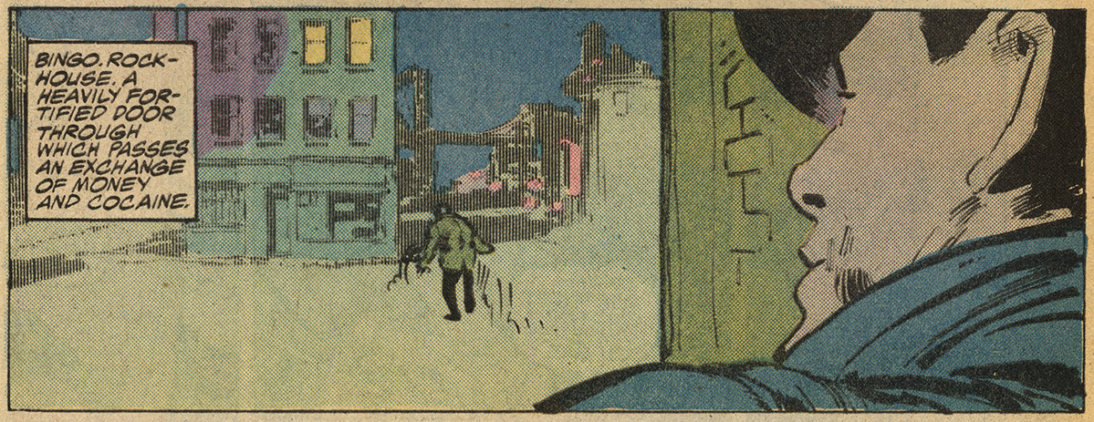
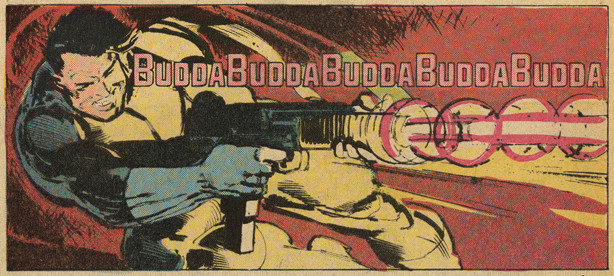
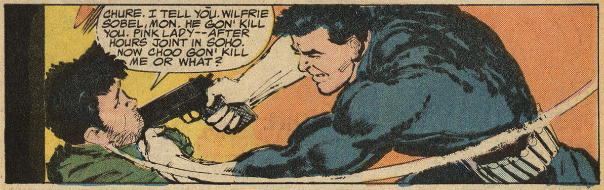
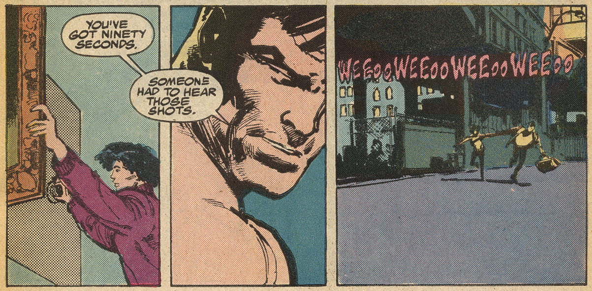
Images from Punisher 1, 1987. Script Mike Baron, art Klaus Janson
This, in a nutshell, is the story of Frank Castle, aka the Punisher. Inducted into the Marvel Universe (MU) amidst the urban crisis of the 1970s, the contemporary avatar of vengeance started out as a bit player in an already crowded Spider-Man storyworld. Castle’s cultural stock soared during the decade that followed, which in retrospect seems inevitable, but which at the time came as a shock to many people at Marvel. Having found favor with a vocal contingent of fans, the Punisher would go on to inspire multiple series, several shelves’ worth of graphic novels, and guest appearances in Marvel and non-Marvel titles, from Batman and Beavis and Butt-Head to Moon Knight and Spider-Gwen.
The character’s successes and achievements exemplified the trend toward edgier, more violent comics and expanded the Overton window of superhero discourse. A crime-fighting technique that was once unthinkable – systematic murder – was now an option, however controversial, for the characters who carry monthly titles and the companies that publish them.
The sheer volume of printed material speaks to the character’s seismic impact on comics and popular culture more generally. Between 1974 and 2023, Frank Castle was featured in close to one thousand comic books and graphic novels. He turned up in one-shots, solo titles, team-ups, and guest slots. A fair number of these stories were subsequently reprinted in hardcovers and trade paperbacks. For many retailers, the Punisher remains a proven earner. Most fans would agree that the character is part of the serial comic book pantheon, regardless of whether they follow his adventures or approve of his methods.

The scale of the Punisher’s campaign of anticrime violence offers another reason why the character may be considered culturally significant. Few protagonists in all of popular culture are responsible for as many murders as Frank Castle. That said, tallying the villains and henchmen that Castle has expunged in the pages of comic books and graphic novels – let alone films, streaming, and video games – is a fool’s errand.
In a 2011 conference call with reporters and bloggers, Marvel editor Stephen Wacker gravely claimed that ‘Castle has killed 48,501 people, counting back to his first appearance’ [3]. But given that the Punisher has demolished entire islands teeming with bad guys, this is a comically precise figure. In a story from 2005, an aide to the mayor of New York estimates that the Punisher executes ‘a dozen maggots a week’ [4]. Twelve murders a week yields around 30,000 murders in the half-century between 1974 and 2023. The ‘real’ number of deaths committed in diegetic space in the print medium most likely lies somewhere between these two sets of numbers: 30,000-50,000 murders, most of them premeditated and face-to-face.
The Punisher has left his mark on non-print media as well. To date, the character has featured in three studio movies, two Netflix series (his own and Daredevil), a dozen or so video games, a score of animated television programs and direct-to-video animated movies, and numerous video tributes and mashups. Jon Bernthal’s Netflix performances have been especially well-received. The character’s logo and chevron can also be found on licensed and unlicensed items – socks, hoodies, sneakers, beanies, folding knives, pinball machines, shot glasses, key chains, and practically anything else one might think of, including tattoos [5]. There is even a website devoted to images of Punisher action figures playing miniature harps. ‘Why does he do it?’, the site asks.
Frank is doing this in memory of his family whom he communes with through songs, poems, and prayers as he gracefully waves his battle-scarred arms and hands across the strings to fill his private family shrine with harp music and moves the Punisher to joyful tears [6].
The Punisher became a valuable piece of intellectual property (IP) during the closing decades of the twentieth century. He has become a global icon in the twenty-first. Along the way, control over the IP has to a significant extent slipped out of Marvel’s hands. During the 2016 presidential campaign, for example, freelance entrepreneurs combined Castle’s skull-and-bullets chevron with Donald Trump’s distinctive hairstyle to produce the ‘Trumpisher’. This is unlikely to be official merchandise almost by definition. As unlicensed takes on the skull chevron and related imagery proliferate, and not just in the United States, the company’s grip over the character’s media aesthetics seems increasingly uncertain. To a significant extent the brand’s imagery, meaning, and value have been appropriated by social actors – pro-gun groups, pro-police groups, pro-Trump groups, small business owners, eccentrics with websites, and so on – to the evident chagrin of Marvel’s editorial and marketing departments [7].

While the Punisher started out as a comic book curiosity, he has transmuted into something far more socially consequential. He is no longer a mere gimmick or brand. Instead, Frank Castle has come to embody a cause, that of murderous vigilantism. Judging by the extent to which the wider culture has warmed to Punisher-esque imagery, the banner of instant vengeance commands a powerful grip on the imagination of a great many people. At various times and places soldiers [8], criminals [9], pundits [10], politicians [11], and police associations [12] have embraced Castle’s morbid iconography, as has the so-called alt-right. Punisher pins and patches were donned by White nationalist protesters at the infamous Unite the Right rally held in August 2017 in Charlottesville, Virginian [13]. If you want to let other people know that you are prepared to dispatch your enemies, plastering a Punisher decal on your car presents the logical choice [14].
Punisher skulls can thus be spotted on autos, trucks, and sometimes police vehicles across all 50 states. In some places they are close to ubiquitous. These decals and bumper stickers are often modified to include a blue streak that conveys the idea that Blue Lives Matter – a pointed rejoinder to the Black Lives Matter movement. A police chief in Kentucky defended placing decals on patrol cars by arguing, ‘Our lives matter just as much as anybody’s. I’m not a racist or anything like that. I’m not trying to stir anything up like that. I consider it to be a warrior logo’. [15]. In a town near Syracuse, New York, the local police chief described ‘the Punisher symbol on the patrol vehicles’ as ‘our way of showing our citizens that we will stand between good and evil’ [16]
The cartoonist Nate Powell draws a provocative analogy between the contemporary uses of the Punisher logo and the Jolly Roger that pirate ships hoisted in the eighteenth century. ‘The 20th century’, Powell argues, ‘cemented the death’s head as a Western military symbol, from Nazi troops to numerous American units in World War II, Vietnam, and beyond’. In recent years, the Punisher’s version of the death’s head has been ‘adopted as an above-the-law cultural vigilantism’ by ‘aggrieved, insecure white Americans with an exaggerated sense of sovereignty’. Those who affix Confederate flags, Punisher symbols, and similar decals on their cars and trucks ‘have officially declared their existence as above the law, consistent with a long tradition of acting and living above it – propped up by apolitical consumer trends’ normalizing impact’ [17].
When asked about the character’s widespread popularity amongst soldiers and police officers, the Punisher’s chief creator, Gerry Conway, bristles. Even under ‘the most positive faming, the Punisher is a very emotionally damaged criminal’, Conway insists. ‘He’s someone who breaks the law. This is exactly what we do not need as police officers. He’s not intended as a role model’ [18] But this is not always the message that the stories themselves convey. In the tenth series (2014-15), Castle fights alongside a Special Forces soldier who proudly sports a Punisher shoulder patch. ‘We might be in different wars’, the soldier avers, ‘but we’re both in the same fight. I will always consider Frank part of my team’ [19].
-END-
A Cultural History of the Punisher: Marvel Comics and the Politics of Vengeance is published by Intellect Books on or around December 1st, 2023.
To order a copy, click here.
https://press.uchicago.edu/ucp/books/book/distributed/C/bo208658766.html
https://www.intellectbooks.com/a-cultural-history-of-the-punisher
At time of writing, Amazon UK only has the hardback. I hope they will show the reasonably-priced paperback soon!
Kent Worcester’s other books include Arguing Comics (2004), A Comics Studies Reader (2008), The Superhero Reader (2013), Peter Bagge: Conversations (2015), and Peter Kuper: Conversations (2016).
Footnotes:
[1] Mike Baron and Larry Stroman, The Punisher 1.19 (New York: Marvel Comics, May 1989), 1.
[2] Steve Saffel, ‘Editorial’, Marvel Age 135 (New York: Marvel Comics, April 1994), n.p.
[3] Shaun Manning, ‘Greg Rucka Unleashes the Punisher’, 8 July 2011, http://www.cbr.com/greg-rucka-unleashes-the-punisher/.
[4] Garth Ennis and Leandro Fernández, The Punisher 6.22 (New York: Marvel Comics, August 2005), n.p.
[5] See ‘The Punisher Skull Tattoos: Seeking Justice’, Tatt Mag, https://tattmag.com/punisher-skull-tattoos/.
[6] https://punisherharpzone.com/.
[7 See, inter alia, Francesco Cacciatore, ‘Why Marvel is Rebooting The Punisher (And Why it Won’t Work)’, Screen Rant, 20 December 2021, https://screenrant.com/why-marvel-reboot-punisher-2022-not-work-controversy/.
[8] Punisher iconography could be found ‘on unofficial unit patches; spray painted on buildings, vehicles, and equipment, and as military tattoos’, in Iraq and Afghanistan. James Clark, ‘Bone Deep: The Relationship Between the Punisher and the Military’, Task and Purpose, 16 March 2016, https://taskandpurpose.com/culture/bone-deep-the-relationship-between-the-punisher-and-the-military/.
[9] In 2018, a Florida man was arrested ‘on charges of criminal mischief of more than $10,000 after repeatedly using a firearm to damage property’. ‘He was seen on camera wearing a Punisher t-shirt’, the report noted. A few months earlier, the FBI asked for the public’s assistance in apprehending ‘a man in his mid-to-late thirties’ who ‘wore a gray Punisher T-shirt in a December 7 robbery’. Eric Rogers, ‘Man in Punisher T-Shirt Arrested for Shooting Up FPL Property’, Florida Today, 8 March 2018, https://www.ajc.com/news/local/fbi-says-man-punisher-shirt-robbed-metro-atlantabanks/CBm6rTbG5HJCZRQkhT1QOJ/.
[10] During the first year of the COVID-19 public health crisis, Fox News broadcaster Sean Hannity sported a Blue Lives Matter/Punisher pin on his nightly cable news program.
[11] Supporters of Rodrigo Duterte, the President of the Philippines from 2016-22, sometimes refer to him as ‘The Punisher’. On the eve of his inauguration, Duterte told a crowd in Manila, ‘If you know any addicts, go ahead and kill them yourself’. The Human Rights Watch estimates that ‘more than 12,000 people have died in the drug war, many of them victims of summary execution by the police’. Felipe Villamore, ‘Duterte Says His “Only Sin” Is the Killings in a Drug War’, New York Times, 28 September 2018, A4.
[12] The St. Louis Police Officers Association encourages its members to use Punisher imagery on social media, while the Detroit police union defended the use of the Punisher insignia on police uniforms at Black Lives Matter protests in 2020. See Doyle Murphy, ‘St. Louis Police Union Loves the Punisher: But the Punisher Isn’t On Board’, Riverfront Times, 12 July 2019, and James Whitbrook, ‘As the Punisher Skull Re-Emerges on Cops in U.S. Protests, Marvel Reckons with its Imagery’, 25 June 2020, https://io9.gizmodo.com/as-the-punisher-re-emerges-on-cops-in-u-s-protes1843911179. See also Abraham Riesman, ‘Why Cops and Soldiers Love the Punisher’, http://vulture.com/2017/11/marvel-punisher-police-military-fandom-html.
[13] Stepehn Rodrick, ‘Jon Bernthal is Learning to Keep his Demons at Bay’, Esquire, 3 January 2019, https://www.esquire.com/entertainment/movies/a14443788/jon-bernthal-the-punisher-cover/.
[14] The iconography’s confrontational aspect cannot be easily overstated. In 2017, ‘a 29-year old smuggled four guns, throwing stars, pepper spray, and a knife into the Phoenix Comicon. Police found the man inside the convention dressed as the comic book character the Punisher in all black clothes, black face paint, body armor, and a belt with ammunition for his multiple guns strapped across his chest. He had allegedly come to kill police as well as fictional law enforcement’. Few comic book characters are capable of summoning this kind of terroristic vibe. Kelly Weill, ‘Cosplayer Set Alarm for Alleged Green Power Ranger Assassination, Bragged about Knife Collection’, http://www.thedailybeast.com/articles/2017/05/29/power-rangers-cosplayer-set-alarm-for-allegedgreen-power-ranger-assassination-bragged-about-knife-collection.
[15] Fernando Alfonso III, ‘Chief Removes Punisher Emblem, ‘Blue Lives Matter’, From Police Cars After Public Reacts’, http://www.kentucky.com/news/state/article134722264.html.
[16] Charley Hannagan, ‘Solvay Police: Punisher Decals Stay; They Show “We Will Stand Between Good and Evil”’, 1 May 2017, http://www.syracuse.com/news/index.ssf/2017/04/central_new_york_police_punisher_decal_shows_we_will_stand_between_good_and_evil.html.
[17] Nate Powell, ‘About Face’, 24 February 2019, https://popula.com/2019/02/04/about-face/.
[18] John Annese and Rocco Parascandola, ‘Good for Morale or Bad Community Relations?’ New York Daily News, 4 November 2018.
[19] Nathan Edmondson, Kevin Maurer, and Carmen Carnero, The Punisher 10.8 (New York: Marvel, September 2014), n.p. This may have been the view held by the Milwaukee police officers who called themselves ‘the Punishers’ and who ‘wore black gloves and caps embossed with skull emblems while on patrol’. John Diedrich, ‘Milwaukee Police Looked into Punishers’ Group’, Milwaukee Journal Sentinel, 5 January 2011, A1.

