
or: Homage to Mildred Marsh and Cynthia Blake
Larger versions of some pictures can be seen by clicking on them. Use the back arrow on your browser to return to this page. Or right click to open an image in a new tab or window.
Continued from:
- Part 1—Roy Lichtenstein—the man who didn’t paint Ben Day dots
- Part 2—Halftone dots, Polke dots, more Roy
- Part 3—CMYK / Four-colour comic book dots vs. RGB dots on screens
- Part 4—Pre-history, origins—Ben Day in the 19th century
- Part 5—Ben Day in lithography
- Part 5.5—French comic strips of the 1880s. Coloured by relief aquatint.
- Part 5.75—A lithographic protocomic (?) from 1885
- Part 6—Ben Day meets the Sunday Comics in the 1890s
- Part 6.1—Tarzan and the Ben Day Dots—secrets of 1930s comic strip colour
- Part 6.2—Fun With (Mis-)Registration—when colour printing plates don’t line up
- Part 7 — The Birth of the Comic Book,
- Part 8 — 1930s to 1950s: the Golden Age of Comics, and Craftint Multicolor
See also Part 9b: The Silver Age, part 2
guy.lawley@btinternet.com
Introduction: The dots come full circle
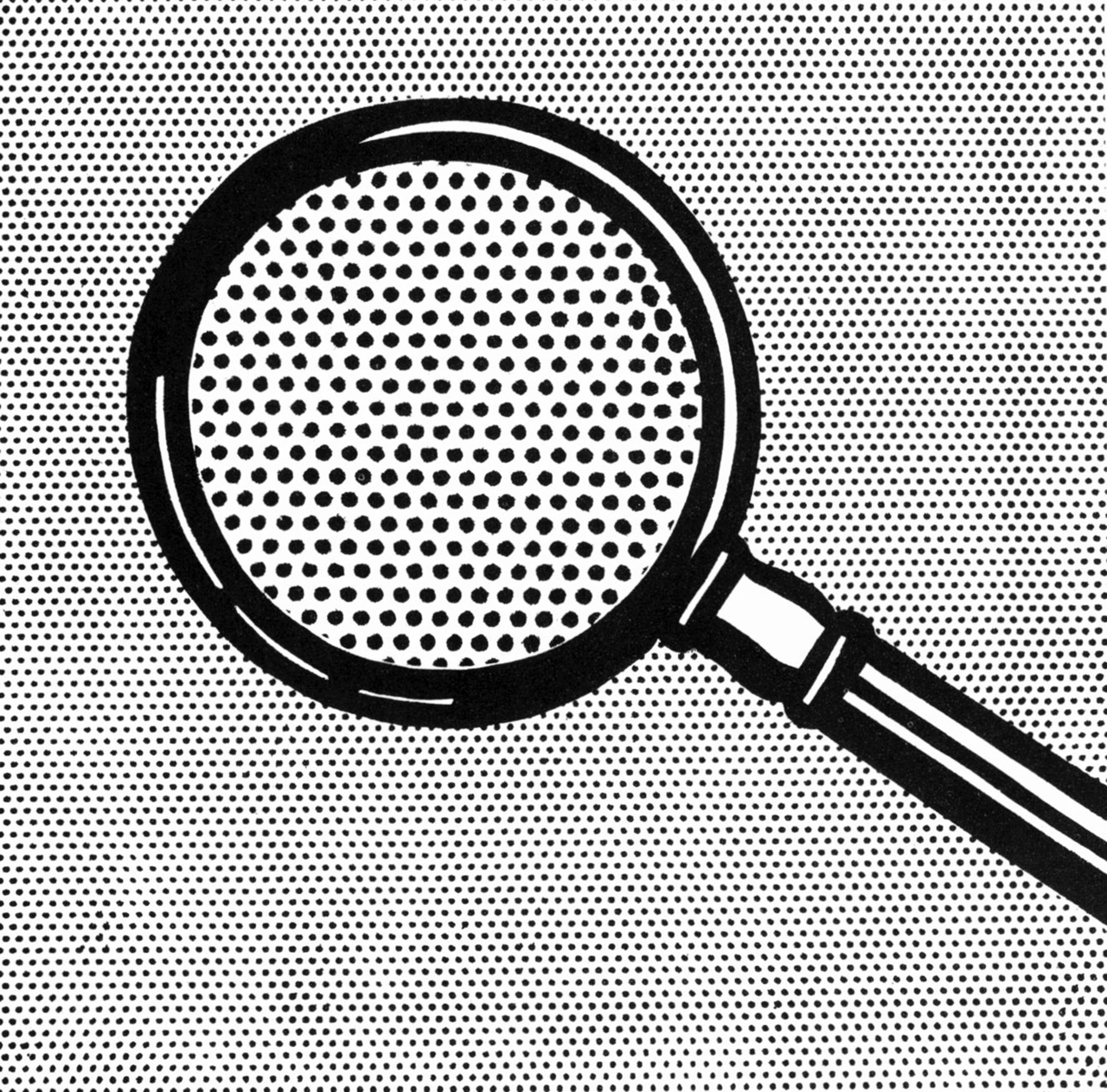
Roy Lichtenstein, Magnifying Glass (1963). Oil on canvas, c.41 x 41 cm
With this post my history of Ben Day dots cycles back to the 1960s, the decade where I began; to the comic books — and the dots — which inspired Roy Lichtenstein’s Pop Art paintings. Mainstream US comics of this period are particularly remembered for the renaissance of the superhero, beginning at DC and including Spider-Man, the Avengers and other enduring characters from the newly ascendant Marvel comics.
It was Lichtenstein who popularised the idea that those comics were printed with something called ‘Ben Day’ dots, though in fact the genuine Ben Day method (patented in 1879) had almost completely fallen out of use by that time, as cheaper faster technologies replaced it. However, in the printing and publishing industries the old name had stuck to the new types of dot, as a genericised brand name like ‘Band-aid’, ‘Kleenex’, ‘Hoover’ and ‘Diesel’ — although by the ’60s it might be spelled Benday, Ben-day or simply benday. The worldwide fame achieved by Lichtenstein and his paintings brought the name out of obscurity and into much wider usage.
This post, Chapter 9a, looks at the 1960s dots as they appeared on the page, and how their colour guides worked.
Chapter 9b has the technical details of how the dots were created during the production process.
Plenty has been written about how Roy Lichtenstein made his version of ‘Ben Day dots’ on canvas. These two posts show how the original dots were made for their original source: the printed pages of Silver Age comic books.
The key stage in comics production: Colour separation
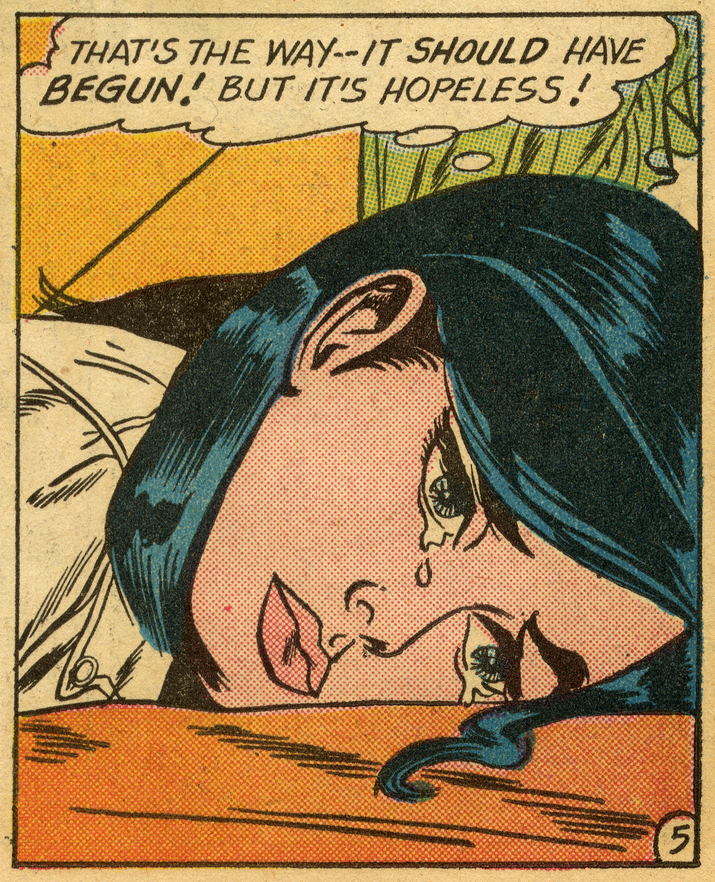
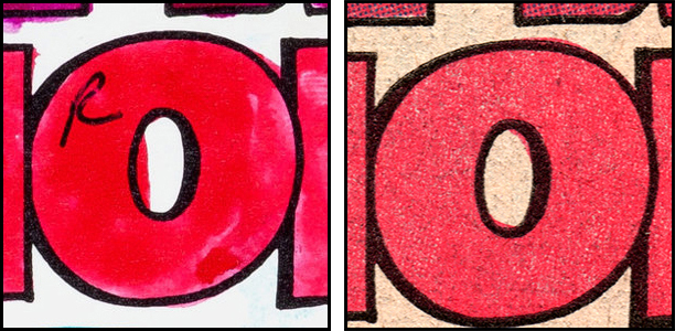
The 1962 DC comic panel at the head of this page (magnified details shown below) was the source for Roy Lichtenstein’s painting ‘Hopeless’, and shows that era’s new variety of (so-called) ‘Ben Day dot’.
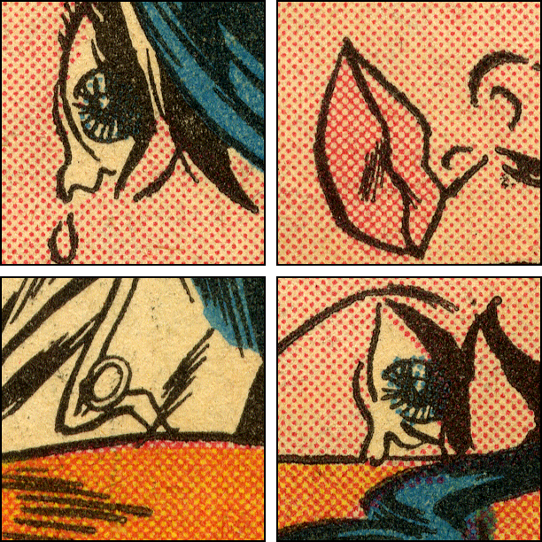
Half-inch (c. 1.25 cm) squares from the above panel in Secret Hearts 83, 1962
The dots were added during the production stage called colour separation, when a different image was made for each of the three colours Cyan (blue), Magenta (red) and Yellow used in the CMYK (or ‘four-colour’) printing of the comics. Each of the three images, having been constructed, had to be etched (or ‘engraved’) onto a metal printing plate — an additional step in the production process.
Separately from the colour work, the black and white ‘line art’, the K in CMYK — including the lettering — was photographically reproduced on a printing plate — photoengraved — in essentially the same way it had been since the first Sunday newspaper strips of the 1890s.
Photographic colour separation of fully coloured artwork (‘process colour’) did not come to mainstream US comics until the 1980s. Like the photoengraving of the black plate, 1960s comic book colour separation was in some ways also similar to 19th century methods — still largely done by hand — but using a very different technology from the genuine Ben Day dots of the 1890s to the 1930s. Technical details of the Silver Age method are given in Part 9b.
This post is about the interior pages of a wide range of US mainstream comic books — those published by Marvel, DC, Archie and others — produced in a certain standardised way, and printed on newsprint. Their covers, printed on better (usually glossy) paper, were always dealt with separately and by a range of different methods, which this post will not deal with. Not all comics publishers used the techniques I describe here for their inside pages, but the majority did.
The committed Ben Day Detective will be able to tell when a comic page (at Dell or Gold Key, for example) departs from the ‘rules’ described in my posts. Obvious exceptions like Jack Kirby’s Marvel photocollages are just the tip of the iceberg!
Magnifying glasses in hand, let us begin…
The end of Craftint Multicolor… and the beginning of a new ‘Age’
Earlier posts in this series have explained the original Ben Day dots, used in newspaper comics from the 1890s onwards, and how they were phased out of the new comic books in the 1930s. At that time National / DC’s Jack Adler and Sol Harrison pioneered two new methods, one using grey painted images photographed as halftone dots (which I haven’t yet covered in detail) — relatively expensive and, at DC, confined to covers and advertising pages. The other method was Craftint Multicolor, which dominated the pages of mainstream comics of the 1940s and earlier 1950s. The signature feature of this method, easily seen on the printed page (especially with the help of a magnifying glass) was its use of closely spaced lines for the darker tints, rather than dots.
The panel below, from another DC romance comic — a moonlit scene helpfully coloured only in blue — shows areas of solid or ‘100%’ colour, and both the pale dot and darker line tints of Craftint Multicolor. These were generally referred to in the comics business as having colour ‘values’ of 25% (or a quarter strength) and 50% (half strength) respectively. In fact on the printed page their values could vary considerably. (Full details of Craftint Multicolor are given in Part 8.)
Before the Silver Age: Craftint Multicolor in use
In comics cover-dated October and November 1954 Marvel Comics (then known as Atlas) phased out Craftint and phased in a new colour separation technique. DC followed suit, but two years later, starting with comics cover-dated October 1956. Coincidentally this is usually defined as the beginning of the so-called ‘Silver Age’ of comics — US superhero comics, anyway — with the publication of DC’s Showcase 4, the first appearance of the new Flash. The ‘first Silver Age comic’ was also one of the last to use the old ‘Golden Age’ Craftint dots — and of course lines. The images from Showcase 4 below were scanned by me from the Taschen book 75 Years of DC Comics by Paul Levitz. (The book is highly recommended; quite expensive, but a good deal cheaper than a copy of this comic!)

Origin of the Silver Age Flash. Both speed lines and Craftint lines can be seen. Art by Carmine Infantino and Joe Kubert.
The Silver Age dots, which Roy Lichtenstein copied and called ‘Ben Day’, were two generations of new technology away from the original Ben Day variety, and created in a very different way from either Ben Day or Craftint. Key to the new technique was a clear plastic sheet of the type known as ‘acetate’ — actually cellulose acetate, which had replaced the highly flammable cellulose nitrate in cinema film (‘celluloid’) in the 1930s.
Ben Day and Craftint Multicolor were both names of branded commercial products, but the post-Craftint method used in comic book colour didn’t have a catchy name. Similar acetate sheets are sometimes referred to as ‘3M’ after the main company which manufactured them. However that name does not seem to have caught on widely. History does not relate how Roy Lichtenstein picked up on the name Ben Day. If someone had told him the comic book dots were called ‘3M dots’ you would probably not be reading about the history of ‘Ben Day dots’ now. I will refer to the ‘Silver Age’ method as ‘the acetate method’.
An example of the new Silver Age DC tints is shown below, in a panel scanned from the first page of Superboy 52 — like Showcase 4, cover-dated October 1956. Lana Lang’s skin is the same tint as the old ‘25%’ Craftint dots. Her hair and the curtain behind her both show a ‘50%’ magenta (red) tint, which previously would have been made up of lines. The magnified details show that this tint was now formed by a dot pattern very close to a checkerboard in appearance, at least when printed on white paper.
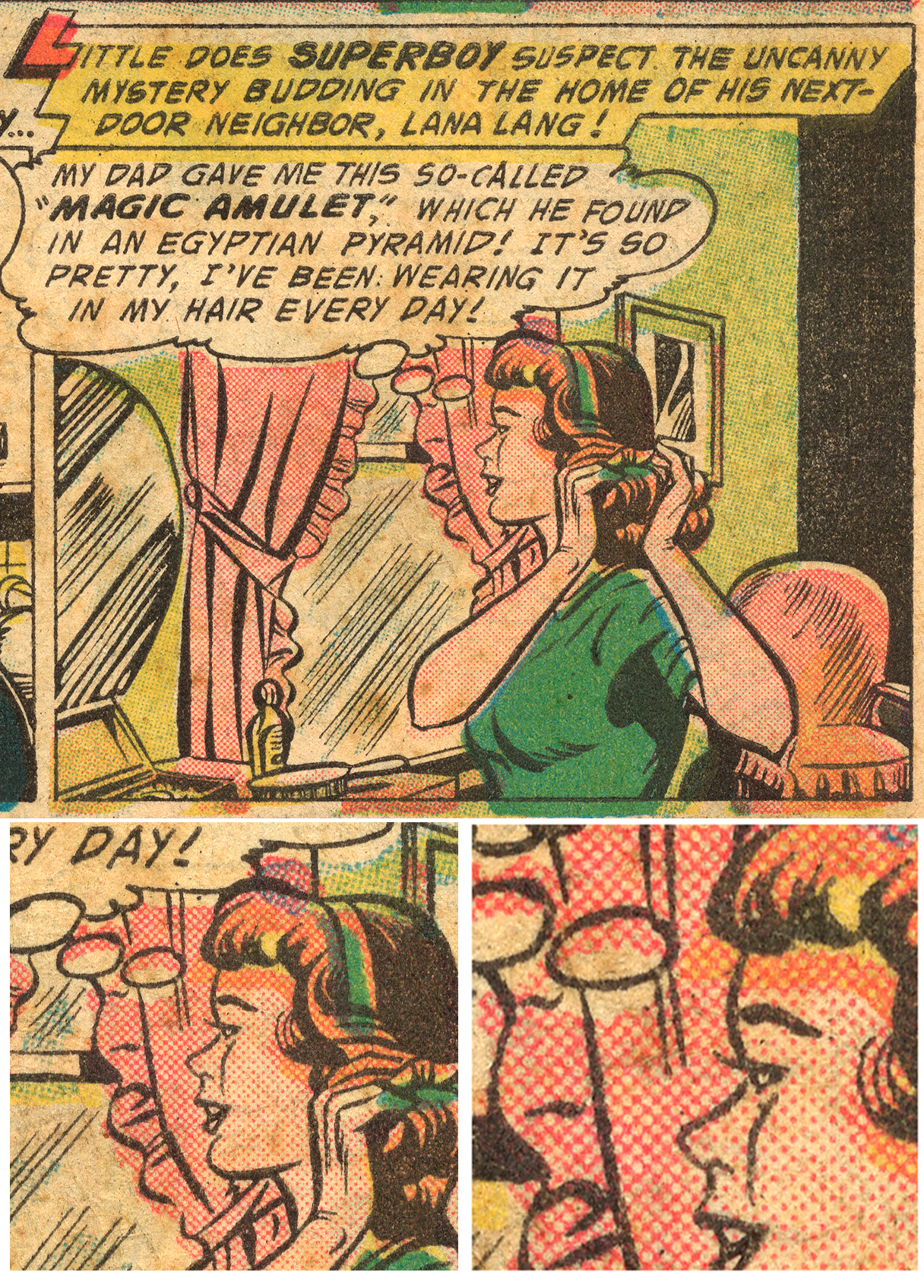
Page 1, panel 3, of Superboy 52, October 1956. Below left, a one inch square (c. 2.5cm); right, a half-inch square detail.
An exact checkerboard tint — half white, half black — would of course have a precise 50% colour value (and square dots). As shown below, this is the form taken by the middle point in a black-to-white gradation put through an old-fashioned halftone screen — the kind used to break the continuous tones of a photograph into dots for printing — i.e. a halftone version of a 50% tint.
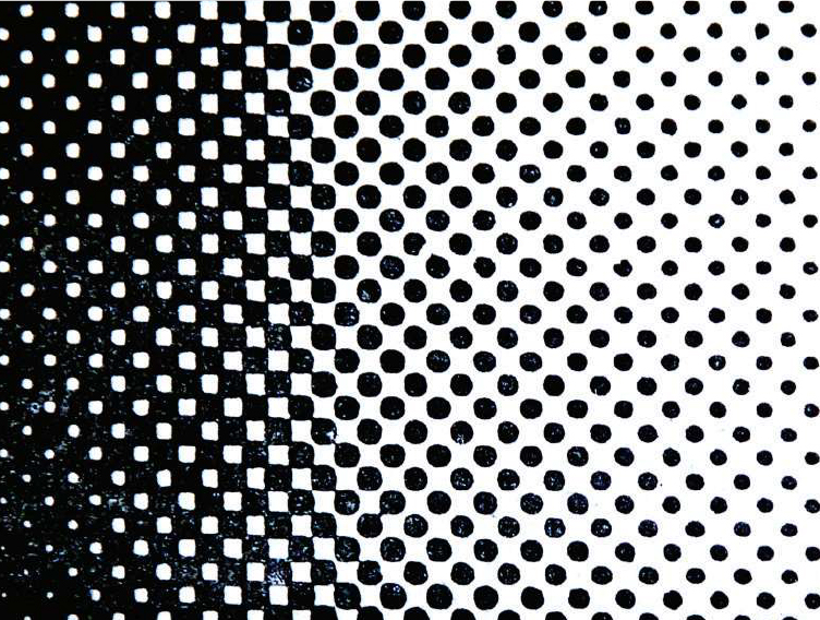
The middle part of a gradient from black to white, as represented in optical ‘halftone’.
To the left of the mid-point, where the tint becomes darker than 50%, increasingly round white dots are seen within the black. On Lana’s hair in the panel above, the same magenta tint printed over yellow seems to show this pattern — more printed colour and less ’empty space’. The printed tint, in other words, could resemble 50% or a darker value more like 60 or even 70%, varying not just from page to page but in immediately adjacent areas of a single panel. However in the production process, before printing, the tint would have been the same — or at least, intended to be the same. More on this below.
Such variations in the printing of tints show why any attempt to define their values in precise percentage terms can never be exact. Nor could it at the time the comics were published. Artists, colourists, editors, production teams, colour separators, engravers and printers must all have recognised the limitations of the fast cheap printing of the day — four-colour rotary perfecting letterpress on newsprint. I could abbreviate that to FCRPLON, but I prefer to call it ‘old-school comics printing.’
And it really was old-school. The first Sunday newspaper comics of the 1890s were printed in essentially the same way. By the 1960s and 70s, most of the publishing world had moved on to process colour production, and increasingly abandoned letterpress printing for offset litho. The comics business resolutely stuck to its old school methods until literally everyone else in the USA (with the possible exception of the Yellow Pages phone books) had given them up. Mainstream US comics very gradually introduced offset litho through the 1980s.
But I digress. Although varying somewhat on the printed page, we know that the acetate colour system in theory had only three values of each colour to work with — 25, 50 and 100% — as with Craftint before it, but unlike the original Ben Day method itself. The well-known 64 colours available on the comic book page resulted from the three-value limitation of the newer methods. This limited gamut of colours did not apply to the old Ben Day process, which was far more flexible — capable of producing a much larger range of tints, colours and patterns.
I haven’t yet discovered when other publishers made the switch to acetate, though Charlton, for example, certainly used Craftint into the 1960s. (Some others may have continued to use the alternative ‘grey paints’ method I alluded to above; more research is required on this.) As far as I can tell, DC and Marvel used the acetate method, in the form I will describe here, well into the 1980s.
Printed dots, ideal dots and… negative dots.
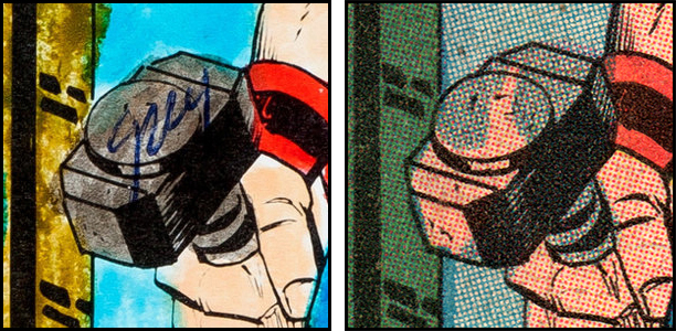
The aesthetic appeal of the 60s dots is easy to see in the example below, which I have shown before — half-inch squares from the Fantastic Four 89, 1969. Again, the darker tint is not a checkerboard but more like a grid of inked colour with round ‘holes’ in it. I call these dots ‘negative dots’ — as opposed to the positive dots of the 25% tint, which are clearly dots composed of coloured ink. Negative dots in the 50% tints are a signature feature of the acetate method, just as the lines were in Craftint.
As with actual holes in a solid object, like a sieve or colander, whatever is under the holes shows through them. In this case it is mostly not white but yellow, where both magenta and cyan tints have been printed over ‘solid’ 100% yellow — like Lana Lang’s hair. On the Thing’s face, the cyan tint is mostly printed on white paper (actually a 25% yellow dot tint). Unlike Lana’s curtain, it does not show a checkerboard appearance, but negative dots again.

Half-inch squares (c. 1.2 cm) from Fantastic Four 89, cover-date Aug 1969. Art: Jack Kirby and Joe Sinnott.
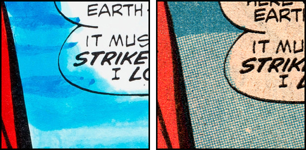
Below is another example, from Strange Tales 110 — not from a scan this time, but a photograph taken through a USB microscope. Here we see the light and dark tints of cyan printed on a white background, and next to each other.
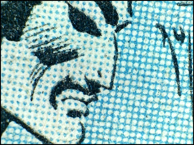
Dr Strange by Steve Ditko, 1963. Original size approx 1.4 x 1cm
And again we see negative dots, not a checkerboard. In my experience looking at 1960s Marvel and DC comics, the darker tint is more likely to show the negative dots appearance. Here is an illustration of a 60% tint from the 1965 book Preparing art for printing by Stone and Eckstein (Van Nostrand Reinhold, New York) p.44. (It doesn’t mean ‘c.60%’ as in ‘approximately 60%’; in this illustration, picture ‘a.’ showed a 10% tint, picture ‘b.’ was 30%, and picture ‘c.’ followed)

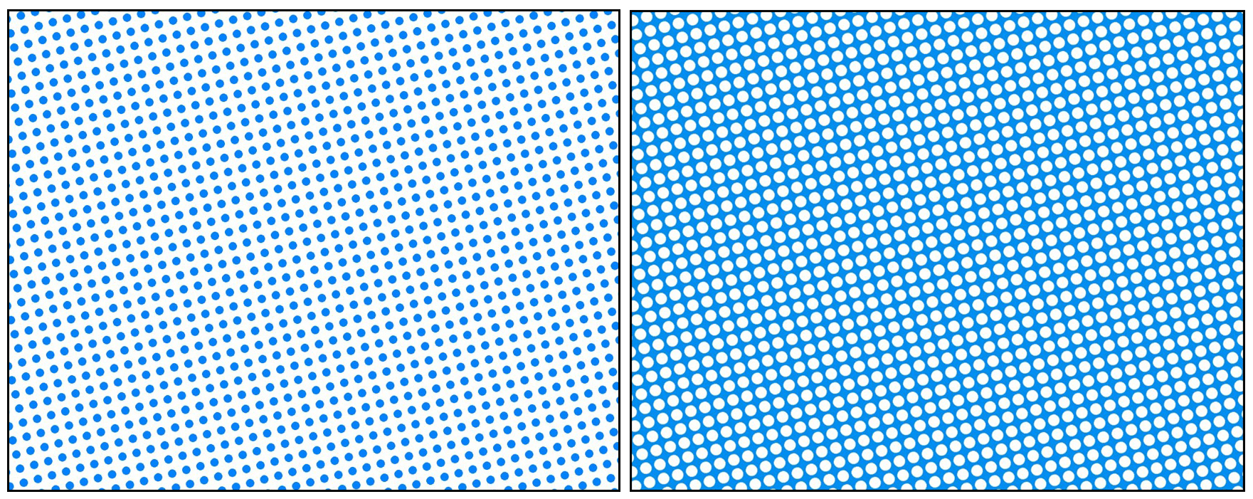
So was the so-called 50% tint actually intended to be 60%, as some have suggested? Creating tints in the image-making software Clip Studio (known as Manga Studio 5 when I first used it) suggests a possible answer to this question — ‘no’. The image below was made in this programme, and the value set at 50%. The square form of this tint is obviously not a checkerboard, and the round dot version closely resembles the comic book dark tint. This certainly shows that a dot tint with 50% value does not have to be a checkerboard, but can indeed be a grid of colour containing negative dots.

Tints made of both positive and negative dots, when printed in real life on paper with liquid ink, are prone to becoming darker than intended due to dot gain, as defined here (a web page about offset litho printing, not the old school comics variety, but a clear and relevant account of dot gain). On newsprint dot gain is particularly likely, largely due to ink spreading between the coarse fibres of the paper.
On the other hand, you have probably seen parts of old school comic books where insufficient ink or low pressure in the printing press have created very light tints, or even complete gaps in the colour images. Even ‘solid colour’ tends to contain patchy white areas due to fast printing and rough paper.
I will continue to refer to 25 and 50% tints — while accepting that these are nominal, approximate figures only — and where my examples have been created in Clip Studio (or some years ago in Manga Studio 5) they will use these theoretical, ideal values.
Also, the colours of these simulated on-screen examples can only be approximations of the printed CMYK colours… which leads on to my next section…
Colour guides: CMYK meets YRB
As is well known, a colourist employed by the publisher prepared a colour guide for every page of a comic, at the reduced size of the printed page, using watercolour dyes on a photocopy of the black artwork — or earlier, on another type of printed copy; a silver print. [Update April 2022: Silver prints were made like regular photgraphic prints, from negatives, but not on glossy paper like most photos. Cartoonist Kayfabe (Ed Piskor and Jim Rugg) on YouTube report that Jim Shooter made the change to the much cheaper photcopier method when he took over at Marvel Comics (1978), although colourists disliked the cheap thin paper.]
As this colour guide system developed, the colourists used watercolour dyes matched to the colours of printing as closely as possible, i.e to the CMY colours, their 25 and 50% dilutions and mixtures thereof.
These quickly-made, often messy guides were sent to the colour separators — staff at the engraving company which made the printing plates. Unlike ‘process colour’ artwork, these were not finished images to be colour-separated photographically or on a scanner, but essentially just diagrams for the next person in the production line to work from. Each guide had to contain a clear set of instructions for the colour separator, and to that end a system was developed for adding an abbreviated form of written information to their coloured images.
Below is a Marvel colour guide for Thor 163, 1969, some detailed views of one-inch squares, and the page as printed. (You will notice that the colourist was not credited at that time.) So far I have been referring to the colours in comics by their CMYK names, including cyan and magenta. You can see that the colour guide was annotated instead using the letters Y for yellow, R for red and B for blue — as well as numbers. This YRB system is seen throughout the comics field, and very rarely (if ever) elsewhere. It’s worth pondering why this was so, and how it worked.
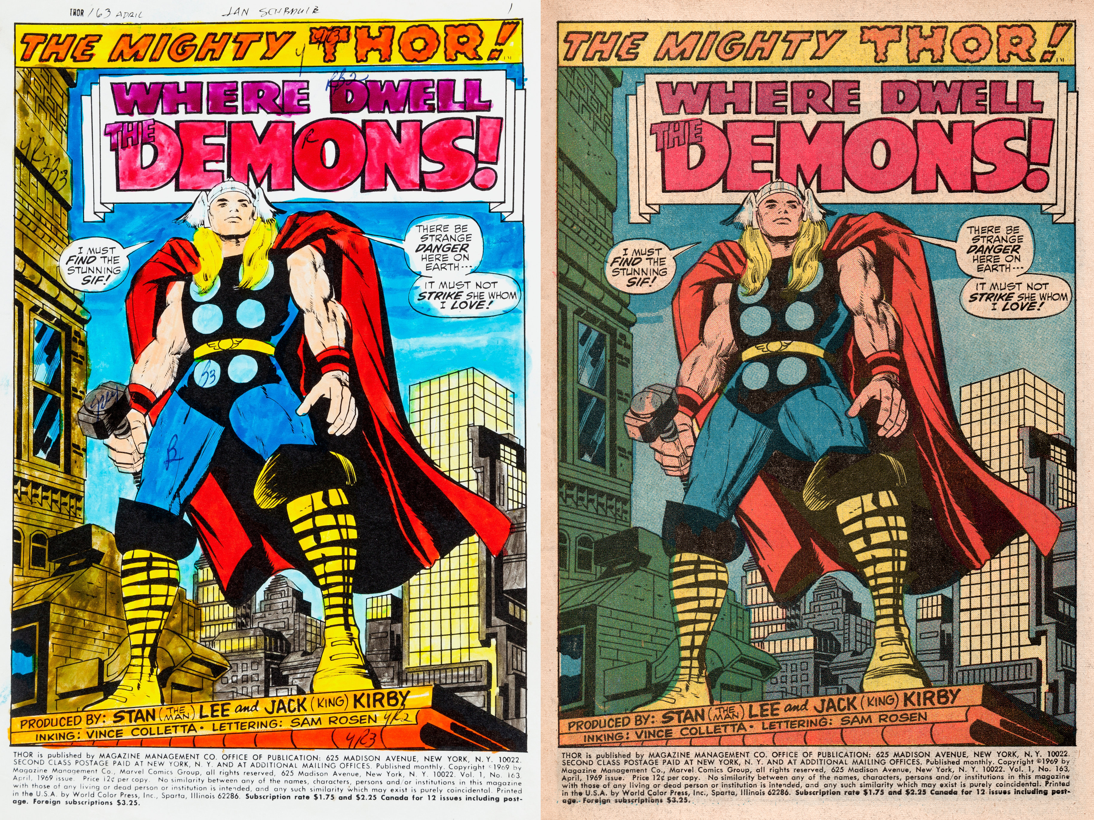
Thor 163, Marvel Comics, cover-dated April 1969. Colour guide from Heritage Auctions.
Like many things in comic book production, the YRB system probably started with long-term DC staffers Sol Harrison and Jack Adler, in the 1930s or 40s. In book and magazine publishing with CMYK process colour, production staff had to factor black into their colour separation processes. In old-school comic books, the black printing plate was dealt with separately, and while it might contain black dot tints on rare occasions, they were not actually made within the acetate system, but on the drawing board itself, as part of the ‘line art’.
Colour separators only had to consider the other three colours — C, M and Y. Simplifying things further by referring to cyan (a.k.a. ‘process blue’) as ‘blue’ and magenta (‘process red’) as ‘red’ must have been tempting — shorter words save time and space! — and perhaps seen as less confusing for non-specialist employees.
In CMYK, black had probably been designated as K (for the ‘key’ plate) and C for cyan / blue, partly to avoid any confusion arising from use of the letter B. If B sometimes meant ‘black’ and sometimes ‘blue,’ the potential for disastrous printing errors would have been built right into the system. YRB could afford to use B for blue without that problem.
The primary colours outside of the printing biz, of course, were usually thought of as red, yellow and blue, often abbreviated to RYB. However YRB became the preferred option in comics, probably because their yellow was always printed first, magenta second and cyan third — or Y, then R, then B — and finally black on top of the other three. (In other areas of printing, different / more flexible orders of printing might be used.) When checking progressive proofs of printed covers, production staff and editors would also have seen images in Y-R-B order (and finally K on top).
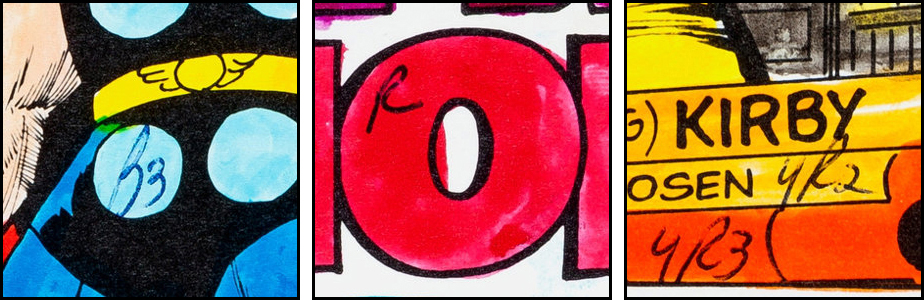
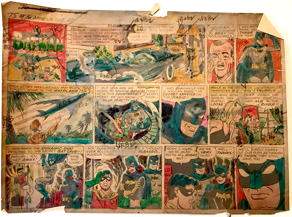
The same system can occasionally be seen in use in the newspaper strip field in the 1960s. Whether it spread there from the comic books is unknown. Dewey Cassell has a page at Comic Art Fans where you can see YRB in action on both a colour guide and a proof page (printed on better paper than the final newsprint version) of a 1967 Batman strip, as shown below. The condition of the colour guide is an indication of how little they were valued at the time (not by Dewey, I hasten to add!) — they were usually thrown away, meaning that few survive at all.

Below are my approximations of the three primary colours in the YRB system, and the colours which resulted when their semi-transparent inks were printed over one another on the page. This kind of colour mixing is known as physical blending.
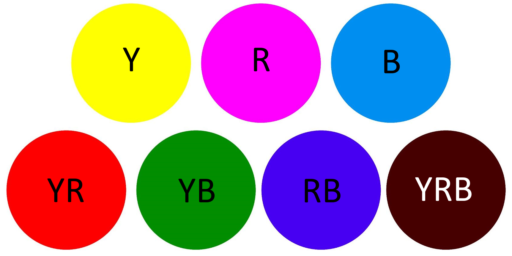
On the printed page then the comics did not have only the three basic colours from which to create their full gamut, but seven (plus black, plus white). The added four were the three secondary colours, created by printing one colour over another — YR (which we might call scarlet), YB (dark green) and RB (dark blue) — and the tertiary YRB, mixing all three primaries to create a dark brown.
YRB as such was rarely used in the Silver Age — an area of ‘solid’ YRB was 3 x 100% = 300%, and most printers, inside and outside comics, encouraged publishers to avoid colour mixes over 240% (sometimes 200 was the limit). Too much ink on the paper could in theory cause a variety of problems. In 1969, artist Neal Adams started taking more chances with darker colours, including YRB, in his DC comics, reckoning that their newsprint paper would absorb the ink burden without complications. He was right. Of course he was — he was Neal Adams.
Below is page 4, panel 6 from the 1968 DC comic The Brave and the Bold no. 79. This was the first comic where Adams drew Batman on the interior pages, and this was the only panel with an area of solid YRB in the background. As you can see, some of it ends up as RB, some as YR, and a few more colour separation anomalies are visible — especially if you can click through to the large version.
ABC, YRB, 1,2,3
This post is all about the Silver Age comic book dots, i.e. the tints created from these basic colours. Without their tints, their 25 and 50% colour values, the comics would only have had those seven colours seen above to work with. Adding tints, the full gamut became the often-quoted 64 colours — or in fact 63 YRB system colours plus white for the 64, or adding both black and white, 65. A puny figure, to be sure, compared to the millions of colours available on our screens today, and in contemporary comics — digitally produced on computer then printed on glossy paper by offset litho.
But 63 is a big step up from 7, you have to admit.
Still, all those tints and mixes were of course limited to combining the seven basic colours (with or without white) in more or less complex ways. And only a fraction of that gamut of 63 would ever be used in most published comics.
Let’s look at some of the colours in Thor 163, and how they were designated in the YRB system. Here is solid cyan, or blue, labelled B on the colour guide (left), and as printed on the page (right):

And here is B3, which is 50% blue:

And R, designating solid red:
Below are two tints of orange — red printed over yellow. YR2 stands for solid yellow, Y, plus R2, the 25% red tint. YR3 is solid yellow plus R3, 50% red — though here both red tints look a good deal darker than their nominal values.

DC’s production maven Jack Adler explained in a 1975 interview (published in Amazing World of DC Comics no.10, Jan 1976) why there were R2 and R3 tints but no R1. This notation originated in their painted grey system of the late 1930s or 1940s, which I mentioned earlier:
“Well, we used a gray [paint] series put out by the Miller Brush Company. In shooting, in order to get the flesh value… the first value that picked up [photographically] as a 20% was a number 2, not number one. Number one [10%] got lost, so we actually used the grays’ numbers as the numbering system… and today the colors are R, R2 and R3 for red solid, 25% and 50%, and so on.”
I.e. their 10% grey paint, No. 1, was too pale to photograph for printing, so they had to start with no.2 as their palest tint. (I suspect that the Miller Brush grey paint No.3 might been 30% in fact, not 50% — but this kind of detail is lost to time.)
This ‘grey paint’ colouring system was completely different from the Craftint Multicolor used at the time for the inside pages of most comics. Nonetheless, since Craftint had the 25 and 50% tint limitation, that was how the standardised labelling of those tints as 2 and 3, and not 1 and 2, arose.
Here are some more examples from the Thor 163 page. Firstly, Y, the darker orange YR3 again, and RB2, a classic comic book purple or maroon, (25% cyan, B2 over solid magenta, R).

Each dot in RB2 is of course no longer cyan, but the dark blue of RB.
Next, the colour guide says YR2B3 for the wall to Thor’s right (our left). If you think the printed version looks quite different, you’d be right. It ended up as YR2B — solid blue substituted for 50% blue, creating a much darker, greener colour. (Error? Aesthetic judgement at work? We will never know.)

You will immediately have noted that this is a 225% colour mix — close to that possible 240% borderline which may or may not have applied at Marvel. In fact in this system anything above 225 would have hit 250. The dots here, magenta printed over yellow, then in turn over-printed with blue, are in theory little YRB dots. In practice, on the page, they’re not the very dark brown shown in my on-screen diagram above. Especially in old-school comics printing, practice makes imperfect.
The complex mix of tints on Thor’s hammer seems to have been labelled only ‘gray’ or ‘grey’. In my copy of the comic, an error occurred which makes it easier to see that this grey tint was Y2R2B3 — the same as the standard caucasian flesh tint with added 50% blue. Let all Midgard decree that it shall henceforth be known as Mjölnir Grey!
Something seems to have gone wrong here in the colour separation, or in the plate engraving, or at the printing stage. If any reader has this comic, perhaps you could report in the comments whether your copy has the same defect. TIA!
[Readers have let me know that other copies do have the same defect — many thanks! And Nicholas Burns spotted the small white space between Thor’s hand and his cape, seen on both colour guide and printed page (and in my ‘B’ square above). This should have been sky blue, i.e. B3 in this case. Nicholas reckons the separator was ultimately responsible for both these errors in B3, and I think he’s right — though the colourist must share the blame!]
Mjölnir grey, Y2R2B3, is 25 + 25 + 50%, a total of 100%. If it’s 100%, you might be asking, why is there still some white paper showing through? Answer: because the tints, both dots and grid, overlapped each other a lot. As a result, Mjölnir grey contained all seven of the YRB colours in a complex rosette pattern, and quite a lot of white — as seen below in a micro-photograph of Y2R2B3. A ‘100%’ colour mix doesn’t necessarily mean 100% coverage of the paper.

Buildings in the background have the same grey colour, but on the colour guide they were not labelled at all. Sometimes, it seems, shortcuts were taken, and the separator had to rely on their own knowledge of the colours routinely used in that comic or by that publisher.
With repeated elements in a story — a city background, a character’s hair or clothing — colourists routinely labelled things only once at the beginning of a page or sequence of pages. A superhero’s costume which stayed the same every month might perhaps not be labelled at all. Here Thor’s scarlet cape and armbands were not labelled YR, for example though his tights, as we saw, were noted as ‘B’.
The sky behind our hero is another example. Inker Vince Colletta is renowned for leaving out details drawn by pencillers, and this page may have suffered further at the hands of the colour separator. It looks as if the colourist intended the sky to contain stripes of B, B3 and B2 (though they didn’t label them at all). The colour separator, perhaps pushed for time, felt that a simpler transition from B to B3 would suffice. (There is one small stripe of B on the other side of Thor.)
Colour guides from the 1980s are seen much more often, and on the whole seem to have more thorough labelling.
More fun with dots: a different angle on The Hulk vs The Thing
Below are the 25 and 50% tints of cyan, henceforth known as B2 and B3, in simulated (Manga Studio 5) ‘ideal’ versions.
And the same for R2 and R3.

If these look wonky on your screen… they’re not. A fun-packed optical illusion occurs because each set of dots is inclined at an angle — a different angle for each colour, in fact. These are known as ‘screen angles,’ probably because of halftone screens (though the original Ben Day dots were also made using screens of a different kind).
The screen angles in old-school comics varied, but until the mid-1970s the colours were always kept 30 degrees apart from one another. This avoided Moiré patterns and ensured stable ‘rosette’ patterns when tints were printed over each other, keeping the colours uniform or ‘flat’, and consistent.
When Marvel and DC’s engraving company changed to a cheaper camera system sometime in the mid-1970s, all the colours were screened at the same angle. The result was similar to the situation in the Tarzan Sunday strips I looked at in Part 6.1, and there was a distinct drop-off in the quality of colour. No-one seemed to notice at the time, since the printing of the comic books was getting shoddy in a number of other ways — e.g. ever-cheaper paper, and plastic printing plates replacing metal. More recently Zoe D. Smith has taken notice of some of the hideous results, though her article mainly addresses more serious issues around the depiction of skin colour in comics.
But I digress. Here are two examples of tints over solid yellow — YB2 and YR3.

No doubt these are immediately recognisable as ‘Hulk green’ and ‘Thing orange’. (Which colour do you think would win in a fight?)

Again, as shown in my original YRB diagram above, due to physical blending on the printed page, the positive blue dots in YB2 were no longer blue, but YB, i.e. dark green (the same as Hulk’s hair). Likewise the magenta ink grid around the negative yellow dots in YR3 becomes a grid of scarlet, YR.
Of course, whereas I am demonstrating how the comic book dots worked, readers of the comics were not supposed to perceive those dots at all. The intended result was flat colours, with the dots merging into invisibility. This type of colour mixing — blue with white in B2 and B3, dark green dots with yellow in Hulk Green, etc. — is called optical blending. It occurs in your eye (or a camera) when you look at dots too small to distinguish as individual marks.
On smooth and/or glossy paper, the printing of tiny dots at 175 or 200 or more lines-per-inch is possible. These dots can effectively disappear, achieving the intended illusion. In the old-school comics, printed on newsprint with 60 lines-per-inch dots, only yellow dots could reliably do so. At a normal reading distance, old-school cyan and magenta dots often remain clearly visible…
…or sometimes only on the threshold of visibility. Thankfully magnifying glasses and microscopes are available to help Ben Day detectives overcome this annoying difficulty!
Homage to the women who made the colour separations
This post is dedicated to two colour separators at the Chemical Color Plate Corporation of Bridgeport Connecticut, Mildred Marsh and Cynthia Blake. On the whole these staffers, who were mostly women, remain completely anonymous. Mildred and Cynthia though gave interviews to the Connecticut Historical Society for a highly impressive exhibition in 2003-2004 celebrating their important local links to the comics business.
Mildred (b. 1926, d. 2016) worked during the 1950s and possibly later, with both the old Craftint and the new ‘Silver Age’ method. Cynthia was there from 1974 “for about seven years” — a later ‘Bronze Age’ period of the old school comics, of course, but using essentially the same production methods. Mildred’s interview transcript is much longer, Cynthia’s really just a brief precis, including this:
“All the color separators worked in the art dept. Lighted tables set up in rows, 2 bosses oversaw. 25-30 people, mostly women.”
There isn’t room for much discussion of the often fascinating contents of these interviews. They confirmed some of the facts about the acetate process that I had read about elsewhere, and added some details. From Mildred we learn that Chemical Color did the colour separations and plate-making for Marvel, DC, and Archie, possibly other comics publishers, and for advertising agencies. She also describes working on comics she didn’t like: “The horror ones were scary. I admit I’m glad that they took them off the stands.” Elsewhere we learn that these were the classic EC comics. Cynthia tells us they worked for newspaper strip syndicates too.
More details about Chemical Color, including photographs of the workrooms in the mid-1980s, can be found in this article by Eliot R. Brown, which I only discovered after completing my first draft of this post. Big thanks to Eliot, and to Sarah who alerted me to Eliot’s article.
The colour separators were not really ‘little old ladies’ as is often claimed; a myth which has grown up largely unchallenged. However many of them were local women, who might have described themselves as ‘housewives’, and had perhaps answered a recruitment ad in a newspaper, as Mildred did. She confirmed that they worked for non-unionised pay in her time, but believes that they were unionised shortly after she left.
“The men [e.g. the plate engravers] were unionized. They made big dollars for very little work. The girls had to constantly paint to reach the quota… you had to do so many pages… if you didn’t do 20 pages within a week — that was the limit, if you didn’t do that then you would be eliminated, out. And then from there they had maybe 25 pages then you maybe got $25/week then if you got to 30 pages then you got $30 – $35 dollars, and I was out to make the money…”
Mildred said she made made $3,000 a year — more than her husband. That would be about 60 dollars a week. Was she then separating perhaps 50 pages a week?
Unfortunately these interviews do not answer all the questions we might ask about the working conditions at Chemical Color Plate, or of the technical details of the work these women did. There remains some need for conjecture, and to reconstruct a scenario from the evidence which does exist.
The second part of this post, Part 9b of my History of Ben Day dots, has my detailed look at how the colour separations of the 1950s and 60s comics were done, to the best of my current knowledge (April 2021, updated July 2021).
As before, I worked through a notional example of colour separation using just one picture — an out-of-copyright comic book panel from Dream Book of Romance 5, drawn by Frank Bolle and taken from the original B&W art. I downloaded it from Lars Teglbjaerg‘s page at Comic Art Fans and use it with his kind permission.

After I posted my reconstruction of the colour separations, Nicholas Burns immediately sent me a version of my coloured panel as it would have looked on old-school comics newsprint… kudos and many thanks for that!

Please send me your own comments and corrections. I’m breaking new ground with this attempt at a thorough history of the topic. I may have got things wrong, or made some things less than clear.
Will there ever be a Part 10? I’m not committing myself at this point. Coming full circle to the 1960s seems enough for now.
–
Thanks are due to Mildred Marsh, Cynthia Blake and all their colleagues at the Chemical Color Plate Corporation, and to Andrea Rapacz at the Connecticut Historical Society for sending me the the texts from their exhibition; to Lars Teglbjaerg for the Frank Bolle romance panel; to Dewey Cassell for the Batman page; to Craig Yoe for explaining how widespread the ‘grey paint’ method probably was (more research needed!); to Sarah for the heads-up on Eliot Brown, and to Eliot himself; to Nicholas Burns for many things, and to Pascal Lise for a stimulating discussion about 50% tints. Also to Todd Klein, Anthony Tollin and Bob Rozakis for writing about comics colouring online.
I believe I am also indebted to Khouri Giordano, who I think authored a web page some years ago which I now can’t find. IIRC he gave some details about the acetate system which I found hard to believe (9 acetates for every page?!?) but which set me on the trail to confirm the facts. Fiona McIntosh provided research assistance, tech advice, and incalculable, invaluable support besides.
And thanks to my readers for their patience! This post has been a long time coming.
–
Main content © Guy Lawley 2021
Thor, the Hulk, the Fantastic Four (including the Thing) and Dr Strange are copyright © Marvel Characters, Inc..
This post’s first two romance comic panels, plus Superboy, Batman, the Flash panel from Showcase 4 and the panel from The Brave and the Bold are copyright © DC Comics.

I have been copying some regional British newspaper cuttings from the 1950s and early 1960s. Naturally, for the era, they are not in colour. And the cuttings include photographs of the last steam railway locomotive to be overhauled at a certain local repair works before it became a diesel depot.
While the text reproduced very well, the photos did not. With the engine being painted black all over, and it was inside the workshops that were lit with very random lighting – plus it had been polished for the occasion – did not make for an ideal subject for black and white film. Especially when the negatives would have to have been turned into the plates that produced what the readers saw in their local papers.
The connection with Ben Day dots is that the dots that made up the printed images in the papers are so obvious. Just as the grain in old films was so obvious to cinemagoers right up to quite recent times.
But, the human brain being what it is, people only see what they want to see. At 16, 18, 24, 25 or 30 frames a second, the mind is fooled into seeing continuous flowing movement; at a cinema or when watching TV. And, if the quality is good enough, the mind ignores all the dots that make up a picture in a newspaper or magazine. And then came dot matrix printers…..
I tried scanning the cuttings, but the dots stood out far too much. So I used my Canon 5D mounted on the column of my photographic enlarger, and made high resolution copies. Both the text and the photographs were reproduced with fair results.
The end product was a combination of reproduction methods spanning most of the era of photography. And pixels are just the latest incarnation of dots in printing. Ben Day lives, along with the many unknowns who have contributed to magazine and newspaper images since the days of the hand carved wooden blocks in the 1700s.
Eric Hayman
Well done Eric for ‘rescuing’ that old halftone image. I, of course, love all these big dots when they are visible or hovering at the edge of visibility.
I also absolutely agree with you that Ben Day and all who came after him (including Meisenbach and Levy with their halftone screens) were ‘standing on the shoulders of giants,’ including all the old engravers on copper and cutters of wood, who established their own vocabularies of line and dot tints. More immediately, the debt they owe to Thomas Bewick and his new developments in wood engraving from the 1760s onwards is immense!
I’d be happy to help with the visuals for this essay. You’ve got my email. Also have some questions/comments/suggestions about the process Mildred used. Hard to explain without visuals!
Thanks Nicholas. I’ll be in touch.
I hope you’ve already seen that I’ve added your fantastic panel recreation on newsprint at the end of this post!
Hello ! First of all, thank you for your amazing work ! I’m doing a Comic Book (it’s called Bedlam City, but it’s in French…) wich is an hommage to the Silver Age and since I discovered the Benday Dots process, I fell that I have to use them for my colors ! You can watch my work here : https://www.instagram.com/p/COOOZsRKIKH/. (there a several pictures)
I’m curious to have your opinion. And by the way, I don’t know of my dots have the good size ! What do you think ?
I think your dots and colours look fantastic! Very authentic!
Thanks for sharing.
On an actual comic book page the dots would be 60 lines per inch.
On a screen (or in any modern print format) we are are to choose to how big or small… whatever looks right to you in your own context! Aim at something that looks just like an old-school comic book on the screen, or more like a Lichtenstein painting, or… just your own thing!
Does that make sense?
:0)
Como profesional de Artes Gráficas durante más de 50 años, me ha encantado su trabajo. Le adjunto el enlace de mi blog donde puede ver algo que tal vez le interese.
Saludos.
http://sangredrago.blogspot.com/?m=1
So I know this is technically later than the scope of the Silver Age, but I know that in in the early 80s, a 75% tone marked as Y4/R4/B4 was added to the system to increase the amount of colors. As you showed, the screen for 50% was just the same screen used for 25% inverted, and 100% was fully solid, so I was wondering if you knew how the screen for 75% was worked here?
Thanks for that great question.
As you know I have retired exhausted rather than attempt to tackle the 80s!
Maybe that’s what you are doing… if so, fantastic!
Two things:
AFAIK the 80s seps were made in fundamentally the same way as the silver age method; 75% tint and all.
I.e.: acetate sheets marked up with solid red areas, shot in the camera to create the dot screens.
But there was a big shift away from painting Opaque Red onto the acetate, to cutting out pieces of sticky see-through red plastic sheets (Rubylith) (and sometimes orange sheets) with scalpels, and sticking them on the acetate. If carefully done I suppose it was more precise than the painting method.
Secondly, also AFAIK, the 75% tint would have been shot in the camera just like the others, using a contact halftone screen.
I hope it is clear that I’m certain that only one actual physical screen was used.
It was changing the exposure time in the camera, when photographing each acetate, that changed the percentage value of the dot pattern, i.e. the strength of the tint.
You said: ‘the screen for 50% was just the same screen used for 25% inverted’… actually the 50% screen was different from that.
But you have put your finger on something there, because on basic principle, the 75% screen (or I prefer ‘tint’) must actually have been ‘the same screen used for 25% inverted’.
That is, the 25% tint was 25% colour and 75% no-colour.
The 75% tint had to be the exact opposite: 75% colour and 25% no-colour.
Checking the real thing on the printed page should confirm that.
It should consist of ‘negative dots’ to the value of 25% surrounded by coloured ink.
Do let me know if that’s been clear or not clear.
And if you are working on a project about this I’d love to hear about it.
Best wishes,
Guy
guy.lawley@btinternet.com
I should have said: the relevant part about shooting the acetates in the camera is in part 9b. This quote from the 1965 book by Stone and Eckstein says it all:
“Today tinting is accomplished with a screen similar to the halftone screen. It is placed in the camera in front of the film and a white or black surface is photographed. The screen value, 10%, 20% , 30% , etc., is controlled by manipulation of the exposure.”
The ‘screen similar to the halftone screen’ has got to be a contact halftone screen, which replaced the old-fashioned halftone screen, starting in the late 1940s and into the 50s.
This, I think, is a big part of why Chemical Color switched from the Craftint to acetate method from 1954 onwards — the commercial availability of contact halftone screens, which made the new method possible.
Pingback: Murderous vigilantism for fun and profit: Kent Worcester’s history of the Punisher | LEGION of ANDY