
Ben Day in the Printing Business
Part 1: Lithography (1880s to 1940s, approx)
See also:
- Part 1: Roy Lichtenstein, the man who didn’t paint Ben Day dots
- Part 2: Lichtenstein dots, comic-book dots, half-tone dots and Polke dots
- Part 3: RGB dots on the screen, CMYK four-colour in the comics
- Part 4: Ben Day dots, pre-history & origins
- part 5-&-a-half: French comic strips 1886 – 1888 & the forgotten technique used to print their colours
- Part 5-&-three-quarters: Ben Day in a litho’d kids’ magazine from 1885—anticipating the look of comic books—an ancestor?
- Part 6— 1890s: Ben Day in the original Sunday Comics
- Part 6.1 —Ben Day dots in their prime—on 1930s Tarzan Sunday pages
- Part 6.2—Registration—as in, getting the colours lined up right—or not
- Part 7—Ben Day Dots 1933 to 1937—the birth of the comic book
- Part 8 — 1930s to 1950s: The “Golden Age” of Comics — exit Ben Day, enter Craftint
- Part 9a — 1950 & 60s: The “Silver Age” of Comics, Part 1
- Part 9b — 1950 & 60s: The “Silver Age” of Comics, Part 2
guy.lawley@btinternet.com
Introduction:
The Rise and Rise of Colour Lithography
As always:
- click on a picture to enlarge
- many pictures can be clicked again to enlarge more—you’ll see the + sign
- use your browser’s back button/arrow to return here
FOOTNOTES will be linked and made clickable when I can get round to it. Apologies. I just want to get this post up for now.
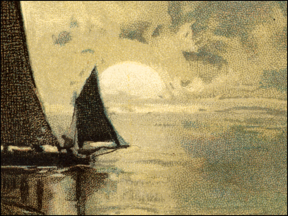
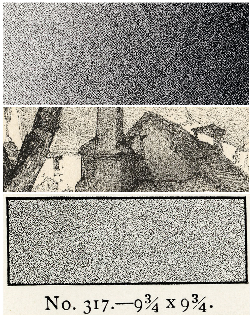
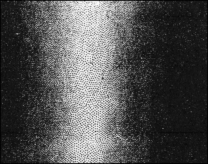
Detail of lithograph using Ben Day dots (The Boy’s Own Paper, 1891)
In my previous post I looked at the main methods that were used to print illustrated material up to the 1880s, when Ben Day dots came on the scene. Printing was a rapidly expanding industry throughout the 19th century in Britain, the USA and Europe, as demand for books, newspapers and magazines increased. (Not to mention art prints, stationery, forms, tickets, chits etc.) In the later part of the century the packaging and advertising of foods and other products also required more and more printing—of advertisements, labels, posters, leaflets and other promotional items.
Lithographic printing was a new arrival in the early years of the century. Invented by Alois Senefelder in the late 1790s in Munich, Germany, it became established as a regular trade in large European cities in the mid-1820s. For some purposes, especially pictorial, lithography offered real advantages in speed and economy. Michael Twyman has charted the rising numbers of printing businesses in London—letterpress, intaglio and lithographic—from just over 200 in the early 1820s to about 1500 by 1890. (1)
Twyman’s figures also show how lithography grew proportionately more rapidly than other types of printing, from small beginnings in 1822-23 to almost a third of all London printing firms by 1890. Similar booms in lithography were happening in Europe and the USA. As the 19th century went on, smaller towns started to have their own local lithographic printers.
Letterpress printing—a much longer-established method, for books, newspapers and magazines—was also thriving, mostly for black & white material. Lithography found a particular place in the printing of colour images, but was also useful for one- or two-colour items such as contracts, forms, diplomas, certificates and labels. It took a lot of business away from the old intaglio processes for printing in B&W, i.e. engraving and etching on copper and steel.
Amazing though it seems now, in the early years of the Ben Day process, the 1880s—and for some time after that—lithographic printing was almost exclusively done from heavy stone blocks. As seen in Part 4, pictures engraved on wood dominated the pages of magazines and books. For illustrations and posters, one advantage of lithography over wood engraving was size. Wood blocks were small and slow to engrave. Litho stones could be a lot larger in area, as well as faster to prepare. Of course, the larger the stone, the more cumbersome it was.
The stone in the picture below—dating from slightly later—was used to print a cigar box label. The label would have been about 25 x 18 cm, the stone in this case about twice that size. It looks as if it was printing two copies at a time. With small labels and cards, 30 or more copies might have been printed at once, from a very large stone—more on this later.

Cigar label and printing stone, 1888-1907, from http://www.johngrossmancollection.com/id13.html
Larger stones than this were also used for posters. Because of the weight and thickness of the stones—and because stones could break—lithographic methods using thinner, lighter metal (zinc) plates were gradually developed. Eventually these evolved into the “offset litho” used for printing almost all paper material today (2).
However, when Ben Day patented his “printing films“—later known as “shading mediums“—in 1879, the surface used for most colour printing was still a hefty chunk of limestone. As I showed in Part 4, Day described in his patent documents how his new semi-transparent gelatine sheets could be used to imprint patterns of lines, stippled dots or other shapes onto drawing paper or a lithographic printing stone.
The method might have been attractive to some illustrators, working on paper and board—and I have shown that Day himself used his films this way—but it was the burgeoning field of colour lithographic printing (chromolithography) which responded most enthusiastically to his new shading process.

Ben Day screen on lithographic stone. Photo from M. Twyman’s History of Chromolithography.
Later, from the early 1890s, this carried over into the brand new area of metal-plate photoengraving or “process” printing. This was in its infancy in 1879, but would gradually come to dominate the printing of pictures and graphics. It was here that Ben Day shading went on to find its place in the comics—of which, more later.
It is clear that in their first decade—before they were widely taken up by photoengravers—Ben Day’s lines and dots were very extensively used in colour lithography, itself a large and growing field.
Indeed, I will show in this post that Ben Day’s shading mediums did not just share in the success of colour lithography, but were themselves an important factor contributing to that success.
Commercial lithographic printing from stone as well as zinc did not really die out until the 1940s, at least in Britain—though its heyday is usually quoted as the 1870s to 1920s. Shading mediums, including Ben Day’s, were in constant use in commercial lithography from the early 1880s for 50 or 60 years.
This is the forgotten history of the Ben Day dot.
If Ben Day dots are remembered at all in the 21st century, it is for the printing of colour comics—a photoengraved letterpress method—or the exaggerated version of comic-book dots painted by Roy Lichtenstein.
Next time I will move on to photoengraving. This post is about the use and success of the Ben Day method in lithographic printing.
Starting with:
(i) The Importance of the Adjustable Frame
As discussed in Part 4, following the 1879 debut of his printing films, Ben Day’s next patent in 1881 was just as important for the success of his method—the “Adjustable Frame for Printing Films.”
As seen in the 1879 patent, each transparent shading sheet, with its pattern of lines or dots (shown as dotted area A in the diagram below) was fixed to its own wooden frame (B). This framed film became known as a “Ben Day screen“. For clarity, I have tinted the screen orange in the picture below, taken from Day’s 1881 patent document. The new Adjustable Frame held firmly on to the screen, and being hinged, allowed the inked screen to be lowered into position, flat down onto the surface which was to be imprinted with the Ben Day pattern.
The frame was at a suitable height to be used with a lithographic stone, as shown below. I’ve tinted the stone purple.
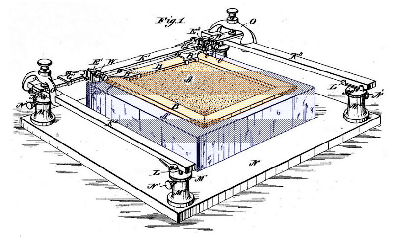
The great advantage provided by this mechanism was the very accurate placement of the Ben Day film on the stone.
I suspect the Adjustable Frame was inspired by—one might say derived from—a similar-looking frame which had been recently introduced in lithography. This was used to line up stones in the best possible register, when printing in two or more colours.
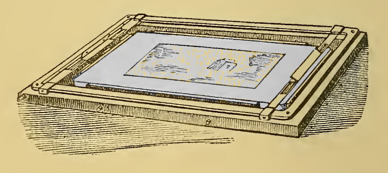
The picture above is taken from W.D. Richmond’s The Grammar of Lithography (3)—published in book form in 1878, the year before Ben Day’s first patent, but originating as a series of magazine articles starting in 1875. After detailing various ways of registering stone blocks by hand, Richmond has this to say about the new-fangled device:
Registering machines have also been employed by some lithographers with success, and though they are not usually on sale by dealers… they may be had to order. [The illustration] shows one of these contrivances adapted to a stone. It consists… of a frame adapted to the stone by means of set screws, which answer the double purpose of securing the frame to the stone and adjusting it in position.
The Ben Day screen was quite a different proposition. It often did not need to be positioned on the stone or drawing with any degree of perfect register. For a single application, the screen could be placed by hand, so long as the craftsman could hold it steady while rubbing down the pattern. As seen in Part 4, areas of the image which were not to be shaded were “masked off” with a paper “frisket” (as per Day’s own patent description) or, in lithographic studios, with a layer of liquid gum, painted on and allowed to dry. It was the careful positioning of this “mask” which determined the accuracy of the shaded area, not the precise placement of the Ben Day screen itself.
However, Day realised that applying his shading films more than once would be useful, to create repeated or enhanced patterns. His ingenious twist was to use a device similar to the registering machine—his Adjustable Frame—to mis-register his line and stipple patterns between applications, but by very slight amounts and under very tight control.
On Day’s new device, the adjustment screws moved the frame one thirty-second of an inch per complete turn. “By means of the pointer V and the scale on the dial W the most minute movements of the screws can be regulated and measured,” as Day said in his 1881 Letter Patent.
A 1948 book (4) reports that precise movements of 1/640 of an inch—about 4 hundredths of a millimetre—could be made, implying that the dial had 20 divisions per turn of the screw, which is credible. Day does not actually state this in 1881, and it could have been a later refinement. Clearly though the original device was already quite efficient in its adjustability. (5)
This had a very important application: after imprinting its pattern on the stone once, the Ben Day screen could be lifted off the block, re-inked, replaced in the frame, moved a fraction of an inch, then used to apply a second print of the dot or line pattern. This print would sit alongside the previous one, creating a double pattern. A third was also possible, more if needed.
In Part 4, I showed Day’s parallel line pattern being used for cross-hatching, in which a second set of lines was imprinted over the first—seen below in his own drawings from the 1879 patent. This was shown as a manual procedure.

From 1881, with the Adjustable Frame, it became clear that there was much more utility in his “printing-films” than it might at first have seemed.
Every individual film, Day had now revealed, was able to print multiple patterns.
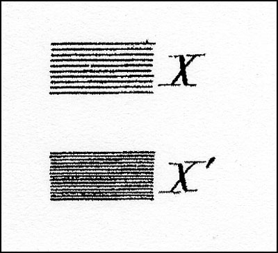
In diagrams provided with the 1881 patent, Day shows how this could work in practice, with two simple examples. First a line pattern X is repeated at an even spacing to produce a doubly-dark line shading pattern, X’:
Then he shows us some Ben Day dots—the first time we have seen any in his own documentation—albeit not the regular grid of dots which we now know so well, but a stippled dot pattern, looking very much hand-drawn. (As we will see, this hand-drawn pattern was not simply a case of technical limitation.)
The original pattern Y1 is shown being doubled to Y2 and tripled to Y3:

Finally at Z he shows a stipple which has been re-applied up to four times, with different areas being pressed with the stylus “according to the shading of the picture or print desired.” In other words the user can to some extent draw with the dots to create a graduated shading effect.

Two notable points emerge from this:
Firstly, whereas today we think of Ben Day dots as regular round dots in a mathematically precise pattern, in their early days they were intended to look like hand-drawn stippling. Day was mimicking the kind of dots that artists and printers were already using. These might be semi-regular—perhaps laid out in curved lines—but they were recognisably marks made by hand.
Secondly, this was just what the commercial lithography industry needed at this point in its continuing development. Benjamin Day’s 1878/9 patent text may have seemed rather tentative about the use of his shading mediums in lithography, but in 1881 they were poised on the brink of major success.
I will now look at the various different ways lithographers had made images on their stones up to this point—and how Ben Day’s patterns fitted into their world.
(ii) Lithographic Shading Techniques Before (and With) Ben Day
Among the various printing techniques of the 19th century, lithography was something of a magpie and something of a chameleon. Its pioneers looked at other, long-established printing methods, worked out what they could borrow or adapt, and/or how to mimic the look of wood engravings, letterpress text, copper and steel engravings, etchings etc. When photographic printing methods took off in the latter part of the century, ways were soon found to imprint photographic images on stone.
Before 1837 though, hand-drawn black and white or two-colour work was the bread-and-butter of the lithographic printers. One of their great advantages was mixing text and images on one stone and in one print run, with text that could be more creative than that of the letterpress printers. The latter needed a set of cast metal type for every style of lettering, which had to be printed in straight rows and columns. The lithographer could potentially draw a new style of lettering for a client’s particular needs, and it could flow around the page and be integrated with images.
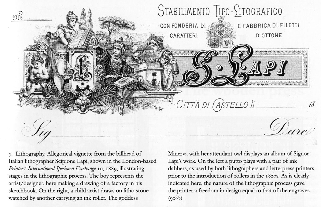
The Italian billhead below shows some of this, as well as a scene illustrating lithography itself. Click to enlarge, and you should be able to read the original caption which I have left in place.(6)
The basic techniques listed below could be used for:
- making a single-colour (monochrome) print—usually black ink on white paper, but not limited to that
- or for one of the stones which would be printed in coloured ink as part of a tinted print (black plus one or two colours)
- or one of the stones used for a fully-coloured lithograph. A typical colour print might use 9 colours, and so require 9 stones. Fewer stones, or more, could be used as needed.
In every case, the ink used to make the image on the stone was black—a special grease-based black ink. Once that black image had been drawn—including writing and shading if needed—the final, printable, version was “etched” chemically onto the stone. The original black greasy ink was removed. The printing ink then used with that stone could be whichever colour was required. For more detail, see Part 4.
The main techniques used in making images on the stone were:
Ink drawing directly onto smooth, polished stone
A brush or pen could be used, with the black greasy ink in a liquid form called tusche. This gave a solid line—or dot, where needed—and could be used on a smooth stone to imitate fairly closely a drawing done on paper.
“Engraving” on stone
Fine line work imitating closely the look of copper or steel engravings could be achieved. The stone was coated with a thin gum layer, then a fine point used to scrape the gum off, creating a drawing in lines and dots of exposed stone—or if the point scratched off the stone surface, actual lightly engraved stone. Lithographic ink was applied to the exposed lines on the stone, masked off from the non-image areas by the gum. The final inked image, with the gum washed off, could be etched onto the stone in the usual way. The stone then produced prints almost indistinguishable from a real metal engraving.
When wood engraving became the world’s favourite method for printing pictures (see Part 4) lithographers learned to mimic the “white lines on black” look by laying down ink on the stone, then scraping it off to create the white lines of the final image. Again the final effect was a very close copy of the wood engraving technique.
Both of these techniques were complicated and required a great deal of training and skill to execute. They would only be used for special jobs.
Shading in lithography
Generally speaking, lithographic printing, like letterpress, could print only solid areas of colour—in the case of a black & white image, no shades of grey. However, each line or area of solid colour could be very thin / small.
Small dots could be drawn with a pen, larger ones with a brush—again, on smooth stones. This kind of shading—stippling—came into its own later in the day, and will be looked at below.
The main earlier form of dot-making was…
Crayon or “chalk” drawing on rough, “grained” stone
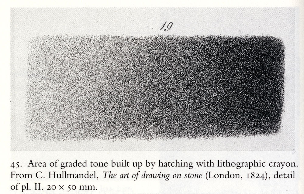
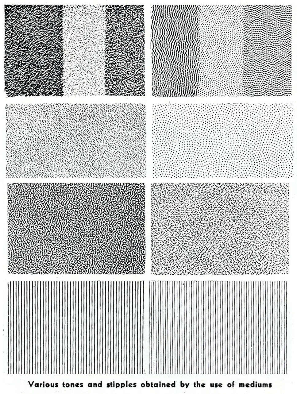
On a rough textured or “grained” stone, a greasy black crayon—called rather misleadingly “chalk”—could be used. This gave a pleasing “natural” effect something like a drawing done with actual chalk, charcoal or soft pencil on a “toothed” paper. This was useful for shading in lithography because it was essentially a pattern of tiny dots—a fairly random distribution of dots of many sizes. Each dot on the stone could be printed from, as a small area of solid colour.
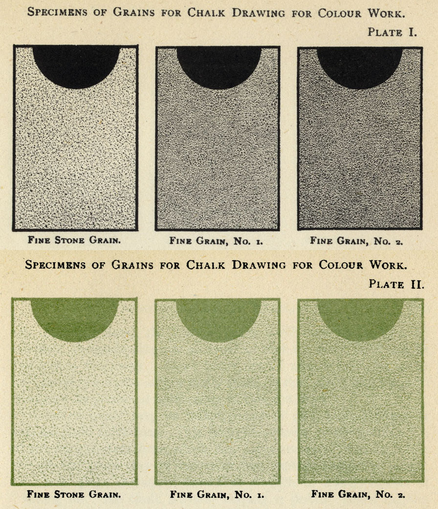
This illustration, from a 1940 book by renowned lithographer Thomas Griffits, shows some typical patterns achieved with crayon / chalk. The upper rectangles are about 40 x 35 mm on the page. (7)

And below is a very skilled example (only 20 x 50 mm in size, originally) by Charles Hullmandel, one of the pioneers of lithography, reprinted by Michael Twyman. Again, I have left his caption in place. (8)
This kind of drawing was not as straightforward as it might look. At a basic practical level, it had to be done without the slightest touch of the artist’s hand onto the stone. Due to the method used to etch the image, any tiny, unseen greasy residue from human skin would show up on the final print as an unwanted mark.
The drawing itself could easily turn blotchy and uneven, whereas an even tone or a smooth transition was usually what was required. This uneven effect is deliberately shown in the “flat chalk” example above. The others have been carefully worked using repeated strokes with the point of a sharp crayon, not a flat edge.
“Crayon or chalk work calls for a delicacy and refinement. Only the most experienced lithographic artists are capable of doing real justice to this class of work.” So wrote Henry J. Rhodes, lecturer in lithography at the Royal Technical College, Glasgow, in a book of 1914 (9). He also stressed that crayon work required great skill from “the provers, transferrers and printers”—i.e., even if the artist did his or her job well, shoddy printing techniques could easily mess it up. (I will return to “transferring” later.)
Artists like Delacroix, Goya, Manet, Whistler and Toulouse-Lautrec famously used crayon lithography for prints or posters, but an army of mainly nameless commercial artists also had to master it for their day-to-day work.
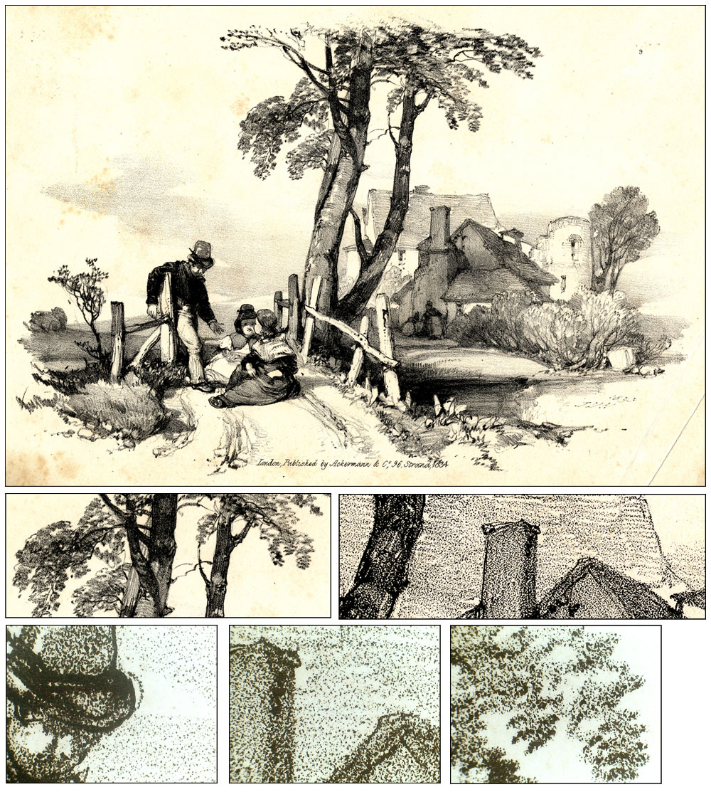
Below is a fairly commonplace lithograph from 1834, bearing the name of its publisher but, typically, not its artist—though the eagle-eyed will spot a semi-legible date and initials in the space at bottom right. This was almost certainly drawn on grained stone. Under the main image I have shown some details at different levels of enlargement. The grained, hand-drawn character of the shading can be clearly seen.
The full image is about 23 x 15.5 cm. Finer details (bottom row) each about 12 x 9 mm.
With his 1881 patent, Ben Day demonstrated that his shading technique could produce a great variety of patterns, including something rather like the random “natural” dots of chalk / crayon drawing, as seen at Y and Z in his diagrams. Also, this could be done using not only a very fine degree of control but also some creative skill or spontaneity, as the job demanded. Furthermore it might be done without employing a trained / skilled artist—potentially a significant saving in time and money.
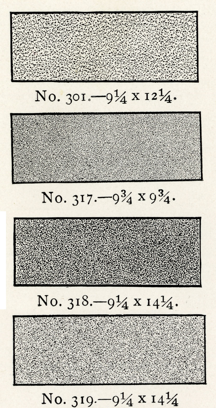
Later on, Ben Day also produced shading tints which directly imitated areas of crayon drawing, without the need for second, third or more applications. I have selected the most crayon-like below, from Ben Day proof pages printed sometime between 1911 and 1936. (The numbers like “9 1/4 x 12 1/4” refer to the size of the Ben Day screens, in inches.)
It is likely that some or all of these same patterns were in use much earlier than that. Bamber Gascoigne, in his 1986 book How To Identify Prints, reports an early Ben Day advertisement from 1887, stating that more than a hundred varieties of screen were then available, including grained tints. (10)
Here is a direct comparison of Hullmandel’s ideal chalk shading, a real lithograph, and one of Ben Day’s patterns:
I have shown black & white examples, but crayon / chalk drawing on stone was used for a lot of early chromolithography, i.e. colour work. Godefroy Engelmann, pioneer and early patenter of colour methods (1837) used mainly crayon work.
From the very start of his endeavour, though, Day would also have been aware of another key factor—one which had already pushed lithographic image-making away from chalk drawing on rough stone and inexorably towards the use of smooth, polished stones and a lot more of a different kind of shading: stippling.
Stippling
By the 1850s and 60s steam-powered lithographic printing presses were increasingly replacing the old, slow hand-presses. An early pioneer of the powered litho press was the Parisian, Hippolyte Marinoni. We shall be meeting him again later in the Ben Day story.
The future of commercial lithography clearly lay with the powered press.
And as a general rule, the powered presses could not handle rough stone, only smooth—mainly because they used different ink rollers from the manual machines, and did not dampen the paper between printings (11).
That meant that the future also belonged to techniques for creating images on smooth stone.
This was when stippled shading gradually started to take over from chalk/crayon work.
As Michael Twyman puts it, “Pen and ink stippling (with or without the support of mechanical tints [i.e. Ben Day patterns]) became the bread and butter technique for commercial work, and was adopted for the reproduction of popular paintings, magazine and book illustrations, greeting cards, scraps, advertising and ephemera. It remained the staple method of chromolithography until the demise of the process, and is especially obvious in trade cards and labels, where its visual characteristics often seem to have been exploited for their own sake.”
I showed examples of hand stippling on a scenic postcard in Part 4. I don’t know the date of this, but judging by the lack of regularity in pattern of the dots, most or all of the stippling looks hand-done to me:

Henry Rhodes provided this example (original image 20 x 50 mm) of various ways stippling could be done by hand, in his 1914 book:

I note that in places dots and lines are used together in this hand-drawn example. This could be done by superimposing more than one Ben Day pattern as well.
Rhodes goes on to describe “shading mediums” and how they were applied to a stone, though without mentioning Ben Day by name, and provides this example of one (54 x 50 mm):

The “festooned” or “fan-shaped” hand-stippled pattern became a firm favourite in lithographic printing. In their idealised form, the curves overlapped each other constantly, so the pattern could be extended indefinitely over a large area.
Lithographic artists, craftsmen and printers learned during their apprenticeships that, when drawing stipple, they must avoid dots in straight lines. In this they were partly imitating the copper engravers who came before them. Curves and festoons of dots were to be preferred, as giving a more “natural” look that was easier on the eye. In addition, the human hand is quite well suited to drawing a curved array of dots. You can easily try this out for yourself.
Similar forms were occasionally seen in wood engraving, amongst the generally relentless linearity, in the negative version—white dots on black. H. Pisan, engraver of Gustave Doré‘s Bible illustration Achan Stoned (c.1865) used a few curved arrays of dots on his black sky, for example:

The examples below are from various pictures printed in The Magazine of Art, 1891 & 1893. The bottom right detail shows how wood engravers also had their own version of black dot stippling, created effectively by carving cross-hatched white lines on black, leaving fragmented black lines reduced to a dotty pattern. Missing “dots”, clearly seen here, might be where the tiny remaining bits of wood simply broke off.
Ben Day and Stipple
The Ben Day shading mediums, or mechanical tints, were ideal for use on smooth stone. Indeed, the polished hard surface of lithographic limestone blocks took the pattern from a Ben Day screen better than the rougher, more absorbent surface of drawing paper. (The same advantage applied to smooth, hard zinc—i.e. metal—printing plates in later years.)
Though the early years of the Ben Day tints are not well documented, it appears that these curvaceous stippled patterns were introduced into his range from the very beginning of their commercial use, or very near it. The 1887 advertisement reported by Bamber Gascoigne offered line, stipple, grain and other patterns.
Ben Day’s first patent for an actual dot pattern, in 1900, was for just such a stipple pattern:
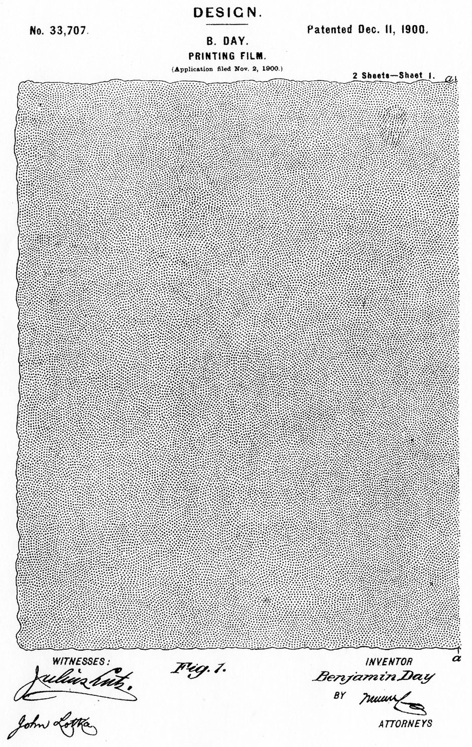
A close-up look at the shapes of these dots (below, enlargeable) shows that they probably originated on a specially made etched copper plate. The shape of each dot is characteristic of copper etched by acid. From the copper plate they were moulded in gelatine to create the printing surface of the Ben Day screen, as described in Day’s 1878/9 patent text (see Part 4).
The only other Ben Day dot patent I have found was for a graduated tone of the same or a similar pattern, in 1901, as seen below:
I have a catalogue of Day’s products, sold to me as 1911 vintage. The cover does have a 1911 copyright, but the booklet is designed for newer pages to be inserted. One of the interior pages is copyright 1936. (12)
In these pages 172 different screens are shown. Below I have collected, from different pages, all the 26 stipple tones. Most of them are on one page headed “Hand Stipples.” Lithographic studios would typically have kept a limited number of Ben Day screens on their shelves, perhaps ten or fewer, which they were familiar with and could use flexibly. Special orders might be put in for unusual screens where needed.
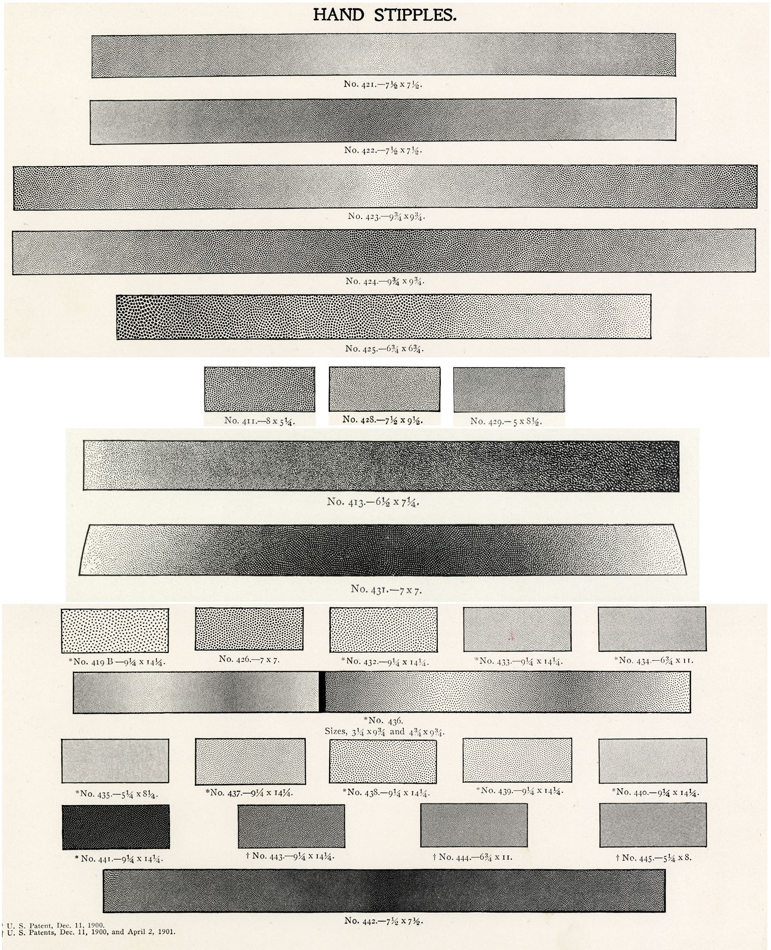
It is worth noting that several of these patterns are not flat, even tones, but graduated from light to dark, and that three of them use white dots on a black ground.
I have yet to find any definite examples of Ben Day lines in full colour lithographic illustration, though it is likely they would occur in black & white work, e.g. for shading of lettering, and it is documented that many coloured maps used Ben Day lines—more later.
The evidence shows that, in lithographic colour work, the so-called “hand stipples” were the favoured Ben Day tones. The regular grids of dots which we know from 20th century comics were a later development, giving a look more like the new “halftone” process—of which, more in a future post.
Not everyone was keen on stippling, however. In 1905 David Cumming, lecturer in lithography at the Heriot-Watt College, Edinburgh, wrote: “Hand stippling… is really an imitation of grained stone drawing, and is well adapted for machine printing. In artistic effect and softness it comes far short of grained stone work, but for commercial purposes it answers admirably…” Later in the same book, he is more judgmental: “The stipple dots, especially if visible in the stronger colours, are very offensive from an artistic point of view.” (13)
Bamber Gascoigne says of Ben Day screens: “It was argued that such textures would look natural since the originals, on which the embossing was based, had all been hand drawn. In fact they have a very mechanical look. The ordinary late 19th century lithograph, sometimes to the eye but certainly through a [magnifying] glass, will seem to have an advanced case of the measles.”
The same witticism had been applied to Roy Lichtensteins’s so-called Ben Day dots in the 1960s. Actually, any spots seen on people’s skin in old lithographs are most likely to be hand-drawn. I will show a typical example later. Nonetheless, Gascoigne’s point is not wrong—the dots on many areas of many pictures are somewhat obvious, though I would emphasise that Ben Day stippling is no more spotty than its hand-drawn counterpart.
Thomas Griffits managed to write a whole book on The Technique of Colour Printing by Lithography (1940) without once mentioning the distasteful matter of stippling, hand or mechanical. His book provided the images of chalk shading above. As Frank Pick’s introduction made clear, this was a book about lithography as art—or at least, a craft capable of producing faithful reproductions of proper art, i.e. oil or water-colour paintings.
“Now the lithographic poster is back in the streets on the ubiquitous hoarding,” wrote Pick. “The commercial printer discovered the ease with which the invention could be exploited, the cheapness by which copies of anything could be multiplied, and lithography has had to bear the unjust burdens of these sins against its honour.”
As joint pioneers of the British railway poster, now seen as a lithographic artform in its own right, perhaps Pick and Griffits both felt they were themselves sinners—or more likely, feared they were being seen as such. Possibly they sought to atone by writing stippling out of the story of lithography. (14)
Ben Day Dots in Action
(a) Simple Tints
The scholar of the Ben Day dot is concerned less with the refined artistic print, more with the commercial end of the lithographic trade. Alongside some admittedly shoddy work, a great deal of admirable image-making was done. This gold-edged peacock, for example, was printed as a label for a bale of cloth, probably in Manchester sometime in the first half of the twentieth century.

Generally, hand drawing and hand stippling would have been used for details like faces, hands, most clothing—anything which needed careful delineation and individual “modelling”. Though Ben Day was keen to stress the variations that could be achieved with his dots, in practice they were often used, as here, for flat areas of tone like backgrounds.
On this label, lines and stipples done by hand are evident on parts of the peacock and the mound he stands on, but the background is done with two colours of Ben Day, yellow and pink, sometimes overlapping to make a pale orange. Each detail shown here is about 30 x 12 mm on the label. Full image area = 4.25 x 5.25 ins or 107 x 134 mm approx.

Like the peacock, the Naranjada label shown below is probably an early 20th century production—perhaps a conscious British emulation of the famous brightly-coloured Californian fruit crate labels. The oval is 90 x 70 mm, 3.5 x 2.75 inches. Here the background clearly shows a doubling up of the blue dots in places. In addition, I think some of the orange dots on the fruit itself are done with Ben Day.

As Twyman points out, because the Ben Day stipple patterns imitated hand-drawn dots, it can be difficult or impossible to tell them apart when looking at a lithographic print—especially when hand work could be added to augment mechanical tints. Looking for precisely repeated elements in the pattern, and comparing the patterns to known examples, e.g. those in the catalogue, may help.
Another way to detect Ben Day dots might be to look for evidence of the edges of masked areas. At the stage when the Ben Day dots were imprinted onto the stone or plate with black ink, a liquid gum was painted on first, to mask off areas where the shading was not wanted. Any whole dots, or parts of dots, which were inked down over the dried gum layer would have been washed off with the “mask”.
I think this can be seen on the Naranjada orange segments, where small masked patches show as orange-yellow ovals between the darker orange dotted areas. At the edge of these areas some dots seem to have been “cut in half” where they overlapped the mask. I have tried to show this in 20x and 400x magnifications below (15). Also, in places on the orange segment, the dot pattern is overlapped on itself for a darker colour.

Hand-drawn dots, I’m fairly certain, were simply drawn on the stone without requiring any masking—thus every hand-drawn dot should show as a full round dot, with no “cut off” fragments. The handmade dots would often get smaller at the edges of shaded areas, but each dot would still be a round shape, no semicircles etc. The whole fruit seen on this label shows definite hand-stippling, in two shades of brown.
The image below is earlier, and can be dated quite precisely, as it is from an advertising insert in the April 1888 edition of The Magazine of Art (16). Image size= 125 x 195 mm, 5 x 7.75 inches approx. The black image is probably taken from a wood engraving, transferred to stone. On the red stone, the lithographer appears to have used two types of Ben Day shading, line and stipple, overlapping in places. This works quite well, as part of the shadowing accentuating the “3-D” look of the folded paper, but shows the danger of creating “Moiré”-type patterns where tints overlap. A hint of such a pattern is emerging here. More on this later.

(b) More Complex Use of Ben Day Dots
The Boy’s Own Paper, or B.O.P. as it liked to be known—launched in 1879 and surviving until 1967—provides an enduring record of trends in illustration and printing. Bound hardback volumes are available fairly cheaply. I have an example from 1890/91, complete with advertising inserts and the colour lithographs occasionally issued with this mainly black & white weekly—both often missing from such books. The majority of the illustrations are still wood engravings at this time. A very few are printed directly from line drawings by the new (ish) photoengraving process.
The first lithograph, at the front of the book, is a fold-out more than three pages in length. Readers of the B.O.P. were never treated to pictures of exotic ladies, however. The subject of this picture is the uniforms of the British cavalry—far more suitable for good Victorian boys. The two illustrations below show only the left end of the print (which is the full height of the image area, 260 mm) and part of its right end.
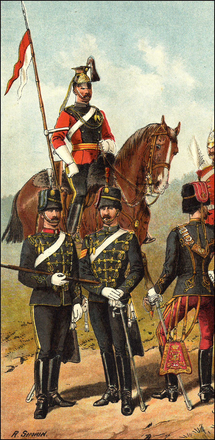
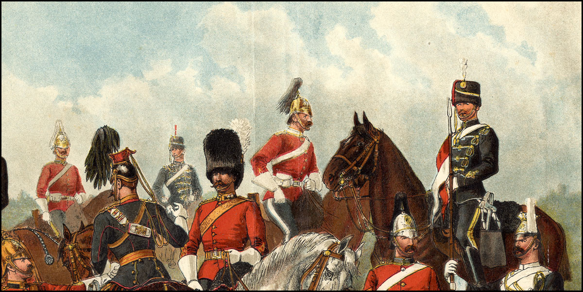
Below are areas of sky in close-up. (Each image approx. 40 x 40 mm.) These views reveal the complexity of the Ben Day work. Not only has a stipple pattern of large blue dots been laid down multiple times, it is also joined by a different, tighter pattern of much smaller blue dots. Some areas which at first may look plain white or pale blue also have grey dots, in addition to the more obvious grey areas themselves.

In these other close-ups, below: the red stone was clearly off register (by a little less than 1 mm); dark Ben Day dots appear to have been used on the clothing of the soldiers, which is somewhat unusual—alternatively, they might have been drawn on Nelson paper, and transferred to stone (more on Nelson paper later); Ben Day is used extensively in background areas; complex mixing of overlapping colours makes it very difficult to see how many colours were used.

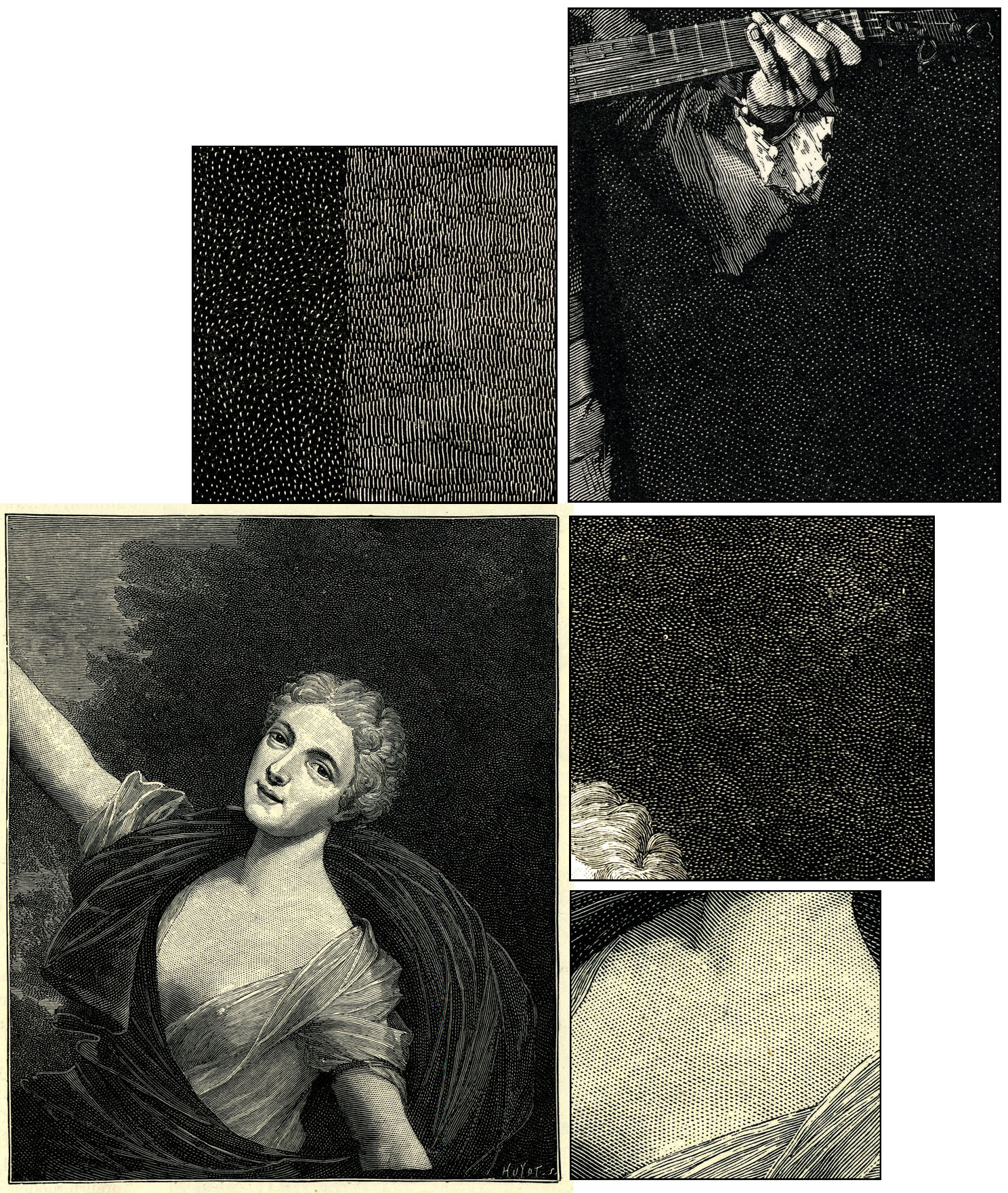
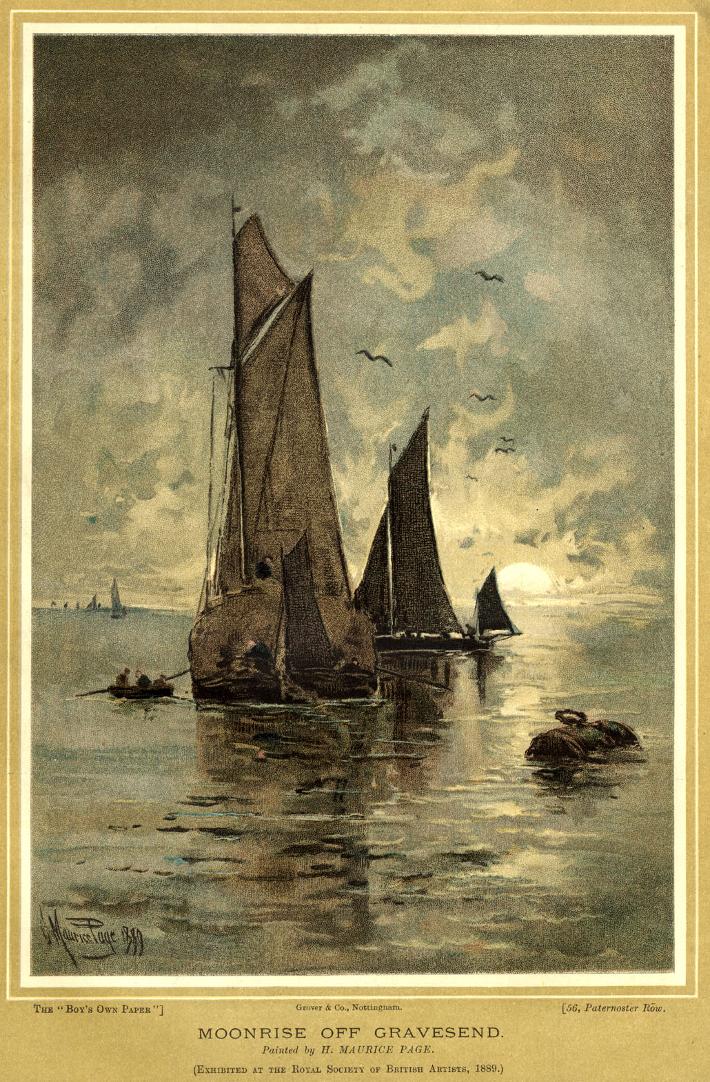
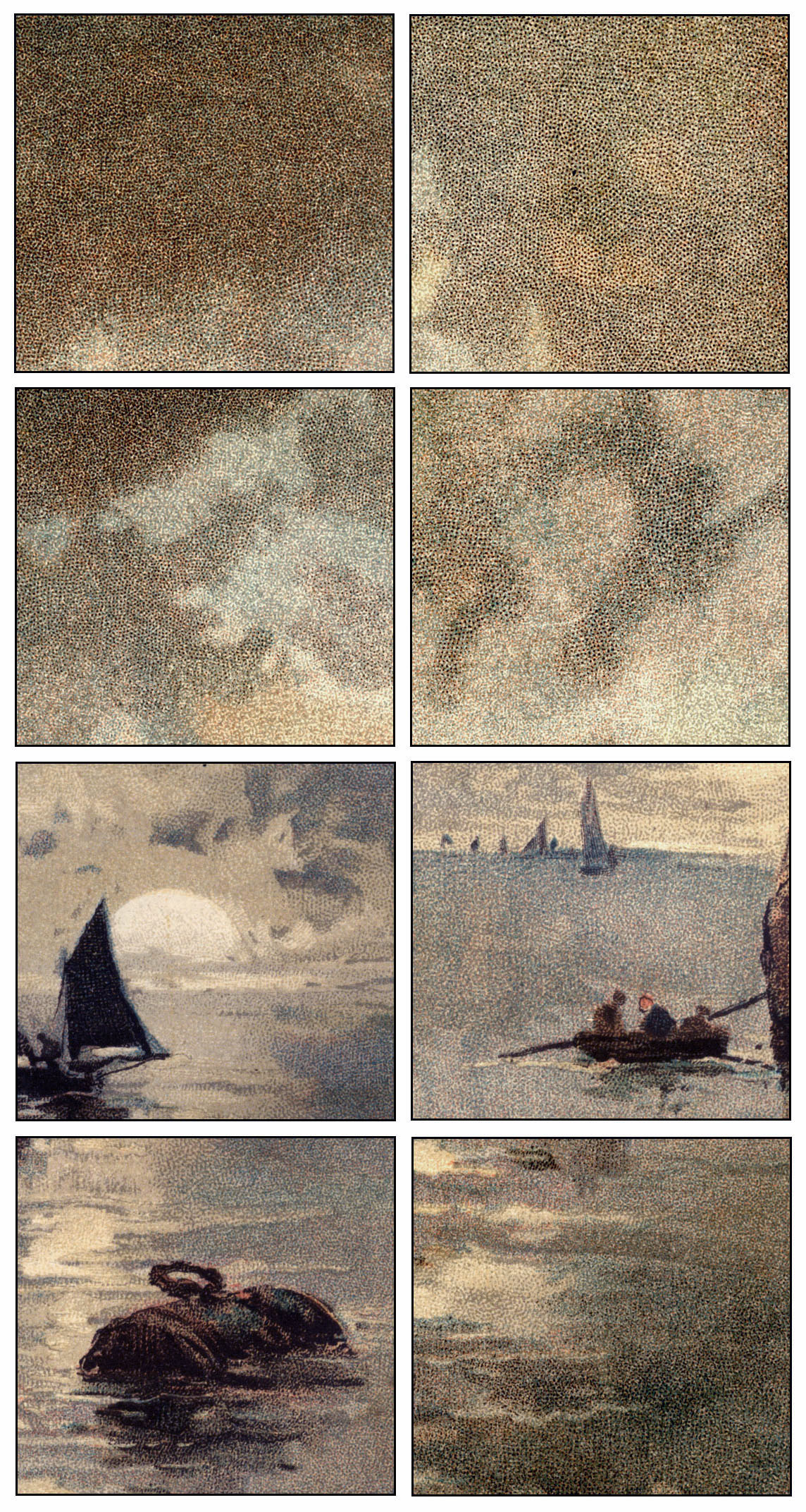
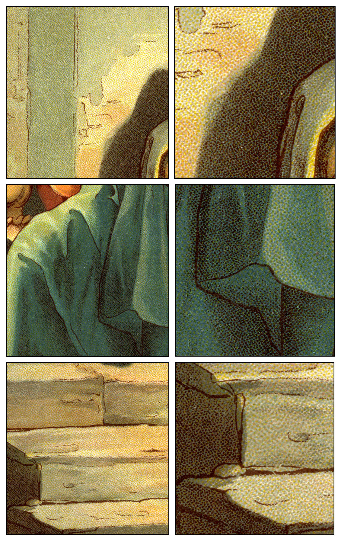
Below is Moonrise off Gravesend, a lithographed copy of an 1889 painting, which appeared with the B.O.P. of May 2nd, 1891. (Picture area c. 160 x 240 mm. The framing colour in this case was not done in metallic ink, unlike the peacock label above). This is a good example of the art of “facsimile”—the closest possible copying of an actual painting—though a commercial product like this is a far cry from the expensive, largely crayon-worked artistic prints which would have satisfied the demands of a Thomas Griffits. For the young readers of the B.O.P. though, it provided a tasty treat. For us, it also supplies ample use of Ben Day’s shading mediums for enjoyment and study.
All I would add in words to the details below is this question: would the picture look any better if some underpaid stipple artist had driven themselves insane—and possibly first blind—drawing each dot by hand? (17)
Also from my own collection comes another commercial product, like the B.O.P. aimed at a middle-income market, I would guess—though she may have been a promotional item, given away free. The calendar girl below was published in 1886 for the year ahead, 1887. Her background, outside the oval, is a slightly shiny gold, though not as sparkly as the peacock’s border, and sadly has been affected by moisture over the years (crinkled).

The image area is large—405 x 470 mm or 16 x 18.5 inches approx.—and that is with the calendar itself trimmed off. (Not by me, I hasten to add.) Imagine the weight of those stones! And how many stones—how many colours, that is—do we think were used? Perhaps a look at some close-ups will help us find out…
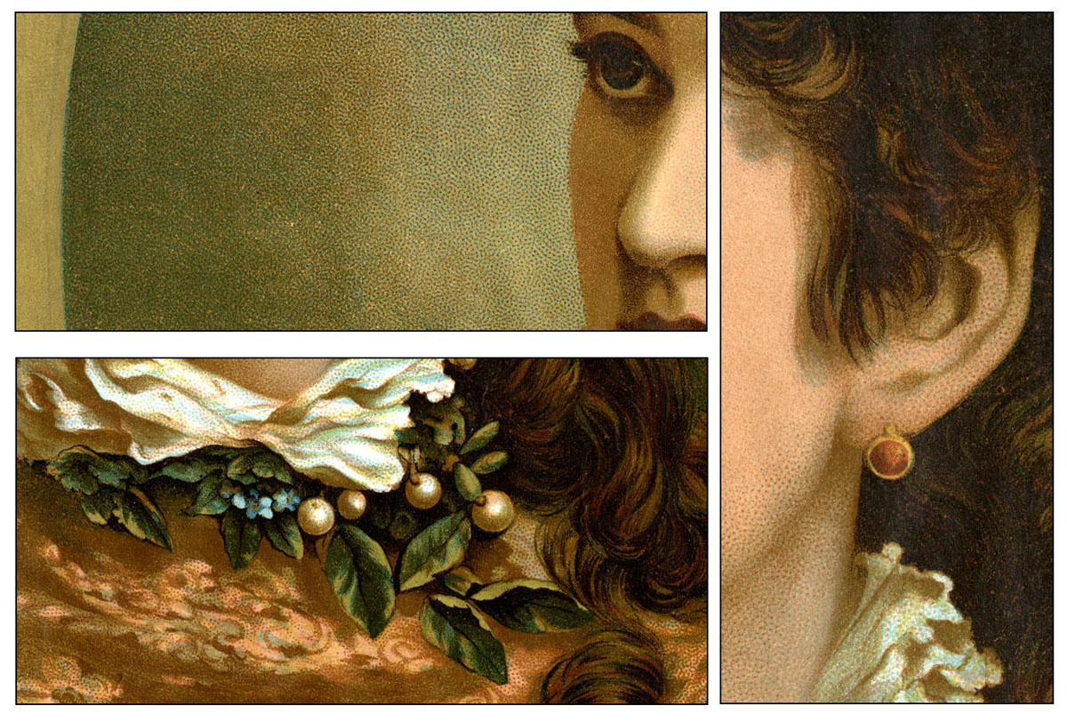
Having used a magnifying glass on the original print, I think there are nine colours here, as well as the gold—which makes the print absolutely typical of its kind. The colours I see are: flesh tone, dark brown, mid-brown, dark green, pale green, pale blue, mid-blue, scarlet red and a tiny bit of yellow. What looks like black is, I think, dark brown plus dark green.
At first glance, the yellow seems to have been used only on her ear-ring, which would surely have been a huge waste of the large stone used to print it. A closer look shows that the gold border is almost certainly printed over yellow, to give it more “body”. Magnified, the yellow just shows at the edges.
The background within the oval uses Ben Day patterns—dark green and mid-brown dots over a pale green ground, with multiple applications of the dots in the darker areas. On her face the pale blue (looking grey) and scarlet dots printed over the flesh tone are, I think, hand-drawn—likewise the mid-brown dots in the more shadowy areas of her skin. The details below show the blue and red dots in typical curved arrays, like the Ben Day versions, but varying in size and distribution in a way which is characteristic of hand-stippling. The brown dots under the eye have been done in a combination of large, probably brush-painted, dots with some tiny pen-stipples.

Before leaving this fine example of commercial work, let us reflect on the challenges facing its creator or creators—there was probably a team, each working on one or more of the stones. One person had to break down the image—probably an original painting—by a process of sketching and thought experiment, into a printable range of colours. An outline image was traced from the original and copied onto each of the nine stones, in a non-greasy ink, which would not become part of the printed images. (As described in Part 4.)
Then, using their skill and judgement, they drew images (and imprinted Ben Day patterns) on the stones, one for each colour, in black ink—visualising in their heads how the final coloured combination of images would look. Time and budget permitting, they may have printed proofs of some individual colours or colour combinations as they went along, to guide them further in preparing the next stones in the sequence.
As if that wasn’t hard enough, the images all had to be in the closest possible register, not to mention the technical challenges of removing gum masks without taking off any ink, “etching” each stone correctly, etc.
Given all that, is it any wonder that lithographers embraced the savings of time and effort which Ben Day’s shading mediums offered?
—
And finally…
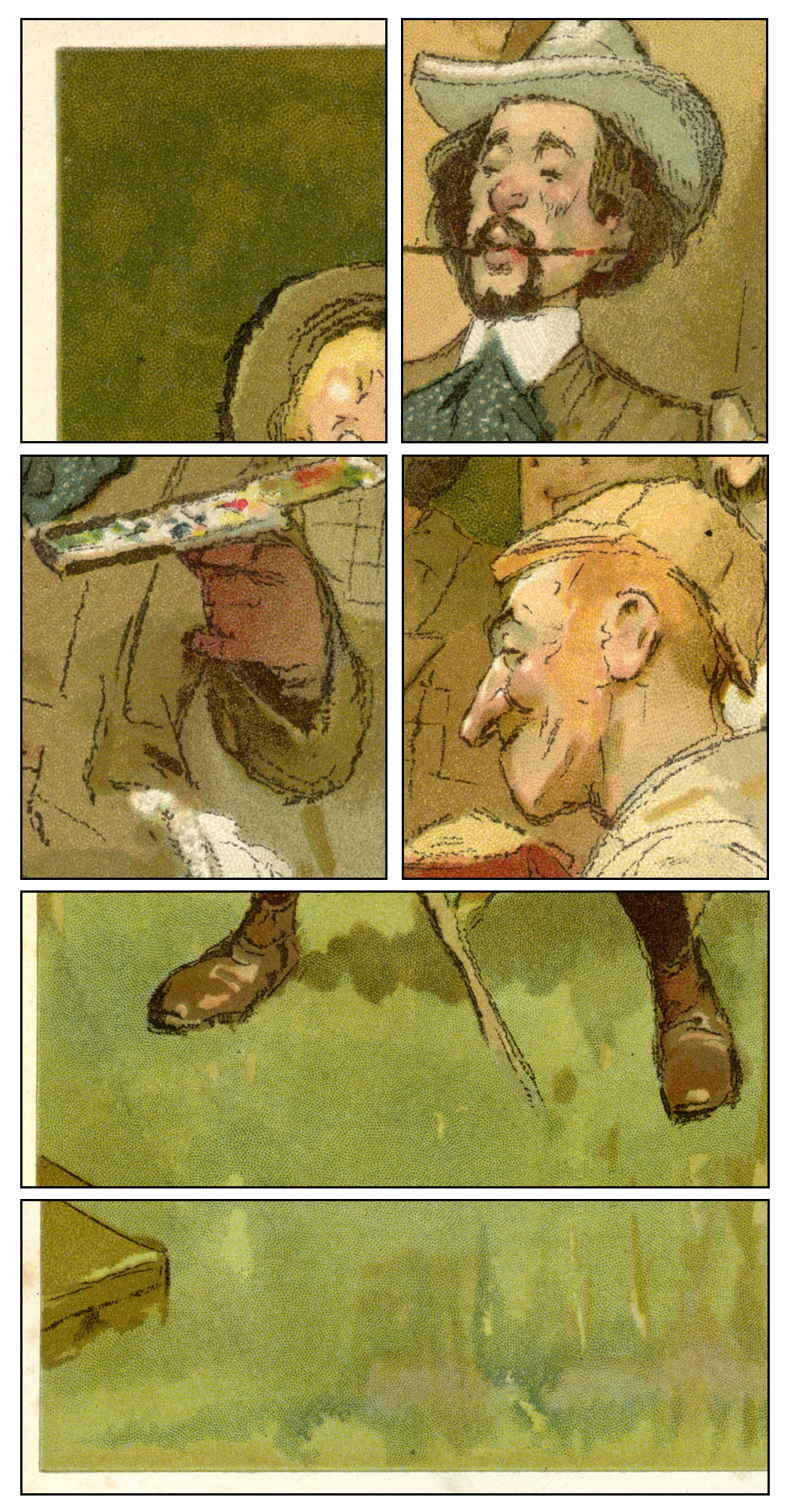
Before leaving the subject of stippling, one last image from my own collection—just for the fun of it. It’s by Tom Browne—artist of the Johnnie Walker whisky man, and creator of the comic strip Weary Willie & Tired Tim—from The Boy’s Own Paper of 1902. The name of the company which did the lithography, Tom Browne and Co. of Nottingham, is no coincidence—it was indeed Browne’s own.
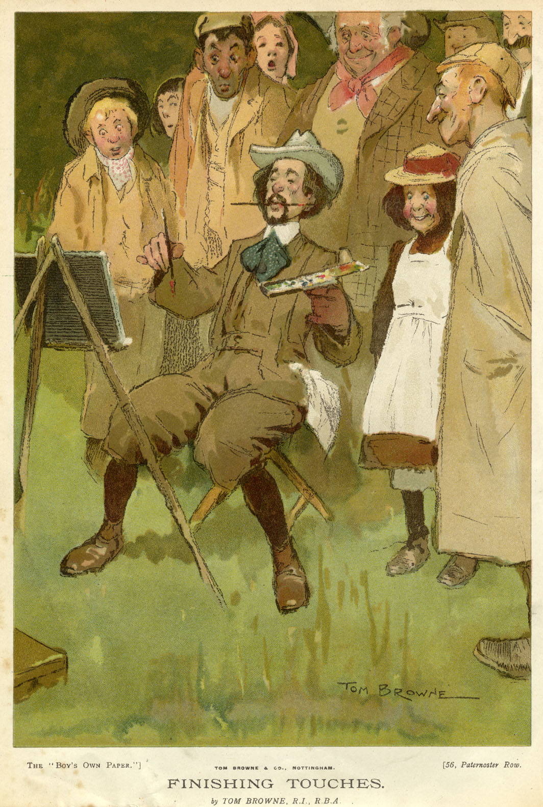
I’ll let the stippling on this one—and the drawing—speak for itself…
Spatter
This technique of dot-making is closely related to stippling, and also known as “splatter”, “splash work”, “sprinkling” or simply “toothbrush” after the main tool used in creating it. Quoting Henry Rhodes’ Art of Lithography:
“A means of obtaining an irregular flat tint… It is effected by dipping a tooth or similar brush into lithographic writing ink and then going over the tips of the hairs with some such instrument as the small blade of a pocket knife in such a way as to cause the hairs to spring smartly forward. The splashes thus thrown produce a tint.”
If that is less than clear, perhaps a picture will be worth the proverbial thousand words:
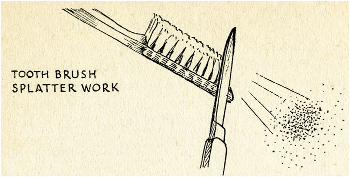
The illo is from Thomas Griffits’ book—the one that failed to mention stipple. Spatter / splatter on the other hand clearly had the seal of artistic approval. Griffits added that a fine wire mesh held between the toothbrush and the stone could break up the larger blobs of ink, making a finer pattern.
Rhodes wasn’t kidding about “irregular” tint. The randomness of the spatter pattern was (and remains) part of its appeal, and something it had in common with the stone grain. Spatter also anticipated the airbrush, with its much more regular, controllable jet of ink droplets. That came into use through the late 1880s in the US and the 90s in the UK, its driving force of compressed air initially produced by a foot-pump.
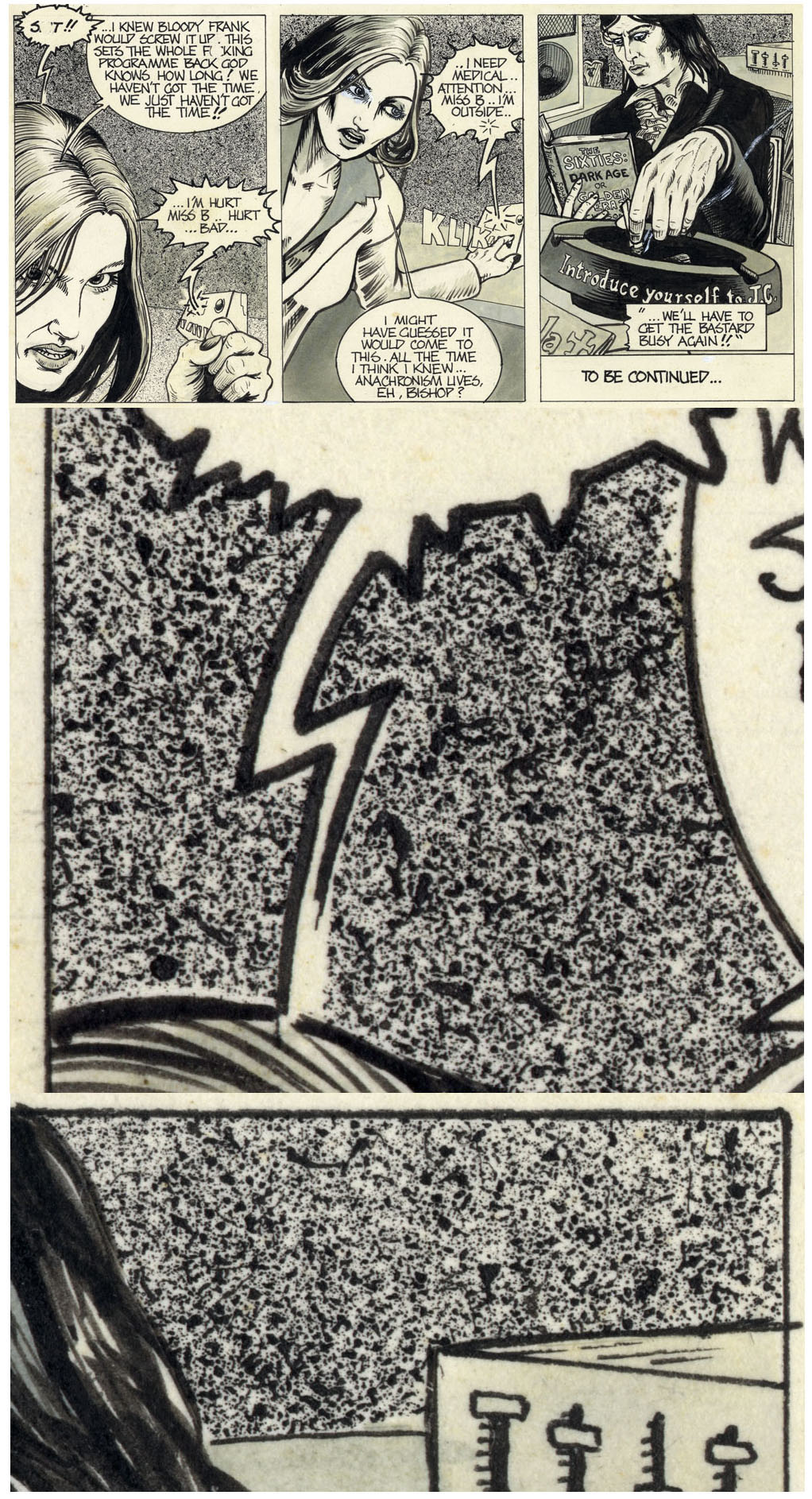
The hands-on excitement of spatter ensures it will continue to inspire young artists, at least as long as ink remains in use. (I’m not aware of a precise computer screen equivalent.) The examples below are from an unpublished comic strip from 1978, done on paper, of course, not stone. The close-ups are 20mm and 30mm across respectively. Occasional imperfections in the masking process can be seen. (18)
Spatter work is said to be quite widely used in lithography. Did Ben Day, magpie and chameleon in his own right, set out to imitate it? No. 329 in the catalogue is certainly similar.

Transfer Paper
In the very early days of lithography, its inventor Alois Senefelder realised that once he had printed an image from a stone onto paper with lithographic ink, when still wet the image could be transferred by pressure onto another lithographic stone. Michael Twyman says that Senefelder considered this as important as the printing process itself. Thanks to him, and the ingenuity of his fellow lithographers who developed the idea over the years, he was not far wrong.
Special transfer papers were soon produced, with a coating which took lithographic ink well while absorbing as little of it as possible. By dampening the back of the paper and pressing the paper down onto a fresh stone, an image could be transferred from one stone to another, even days after it was put on the paper.
Transfer paper was a direct ancestor of the Ben Day process.
But long before Benjamin Day had his great brainwave, as commercial lithography grew and developed, transfer paper was crucial to its expansion. It was used in many inventive ways well beyond the basic taking of images from one stone to another, or “re-transfer”. Before describing in detail how to make eleven different types of transfer, David Cumming says in his 1905 book:
“Before the era of power driven machines there were comparatively few re-transfers used, a large proportion of the work being drawn direct on stone and printed from these original drawings. The introduction of power machines… made the use of re-transfers imperative for rapidity in printing and cheapness in production. Instead of a few labels being put on a stone 10 x 15 or 15 x 20 [inches] and printed at the rate of a few hundred sheets each day, printing stones and plates are now made up to double or quadruple these sizes (see below), and printed at rates from 900 to 4,000 sheets per hour.”
Uses of transfer paper included:
- Drawings and lettering—even typeset text—on transfer paper could be done the right way round, unlike work directly on the stone, which always had to be left-right reversed or mirror-imaged. When transferring to stone from paper, the reversing happened automatically. This was massively advantageous, though details could be lost and fine lines broken up in the transferring process.
- Artists could work more easily from home or studio on paper. Stones could be, and were, sent out from litho studios to artists but their size and weight made this a difficult undertaking. Just imagine being the printer’s errand boy who dropped and broke a large stone on the way back from the artist’s studio to the print shop…
- Michael Twyman points out that Rodolphe Töpffer, Swiss pioneer of an early form of comic strip, re-drew his graphic narratives on transfer paper in the 1830s in order to have them lithographically printed for the public. Previously, only pupils and friends had seen his pen-and-ink versions. As noted above, the freedom to draw and hand-letter his stories at the same time was a particularly lithographic advantage. His Les Amours de Mr Vieux Bois was successful enough to be bootlegged in Paris, again using lithography. The 1842 U.S. bootleg (as The Adventures of Mr Obadiah Oldbuck) is often seen as the first American comic or graphic novel. We shall be meeting Mr Oldbuck later on in the sometimes surprising story of Ben Day.

- Transfer paper could be made almost transparent, so images—including handwritten letters and signatures of the famous, which became a popular feature in magazines—could be copied easily by tracing.
- Given the original printing blocks or plates (or an electrotype or stereotype) a wood or metal engraving could be printed on transfer paper, put on a stone—with or without amendments—then reprinted lithographically.
- Litho stones could print thousands of copies, but the surface did eventually wear down and begin to lose its image. Using transfer paper, an original “mother stone” could be kept safe and sound, its image transferred to other stones which did all the hard graft of printing.
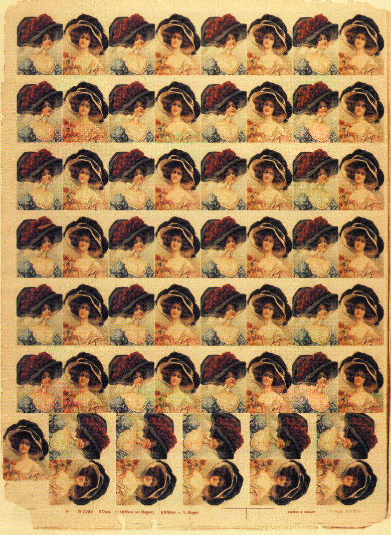
- The small images that made up a coloured label or card could be copied many times onto a large stone and printed in quantity, as mentioned above. The photo below, from Michael Twyman’s First Hundred Years, is an uncut sheet (625 x 478 mm) printed by this method. Assuming the two women were drawn together, 29 copies of the original image (80 x 55mm) had to be made, plus an extra half for the woman squeezed in on her own at bottom left. This was done perhaps on 7 stones, if 7 colours were used—perhaps 210 transfers in all. The pay-off for all that work was a quick print run yielding 29-and-a-half times as many cards per impression, plus a set of mother stones which could be used again.
More pertinently to the Ben Day story, not just images and letters, but any pattern which could be printed onto transfer paper could then be laid down onto a smooth stone. Masking was used to ensure only the necessary areas of the stone took the pattern from the paper. If you are thinking that this sounds very much like the way Ben Day’s screens worked… read on.
- It was often desirable in the early days of smooth stones / powered presses to re-create the texture of crayon-work on rough stone. This could be done relatively simply by drawing on a real rough-grained stone, printing by hand-press onto transfer paper, and transferring to a smooth stone. Either a whole drawing might be transferred, or an area of grained pattern for use as a tint on the smooth stone.
- A stipple or lined pattern could be etched or engraved on the whole area of a copper printing plate, using the same techniques as making a picture (see Part 4 for details). The plate could be then be inked, the dots or lines printed on transfer paper, then transferred onto a smooth stone. Once a metal plate had been prepared in this way it could be used over and over again. Cumming shows some of these line patterns in his 1905 Handbook of Lithography. The black semi-circle at the top is for contrast with an area of “solid” colour. (His original rectangles are 28 x 42 mm.)

- The Morocco pattern above also shows how other printing surfaces, not just engraved metal plates, could be used to make patterns on transfer paper. The original Morocco print would have been made directly from leather.
- Cumming also shows the patterns in green, as an example of colour printing from a stone tinted in this way. I have put one next to the black version here.

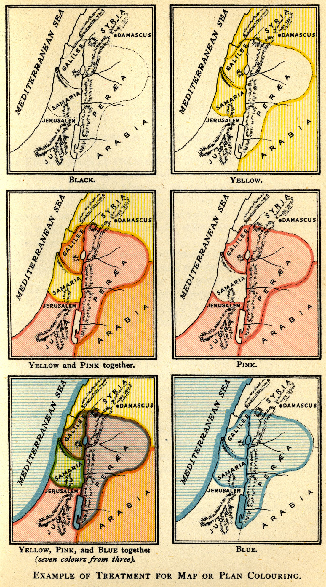
- As Cumming also notes, transferred lines were very useful for colouring maps. Importantly, the colour mixes achieved in this way were very predictable. They used what W.D. Richmond, in his Grammar of Lithography, calls “quarter tints”—lines giving 25% of the full or solid colour—transferred at the correct angles. Cumming shows seven colours being made from the three primaries (below). He could have added several more if he had used the full available range or “gamut” of combinations—but that many colours were generally not needed. Richmond and Cumming both note that the stone must be thoroughly washed between each transfer of lines, which was largely not required with the Ben Day method. The arrival of Day’s screens must have made all this so much easier—something I will return to below, and also pick up on in my next post.
- In a further clever twist, using the same kind of prepared copper plates, or a rough stone, but with no ink, transfer papers could be embossed by pressing them very firmly onto the metal with its line or dot pattern, or the stone’s rough surface. The surface of the paper then held a pattern of raised lines or dots which could be drawn on, with a lithographic crayon. Careful use of the crayon produced an image in a similar way to drawing on rough stone—an image that looked like rough stone crayon work, or a more regular pattern of dots or lines, depending on what had been embossed on the paper. The resulting drawing—or just an area of tint for shading—could be transferred onto a smooth stone. Cumming shows a number of these stone-grained patterns in his illustration below, noting that skill and care is needed to draw on them, just as it was on rough stone.
In his Grammar of Lithography, written in 1875-78, W.D. Richmond wrote about the new type of embossed transfer paper which had been patented in 1867 by Thomas Nelson, of Edinburgh, Scotland. Richmond noted, somewhat in contrast to Cumming above, that the regularity of dots on Nelson’s stippled paper made it easier to draw on than rough stone, and produced a crayoned image “more open and better fit for transferring and printing from.”
Comics historian Andy Bleck recently found a book published in 1890 by T. Nelson and Sons of Edinburgh and New York—which I am fairly certain is the family company of the same Thomas Nelson (though it was named for his father, Thomas Senior). Pictures of the Childhood of Jesus is illustrated with six really splendid full-page colour lithographs, as well as its cover. I reproduce one below. (Original image 192 x 240mm.)

Close-up views show that the stipple used is almost certainly not done using Ben Day—there is generally a lack of the characteristic semi-circular festoons of dots. I strongly suspect that we are seeing Thomas Nelson’s patented transfer paper at work here. (Left hand column about 35mm across on the page, right hand column 17mm.)
Writing about Nelson’s embossed dots, W.D. Richmond added: “Nevertheless, the stippled plate, by its mechanical mode of production, produces a kind of pattern that is objectionable to the practised eye, which, added to its high price, has given an impetus to paper prepared by the old method. [I.e. from an inked grained stone.]” Both of those objections would later be raised to Ben Day dots.
And, as with VHS vs. Betamax, or MP3 vs. Super Audio CD, the technically superior product is not always the one that wins the day. Twyman reports that the same author, Richmond, wrote in his later book on colour lithography (c. 1885) that patterns transferred on paper from copper plates had largely been superseded by mechanical tints, i.e. the Ben Day screens, which had “led to a great saving in labour… ” And he admitted: “The results are such as are unattainable by hand labour.” In other words, embossed or printed transfer paper may have won out over transferring patterns from stone, but was then itself largely wiped out by the next evolutionary step.
Thomas Nelson’s own lithographers probably weren’t the only team to continue using Nelson’s embossed paper into the 1890s, though. It may have been more than loyalty to the family firm—the results they got were undeniably very good. (19)
Ben Day as Successor to Transfer Paper
As noted above, the stippled pattern on gelatine film which Ben Day patented in 1900 was almost certainly created used an etched copper plate as the mould. This, along with their very similar method of use, makes it clear that the Ben Day film was a close relative of embossed transfer paper.
In fact, going back to Day’s Letter Patent which he submitted in January 1878 for his original “Improvement in Printing-Films,” he describes how his early lined films were made from lines “prepared or engraved upon wood, metal or other suitable material,” from which moulds were made (see Part 4). Because he was using hot liquid gelatine to make his films, his method had to be different from embossing patterns onto transfer paper. Otherwise the principle was very much the same.
Also, we have seen above how transfer paper was inked with a pattern in two distinct ways, before the pattern was transferred to a smooth lithographic stone:
- a patterned surface—rough stone, leather, a metal plate etched with dots or engraved with lines, set metal type—was suitably inked up, and the image of the pattern printed onto the transfer paper.
- Embossed transfer paper, on which the pattern existed as a series of small raised “pimples” for dots or ridges for lines, was inked using a lithographic chalk / crayon.
It may appear from my account above that Ben Day’s Rapid Shading Mediums were specifically designed to do some of what transfer paper did—in effect, combining the two roles described above—but to do it faster and better.
Is there any actual contemporary evidence that this was Day’s express intention?
In Part 4 I looked in some detail at Day’s own words, in the 1878 Letter Patent. I noted a persistent lack of clarity in his statements about how his product would fit into the printing methods of the time. Having looked in detail at lithographic image-making, it is worth revisiting Day’s original text.
Ben Day was clearly aware of predecessors to his own shading mediums. The very name of his patent, “Improvement in Printing-Films,” makes that clear. He also says:
“I am aware of the processes described in English patents… of 1867 and 1871; but these do not show a thin, tough, and transparent printing-film like mine, nor the process of producing the impression by the abrasive action of a stylus upon the back of the film…”
I’m certain that at least one of these “English patents” was Thomas Nelson’s, for his embossed transfer paper.
Day also noted that his films were “designed for… printing and the preparation and finishing of drawings, printing and copying surfaces, &c.” Also: “…the quick and rapid production of printing and copying surfaces for lithographic printing…” The main “printing surface” of the time was lithographic stone. The only “copying surfaces” were transfer paper and lithographic stone, as in the “mother stone” method as noted above.
Though his patent showed only lines being imprinted, he mentioned that it could be used for “…any kind of stippling, graining, hatching, lining or shading… with the utmost precision, rapidity and excellency of finish…” Unlike transfer paper, Day’s films were semi-transparent, so lithographers could see where they were putting their shading (20). Combine this with the Adjustable Frame and precision and rapidity are certainly enhanced.
Day also emphasized repeatedly how flexible his patterns were—that is, varying the pressure used when laying a pattern down could produce a darker or lighter tint (or even a wobbly or “waved” line. While this may have been possible to a slight extent with transfer paper, it did not have the rubbery, elastic surface of Day’s film, which theoretically gave the latter far more variability.
Day also notes that a piece of typeset text could be imprinted on a Ben Day film for reproduction. This baffled me at first, as I was thinking in terms of shading and tinting. Using type as shading may not seem shocking to us now, but it would have been very avant-garde in 1878. Day was of course thinking of far more conventional use of text, which many lithographers would have been copying onto stone via transfer paper as a matter of routine.
They rarely attempted a whole book or magazine’s worth of text. It was too time-consuming and the results of uncertain quality—the transfer process always degrading an image slightly. Some short children’s books were printed this way—”nursery” books with very limited amounts of text in a large size, and a lot of pictures. Otherwise, lithographed pictures and letterpress text were separately printed, and the pages combined at the binding stage. Day may have felt his more direct method of imprinting text would offer a useful advantage here. In practice, it probably didn’t—at least, I haven’t seen any accounts of it being used this way.
Discussing how difficult making lined shading or cross hatching is “either in drawing or engraving by hand in the usual manner” Day claims that his new method can achieve “in one hour’s time… an amount of work that would require a month’s labor if executed in the usual manner.” This seems like an exaggeration, but if “the usual manner” included the original engraving of a lined or cross hatched copper plate, from which transfer paper was to be printed, it might be about right. If the lithographer had his prepared metal plate on hand for regular use… perhaps not. Equally, Day might have been comparing a lithograph made using his lined film with a copper or steel engraving done from scratch, or a similar engraving on stone, in which case a month was again perhaps not too far off the mark.
Day’s text repeatedly stressed the savings in time and labour offered by his new method, and, exaggerations aside, he clearly had a point.
A lithographer used to preparing new transfer papers for every job—either printed from a metal plate or rough stone etc., or crayoned onto embossed paper—would have immediately seen the advantages of Day’s system. For example, inking a Ben Day film with a roller was a lot easier than carefully drawing an area of even tone on an embossed paper with a lithographic crayon. And, unlike a piece of transfer paper—used once then discarded—each Ben Day film could be inked, used, re-inked, used again if need be, in doubling up or tripling the pattern—and the ink was then washed off the screen and it was put back on the shelf for next time.
If only Ben Day had been more explicit about all this in his original patent, instead of dropping vague hints… how many weeks of painstaking research might have been avoided? Others have noted that patent texts are sometime written with just enough detail to ensure a patent is granted, but not so much that all one’s secrets are given away. It may even be that Day’s repeated emphasis on the “artistic and decorative purposes” of his films was something of a smokescreen, meant to hide their true primary utility for printers.
The arrival in 1881 of the Adjustable Frame, as noted above, gave Day’s films further major advantages. And it appears that from then on, the printing business took them up in a very big way.
Ben Day as Success Story
Michael Twyman states, in his History of Chromolithography, that English patents for the Ben Day method were taken out in 1881 and 1882. He also shows an American Ben Day advertisement from 1891 stating that the system was “Patented in the US, Canada, Great Britain, France, Germany and Belgium.” The photo below of a Ben Day screen is also from his book. It shows instructions printed in English, Italian, Spanish, French, German and what I am fairly certain is Russian.

In British publications of the 1880s and 90s, it is common to find colour lithographs—with Ben Day dots clearly on view—which had been printed in Germany and Holland. This does not necessarily mean that the whole book or magazine was printed abroad. The bulk of the pages may have been printed by letterpress closer to home.
However, there must have been some reluctance to use the new mechanical tints, in some cases on a national level. Twyman shows evidence that, in 1889 at least, French lithographers were not keen on Ben Day, preferring to continue with hand methods.
I would love to know more about how Day marketed his “printing-films” to the printing business, especially in the early years. I haven’t been able to find any contemporary sources for this. But there is little doubt that the Ben Day system was very successful, significantly changing the industry—indeed, contributing to its continued growth in a fairly major way. How do we know this?
Accounts from Twyman and Gascoine tell us that Ben Day shading was highly prevalent in the last ten or fifteen years of the 19th century, and into the 20th.
I have found a few pieces of more contemporary evidence, the earliest so far being a short piece in an early “Penrose Annual,” then called The Process Year Book for 1898. Subtitled “A Review of the Graphic Arts” this book, aimed at the printing trade—specifically those using photoengraving—was published in London, England. The anonymous writer was probably editor William Gamble. The article was headed Day’s Shading Mediums. The author is clearly well aware of the different ways Day’s films are being used. Leaving out a couple of sentences about photoengraving, which I will return to next time, he says:
“We have pleasure in again drawing attention to this excellent invention, the advantages of which are by no means so well known as they ought to be. [His remarks were aimed mostly at photo-engravers, not lithographers.] These “mediums”… with either lines, dots, grains, stipples or other tints in relief on the printing side… This side, having previously been inked, and the film having been placed by means of the regulating apparatus on the stone, is pressed with a stylus… the pressure printing the tint on the drawing.
By moving the film a trifle to one side, by means of the dials on the apparatus, thus throwing it out of register, the colour of the tint is increased by re-tinting and thickening the lines or dots, etc., etc. A variety of effects can be obtained also by combining two or more styles of tints.”
The article concludes with some revealing discussion of Ben Day’s expanding repertoire:
“Although there are already over one hundred tints from which the artist can select, Mr Day is always on the look-out for new effects and ideas, and in this way not only keeps his clients well up to date in the way of novelties, but is yearly making his shading mediums a more valuable adjunct to the studio.”
The next piece, written fourteen years later, is more explicit about the prevalence Day’s mediums have gained by that time in the trade. It is from an article on chromolithography in the London Times newspaper, from September 1912.
“The artist proceeds to draw, by hand, each separate colour… The actual draughtsmanship may be in lines, small dots, or on grained stone, in addition to areas of solid. The ink used is always the same black, fatty matter. The disuse of grained stone commenced before 1880, and in its place the artist dotted or stippled on the stone, in a mechanical evenness…
After 1885 the hand stippling was largely replaced by mechanical stippling. [My emphasis in each case.] The latter is done by means of semi-transparent films manufactured with a grained, dotted or lined surface, upon which transfer ink may be rolled… to be rubbed down onto the stone. The best example of these is the Ben Day film.
Their introduction has been a great boon to both the printing trade and the public. They have saved labour and time, and can be employed for lithographic drawing, and designs for photographic and letterpress production. They have largely cheapened the publication of works by chromo-lithography.”
By “cheapened” the Times doubtless meant “made more economical” rather than “demeaned, degraded or devalued” as we might use the term. Critics of the “chromo” on artistic grounds might have agreed with the modern dictionary on that point though.
My third piece of evidence comes from British magazine The Artist, March to July 1941. (21)
Printer W. O. Page set out to explain colour lithography to his readers, in a series of articles called Lithography—Modern Methods. Three things are noteworthy about this.
Firstly, as late as 1941, Page’s article was sub-headed with the words: “…lithography constitutes one of the most important of present day commercial methods of reproduction in colour.” I found this somewhat surprising, and I suspect even at the time some of his readers must have been thinking, “Oh, really?” Process colour—printing using halftones and photoengraved metal plates—was taking an increasing share of the commercial printing market by then. Nonetheless, there is evidence that UK servicemen in 1946 were being trained in lithography for the post-war world—not perhaps the wisest of career choices (22). Cumming’s Handbook of Lithography was reprinted in 1946 in an edition “For the use of H.M. Forces—not for resale.” (23)
Secondly, in Part III, May 1941, Page says:
…each colour is drawn on polished stones, and the artist is greatly assisted by films called “mediums.” The best films come from America and are called ‘Day’s medium’ after the man who invented them.
Below is the selection of patterns he showed in his article, presumably reflecting the patterns which he himself—and perhaps lithographers in general—found most useful. The top two are shown overlaid with themselves in different ways. Most are “hand-stipple” or grained patterns. Even at this late date, Page chooses no regular grids of dots in the “halftone” manner, which were being widely used by the photoengraving opposition—of which, more next time.
Thirdly, Page advises his readers that a more affordable alternative to Ben Day mediums is available, made by a company called Penrose. Could this be the same Penrose who published the 1898 Process Year Book, which so effusively praised the Ben Day mediums?
Why, yes, it could. As well as publishing the Year Book, this London-based company’s core business was the supply of chemicals, printing plates and camera equipment to the photoengraving industry. One factor which helped Day’s competition is the fact that the Ben Day machines and shading sheets were not sold to their end-users, but leased, at some considerable expense. Penrose’s machines and films were sold directly, Page tells us, not leased.
Michael Twyman says that Penrose licensed the use of Ben Day machines from Day’s own company, though I suspect this was only until Day’s patents ran out. Evidently Penrose saw a money-making opportunity in marketing—possibly undercutting—the world’s number one in the shading medium business. Clearly the arrival of cheaper competition can be taken as a sign that the Ben Day company was enjoying a high degree of success. I know of at least one other competitor, and Twyman discusses others. I might discuss these in a future post.
While the Ben Day leasing system may have had advantages, for example when a machine broke down or screens were torn—assuming the contract included repairs or replacement—it was costly, which meant that only businesses of a significant size could afford to use the system.
Ben Day meets Alfred, Lord Tennyson
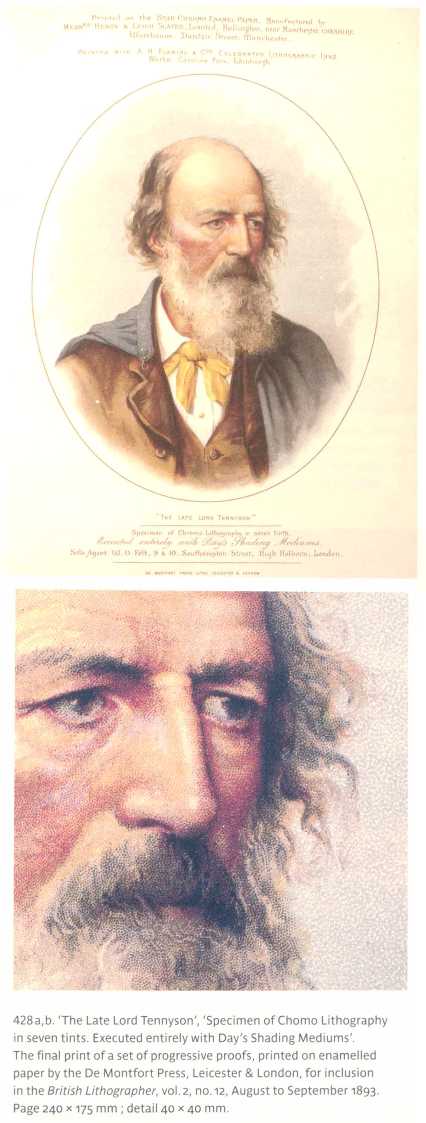
Having recently read Michael Twyman’s excellent History of Chromolithography, I cannot resist re-presenting from that book one final example of Ben Day dots in action. Again, I have left the original caption intact.
For now this is a relatively low-resolution reproduction using the British Library’s scanning system (which generally has been an excellent recent innovation, I must add). I will replace it with a better copy if and when possible.
This is a portrait of Alfred, Lord Tennyson, done completely in Ben Day tints, printed in the magazine The British Lithographer in 1893. This was surely a promotional gimmick, and not something that would often have been attempted. Ben Day patterns were usually integrated into lithographs which used a variety of colouring and shading techniques. But what a splendid gimmick it was—a tribute to the Ben Day method which deserves to endure, and a fitting image with which to close my piece.
Concluding Remarks
In summing up, I will quote David Cumming again, from 1905. After discussing the huge increase in speed of lithographic printing brought about by the powered press, he continues: “It will thus be easily seen that the production of lithographic work is now enormous compared to what it was previous to the year 1870.” Cumming was also reflecting on how important transfer paper was in this revolution.
I would add that the addition of Ben Day tints to the lithographer’s repertoire, from the 1880s onward, completed a triumvirate of technical factors significantly contributing to its ongoing expansion.
I do not discount the importance of photo-lithographic techniques, zinc plates or offset printing, but these innovations came to prominence later, and are outside the scope of this article.
Of course, if there was not also a great demand from the population for printed matter, especially in colour, no amount of technical proficiency could have driven such an increase in capacity. The stories of Victorian and Edwardian art prints, book and magazine illustrations, sheet music, theatre and railway posters, maps, labels for cigar boxes & fruit crates, postcards, greeting cards, advertising material, “scrap” & other ephemera etc. have been told elsewhere, and placed in their socio-cultural context by others.
If the true importance of lithography in these stories has arguably been underplayed, at least authors like Graham Hudson and especially Michael Twyman have in recent years redressed that imbalance.
To some extent that has included discussion of the importance of the Ben Day dot, but about this there is also still a great deal of misunderstanding and misinformation abroad. I hope I have started to fill an important gap at least in the material available online.
And if there is one take-home message from this post, it is probably this:
Ben Day dots aren’t just about comic books and Roy Lichtenstein. Remember also the years of the stone-printed lithograph…
…and:
—respect to the stipple!
Next time:
Photoengraving, metal printing plates, letterpress on newsprint and finally…
….the comics!
Text and original images copyright © The Legion Of Andy 2016
~~~
FOOTNOTES
(1) Michael Twyman seems to have made the study of lithography his lifetime’s work. I may never have embarked on this post at all if I’d seen these two books of his earlier, as he almost says it all. The number of times I quote his work speaks for itself. Luckily I had to find out a bunch of stuff for myself too, so I’ve been able to add a bit here and there.
Breaking The Mould: the first hundred years of lithography (London, The British Library, 2001)
A history of chromolithography : printed colour for all (London, The British Library, 2013)
There is also this indispensable item:
The encyclopedia of ephemera : a guide to the fragmentary documents of everyday life for the collector, curator and historian, by Maurice Rickards ; edited and completed by Michael Twyman. (London, British Library, 2000).
(2) As lithography entered the 20th century, zinc plates were increasingly used. Eventually offset lithography evolved, in which the image prints onto the paper from a rubber surface, after being “offset” onto the rubber from a metal plate. Nowadays most printed paper material is produced by offset litho. It only gradually achieved this dominance. Older readers will remember “the inkies” still prevalent in the 1970s and 80s—newspapers and magazines printed on newsprint by the letterpress method—whose ink so readily came off on your fingers. Now many books are printed directly by digital presses… perhaps offset litho is on the slippery slope to oblivion dock…?
(3) The Grammar of Lithography: a practical guide for the artist and printer, by W.D. Richmond (London, Wyman & Son, 1878). Originally published as a series of magazine articles in The Printing Times and Lithographer, from 1875.
(4) Modern Photoengraving, by Louis Flader and J.S. Mertle, Chicago/Cincinnati USA, (Modern Photoengraving Publishers, 1948).
(5) Twyman reports that later Ben Day advertising claimed that adjustments as small as 1,000th of an inch—or 0.025 mm—were possible.
(6) From a photograph in The Design and Printing of Ephemera in Britain and America 1720-1920, by Graham Hudson (London / Delaware, USA, The British Library / Oak Knoll Press, 2008)
(7) The Technique of Colour Printing by Lithography, by Thomas Griffits (London, Faber and Faber Ltd, 1940)
(8) From a photo in Twyman, Breaking the Mould (see above). Inevitably, and unavoidably, halftone dots from the printed photo will intrude on any attempt to appreciate fully the detail of the dots here.
(9) The Art of Lithography, by Henry J. Rhodes (London, Scott, Greenwood & Son, 1914; revised second edition 1924).
(10) How To Identify Prints, by Bamber Gascoigne (London, Thames and Hudson, 1986; second edition 2004.) And yes, it is the same Bamber Gascoigne who famously presented University Challenge on British TV. How many Bamber Gascoignes did you think there might be?
(11) Michael Twyman has researched this in depth (as he has all areas of the lithography story). Leather rollers put the ink onto the stone before each print onto paper. The new rollers had to be smooth, for speedier inking, and so as to be easy to clean. They used the outer surface of the leather, stripped of all hair, glazed to a smooth shiny surface. They were too smooth and too fast to ink the tiny dots of the chalk drawing on rough stone. The old manual rollers had used “nap” leather, the fuzzier inner surface of the skin. In addition the early powered presses probably didn’t use high enough pressure.
(12) Ben Day catalogues may be hard to date, but they are even harder to find. Michael Twyman reports that “A catalogue from 1901 listed in St Brides Library has not been seen since at least 1939.” Alas this historic library of printing recently closed for lack of funds, though The St Brides Foundation is still open for now. If you have a few spare million, please consider helping them out. http://www.sbf.org.uk/
(13) Handbook of Lithography, by David Cumming (London, A. & C. Black Ltd, 1905, revised 1919 and 1932, reprinted 1946.)
(14) Thomas Griffits (see note 7, above) worked, as lithographer, on Vanity Fair’s famous Spy lithographs, and many railway posters. The introduction to his book was by Frank Pick, a senior administrator of London’s railways who designed much of the look of the London Underground, and is credited with much of the success of its celebrated posters. https://en.wikipedia.org/wiki/Frank_Pick
(15) The USB microscope which I use takes pictures at 20 times and 400 times magnification. I do not mean to imply that the image I am putting on the screen is 20x or 400x the size of the original print. That will vary according to the size you view it on your screen anyway. The numbers are just meant to indicate the level of magnification used in getting the images.
(16) The Magazine of Art (London, Cassell & Company Ltd, 1878 to 1904) is a treasure trove of wood engravings, etchings etc., occasionally available at reasonable prices as unbound copies and bound volumes.
(17) To which you may be inclined to reply, “At least they might have still had a job, if Ben Day hadn’t put them out of work.” The flipside of “progress” in the post-industrial-revolution world, and a problem which we haven’t yet seen the end of.
(18) That Miss Brunner… such a potty-mouth. Apologies to the great Chris Welch for messing with his lovely lettering. Hunter Tremayne wrote the script. Blame him.
(19) The idea of transfer paper lived on in many forms, including Letraset dry transfer tones and lettering, and the “transfer”—pictures of people, animals etc. which children in the 1970s and 80s were given to rub down onto printed cardboard scenes. It is also the distant ancestor of the tattoo that came with my Avengers Assemble Candy Sticks the other day. Instructions: place backing paper and tattoo on hand picture side down, wet back of tattoo with water, press down 20 seconds then peel away paper.
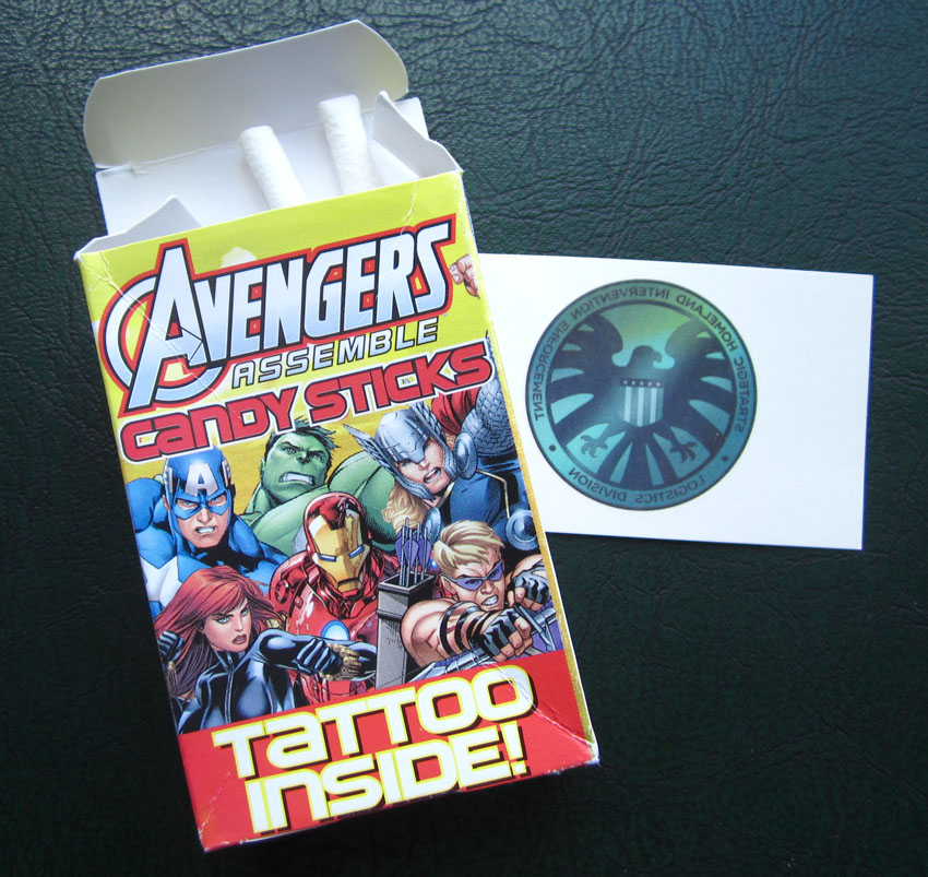
Two words of warning: generally, I’m very fond of candy sticks (or “sweet cigarettes” as they were known in a more guilty age) but these were, disappointingly, quite disgusting. Secondly, I wouldn’t try putting the tattoo on your laptop lid. Didn’t work at all well. Stick to skin use, as per instructions.
(20) I know I said there was a kind of transfer paper that was quite transparent, but this was not suitable for general use. The process that made it see-through also made it second-rate at actual transferring. It was OK when you needed to copy out a letter or a signature.
(21) I am particularly indebted to comics historian Andy Bleck for the discovery of this series of articles.
(22) Indeed, Michael Twyman thinks that the end of World War 2 in 1945 itself provided an incentive for a general retooling of the printing business and spelled the end for chromolithography.
(23) I may or may not have bought a copy myself. I’m not admitting anything, Colonel.

Pingback: Berlins klädaffär – litograferad av Runan | Vardagstryck
Thank you for the comment.
Google translate gives the following (from Swedish to English):
“How did you proceed when the fine lines were drawn up ? Possibly made the surface in bold and then gummed . Then stroked it , and cut up , and pressed the color of the horizontal openings. Or they were drawn up with a greasy crayon and then printed. One possible answer is that it used the technique carreaugrafi described in the & # 8221; Graphic professions & # 8221; from 1939. In Swedish it was called karrågrafi . Technological characterization international bone – Day and read here a text which is extremely interesting about the method.”
Which I am afraid leaves me very little the wiser.
Comment came from here or somewhere hereabouts:
http://vardagstryck.blogg.kb.se/2016/01/05/berlins-kladaffar-litograferad-av-runans/
Pingback: Berlins klädaffär – litograferad av Runan | Vardagstryck
I’ve been looking for this information for a long time. I’m so excited to find this!! Do you know any books that help teach these techniques as well? Thanks!
-Skyler
Thanks!
And seriously, if there was a book, I wouldn’t have had to write this.
The information is fragmented in lots of different places, mostly long out of print.
One of these posts has a full list of my sources.
The only current books to deal with Ben Day tints in any detail are Michael Twyman’s History of Chromolithography, which is superb but very expensive, and Bamber Gascoigne’s How To Identify Prints, which is an excellent book, but has less to say about Ben Day, and hugely underestimates its usage, IMO.
Comics, even book and magazine illustration, are not really in their sphere of interest, which is fair enough. Not what they are writing about.
It’s up to us!
Pingback: Hästens anatomi i tryck | Vardagstryck
For more about Letraset transfers, & why your tattoo didn’t work on your laptop lid, see http://www.action-transfers.com/
You’ll also see I’ve included lots of technical information about presses, printing techniques, history & so forth which you might find in line with your own interests!
Stunning stuff!
Thanks for the link.
Will browse through some of that wealth of material soon.
Wow! Look what I stumbled upon! I know nothing about dots and splatters, but it sure looks interesting. I’m going to “follow” you and come back later when I can try and learn what this is all about.
I actually was hoping to find information on using a reproduction of one of Tom Browne’s lithographs in a 1902 Boy’s Own Paper. I design greeting cards and would like to use Finishing Touches on a card. Do you know anything about the copyright?
Thank you,
Audrey Drake
Hi Audrey.
I don’t know anything about the copyright in Tom Browne’s work I’m afraid.
I tend to assume that if it is more than 70 years since an artist died (and he died in 1910) then the image is out of copyright.
However I’m aware that copyright is sometimes renewed, at some later date, due to re-publication of a work.
I have also been told that my own scan of an image like ‘Finishing Touches’, as seen on my blog, is copyrighted by me.
I haven’t formally confirmed this, though, and I wouldn’t necessarily assume that just because I had scanned a 1902 image I could publish it in any printed form.
Sounds as if you need to talk to a copyright law specialist. If you find out anything definitive, I’d certainly like to know.
Best wishes,
Guy
Thank you very much for you serious research. I am also a Ben Day lover, designer and lithographer, researching early Brazilian chromolithography techniques. I am now working with a collection of a hundred Brazilian labels (1976-1919), 3 to 14 colors, with a lot of Ben Day patterns mixed with hand stippling. It is a gift to find so organized and critic work here, full of references to go further. Think we have a lot of curiosity in common… I’d like to share my master “Searching the aura: the dynamics of printed image construction for simulation of the original” – that’s a pity I write in portuguese. Now I should quote your work in my thesis, so that is just The Legion of Andy or do you have a real, common, ordinary academic name?
Hi Helena.
Very good to hear from you.
To learn about Ben Day in Brazil and other aspects of your work will be very exciting.
I will be happy to e-mail you and establish contact with my secret identity in the real and academic worlds.