

Tarzan is a registered trademark of Edgar Rice Burroughs Inc., and all images from Tarzan comic strips are copyright Edgar Rice Burroughs Inc., 2016. Used for educational purposes & under fair use.
See also:
- Part 1—Roy Lichtenstein—the man who didn’t paint Ben Day dots
- Part 2—Halftone dots, Polke dots, More Roy
- Part 3—CMYK / Four-colour comic book dots vs. RGB dots on screens
- Part 4—Pre-history, origins—Ben Day in the 19th century
- Part 5—Ben Day in lithography
- Part 5.5—French comic strips of the 1880s, & a forgotten Ben Day predecessor in letterpress
- Part 5.75—A Lithographic Protocomic (?) from 1885
- Part 6—Ben Day meets the Sunday Comics in the 1890s
- Part 6.2—Registration—as in, getting the colours lined up right—or not
- Part 7—Ben Day Dots 1933 to 1937—the birth of the comic book
- Part 8 — 1930s to 1950s: The “Golden Age” of Comics — exit Ben Day, enter Craftint
- Part 9a — 1950 & 60s: The “Silver Age” of Comics, Part 1
- Part 9b — 1950 & 60s: The “Silver Age” of Comics, Part 2
E-mail me at guy.lawley@btinternet.com
![]()
(1) HOW BEN DAY DOTS WERE USED ON THE FIRST SUNDAY TARZAN
(i) Ben Day dots—some basics. The screen. The technique. Not halftones.
(ii) Making Ben Day dots bigger. Also, Sunday comics colour guides.
(iii) Ben Day “Special Effects”—double and triple dots. Getting clever with it.
(iv) Special Effect 2: Dots into lines. This is starting to look like work.
(v) Special Effect 3: Lines into Cross-hatching. Twice the work?
(vi) Tarzan’s Flesh. Incorporating Tarzan’s suntan.
(vii) Panel 4. Lots of fun with dots.
(viii) More Panel 4—Flushed or Ruddy Cheeks. The return of a real Ben Day favourite.
(2) HAL FOSTER’S SUNDAY TARZAN
(i) Foster’s Vegetation. Well, we looked at Maxon’s.
(ii) Tarzan’s Flesh 2. Warning: cuteness.
(iii) Dots in continuity. The Ben Day dot knows few boundaries.
(iv) Tarzan’s Flesh 3. Also contains a princess. And a word on mis-registration.
(v) Ben Day Special Effects—two last examples from Tarzan.
(3) THINGS I LEARNED FROM TARZAN
(i) The 60-degree offset Ben Day screen. It was everywhere.
(ii) Only one actual Ben Day tint was used. There used to be more.
(iii) The screen angle issue. They weren’t. Angled, that is. Total lack of rosettes.
(4) IT WASN’T JUST TARZAN AND LITTLE NEMO
What’s on the B-side? Mr and Mrs Beans, The Smythes, and Winnie Winkle. Hilarity, as they say, ensues.

My title is a homage to Phil Normand’s blog post TARZAN: the Sunday Comics, 1931–1933, part 2: Tarzan and the Ben Day Men, or The Mechanics of Color in the Sunday Comics. When I began to research Ben Day dots in 2013, this was one of my few reference points online.
I commend Tarzan and the Ben Day Men to you as a good read, full of excellent material. (I will specifically take issue with Phil’s interpretation of Jack Adler’s role in the history of comics colour in part 7, however. Adler was important, but perhaps not quite in the way that Phil says.)
Phil quotes the famed Tarzan and Prince Valiant artist Hal Foster from a 1971 interview:
“Those first engravings [on early Prince Valiant, from 1937 onwards] were beautiful things. They had the Ben Day process then and those Ben Day men were artists—they could get the colors. Then they got cheaper and cheaper and now [1971] finally there’s no Ben Day work at all. They use a different process that’s cheaper and not nearly so good.”
In Part 7 I will be describing one of the processes which took over from Ben Day.
And please note right from the start: newspaper comics of the 1930s used genuine, old school Ben Day dots. That’s what this post is about. If you get interested in the subject, and take a magnifying glass to some of your Silver Age Marvel or DC comics, for example, you are not going to see the same techniques in use. Similar in many ways, yes—but not the same. Fair warning!
Meanwhile, as Phil Normand found, Sunday Tarzan pages can be a rich source of Ben Day lore, and I intend to use them for that purpose in this post. Later, I will look at some of Foster’s Tarzan panels of the early 1930s. But my first examples will be from the first ever Tarzan Sunday colour page from 1931—a page drawn not by Foster, but by Rex Maxon.
At this point, Foster had worked on Tarzan, but only the black & white daily newspaper strip. Foster drew the adaptation of Edgar Rice Burroughs’ first Tarzan novel, from January to June 1929. He then returned to the field of advertising, and Maxon took over the Tarzan strip—initially the daily version, and later the Sunday when it launched in 1931.
The original Tarzan dailies had panels with typeset text underneath. This is one of Foster’s dailies (most images can be clicked or tapped for full-size versions in a new window—use your browser’s back button or arrow to return here):

Foster didn’t use any Ben Day tints, or any other types of grey tone, on his Tarzan dailies. As in the example above, he confined himself to pure black & white—with a little “dry brush” work here and there.
Ben Day would come to Tarzan with the advent of colour.
^^Table of Contents
(1) HOW BEN DAY DOTS WERE USED ON THE FIRST TARZAN SUNDAY
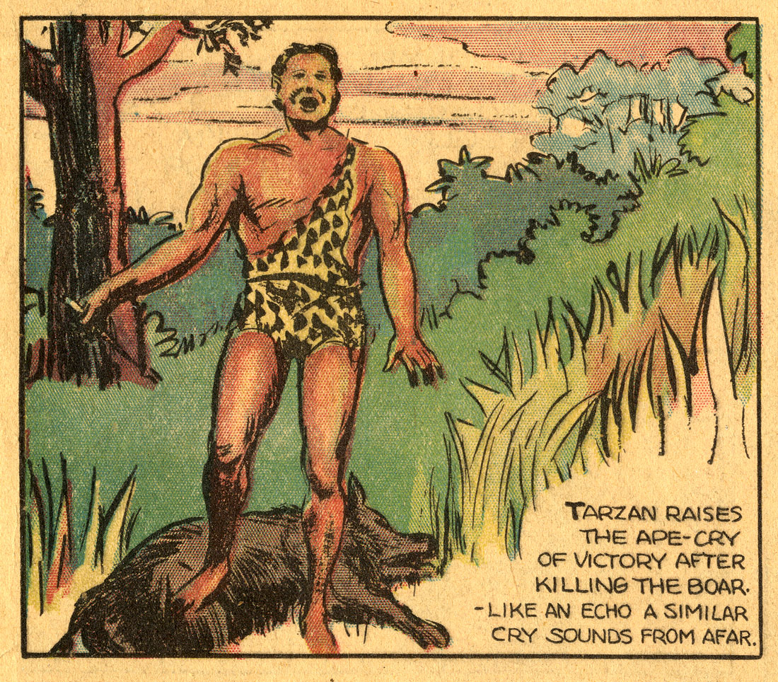
Here is Rex Maxon’s first Sunday page, from March 15th 1931. Not the greatest drawings ever committed to newsprint, maybe—but lots of lovely Ben Day dots!
(Original image size approx. 35 x 48 cm, 13.75 x 18.75 inches)
(Click to enlarge—back button/arrow on your browser to return here):

Before moving on to Tarzan himself, I’m going to look at the complexity of the colouring used for parts of the background scenery. And before looking at real colours in this real comic strip, I’ll set the scene by going over some generalised examples of Ben Day technique.
In a time when we make so much of our art on a computer screen, it is worth remembering that using Ben Day dots was a very “hands on,” industrial business. As part of the photo-mechanical engraving process, it involved a lot of greasy ink, hot metal, and stinking acid baths giving off poisonous fumes. It also required a great deal of concentration, coordination and skill.
The basic elements didn’t change much from the 1880s to the 1950s.
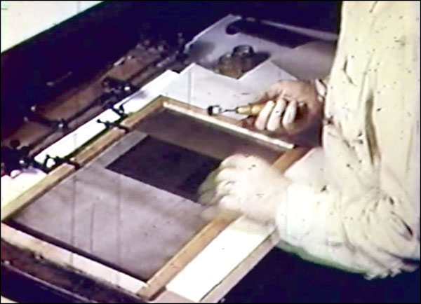
To see this in action, it is worth watching the short film The Art and Technique of Photoengraving, which I linked to in Part 6 (or go here: printingfilms.com). The film follows a photograph through the process, from camera to printing plate. This involves making a halftone image—quite different from images tinted with Ben Day, but photoengraved in much the same way. Photoengraving didn’t mean “engraving a photo,” it meant getting an image onto a metal printing plate using an optical—photomechanical—method.
About 21 minutes in, the film switches to a Ben Day man at work.
He puts a single area of Ben Day dots onto a simple black & white cartoon drawing—the most basic possible use of Ben Day. In this post I will look at the use of Ben Day dots in coloured comic strip work, which is a lot more complicated.
As you may recall, a Ben Day screen was a thin sheet of transparent gelatine, backed with celluloid. It was supported in a wooden frame. The dots or lines of the Ben Day tint pattern were moulded onto the gelatine surface.
In the illustrations below, the Ben Day screen is being used purely by hand. We will see the use of an adjustable frame—to hold and position the screen—later.
After carefully covering the screen with an even coating of ink, the pattern was transferred to a metal printing plate by rubbing on the back of the screen.

The printing plate was then etched with acid, so that the inky lines or dots became a pattern of raised dots “in relief” on the plate, ready to print the tint on paper. (See Part 6 for details.)
As seen in previous posts, Benjamin Henry Day Junior explained from the very start—in 1878—that his “Rapid Shading Mediums” could be used in complex and varied ways.
To start with, a screen could be applied lightly, to create a fairly pale version of the tint—what we might call the “standard” or “idealised” tint. Each dot in this case was about the same size as the dots moulded onto the screen itself.
In the catalogue of Ben Day Inc., showing their tints to the industry, I assume that each one would be printed in this standard form. Here are two examples, from a catalogue page copyrighted 1936. Original size of each rectangle = 3.5 x 1.4 cm.

55 dots to the inch is a screen size which suited the letterpress-on-newsprint Sunday sections. Finer screens were available for use on glossy papers.
While others tints in the Ben Day catalogue were called “mechanical stipples”, these particular tints were called “half-tone” tints—because they used the same basic pattern as the halftone screens used in printing photographs. Also, I suspect, because these Ben Day dots were in direct competition with true halftone screen technology—see below—and wanted to remind customers of this.
The actual halftone screen was a piece of glass with a fine cross-hatched black line pattern on it. It was used to break up the continuous gradations of tone in photographs into dots of varied size, allowing them to be printed. See Part 2—and see this photo of Michael Moorcock’s beard, circa 1986—on the right, in tickly close-up. (Click to enlarge, etc.)

The lines of dots in these Ben Day “half-tone” tints are at 90 degrees to each other, so the dots appear in a square grid pattern, as in tint no. 555, seen here in close-up. The left hand square is as it appeared in the catalogue. Then it’s been rotated by 45 degrees to show the squares more clearly:

A similar square grid is also seen in the halftone photo, because half-tone screen technology used square grids of dots (mostly).
However, the term “halftone” is potentially confusing when applied to any Ben Day dots. Indeed, Ben Day dots in general are sometimes wrongly called “a type of halftone dots.” They definitely weren’t. They pre-dated the commercial use of halftone screens. And an important feature of Ben Day dots was that they avoided the use of expensive halftone screens, and the tricky business of making printing plates from halftone-screened images. This economic/practical consideration helped Ben Day last through several successful decades, competing with halftone methods.
As true halftone technology got better and cheaper through the 1920s, it did however allow “process colour” to edge out Ben Day tinting from many areas of the printing industry. In process colour, a full-colour painting or drawing was photographed through halftone screens (and through different coloured filters, to create the “four-colour” printing plates).
Process colour did not encroach on the Sunday comics—or if it did, it was many decades later than our 1930s examples. (It came to comic books in the 1980s, and was sometimes pretty disastrous as production departments were unfamiliar with it.)
It makes sense to keep the term “halftone” for dots made by photographic means by use of an actual halftone screen—or the modern computerised version. Rather than “half-tones,” as the catalogue calls them, I prefer to call this type of Ben Day pattern “square grid” tints.
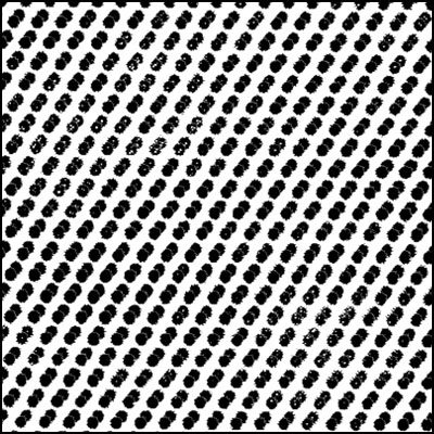
Many of the tints in the Sunday strips were not square grids, but those “mechanical stipples” with an “offset” pattern. In Part 6 I showed this pattern—60-degree offset—used on The Yellow Kid‘s face in 1907. It was a very popular pattern. Roy Lichtenstein took it up in his paintings of the 1960s. No squares here, but characteristic triangles and hexagons:

This a 6mm square of Ben Day tint no 527 for comparison:
As we will see, this is the kind of tint used for Tarzan in 1931—though probably not the exact one.
In a future post I will show how the comic books, by contrast, came to rely on square grids.
^^Table of Contents
(ii) Making Ben Day dots bigger
AFAIK, my software—Manga Studio 5—can’t make offset patterns with variable-sized dots, but it can do wonders with square grids. Many of my examples will therefore use square grids.
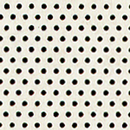
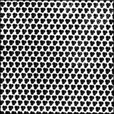
Below is a simple dot pattern, with a “15%” tint—15% of the area is covered by the black dots, and 85% is white background.
Let’s pretend this is a close-up of Ben Day tint, in its standard or “actual size of dot” form. If I was a skilled Ben Day operator rubbing this screen down, I would know how hard I needed to press to get this standard tint—or something very close to it—onto my printing plate.

However, because the moulded gelatine dots are not rigid but slightly soft, I could also press a bit harder, and compress the rubbery dots down against the printing plate. This would make each dot spread out a bit, and imprint larger inky dots onto the metal. Perhaps if I knew I was going to do this, I would have loaded the screen with slightly more ink as well.
I might end up with something like this, below. The pattern is of course the same as the square above. The number of dots per inch is also the same. But, due to the larger dots, this tint is 25% black.
This is just an arbitrary example. A Ben Day operator could vary the pressure used / size of dot obtained to a greater or lesser degree, as required. Once the printing plate was etched, then used for printing, the end result on paper would be paler or darker versions of a tint.
Despite the skill of the Ben Day men, though, the end result might not be exactly what the production department intended. With the cheap, crude printing used in the comics and newspapers, the final printed version might look visibly darker or lighter than the Ben Day pattern originally imprinted on the metal.
This was why artists, graphic designers, and newspapermen were advised never to request a screen tint by percentage—the eventual printed percentage could vary too much.
If a simple grey tint were needed, they would ask for a certain Ben Day tint—say, number 523 from the catalogue. The Ben Day craftspeople in the engraving department were expected to supply the tint in a fairly standard version. (“Nine-&-a-quarter” etc. below refer to the size of the screen, in inches.) (click to enlarge etc.)

The Sunday comic strip was a much more complex case. Here the Ben Day craftspeople were following a “colour guide” for the page—painted on a small B&W copy—prepared by the artist or an assistant. Here’s one by Foster’s successor on Tarzan, Burne Hogarth, from December 1940 (from the Comic Art Fans pages):

The Ben Day people had to decode these guides into the three colours used in their four-colour letterpress printing—the colours of CMYK—Cyan (or “process blue”), Magenta (process red), Yellow, plus blacK. (See Part 3 for more detail on CMYK.)
In doing so, they could get pretty clever with the “varied pressure” technique.
For example, here’s a square made by me on my computer, with 15% tint on the left and 25% on the right. This could be done in Ben Day, and in fact could be done with a more subtle gradation of tint. Mine just goes from pale to darker with no variation in between—except accidentally, where a dot is half one size and half the other.

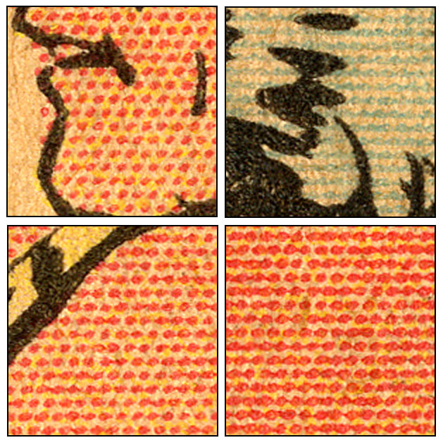
Here are two enlarged quarter-inch or 6mm squares—vegetation from Panel 1 of the Tarzan page shown above. On the left, some red (magenta) dots are shown at something like “standard” size, perhaps a little larger. On the right you can see quite marked variation in size, where the technique of pressing harder on the Ben Day screen has been used very skilfully.

Some online sources will tell you that one way to tell halftone dots from Ben Bay dots is that halftone dots vary in size, but Ben Day dots, in any given area, are all the same size.
Wrong again, internet.
^^Table of Contents
(iii) Ben Day “Special Effects”—double and triple dots
Below is the whole first panel of our Tarzan page. Original size 11 x 10 cm. Click to enlarge—then you should be able to make out many more variations in the Ben Day dots. Close-ups follow.
(Click to enlarge—back button/arrow on your browser to return here):
Below I have blown up a one-inch (2.5 cm) square, in which blue dots are used for both pale blue and green areas. For the green, the blue dots have been printed over an area of “solid” yellow ink—that is, 100% or continuous yellow colour. Very little of the blue itself is a simple or “standard” Ben Day pattern—as it were “straight out of the box.” The Ben Day men have been up to their tricks—creating what I will call “special effects.”
In the bottom right corner of this square there is a pale green area, created with a “standard”-looking Ben Day dot pattern in blue, over a “solid” yellow. The tint is something like Ben Day no. 523 or 527, as shown above, though probably smaller dots.
In the top right corner, the same Ben Day pattern has apparently been applied much more heavily, to create a darker green.
These differing tints are illustrated below, in squares about one quarter of an inch (6 mm) across:

I fact, though I think the Ben Day operator has pressed harder to create bigger blue dots in this right-hand square, they have also done something more complicated than that.
Judging from the size of these dots, compared to the lighter version, I doubt if simply pressing harder could have been enough. Looking also at their shape, I think the Ben Day dots have not only been made larger, but also probably “tripled up”—that is, re-applied a second and then a third time.
This required very fine adjustments of the position of the Ben Day screen. The man who invented the screens had this covered from a very early stage. I showed before how, in 1881, Benjamin Day Jr patented his adjustable frame, very soon after his original patent for tint screens in 1879.
This photo shows an early frame—the black metal thing—holding a Ben Day screen in place on top of a lithographic stone, not a metal printing plate. The method used on metal was essentially the same (as seen further down the page).

The frame held the screen very firmly, and could be moved by increments of as little as 1/640th of an inch, or 4/100 of a millimetre (0.04) mm. (Some sources state that even smaller adjustments were possible with later versions of the frame.) In applying the Ben Day screen to a printing plate more than once—to create larger dots / darker tints—this precision was important.
It meant that any one screen could be used to create a number of different patterns. One of Day’s original examples was a line tint being used twice to create cross-hatching. (In fact, this simple example was shown in the 1879 patent as a manual technique, before the adjustable frame was patented 2 years later.)

Below is a screen shot from the The Art and Technique of Photoengraving (thought to be from the 1950s) which I included in Part 6. In this shot the Ben Day man is placing an inked Ben Day screen into his adjustable frame.

And below, he is about to rub down the dot pattern—using a small roller—onto a metal printing plate, which is underneath the Ben Day screen.
Of course, once the dots or lines had been etched onto the metal, the printing plate only had to print once to get the image onto the paper. The doubling or tripling of the pattern was only done at the point of applying the Ben Day to the plate.
And, whereas the finished printing plate could be used to print any colour required, all the Ben Day work at this stage was done with thick greasy black ink. I will illustrate below the way this worked, in black & white, when applying a multiple Ben Day tint.
Here—scanned from a black & white page—is a single application of a tint. It looks much the same as the dots in the Tarzan panels above (if a little darker, with slightly larger dots). Like them, it is a 60-degree offset pattern.

In order to create a doubled-up version of this tint, I have used Photoshop. The Ben Day craftsperson of 1931 would have carried out these steps:
- inked up the underside of the Ben Day screen
- placed it in its adjustable frame
- applied a single pattern, as above, to the printing plate
- raised up the screen using the hinges on the frame
- re-inked the screen
- adjusted the frame about one-hundredth of an inch (a quarter of a millimetre) to the left and “down” (i.e towards them)
- re-applied the Ben Day pattern, creating something like the one below—a doubled version of the standard dot pattern, with the dots overlapping so they do not appear as two dots, but blunted “dumbbell” shapes.
Finally, after adjusting the frame again, a third application would have created this tripled version:
Showing them together below illustrates the variety of tints that could be made using this method. As applied to the metal printing plate, all the dots would be black, and all the tints look like shades of grey—comparable perhaps to 15%, 25% and 40%.
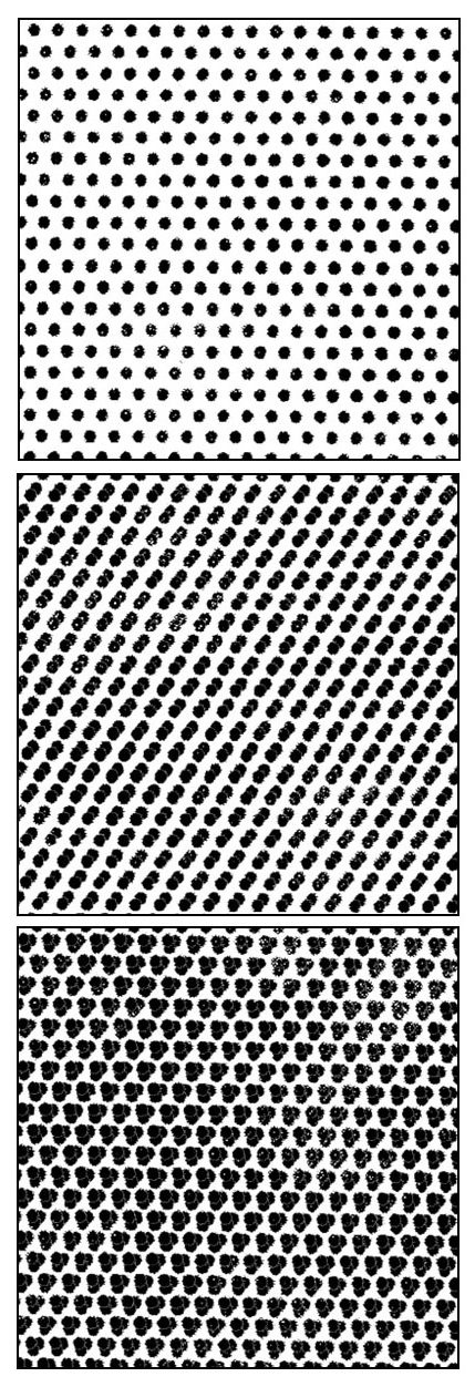
Of course, once the plate had been etched with acid and readied for printing, the same tint could be printed in any available colour, and in many combinations. Below, my three tints are being used to print blue dots over a yellow ground, as in the Tarzan panel above, making three shades of green:

Compared to the blown-up 6 mm squares from Tarzan, you can see how I am only approximating the actual printed page. (For a start my triangles are upside down. Oops!)
The Tarzan page probably looked a fair bit brighter on the day it was printed, but my manufactured examples are somewhat too bright. And my dots are too close to perfectly circular. In the printed version, the combined effect of etching the plate then printing on coarse paper was to create dots which were far from perfect. My scanned dots will never look quite right, but they will give you an idea of how the Ben Day operators created their tints.
^^Table of Contents
(iv) Special Effect 2: Dots into lines
On the left, below, is another patch of greenery from Panel 1—again, about 6mm square—perhaps with some dots tripled, some doubled, and an area in the middle with no blue at all, just yellow. Also, some of the dots in this first square seem to be running together to make lines.
And on the right is a square with a lot of diagonal green lines—that is, blue lines printed over solid yellow.

In some comic strips of the 1930s, or earlier, you will see actual Ben Day lines printed, as in Ben Day’s original example of cross-hatching, shown above. I showed a children’s magazine from 1885 in Part 5.75 which used a lot of Ben Day lines (albeit printed by lithography.) Below are some from Ben Day Inc.’s catalogue, again from 1936.
But the irregular lines in Tarzan are not standard Ben day tints like the one above. They have been made out of Ben Day dots. By now, you can probably see how it was done. I’ll show you anyway.
Below, I’m starting on the left with the same offset dot pattern I used before. The middle square shows a doubled pattern, this time with the dots completely separate from one another. They are almost formed into lines, but still quite dotty. I can improve on this, and so could the Ben Day operators.
The right hand square is a triple pattern, which resembles the lines in the Tarzan panel quite closely. It is obviously quite a lot darker than the doubled-up “almost lines.” If the dots were smaller, a fourth application of the Ben Day screen might be needed to make lines. I suspect the Ben Day operators chose dot screens which avoided quadruple application if they could.
^^Table of Contents
(v) Special Effect 3: Lines into Cross-hatching
Shown below are two more 6mm squares from Panel 1, again showing dark green areas. Now we are seeing not just lines, but cross-hatching, effectively made by crossing two sets of lines.

However, unlike Ben Day’s own example of cross-hatching as seen further up the page, these lines are once again made from dots. Here’s how.
Below, on the left, I start with the lines I created above by tripling a standard dot pattern.
In the middle square, I have added a fourth application of the same dot pattern. This odd-looking pattern does actually show up in some Sunday strips. You will see something very much like it in section 2(v).
Finally in the third square I have added a fifth application of tint, to make a cross-hatched pattern with diamond shapes. The basic hexagon pattern of the original offset grid is also maintained here in the white spaces.

The Ben Day team might have done something to make it even darker. Parts of their printed tint have “filled in,” possibly due to so much blue ink, and the pattern on newsprint is much less clear-cut over all. But I reckon I have recreated their tint at least in principle. Here’s a blue-on-yellow version of my tint, next to a Tarzan green square:
Before leaving Panel 1 of this page, I’d like to take a look at some flesh tones—starting with Tarzan’s own skin. As we will see when we move on to Hal Foster’s version, Rex Maxon’s earlier ape-man had not only a very deep bronze tan, but also more complex Ben Day work than his later self.
His skin has a solid yellow base, with a great variety of magenta (red) dots on top of that—showing as scarlet, as they are mixed with yellow. Red dots can be seen at various sizes—some almost certainly doubled up, if not tripled—as well as made into lines. Finally he also has a few small blue dots added for variety and shading.
This is another 1-inch, 2.5 cm square:
The background here also shows dots of various sizes, both magenta and blue. Occasionally they have overlapped to make purple.
^^Table of Contents
This is the fourth panel from the Tarzan Sunday of March 15th, 1931.
Oh no! Bob and Mary have been caught by Zugo, the mighty ape! (Spoiler alert: Tarzan saves the kids. Phew!)

Below are four 1.25 cm or half-inch squares from panel 4, showing a variety of special effects. Mary’s dress in the bottom left square is noteworthy. The lines go from thinner to thicker, lighter to darker blue—a very subtle effect.
 Something I haven’t mentioned before on this page is the use of black Ben Day dots. These are very obvious on the vegetation in the bottom right square, less so on the ape’s face above that. Black dots—as shown in Part 6 in black & white comic strips—were etched onto the same plate as the black line artwork itself.
Black Ben Day is something fairly unusual in coloured newspaper strips, and even more so in comic books—something I will return to another time.
(viii) More Panel 4—Flushed or Ruddy Cheeks
My final special effect from this Rex Maxon page is one which I first showed in Part 6, illustrated with a picture of Ella Cinders—the “ruddy cheek” effect.

Both Bob and Mary have it in this fourth Tarzan panel, though it is not utterly typical.

The ruddy cheek was a great favourite of the Ben Day operatives. It generally seems to have been done by varying the pressure when imprinting dots, giving larger dots in the middle of the flushed area. (If I find one—or a matching pair—done with doubling or tripling of dots, I’ll let you know.) Below is my attempt to model this effect. Again, I have had to use a square grid, not the offset dots of Tarzan or Ella Cinders.
On the left is the black dot pattern, as it would have been rubbed down onto the printing plate in black Ben Day ink. On the right I have combined a magenta version with uniform-sized yellow dots, which I think is something like the average printed version of the ruddy cheek.
We shall be meeting this effect again!
^^Table of Contents
(2) HAL FOSTER’S SUNDAY TARZAN
Within months of the launch of the colour Sunday strip, partly due to pressure from Tarzan’s original author, Edgar Rice Burroughs—who was reportedly not keen on Maxon’s artwork—Hal Foster started drawing the Sunday Tarzan. His first strip appeared on September 27th, 1931. (Foster was never to draw the dailies again, however. They stayed in Maxon’s hands for many years.)
Foster stopped drawing Tarzan in the latter part 1936 to work on his new creation, Prince Valiant, which unlike Tarzan he owned the rights to. Foster left Tarzan with several months’ worth of pages completed. His last Tarzan appeared on May 2nd 1937. Prince Valiant had had debuted in February that same year.
Publisher Dark Horse is producing beautiful full-sized hardback reprint editions of Foster’s Tarzan Sundays—highly recommended, for information, for reading pleasure and for the Ben Day detective.
Hal Foster also took over the colouring of the Tarzan strip—according to Mark Evanier, in his introduction to Dark Horse’s Volume 1—and I don’t know if Maxon or someone else did the colour guides prior to that. There is certainly a marked difference between my early Maxon page and the Foster pages.
The Foster era is marked by a simpler use of colour in general, and of Ben Day dots in particular. The early Maxon pages might almost have used too much complicated Ben Day, as if to compensate for the crude drawing. I don’t know if some of this change occurred before Foster came on board, as I don’t have Maxon pages from the end of his run.
Either way, the Ben Day team in the engraving workshop were probably relieved. They had less work to do, though as we shall see, it was not the end of the “special effects” altogether.
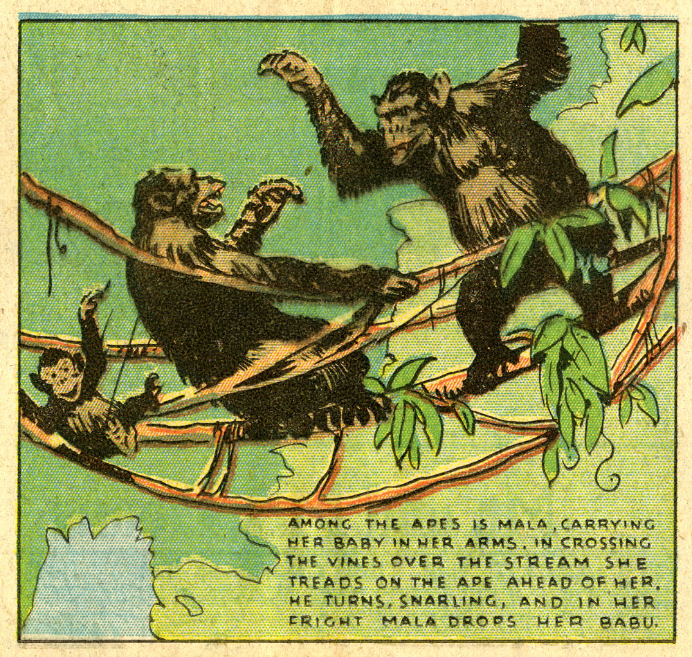
From time to time, between story arcs, Foster would drop in self-contained single-page vignettes. Here’s one from January 24th 1932. (Original image approx. 34.5 x 46.5 cm, 13.5 x 18.5 inches.)
Clicking / tapping to enlarge highly recommended. Not just beautifully drawn and Ben Dayed—it’s also a heart-warming happy family tale of… er… nature red in tooth and claw. Your browser’s back arrow or button will bring you back here, probably smiling. Unless the implicit racism of the whole Tarzan edifice really bugs the hell out of you. In which case you’re probably not even reading this post, since I have left that (valid) discussion to be had in other venues.

(Note that the paper has put one of those space-filler bands across the bottom of the page, with Rex Maxon’s version of Tarzan, and guest stars Bob and Mary. Which just points up the higher quality of Foster’s vision of Tarzan. No cute kids in this jungle… well, not unless they’re furry… OK, cute ape kids maybe. But Foster really did up the game in so many ways!)
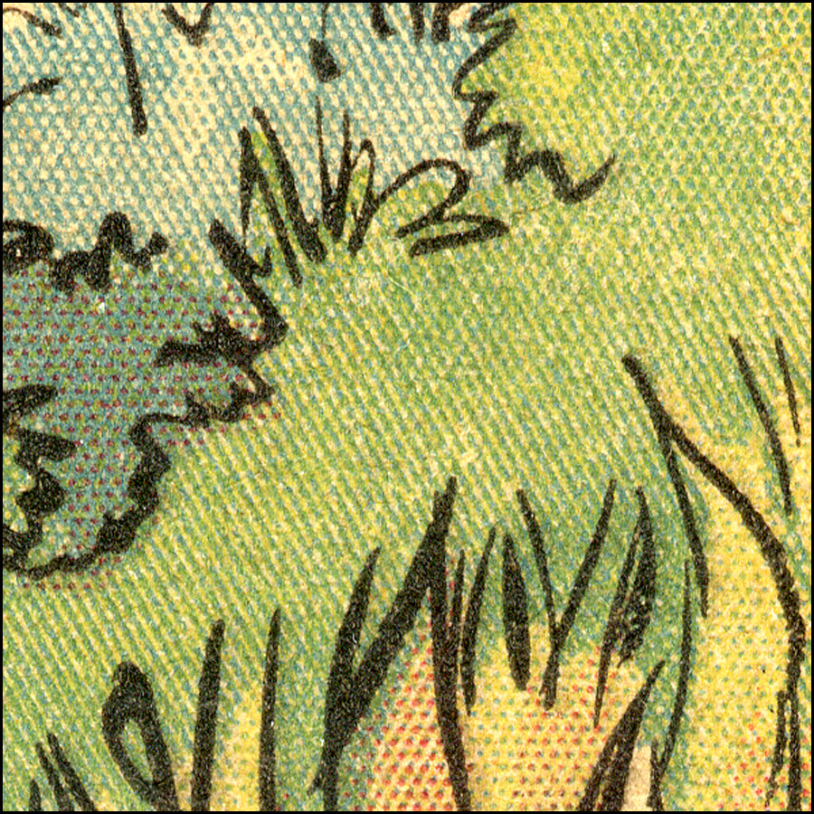
Panel 2 has some lush vegetation in the background, and it is worth comparing it with the Maxon variety. Maxon, as you will remember from above, had yellow, red and black amongst his greens. (Original image size 10 x 9 cm approx.) Clickable.
Here is Foster’s jungle shown as 1.2 cm (half-inch) squares, from the above panel:

^^Table of Contents
And here is Tarzan himself, in Panel 7. Foster’s version of his skin tone is very much simpler (and paler) than that of Maxon’s “bronzed Adonis”:
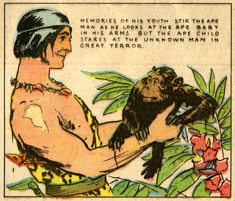
Generally though, there was some use of slightly more complex Ben Day on his skin, and the ape-man was usually shown as a little more tanned than this.
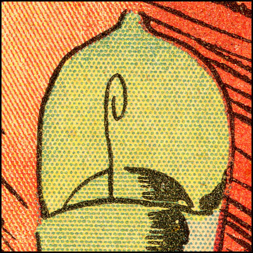
Here he is with some of his ape pals, from the logo panel of September 18th, 1932.

Tarzan’s hair shows the characteristic lines, made up from dots, which we saw earlier. His skin tone use yellow dots—not solid yellow as with Maxon’s version—and a lot of magenta dots. His ape companions are a brown colour very similar to some shades of Maxon’s bronzed Tarzan, but the ape-man himself has lost that deep tan.
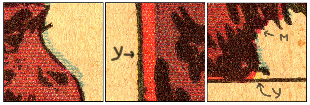
In fact, the apes are browner than Tarzan ever was. Here is a close up of Apey McApeface from the other side of the same logo panel. Original size, 3 x 3.7 cm.

The registration has clearly slipped a little, especially on the blue plate. This gives us a chance to explore the Ben Day tints used for all three colours. As is often the case, looking at the edges of an image provides a rich source of information. The squares below were originally half an inch, approx. 1.25 cm, across.
Blue lines are evident. Underneath them is a magenta tint which is almost solid, but shows a pattern of dots characteristic of the dense cross-hatching which we saw in the green tints at 1(v), above. I have marked the yellow (Y) which underlies the magenta—giving it a scarlet hue—and a tiny patch of pure magenta (M) which has escaped from the yellow. This will be clearer on the enlarged image.
Not that Tarzan himself, by this time, is completely pale-skinned—hardly likely, given his outdoor lifestyle. The 6mm-square details below show that the Ben Day magenta tint has been pressed quite firmly for larger dots—ink seems to have run between dots in places, though this could have happened at the printing stage, rather than the Ben Day stage. Dots have also been doubled up to create a darker tone. In the last square—from his left upper arm—the dots have almost been run together to make lines.
In this story, Tarzan has a human companion, another white man, Von Harben.
Slightly surprisingly, his skin is just as tanned as Tarzan’s, as shown below—Von Harben must’ve been hanging out in the jungle for some time. The left and right panels show their two faces, from the second story panel of this page. The middle panel is Tarzan’s hand and Von Harben’s arm, juxtaposed, from panel 3. Not a hint of difference. Later I will show some contrast in skin tone between Tarzan and another person.

^^Table of Contents
The left-hand square also shows very nicely how the magenta dots are in complete continuity from Von Harben’s skin, to his hair, and to the purple background. These areas of the picture have not been laid down separately in Ben Day dots, but all together, crossing black outlines.
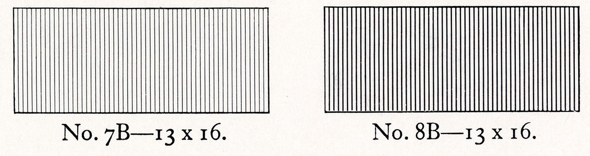
In fact the Ben Day operator would have laid down tints on the magenta printing plate for the whole page in one go—or as few goes as possible, bearing in mind that the maximum size of a Ben Day screen was 13 x 16 inches (approx. 33 x 40 cm)—less than the page’s image area—and some a good deal smaller than that. The Tarzan page is broadsheet newspaper sized, and the strip itself approx. 34.5 x 46.5 cm, 13.5 x 18.5 inches. Ben Daying it was a pretty huge undertaking.
The black line drawing was “stained” onto the metal to guide the placement of the dots (as shown in Part 6) but there was no need to stop at each black outline, if the tint continued from say, a face to hair to a background—as with Von Harben here. Panel borders, of course, had to be stopped at. The gutters between panels had to remain free of dots, so as to print white.
I haven’t got B&W versions of any of my colour panels, so I will use a Hal Foster panel, below, from a different page to illustrate this point. This was scanned from original artwork (not by me!) (You won’t catch me taking it out of it’s frame. Or its temperature- and humidity-controlled vault. ;O)). It was an introductory page, to bring new readers up to speed on Tarzan’s history.
I will use my own imagined version of the colour for this panel, not attempt to reproduce the real thing. And I’ll stick with one panel for simplicity—but again, bear in mind the whole page would have been done in one or two goes, several panels at a time.

Below is my interpretation of the “stain” on the printing plate, which the Ben Day operator will use to place their dots on. It’s been left-right reversed, of course, to be the right way round for printing—another challenge to the Ben Day person following a colour guide done the right way round!
This stained image will not be etched onto the plate. Only the Ben Day dots will be etched on.

As well as the actual artist’s colour guide, the Ben Day operator may have a sketch showing a “breakdown” of where each individual colour tint needs to go, and how dark or light it should be in each area.
Let’s say that our Ben Day person is laying down a first application of dots for the magenta plate. They have to envisage not only where magenta dots go for Tarzans’ skin, but for example if the sky behind him is purple, dots are needed there too. Also, the apes’ fur had to have about 5 applications of dots to make the cross-hatching, so this first application had to cover the apes as well. If the branch Tarzan is sitting on is orange, that too would need magenta dots.
After masking off the areas which don’t need magenta—Tarzan’s hair, loincloth, rope, bow and necklace; green leaves; yellow vines: and a yellow background under the branch, let’s say—the first application of dots goes on like this (size of dots exaggerated for effect):
Let’s imagine, for simplicity again, that no more dots are laid down—these apes have paler brown fur, let’s say, and only need one layer of magenta—and we see this plate through to the printed version. Since the stained image isn’t going to be etched, only this dot pattern ends up on the etched printing plate:

And if printed alone, in magenta—something that in reality would not be done—it would look like this:
The magenta dots have not stopped for any black outlines, except the panel border itself. Tarzan has pretty much disappeared, only his hair and a few other details showing. The apes have merged into each other and into the background.
Let’s bring them all back, by envisaging another unrealistic step—printing the imaginary “black plate” on top of our “magenta plate,” thusly:

The Ben Day operator has to do this in their head, while consulting whatever colour guides are to hand, at each step of the way. In reality, this would just be Step One on the magenta plate—of perhaps five steps—as we build up the various tints of magenta required by the artwork. The Ben Day person would also have to do up to another 11 panels.
Following the five or so applications of the Ben Day screens, we must then factor in the four steps of resin-powdering and metal heating which followed, in between the stages of acid-etching. There were probably at least three repeats of all those steps. Eventually, after a day or more of demanding work, we might have a usable magenta printing plate. Only three more to go and we can print a colour page!
(In reality, the flat plate needs to be cast as a “stereo matrix” or “mat” in papier maché, which will be used to make a curved metal printing plate to fit on the cylinder of a huge newspaper printing press… but that is another story altogether.)
Leaving all that aside, this shows how the dots end up in continuous tints across many parts of the printed picture. It isn’t always obvious, as the dots are often mixed with other colours, or doubled/tripled/quintupled in places, and black outlines interrupt the pattern. But we have some good examples here, and perhaps some of you Ben Day detectives will have fun noticing this from now on.
^^Table of Contents
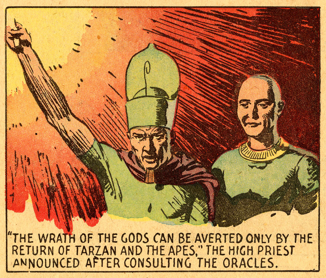
My penultimate look at Foster’s Tarzan sees him with one of the many beautiful, regal women he was always meeting in that exotic jungle of his. Princess Nikotris, not unusually, was of Egyptian heritage. This episode—April 9th, 1933—was entitled The Ape-Man and the Princess.
Here they are in the logo panel:
![]()
You will immediately have spotted that poor registration has given the Lord of the Jungle pink teeth here.
A word about the registration problem: it is possible that the stained images on the Ben Day operators’ printing plates were occasionally misaligned. This should mainly have been picked up at the stage of making “proofs” or test prints, and the plate(s) re-done.
Registration errors like Tarzan’s pink teeth almost certainly arose from the printing end of the process, not from any errors made by Ben Dayers.
Newspaper presses worked at great speed, and the basic technology had been designed for printing only black and white, with no need for four plates to be perfectly aligned.
Even if well-aligned at the beginning of a “run,” there could be movements of plates on the cylinders as printing progressed. Even with improved technology in the 1930s – some 40 years after Hippolyte Marinoni first printed four colours on newsprint – a degree of slippage was inevitable.
Appallingly badly registered pages would be spotted and the presses stopped, and realigned. But that involved delay and expense. So minor degrees of misregistration were tolerated. After all… it was only the comics! (See also Part 6.2.)
Some lucky readers would get copies in good register, others wouldn’t. Collectors – and publishers reprinting from original newspaper pages – generally seek out the best possible examples. On the other hand, misregistration can allow the Ben Day detective to learn more about tints and colour mixes than would otherwise be possible.
Meanwhile, back in the jungle… you have probably also noticed that Tarzan is a good deal more sun-tanned than his companion. The differential in flesh tone was maintained in every panel of this page.
Details follow; each square was originally about 1.2 cm across, or half an inch. (Enlargeable, like most of them.)
![]()
The third square above is also notable not only for the return of the ruddy cheek effect—those jungle princesses had access to the finest rouge, doncha know—but also something called “ink squash.”
This is not a messy raquet sport, but a feature of relief printing often seen in letterpress. Bamber Gascoigne describes it so succinctly in his excellent book, How To Identify Prints, that I can do no better than quote him:
“The pressure of the raised printing surface pushes the ink into a rim round each printed area.”
In this case, ink squash has created a pale area in the centre of each dot, and made the princess’s ruddy cheek less red than it might have been. It’s easier to see in the full-sized image. Looking back at Ella Cinders in section 1(viii), we can see that she has been afflicted by the exact same problem.
This is sometimes particularly noticeable where Ben Day dots are concerned, but you will see it elsewhere as well—in black outlines as well as in coloured areas.
You might think that Nikotris is curiously pale for an Egyptian. There are of course several other notable differences between Tarzan and his companion. Far be it from me to suggest that Tarzan’s jungle may have been not just slightly bonkers, but a place of engrained sexism as well as racism. This post is about Ben Day dots.
^^Table of Contents
(v) Ben Day Special Effects—two last examples from Tarzan
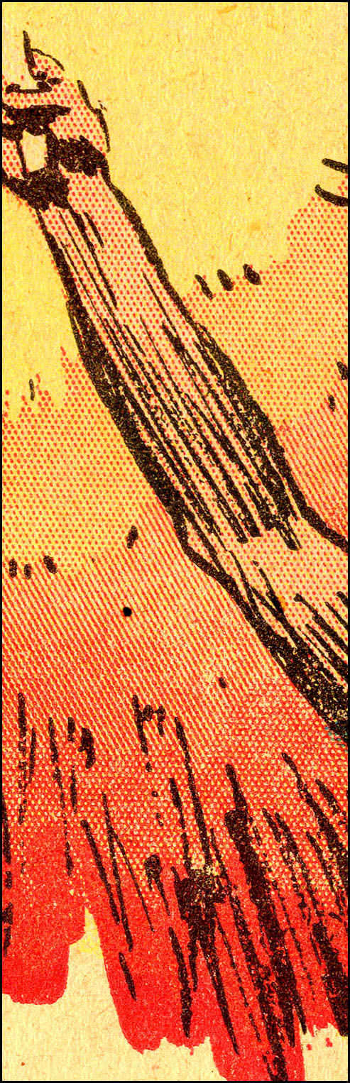
From March 12th, 1933, comes a panel with some more of those pallid Egyptians.
My first details are from the High Priest’s splendid hat. The next two squares were originally one inch, or 2.5cm, across.
The top of the hat has some darker dots which might have been created by deliberate manipulation of the Ben Day screen, or might simply be due to the vagaries of cheap letterpress printing. In future posts I will be showing more of the accidental variation in dot size which often occurred, especially in the comic books.
Lower down, we see a definitely deliberate Ben Day effect, where there is darker green, using bigger blue dots. These dots are also larger than the dots on the blue highlight at the right side of the hat.
I’m pretty certain these dots have been “doubled up.”
They also show nicely the continuity which I discussed before. You can see how one application of dots was laid down all over the hat, then another added just to the darker green parts. Below you can also see continuity of blue and magenta dots on the face and clothing.

The other thing about this panel is the use of red and yellow to depict the flare of light from the torch, which the priest is holding mostly off-panel.
By this stage you won’t need me to explain how these effects were done. I would like to draw your attention to the continuity element, though—this time, not across black outlines, but between shades of tint. If you scroll down this image, you are almost watching Ben Day dots being added to a printing plate, one layer (or more) at a time.
The solid red at the bottom was of course just painted onto the metal, using the same black ink as was used on the Ben Day screen—or very similar.
^^Table of Contents
(3) THINGS I LEARNED FROM TARZAN
I have shown that the use of Ben Day on Tarzan changed significantly from the early Rex Maxon pages in 1931 to pages by Hal Foster in 1932 and 33.
There are some common features, though, and three of those features were completely unexpected to me.
(i) The 60-degree offset Ben Day screen
Being used to more modern comics—I’d been looking in detail at Marvel and DC comic books from the 1950s and 1960s—I was expecting the square dot grids (which they used consistently) to dominate in the earlier Sunday comic strips.
More on this another time.
(ii) Only one actual Ben Day tint was used
All the variations in dot size and dot pattern, and the use of lines, were created by the Ben Day operators. We have seen how they did it—using varied pressure when applying the screen, and multiple applications of the screen in a variety of combinations.
I was expecting to find a number of Ben Day tints in use. As I showed in Part 6, a Yellow Kid half-pager from 1897 made use of a number of different Ben Day screens:
- at least two with the 60-degree offset pattern, but different dot size and different number of lines per inch
- other dots almost in a square grid, but in fact with slightly curved rows of dots
- irregular grained / stippled patterns
- lines which really were Ben Day lines, not made of dots run together.
Some of this can be seen in the half-inch (1.25 cm) squares below, from The New York World, Sunday June 20th, 1897:

This is not to say that the 1897 Ben Dayers didn’t know how to do “special effects.” They varied the size of their dots and thickness of their lines considerably, for example. As seen in Part 6, they also used engraver’s tools on the metal plate to scrape away parts of their tints after etching.
But they also, like the lithographers before them, used a great variety of Ben Day tints in a single image.
Thirty-four years later, it seems the Sunday comics were doing things very differently.
So: why didn’t the Tarzan team buy in a bunch more Ben Day screens? Why this do-it-yourself-with-a-lot-of-hard-work technique?
As an example, the gradual darkening of the red in the High Priest’s torch-light could have been done a lot more easily using one of Ben Day’s own graduated tints—like no. 413, below.

Also, there were several Ben Day line tints. The Ben Day team didn’t have to make their own lines out of dots, at significant expense in their own time and effort.
And, at a very basic level, they could have bought in a number of different sizes and densities of Ben Day dot, rather than relying on doubling and tripling of a single screen tint.
So, why use a method which seems at first to be unnecessarily time-consuming? A number of factors probably led to this evolution in technique:
- Cost—the fewer different screens in use, the less expense.
- Consistency—all the pages had a consistent look—and the printing plates were technically similar, so the printers could set up for a standardised type of job.
- Expertise—teams of Ben Day workers learnt how to handle one narrow type of job really well, and quickly, leading to:
- Speed—the weekly deadlines for the Sunday sections had to be met, and the faster you could work, the more work you could take on.
- Craft and control—maybe the Ben Day men liked doing it their way, rather than relying on the standardised graduated tints, for example.
- Technical factors—like avoiding Moiré patterns, which occur when dot screens of different “frequency” (number of dots per inch) are laid over each other. Also keeping colour mixes consistent—more on this below.
^^Table of Contents
All the Ben Day dots in Tarzan are set at the same screen angle.
This clearly helped to maintain uniformity in tinting, but it is completely different from what I expected—as I will explain below.
The Ben Day screen could be used at any angle. (There was a specialised version of the Ben Day Adjustable Frame which allowed for very precise angle adjustments.) For consistency, working with the 60-degree offset pattern, it made sense to keep one direction of dots either horizontal or vertical. In practice, the Ben Day screen itself was almost certainly orientated this way.
In my example above, section 1(i), I had it vertical—as per The Yellow Kid 1897.
Below I show it horizontal, as per Tarzan, 1931-33. Two other lines of dots always run at 60 degrees to this one, whether it is kept vertical or horizontal.

Here are some more examples from Tarzan (1.2 cm, half-inch, squares from the Jan 17th, 1932 Sunday page):

Keeping the screen angle the same every time means that consistent patterns of dots are created when one colour is laid over another—at least in principle.
In practice, if (when!) the registration slipped—i.e. the colour printing plates were not perfectly aligned with each other—the exact overlap of the dot patterns would of course vary.
Rarely the dots would sit wholly on top of each other, i.e. overlap completely. Equally rarely, they wouldn’t overlap at all. Mostly they would be overlapping partially. As seen below, this would actually affect the resulting colour quite substantially.

In the left hand square, there is more white showing, so a paler colour results. All the mixing of colours is actual mixing as the cyan and magenta dots overlap to make purple.
In the right hand square, all the mixing of colours is “optical mixing” only, as the dots sit side by side. There is less white visible, so the effect is of a darker purple. As the Impressionist painters found in the 19th century, there is also a greater vibrancy of colour when dots sit side by side—though vibrancy was unlikely to be an issue when the dots were printed by cheap letterpress on 1930s newsprint.
In the cheap and cheerful world of the Sunday comics, whose letterpress printing was not expected to be of a high standard, that degree of inconsistency was tolerable. Pale purple was pale purple, after all. No-one really cared exactly how pale it was, or wasn’t. Anyway, as we have seen, due to the limitations of this kind of printing, dots might end up darker or lighter anyway, in fairly random variation.
Why was this uniform screen angle an unexpected finding?
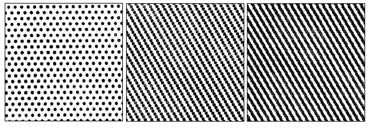
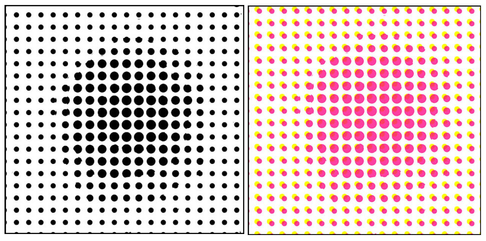
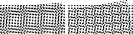
Because in both 1960s comic books, and in the more sophisticated types of four-colour printing—e.g. fine Ben Day dots on glossy paper, and “process colour” with its four halftone plates—printers set their screen angles very differently. This illustration (from this site) shows typical screen angles, but there are variations:

The halftone version is nicely explained here;
http://the-print-guide.blogspot.co.uk/2009/05/halftone-screen-angles.html
I had seen this for myself in 1960s comics (but see below* for the 1970s!). I had read about it in books on printing, and online—though these sources rarely mentioned comic book or comic strips. I had been left with the impression that all four-colour printing used differential screen angles.
In my Ben Day Inc. catalogue, there is an undated page headed “Twelve new Ben Day color angle half-tone films.” These full-sized 13 x 16-inch screens came pre-angled at 45, 75, 105 and 90 degrees.
Since they are square grid patterns, 90 degrees is the same at the zero degrees shown for yellow above, and 105 degrees = 15.
Ben Day Inc. was clearly serving the needs of engravers producing Ben Day four-colour work, reproducing the equivalent of true halftone screen values—saving the Ben Day men the time and effort of angling screens on the metal. This wasn’t an issue for Tarzan and other strips which didn’t use angled screens, of course.
A major issue, if the screen angles are not optimized, is the famous Moiré effect—as seen below in black & white. This will happen with coloured dots printed over each other as well, of course:
The Moiré effect only happens if your overlapping dot tints are at the wrong angle to each other. It doesn’t happen if they are at the same angle, as shown with my blue and magenta dots above. So why angle your screens in the first place? Aren’t you just asking for trouble?
In reality, even angling the screens the best way possible does not eliminate the Moiré effect, it just reduces it to the minimum possible. In fact it creates rosettes of dots, in which the colours are sometimes overlapped and sometimes juxtaposed, in a way which may look random but is actually quite structured. In these rosettes, the colours overlap/don’t overlap in a ratio which remain fairly consistent even if the registration slips a bit—the rosettes just shift around.
Curiously, the option of having all four screens at the same angle is not even mentioned in the sources referred to above. I can only assume it’s not an option because of the colour variation which would occur, as shown in my pale purple example. This would not be tolerated in higher quality types of printing, where getting the closest possible to a “true likeness” of an image is desirable.
I think this is the real secret of the angled screens. Rosettes give a high degree of consistency to the printed colours in both comic printing and process colour printing.
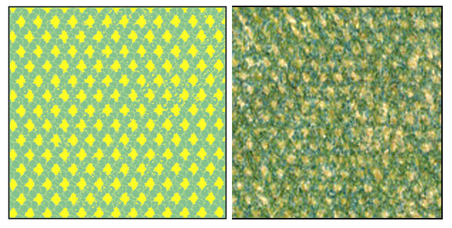
Not only that—they are rather attractive! Here are some from a 1960s comic book, and from a halftone colour photo:
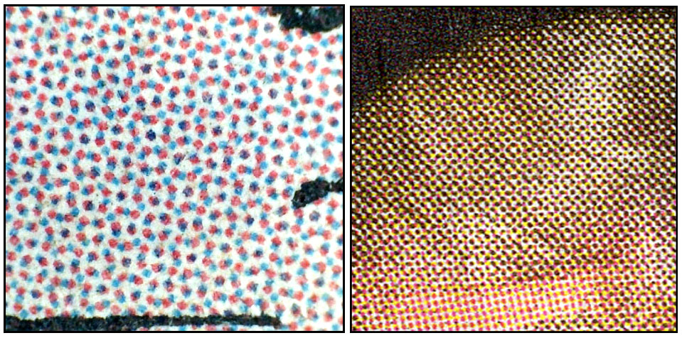
I should remind you that the “halftone dots” in the photo are most definitely not Ben Day dots—they are a different species altogether. And since they were in a 2016 newspaper, you could say they are not really true halftone dots—not produced optically by a glass halftone screen—but a digital simulation of halftone dots.
And indeed the 1960s comic book dots themselves were made by a post-Ben Day method, which I will be describing in a future post. The people working with them may have still called them Ben Day dots, but were they right to do so? Watch this space! Intrigued? You very nearly will be.
In a future post I might look into the “single Ben Day screen” and “screen angle” questions in more detail. For now, suffice to say:
No rosettes in Tarzan. Screens all at same angle.
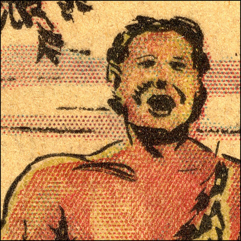
* Plus a long-overdue update (May 2021): shortly after writing this post, I noticed that DC and Marvel comics from the 1970s did have all their dots at the same screen angle… shocking! So all their pale purple, for example, was inconsistent on different pages, or even on parts of the same page, as shown above and again here:
And this went on for years, right into the flexography era of the mid-1980s. The starting date has yet to be found, but I do know that it was due to new cameras being bought by the Chemical Color Plate Corporation, colour separators to Marvel, DC and many other publishers — a cost-cutting measure, of course.
The results could be pretty horrendous, like the striped skin tone shown here by Zoe D. Smith: 4 Colorism, or, the Ashiness of it All – WWAC (womenwriteaboutcomics.com)
I’ll come back to this another day. Probably.
One last point…
^^Table of Contents
(4) IT WASN’T JUST TARZAN AND LITTLE NEMO
When we think about the craft of Ben Day—and I don’t know about your neighbourhood, but in the pubs of south London they speak of little else—it is often a few acknowledged classics of the Sunday comics which come to mind. Little Nemo probably leads the pack, with Prince Valiant and Tarzan not far behind.
Spare a thought, though, for the Ben Day men—and there must have been some women, surely?—who toiled on the often-forgotten strips on the other side of the page.
This is where I went looking for other examples of 1930s Ben Day work—quite literally. I flipped my Tarzan pages over.
And I found that in the humour strips too, where the drawing might be less sophisticated—though sometimes very skilled—the Ben Day operators were giving it a fair bit of effort. Some “special effects,” it seems, pretty much came as standard. By now you will be spotting them yourselves…
Starting with Mr and Mrs Beans, by Robert L. Dickey, from Jan 24th, 1932:
(All pics enlargeable)

…and you’ll never guess—that log that looks just like alligator, well… heh heh… but no. No spoilers!
This is about the Ben Day dots after all.
Four half-inch (1.2 cm) square details follow.

Secondly, The Smythes, by Rea Irvin. Irvin drew the first ever cover of The New Yorker in 1925, fact fans, and plenty more after that.
The Smythes was printed with no blue this week, and so was Tarzan. The blue printing plate was certainly made, and used in some papers. The Boston Sunday Post simply left it off during October 1932, probably to save a little money. Or possibly cyan ink was in short supply at the time.

He remembers, BTW, but the store has sold out.
And look…subtle ruddy cheek effect!

And finally, Winnie Winkle by Martin Branner, from September 18th, 1932. The Atlanta Constitution chose to print only the black and magenta plates that Sunday, so we can see just the two colours at work. On this occasion, Tarzan was in full four-colour glory on the other side of the page.

Continuity across outlines, subtle variations of the magenta tints, and more of those rare black dots are visible here. These strips stood up really well in limited colour, I feel, and this was largely because the Ben Day people did so much work on each of the colour plates.

What’s that…? You really want to see how the story turns out for Perry Winkle and his pals? Look, this is a serious blog about the technical details, you know. This ain’t no library!
Anyway, the punch line might not be that great…
But OK, if you’re going to insist… here’s the next, and last, panel…

Now, if you’ve finished ROFL, I’ll tell you a bit about coming attractions.
Part 7 will definitely be about a major successor to Ben Day. When all that hard work (and all those expensive hours of skilled labour) proved too much of a luxury for the fledgling comic book business, it found a faster, cheaper alternative.
When I have my hands on some key 1930s and 40s research material, I will be bringing you the word on that.
That will be a while though, and in the meantime there might just possibly be a Part 6.2, about another one of those 1890s techniques that looked a lot like Ben Day, and actually tried its best to prevent Ben’s entry into the world of letterpress comic strips.
Fascinated?
Me neither at this point.
But as Van Morrison said: it’s too late to stop now.
Be seeing you! ^^Table of Contents
Text and original images copyright © The Legion of Andy 2016
guy.lawley@btinternet.com


Pingback: 08/29/2016 – Comics Workbook
Good lord, this is absolutely brilliant. Thanks for such a deep dive.
Thanks very much Ontor. Please spread the word.
Plus I need to acknowledge again the work of Phil Normand whose old blog post (link below) helped me to dive deeper, after I’d started out on this project and needed a steer onward.
https://recoverings.com/blog/tarzan-the-sunday-comics-1931-1933-part-2-tarzan-and-the-ben-day-men-or-the-mechanics-of-color-in-the-sunday-comics/
Wow, I’ve been looking forever for a great explanation of how to create the Ben Day dots authentically, this is incredible!! Thank you so much for putting all this time and effort into researching this!
You’re very welcome, Alexandria.
And thanks for your feedback; that’s what makes the effort worthwhile.
If I may ask, are you using recreated Ben Day dots in a project?
I like to hear about ways that people use this information.
Pingback: Exploring Why Comic Books Have Dots – Fairy Epic