
RGB dots on the screen. CMYK “four-colour” in the comics. Etc.

The Avengers, Captain America and Daredevil are Copyright and TM 2015 Marvel Characters Inc.
Most images—including the one above—can be clicked to enlarge. Use the back button or arrow on your browser to return here.
Also available in The History of Ben Day Dots:
- Part 1: Roy Lichtenstein , The Man Who Didn’t Paint Ben Day Dots
- Part 2: More on Roy; Halftone and Polke Dots, etc.
- Part 4: Ben Day Dots: Origins and Pre-history; 19th Century Picture-printing
- Part 5: Ben Day Dots in Lithography, 1880 – 1940
- part 5-&-a-half: French comic strips from 1886 – 1888 & the forgotten technique used to print their colours
- Part 5-&-three-quarters: Ben Day in a litho’d kids’ magazine from 1885—anticipating the look of comic books—an ancestor?
- Part 6: Ben Day dots in the earliest comic strips—the 1890s
- Part 6.1 : Ben Day dots in their prime—on 1930s Tarzan Sunday pages
- Part 6.2—Registration—as in, getting the colours lined up right—or not
- Part 7—Ben Day Dots 1933 to 1937—the birth of the comic book
- Part 8 — 1930s to 1950s: The “Golden Age” of Comics — exit Ben Day, enter Craftint
- Part 9a — 1950 & 60s: The “Silver Age” of Comics, Part 1
- Part 9b — 1950 & 60s: The “Silver Age” of Comics, Part 2
guy.lawley@btinternet.com
~~~
Contents of Part 3:
- Introduction
- RGB colour: Red, Green & Blue dots, on a screen near you now
- CMYK colour: 4-colour printing with Cyan, Magenta, Yellow and blacK
- The road to CMYK: an appallingly brief history of colour printing
- CMYK vs. RGB: total opposites! Who knew?
- 4-colour printing with CMYK in newspapers, comics etc.: with details on the Avengers cover shown above.
1. THE INTRO
Some decades ago, before the internet changed this kind of inquiry forever, I got interested in what everyone called benday or Benday dots. There were two reasons for this; I loved the comic books that were supposedly printed with actual (tiny) Ben Day dots, and I loved the paintings of Roy Lichtenstein, who was said to have painted giant Ben Day dots. (I’ll go on calling them Ben Day dots from now on, as that was their original name, and because it commemorates the man who invented them — Benjamin Henry Day Jnr.)
Here is a detail from a panel in a DC romance comic — one which Roy Lichtenstein did not borrow. This shows the Ben Day dots used to print our heroine’s skin tone and pale blue eyes… or so you might think. Click to enlarge. Back button or arrow on your browser to return here.

From Girls’ Romance 81. Art by John Romita.
Many years ago I read in a book or magazine that “The dots you see in the comic books are NOT Ben Day dots” — or words to that effect.
I wish I’d kept that piece, as it went on to explain its seemingly controversial statement. If I had it now, I could quote what it said and be done. Instead I have tried to rediscover the details behind that assertion. And while the internet has been useful, particularly in locating old books, most of my information has come — fittingly enough for such ancient and largely forgotten wisdom — from those dusty old paper pages.
Now I’m ready to tell the real story of the true Ben Day dots. Including — has this typical lovelorn DC Comics blonde got Ben Day dots on her face? The answer is a very definite “yes and no”.
I will come back to the real, historical Ben Day dots in Part 4. I know, I did promise the full gen on Ben Day dots here in Part 3. But first, I want to look at how the images we see around us today are made. Ben Day dots used to be almost as big a deal as pixels are now. They dominated their field for more than 50 years, from their beginnings in 1879. In trying to understand not only how they worked, but why they were so successful, I found it useful — and fun — to look at their modern-day equivalents.
So, I’m starting with the here and now, before working backwards into the past. This post will look at two other relevant subjects — the RGB and CMYK colour systems — before I get back to the Ben Day dots themselves, and the comic books.
COLOUR IN MANUFACTURED IMAGES
This is what Ben Day dots seem to us to be all about — colour in the mass production of images. But the Ben Day process can — or could (the past tense really is correct here) — be used to print dots of any colour you liked, including black. And while people did increasingly find uses for coloured dots, for decades, every day around the world, millions of black-and-white images using Ben Day dots were printed in comic strips, graphics, advertising art etc. These used the dots to print shades of grey.
From the 1890s, newspapers increasingly used colour as well, as weekend colour sections took off in U.S.. In the colour Sunday comic strips, the dots really came into their own, used to make a huge variety of colours. For example, yellows mixed with varying densities of blue could make a wide range of greens.
The dots below aren’t Ben Day dots from a Sunday strip, though. They are from a 1950s comic book.

But I am getting ahead of myself. Or rather, behind — in the past. I’m supposed to be working backwards, from where we are now. And where we are now is the world of:
2. RGB COLOUR — RED, GREEN & BLUE DOTS. On a screen near you now.
Most of the manufactured images we see these days (as opposed to the images of the real world coming straight into our eyes) are on TV and computer screens. Most of these screens (some book reading devices excepted) are emitting light from millions of little rectangles called, as we all know, pixels. (Short for “picture elements”.)
Nobody would call pixels a type of Ben Day dot, and quite rightly, though they are doing much the same job as their historic forebears. That is, they are creating an illusion of uninterrupted colour from a huge number of tiny dots, so close together that we don’t notice the individual elements — or at least, we can forget they are there.
Though today’s screens can show us thousands, even millions, of colours, these are all made up from only three colours of dot, Red, Green and Blue — hence the name RGB. These colours add together to make, for example yellow, which is red plus green. The white part of a screen is emitting all three colours, as seen in this diagram:

From Wikipedia
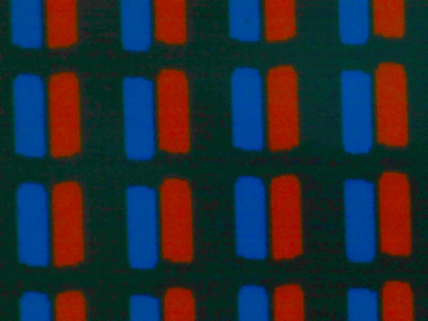
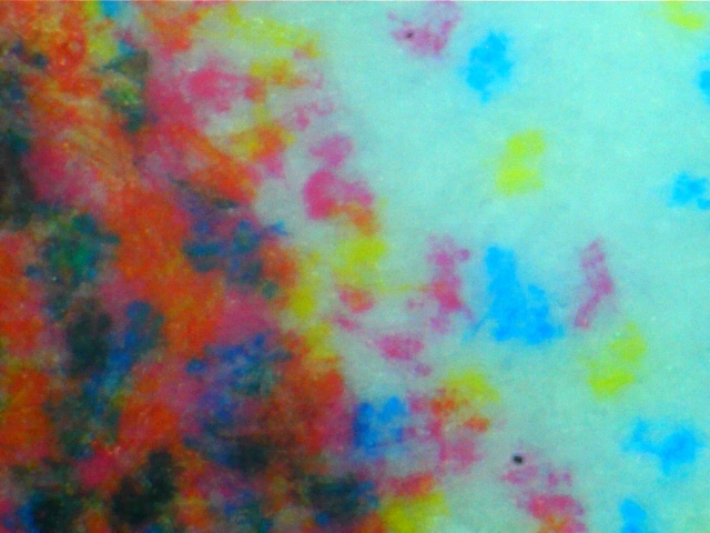
Actual pixels doing this on a real laptop screen can be seen below, photographed at 20-times magnification, using my USB microscope. (I turned the picture on its side so it looks more like the RGB diagram above, though the background below is white, not black):
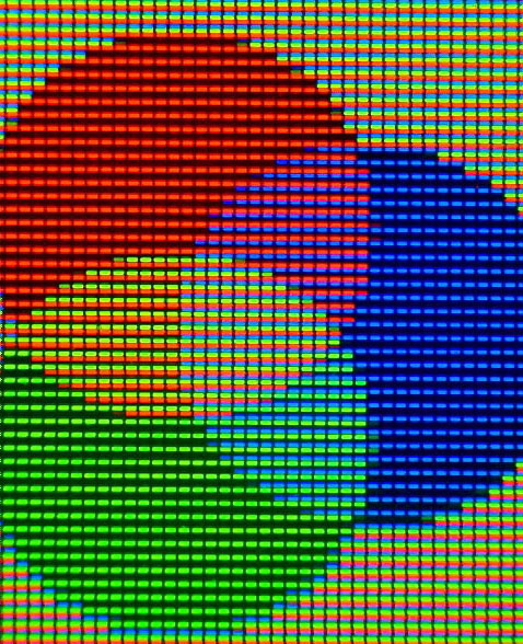
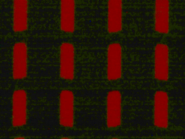
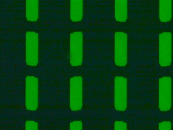
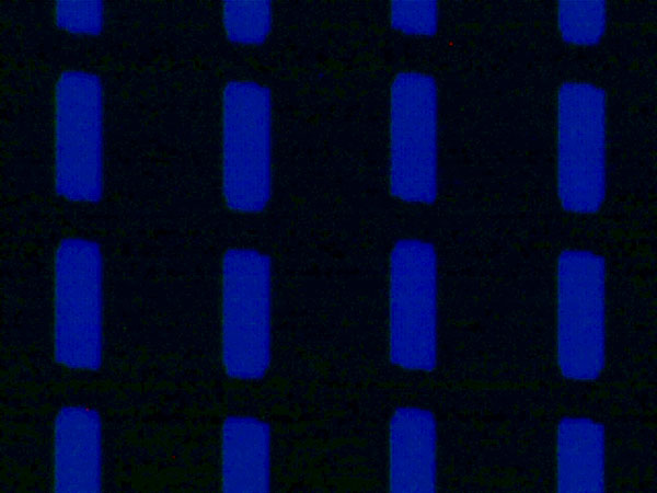
Below are the three RGB colours in close-up, photographed at 400-times magnification from the same screen. They look as if there is too much black on the screen to make a “solid” bright colour. In reality each pixel is of course blazing with light. So what your eye sees is the colour shown in the smaller square on the right:
 =
= 
 =
= 
 =
= 
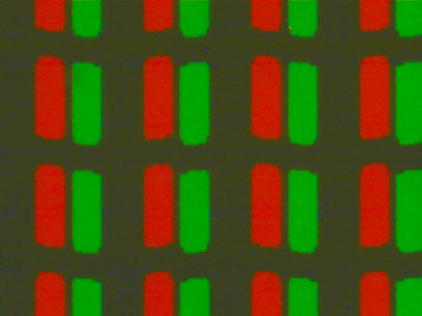
And below are the colours from the overlapping areas of the RGB diagram, also at 400X. These are known as Cyan (the pale aqua blue), Magenta (the pinky red) and straight Yellow:
On-screen cyan:
 =
= 
On-screen magenta:
 =
= 
On-screen yellow:
 =
= 
That last one above, as an example, doesn’t really look very yellow, does it? At least, not when magnified 400 times. Try looking at this detail of the yellow part of the RGB diagram (below) at 20X magnification, with its green and red components also shown. How’s that looking? (Clicking on it shows a larger version):
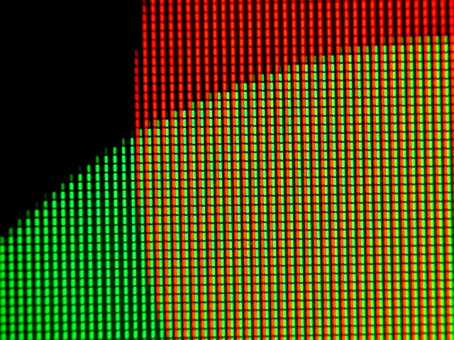
Are you starting to see how the illusion of yellow is created? (Getting a bit further back from the screen than usual might help.) It’s an “illusion” in that there are no yellow pixels, only red and green on a black background. Certainly looks like yellow by the time it’s been through your eye and reached your brain, though, doesn’t it?
And this is how your screen shows you white at 400X:
 =
= 
And below, photographed at 20X, is the white background behind a familiar blue “e”:

Likewise this doesn’t look very white, though you know it “really” is.
And if these enlarged images of “screen yellow” and “screen white” don’t look as if they should really work, that may not be the only thing about RGB colour which seems “wrong”, at least compared to the colour mixes we see or paint on paper.
The RGB model, so familiar on our screens, is quite different from another kind of colour mixing that we also think we know very well… the kind we learned in painting classes. What happened to the famous “three primary colours” we were told about at school?
They are not the Red-Green-Blue trio of RGB, but “The three colours, red, yellow, and blue, that can be mixed together in different ways to make any other colour,” as the Cambridge Online Dictionary says — often shown like this:

Well, those primaries may work (up to a point — see below) on paper or canvas. But these three primary colours were conceptualised by François d’Aguilon in 1613 when the colours of pigments used to make oil paints were the key factors in people’s minds. This was before full-colour printing on paper was even possible; light came from candles, not light bulbs or LEDs, and screens were things you sat behind to confess to your priest. Electricity only entered someone’s life if they were unlucky enough to be struck by lightning.
And the lit-up electric-powered screen is a very different thing from a painting or a print on paper. On a screen we see additive colour, made with transmitted / emitted light, and the three screen primaries are clearly red, blue and green. These three colours add together to make the various combinations — clearly shown in this photo of three spotlights shining the RGB colours onto a wall. (Possibly a little Photoshopped… but an illustration that makes its point.)
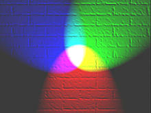
Thanks again to Wikipedia for this photo
Isn’t that what we do when we mix colours with paint, though, or print with coloured ink on paper — add colours together? Strangely enough, no. What we are doing then is taking colour away — subtracting it. We are taking colours away from white.
White paper is not emitting light. It gets its whiteness from reflected light. The white reflected light is still made up of all the colours of the spectrum mixed or added together, just like the white light where those three spotlights overlap. This is seen when prisms or raindrops split white light into its component colours, and we see a spectrum or rainbow.
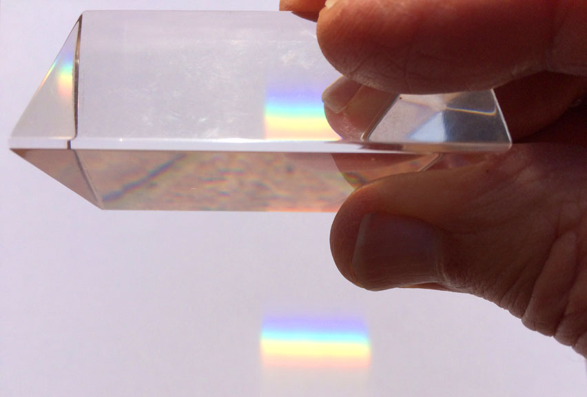
What makes colour subtraction different from addition is that paint or ink put onto white paper absorbs some of that reflected light, taking it away from the white. This is in some ways the opposite of what happens when light is emitted from a screen.
So: on a screen, colours mix in an additive process.
On paper, colours mix in a way which is called subtractive.
Which neatly brings me on to:
3. CMYK COLOUR
The computer screen may bring us most of our images, but we are still living partly in the world of paper, and probably have to print stuff out now and then. Your home or office printer is a place where you will see CMYK colour at work, as anyone who has changed its ink cartridges may have noticed. As with the RGB pixels on screen, the printer uses its own tiny dots to build up images, and a very limited number of colours — in this case not three, but four.
C, M & Y are the Cyan, Magenta and Yellow that we met a while back, where the R, G & B overlapped. K is Black. Obviously. Even if my Epson ink set calls it BK, just to be awkward:
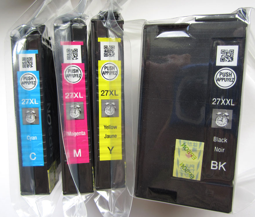
Below is a picture of the Legion of Andy. I have printed out a paper copy to show how my Epson inkjet printer makes the image.

Paper image, enlarged (Click to enlarge. Back button or arrow on your browser to return here.):

Above: Andy’s skin at 20x and 400x.
Below: Andy’s cigarette end, ditto.

As with the pixels, I don’t think anyone would call these printer dots “Ben Day dots.” They are too irregular in shape and pattern. People tend to use the name “Ben Day dots” for neat, regularly spaced, round ones — and they are partly right (of which, more later).
So, my/your printer is using a subtractive CMYK process. And most things printed on a surface — such as paper, but also other packaging materials — will be printed using CMYK (some exceptions will be shown later).
The colour diagram or “model” of CMYK will look fairly familiar to anyone who ever mixed their own paints:

Picture from Wikipedia
In the centre is a black area, where all the colour has been subtracted from the white light by the overlapping cyan, magenta and yellow. In real-world printing, the overlapping colours tend to make something that isn’t really good enough, and black is added to improve the final image. (Some black dots are visible on Andy’s cigarette, above.)
As we will see later, in the days of the real Ben Day dot, and in the comics, the black part of the image was even more important. In fact it was known as the “key”, which is where the K for black in CMYK comes from. (Some sources suggest it was called K rather than B so as not to get muddled up with B for blue. This may have been helpful in some circumstances, but since the blue is actually called cyan or C, it is less likely than the “K for key” story.)
In the CMYK system, it is cyan, magenta and yellow which are the primary colours, not blue red and yellow. These are the colours that really can be “mixed together in various ways to make [just about] any other colour,” as the dictionary had it.
4. THE ROAD TO CMYK
CMYK or standardised “four-colour” printing really only arrived in the early twentieth century. Here’s a very condensed version of the road to CMYK:
Pictures and words carved onto wooden blocks, inked, and printed onto paper were probably first produced in China around the year 200. Reusable “movable type” printing blocks, for printing words, were also developed there in about the year 1000 CE/AD. It was in the 1400’s that both these methods came to Europe.
In Mainz, Germany, Johannes Gutenberg had his metal movable type and printing press running by 1450—one of the key developments in human history.
Pictures printed from carved wooden blocks had arrived in Europe a few decades earlier.
Most pages were printed in black or one colour. Coloured illustrations were usually only achieved by hand colouring, which in larger editions increasingly came to involve stencils. Only a “solid” colour could be stencilled on, with no gradations. A red ink could not be broken up into dots to make pink, for example. This example below, from http://www.prepressure.com/printing/history/1800-1899, is said to be a “nineteenth century penny print” using three “spot colours”:
In the very early, experimental days of colour printing, from 1710 onwards, pioneer Jacob Christoph le Blon did use the three old primaries, red, blue and yellow, sometimes with black. He engraved three or four copper printing plates (as shown below) by hand for each print, using a mezzotint method—one of the ways engravers created grey tones in B&W prints. This allowed for gradations of colour. But his method was very expensive and time-consuming, and did not catch on.
What took colour printing forward were advances in lithography, invented around 1799 in Munich, Germany, initially using stone printing plates, then metal. The images on the printing plates were still drawn by hand, then etched into the stone or metal with acid.
There is a lot more on lithography—especially the part Ben Day dots played in its success from the 1880s onward—in Part 5 and Part 5-&-three-quarters.
In 1837, Godefroy Engelmann patented his technique of chromolithography (colour lithography) which dominated colour printing for decades to come. In the making of high end prints, for framing on the wall, several colours might be used, including two different reds, two blues, even blended shades of black, for example. Inks could be mixed to suit the job at hand.
This one, “Love or Duty“, an 1873 chromolithograph by John Baptiste Jehenne— from a painting by Gabriele Castagnola—is frankly just showing off (click to enlarge, back button/arrow to return):

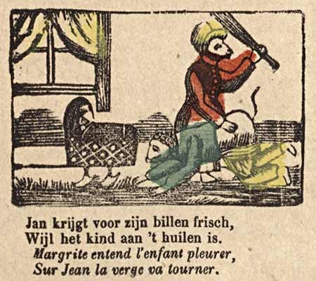
By the late 1800s, relatively cheap colour lithography was being used to make large editions of greetings cards and book illustrations. This birthday card from about 1888 is a more everyday example. If click to enlarge, you may start to see the lithographic dots!
Newspapers, printing mainly words set in metal type, remained black-and white at this time. They used letterpress printing with metal plates, and cheap very absorbent paper called “newsprint.”
The type-revolving cylinder press (using cylindrical printing surfaces, not flat plates) speeded up printing from 1848.
The revolutionary web rotary press — the classic newspaper press with the vast rolls of paper being fed through continuously, and printed on both sides at once — was invented in 1870.
In 1890 the first four-colour web rotary press was built in Paris by Hippolyte Marinoni for his newspaper Le Petit Journal—another revolution. The French printer could in principle have used Ben Day at this time; the method was well-established in colour lithography, but not popular in France. In addition, it would have required new skills to adapt to letterpress printing of this kind. Marinoni chose a different method for his highly-successful colour supplement. More on this in later chapters.
In 1892, this type of press arrived in the USA. The first American newsprint weekend colour supplements were printed in Chicago in that same year, 1892—see Part 6.) The Chicago Inter Ocean newspaper used presses directly inspired by Marinoni’s, but built in the USA on slightly different lines. The Inter Ocean also used non-Ben Day methods of making colour printing plates.
At first only the big city papers, which owned their own printing presses, could afford the new technology. New York was next. From 1893, New York papers started to acquire colour rotary web presses, and within a few years the Sunday newspaper comics section was born in that city—yet another revolution! Right from the start, the Ben Day dot became an integral part of colour comic strip production.
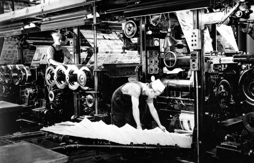
I think this picture below is a web rotary press, circa 1940:
For some years, each newspaper’s staff chose which colours of ink — up to four — to use. But as colour printing spread, it made sense for every mass-production printing business to be offering pretty much the same four colours as everyone else.
The standardised cyan, magenta and yellow are widely reported to have arrived in 1906, when the Eagle Printing Ink Company of New Jersey introduced a new type of wet process inks, in the CMYK colours.
[Update July 6th, 2020: No details of this supposed 1906 development in coloured inks have ever been available online before; just numerous brief re-statements like mine above. However, colour printing expert Brian Gamm has now researched the issue thoroughly. The big advance around that time was new inks suitable for ‘wet-on-wet’ four-colour printing on glossy paper (i.e. for the more expensive magazines rather than the newspapers).
See Brian’s new web site here: http://cmykhistory.com/ and his article on the Eagle company here: https://cmykhistory.com/thomas-a-lenci-and-the-eagle-printing-ink-company/ ]
The colours themselves had been around for a while. Now, in an evolutionary process comparable to Darwin’s “survival of the fittest,” these four hues really came into their own.
It took a long time, though. In 1927, Arthur H. Ogle, Secretary-Treasurer of the Association of National Advertisers, Inc., wrote a piece called Achievement in Color Process Standardization. He was clear that much remained to be done: “It is but natural that the keen minds of the printing and engraving industry should have turned to the standardization of process color inks… It has long been the dream of a group of devoted crusaders… it will soon approach accomplishment…”
He continued: “The technical work, faithfully carried on over a period of years by the Standardization Committee of the American Institute of Graphic Arts, has reached a stage where printing in the standard colors is already being widely done.” On the other hand, “One publisher of an important trade paper has told us that in a recent issue he had twelve color pages, and… an entirely different combination of colors for each of the advertisements!”
Ogle was confident that standard colors had so many advantages that progress would continue, though it would require effort from the righteous, and further improvements could be expected. “The colors themselves are… something of a compromise between the theoretical ideal and the practical necessities… in time we may surely expect better colors than those which we now call standard.” He only meant improvement at a detailed level, though. The four colours were and still are:
Cyan: the name given to a printer’s (or “process”) blue which effectively has no red or yellow in it. (The name cyan was reportedly first applied to a printer’s blue in 1879, the same year that Ben Day launched his dots.)
Here is a quote from Wikipedia about magenta, which was: “…first introduced as the color of a new aniline dye called fuchsine, patented in 1859 […]. Its name was changed the same year to magenta, to celebrate a victory of the French and Sardinian army at the Battle of Magenta on June 4, 1859.”
Magenta, a.k.a. printer’s red or process red, is quite different from the scarlet, “pillar box” or “fire engine” red we were given at school as a “primary” colour. I can’t have been the only schoolkid who ever got upset because mixing my red and blue paints made a nasty brownish colour, not the purple I was promised — due, as I now know, to all the yellow in my “primary” red. (Perhaps by now art teachers have wised up to this problem? PLMK!) A variety of pleasing dark blues and purples can be mixed from cyan and magenta in various proportions, without brownness creeping in.
Printer’s or process yellow is similarly a neutral yellow. As shown on the CMYK diagram, “fire engine” or “pillar box red” is a secondary colour in this subtractive colour model. That is, it’s what you get when you mix two other colours — in this case, magenta and yellow in equal proportions.
Speaking of which, take another look at the additive and subtractive colour diagrams below, now seen side by side.
5. CMYK vs. RGB
The overlapping (secondary) colours in the RGB / additive system are the same as the “pure” or primary colours in the subtractive CMYK system, and vice versa — the three pure RGB pixel colours show up where two CMYK primaries overlap. And in the middle of one diagram the colours overlap to make white, in the other, black.
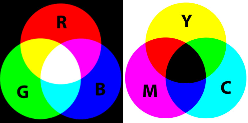
The RGB colour model (on the left) and the CMYK model (right)
I was fairly gobsmacked when this fell into place for me. It seemed almost crazy, but on the other hand, it helps to show that the two processes really are in some ways opposite to one another.
This may also help explain something that you might have noticed in the real world; getting a coloured image on your screen to print out faithfully is not a straightforward matter. Partly, of course, this is because ink on paper lacks the brightness and vibrancy of a light-emitting screen. And in practice, process cyan, magenta and yellow are not exactly the same hues as you see on your screen. But it’s also because the computer/screen combo and the printer are using completely different colour systems, pretty much opposite to one another. In practice, some very clever software is needed to translate RGB into CMYK.
Where that translation needs to be extraordinarily good is in the world of photography, where a top-quality print is required. But it is also important when reproducing colour pictures in books, magazines, comics and newspapers — and on cereal packets etc..
Which brings me to my next section:
6. FOUR-COLOUR PRINTING WITH CMYK IN NEWSPAPERS, COMICS… etc.
Your printer is one place where you might see CMYK in action in today’s world (for the benefit of future scholars, that is the world of 2015).
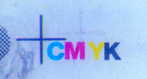
Here is another. These images appear on every page of my daily newspaper:
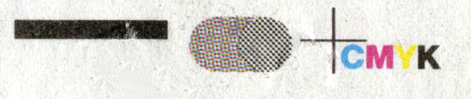

They have been set up to show at a glance if the four printed images that make up the page — still one for each colour, just like M. le Blon in 1710 — are printing well, and are lined up (or “registered”) correctly. The set of registration marks above looks pretty good. The marks below are from a page that is slightly misregistered, with a close-up of the top of the cross. None of the four images is precisely aligned with any of the others here:

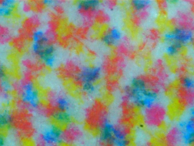
Mass-produced printing has moved on a long way since 1961, when Roy Lichtenstein started making advertisements and four-colour comics his source material. Most newspapers have colour on every page now. In those days, most daily papers were printed only in black and white. The more expensive coloured sections were confined to the weekends, mostly Sundays. In the Sunday comic strips, and in the U.S. comics, printing of this standard (seen here at 20x, an image from few years after 1961, I know) was fairly common:

Today’s newspapers rarely achieve anything that dramatically bad, and if they do, those pages are unlikely to be let out on the streets. Comics have improved even further than their newsprint cousins, relatively speaking; they long ago ditched the cheap “newsprint” paper, for a start. And they print with much finer dot patterns, giving a smoother look to the artwork. Many have digital / on-screen editions too, of course, or are even screen-only.
But the relevant point here is this: very few of the mass-produced paper media that you will see every day (including the comics and the newspapers) are printed by digital means — unlike the pages you make for yourself with your desktop or office printer. There is an intermediate stage in mass-production, as mentioned above — the printing press.
And while your own printer prints out a CMYK page in one go — all the coloured dots, of all four colours, being laid down in a complex sequence as the paper moves once through the printer — the printing press still uses four stages in printing, one for each of the CMYK colours, one at a time. Four different images are printed one after the other, progressively building up to the full colour version. That’s why the four images need to be very closely lined up with each other. Otherwise the final result is something like poor Captain America, above.
Early comics used metal (letterpress) printing plates, transferring coloured inks straight onto paper — like early newspapers. By the 1950s, most newspapers and magazines used web offset printing, a.k.a. offset litho in which curved metal printing plates carried the inks onto rubber blankets, and the blankets carried the image onto the paper. Printers of comics also moved over to offset litho, but it is not clear exactly when they switched. For example, World Color Press in Sparta Illinois, were printing DC comics from 1955, and World Color reportedly started using web offset printing in 1956. However I suspect that their offset presses were used for other magazines, not comic books, until the 1980s. [EDIT: Later research showed that this was correct, with deluxe comic books like Camelot 3000 (1982) and The Dark Knight Returns (1986) leading the way, and regular comic books later making the switch to offset litho.]
Marvel only switched to World Color in 1969, having printed before that with Eastern Color in Connecticut (as DC previously did too). I have been unable to find out whether Eastern Color ever switched to web offset.
The colours used were (and are) CMYK whichever actual printing method was (is) used.
In 1977, World Color published a promotional comic book, Magazineland USA, illustrated by Joe Kubert, showing their comic book printing presses in action. The process looks like letterpress, apparently printing from metal-plated cardboard stereo mats [Edit: definitely still letterpress in 1977].
To read Magazineland USA, visit Rick Diehl’s pages here: https://studdblog.blogspot.co.uk/2011/08/magazineland-1977-complete.html?showComment=1499765504392#!/2011/08/magazineland-1977-complete.html

CMYK is a four-colour process, and everything printed using CMYK is four-colour printing — a name which was often used in the printing and publishing business as shorthand for CMYK.
On the letters page of Boys’ Life magazine for September 1954, Vance Everett of Scotch Plains, New Jersey, wrote to the editor: “You said the Outdoor Code in the March Boys’ Life is in four colors. I counted more than four colors. Who goofed?” The editor replied: “No-one goofed. You have just learned one of the terms of the printing trade. Actually the page was printed with four different colors of ink, skilfully blended to bring out practically all the colors possible. Printers and journalists refer to full color reproduction as four color work.”
But the name “four-colour” stuck particularly to the comic books, perhaps because their crude printing — those dots! that poor registration!— made the process more obvious than the sophisticated half-tones used to reproduce photographs etc. in glossy magazines.
Dell comics published over 1,000 issues of their Dell Four Color Comics between 1939 and 1962, featuring a revolving line-up of characters including Santa Claus, Francis the Talking Mule, and the gun-toing Dick Tracy.
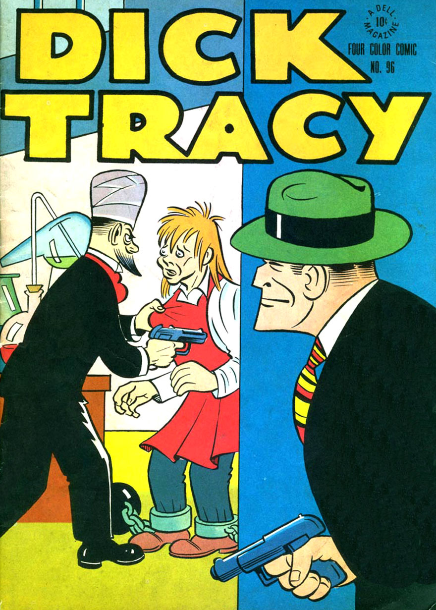
Dell Four Color Comic no. 96, 1946
Publishers like Dell, fans of comics, and other commentators might use the name in a neutral way — e.g. “four-color fantasies” — but it is also very likely to be found in negative terms like “four-colour nightmares” from the time when comics were being persecuted in the 1950s.
In earlier versions of this post, I somehow managed to forget about http://4cp.posthaven.com/in-defense-of-dots-the-lost-art-of-comic-book which is dedicated to the four-colour comic book panel in all its glory. Beautiful work from John Hilgart, and a must- visit site.
Did I mention cereal packets…? My morning breakfast cereal comes in a box printed with CMYK plus 1 — the +1 is a dark green ink, known as a spot colour. This is not unusual in packaging, and is often seen on book covers and elsewhere. Here’s the cereal box registration mark and a close-up of part of the product’s logo. This shows that most of the green is still made up of blue and yellow dots. Only part of the logo uses the green ink:


These dots are one kind that people will often call Ben Day dots. “If you blow up a printed picture like this,” they will say, “you can see the Ben Day dots.” This is not true. These are halftone dots, as seen in Part 2 in black & white photos prepared for newspaper printing with a “halftone screen”. These are the modern, colour, equivalents, produced by software rather than by glass screens in a camera. Not Ben Day dots. Different animal.
By contrast, this cellophane wrapper (below) for Swizzels’ Fizzers is only printed with solid colours of black, white and pink — all ‘spot colours’ — no CMYK mixing at all, and no dots. Also still common in packaging, though much more common in days gone by.

Meanwhile, back at the the four-colour process, here’s Cap again on the cover of Avengers 201, cover-dated November 1980. The printing of this comic was basically the same as it would have been in 1960. Some details were different, but surprisingly little had changed even since Cap first hit the printed page in 1941! (It was in the 1980s that changes — mostly for the better — really accelerated.)
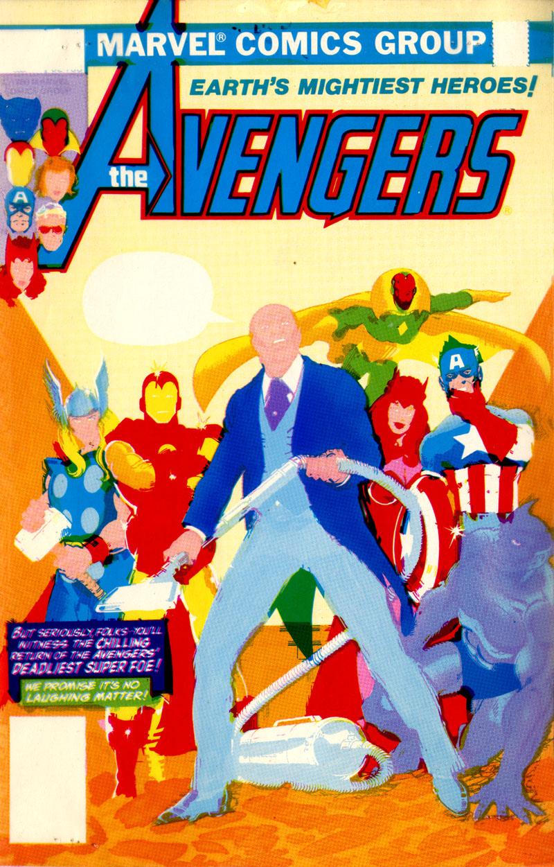
The next eight pictures are scanned directly from four actual test printouts — “proofs” — sent to Marvel Comics’ art department from the printer for approval. (A few red marks can be seen on the black and white picture, indicating corrections needed.)
To start with, here are the four images in CMYK order:


They are printed on clear plastic (acetate) at the same size as the comic, and are exactly the same as the four steps in printing, if they were done individually.
On the printing press the four individual prints would not be made like that. The order of printing was yellow, red on top of the yellow, thirdly blue added, then black. The acetates were stapled together for the editor to view in this order, on a white backing. Laying the transparent images over each other is just like watching the progressive printing process happening. Hence sets of acetates like this are called progressive proofs. Again, these are real scans of the actual acetates:
then 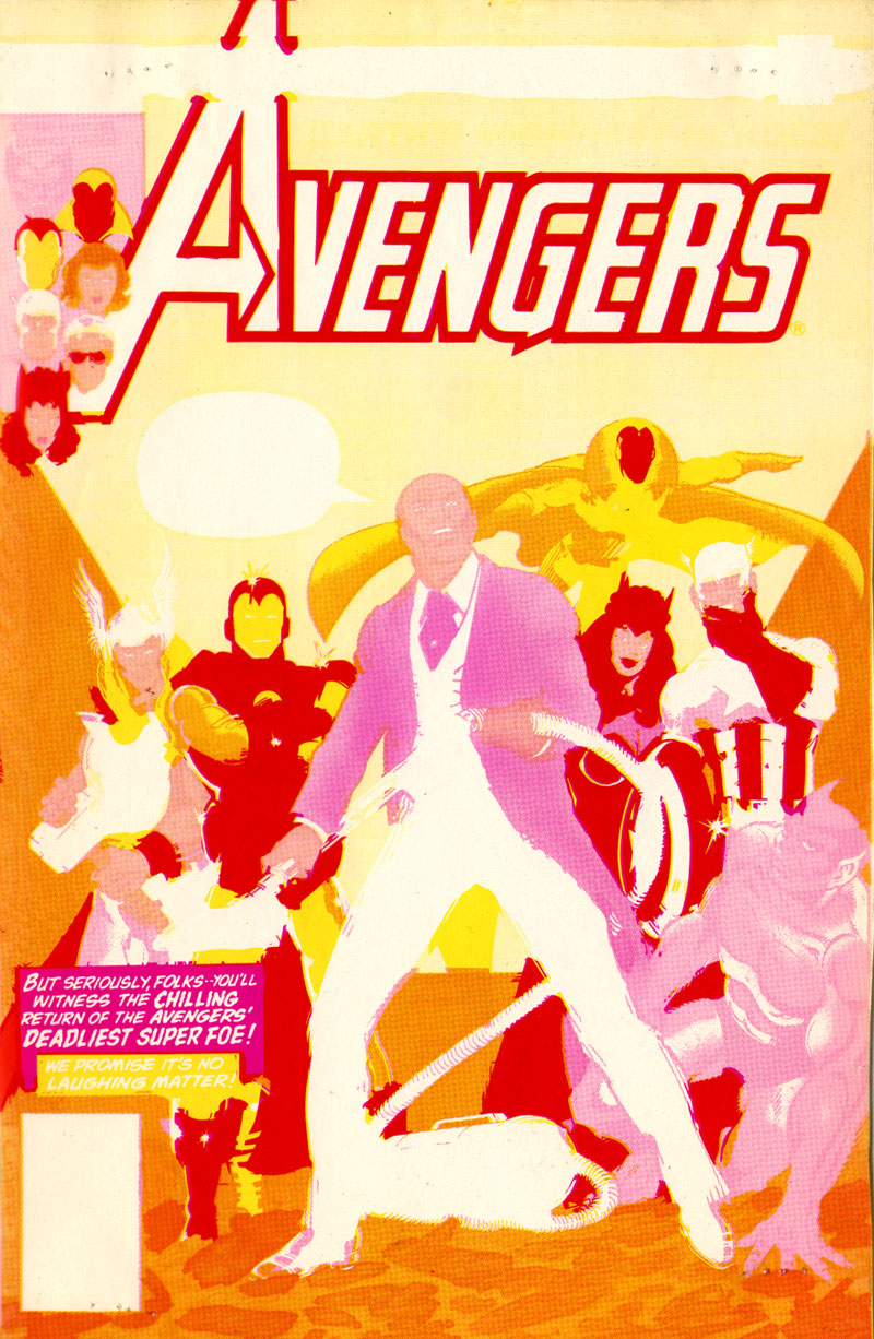 then
then
 and
and 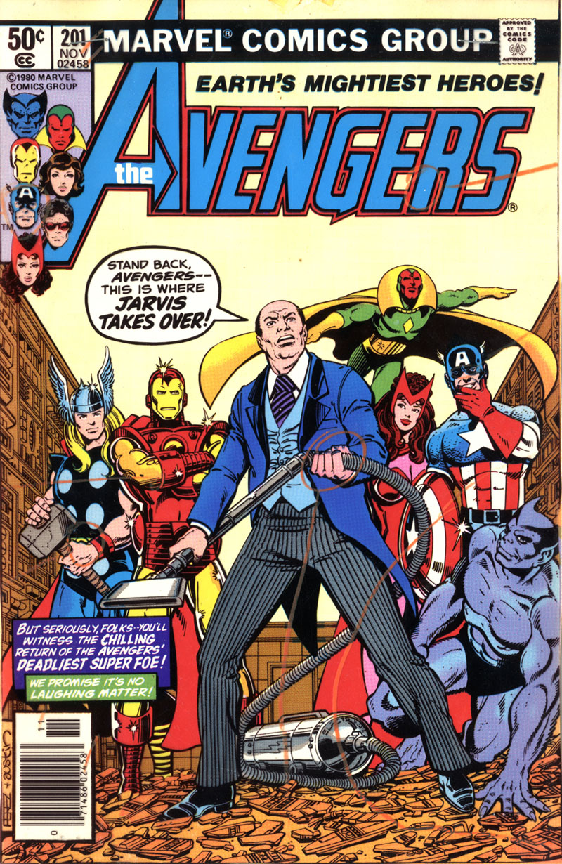 .
.
The Marvel staffer saw the final version first, and could look underneath to view the lower layers if flaws were apparent.
Comic book publishers in those days only viewed proofs of the covers. Making advance proofs of the interior pages would have been too costly and time-consuming. Apart from anything else, these were physical objects which had to be mailed around the country. Imagine that!
Finally, here’s another one I really love, but don’t — alas! — own: the cover of Daredevil 38, March 1968. Progressive proofs were printed on paper, not acetate, in those days, and these were photographed rather than scanned.
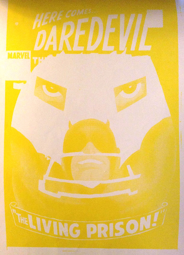
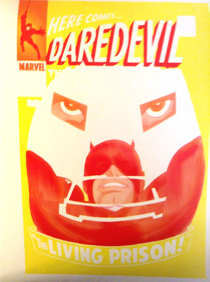

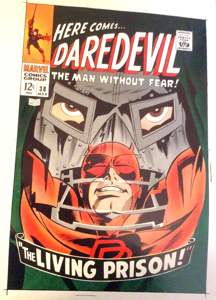
In Future Posts I will look at how four-colour comics images were produced after the penciller and inker had done their jobs and delivered a black-and-white drawing. Will that — finally — involve Ben Day dots? Again, “Yes and no.” You will , I promise, find out why I keep saying that.
See you then, I hope.
Text and original images copyright © The Legion of Andy 2016
guy.lawley@btinternet.com

Pingback: BEN DAY DOTS, PART TWO | LEGION of ANDY
Pingback: ROY LICHTENSTEIN: THE MAN WHO DIDN’T PAINT BEN DAY DOTS | LEGION of ANDY
In French, the four-colour printing process is called quadrichromie.It obviously comes from Latin for ‘four colours’, but what an impressive term! Unfortunately, nobody understands it outside of the French-speaking world, so we have to use the cruder term CMYK…
Hi Matthieu. I don’t know how I missed your comment until now.
Many apologies!
I love the word quadrichromie!
Also chromotypographie! (A French speciality, of course)
It’s a shame they don’t get used more often.
Hi Andy….I am the coauthor of The Secret Language of Color. I am coauthoring a 2nd book called What Is Color? and would love your permission to use the all images you posted of the pixels in Section 2. RGB Colour – Red, green, & blue dots on a screen near you now.
Hi Joann.
I’d be happy for you to use those images, with appropriate credit given.
They were taken from an older laptop, in 2015, and do not represent more modern screens, as far as I know; e.g. the ‘retina’ screen on the iPad which I’m typing this on looks quite different…! (As I’m sure you know.)
Also I might have higher res images in my old files.
I’m on holiday right now but will be home in six days.
If you can wait I can confirm then if I have better images.
(They won’t be amazingly good… simply taken with a very basic low cost USB microscope.)
We could perhaps move this conversation to email…
Perhaps you could send me a direct mail at
guy.lawley@btinternet.com
Best wishes,
Guy ‘LegionofAndy’ Lawley
Hello Andy,
I am researching the innovations surrounding the introduction of four-color wet process inks and was wonder if you could share your references for the comments below. I’m looking for primary sources that I can search around. I found a lot about Marinoni, but nothing related to the use of his press for four-colro pritning. I also found a bit about Eagle Printing Ink, although nothing specifically stating the year 1906. For the last reference, I’m not getting any hits on Arthur Ogle or ths cited article. Any help you can provide in locating these sources would be appreciated. Thanks!
–“In 1890 the first four-colour web rotary press was built in Paris by Hippolyte Marinoni for his newspaper Le Petit Journal—another revolution”
–“The standardised cyan, magenta and yellow are reported to have arrived in 1906, when the Eagle Printing Ink Company of New Jersey introduced a new type of wet process inks, in the CMYK colours.”
–“In 1927, Arthur H. Ogle, Secretary-Treasurer of the Association of National Advertisers, Inc., wrote a piece called Achievement in Color Process Standardization”
All the best,
Brian
Hi Brian.
Thanks for the questions and for taking this to email; your own insights are really interesting.
I’m leaving this here in case it helps clarify anything for others.
I’ll send you some contemporary sources confirming the 1890 date of this Parisian invention, and how successful it was.
There’s no doubt that it predated the Chicago and New York colour newspaper presses. It also directly inspired them.
But the US presses were re-designs, first by Scott then by Hoe, as you know.
The 1906 date for ‘Eagle’s new CMYK inks’ is all over the ‘net but I can’t find any clear or historic source for it.
Ogle’s essay was in the 1927 book Achievement in Letterpress edited by L. Flader.
Guy
Pingback: Thomas A. Lenci and the Eagle Printing Ink Company – CMYK History
Pingback: Kleur | Drabkikker
Hi Andy,
This is great! Thanks for explaining all of this. This is exactly what I was looking for. On the part where you discuss the progressive proofs that would be sent to the Marvel Comics’ art department from the printer for approval, do you own that progressive proof for the Avenger’s comic? Would only one progressive proof be made per comic issue?
Thanks!
Ryan
Thanks, Ryan.
Yes, I bought that set of proofs from eBay.
And yes, routinely I’m pretty certain only one set of progressive proofs would be made.
Maybe for a prestige project, if major changes were needed, they might order a second set, to check the changes had been made as requested before going to print.
Generally in the rush to meet deadlines only the one, and mostly of course, just thrown in the trash after use.
Guy