
EXIT BEN DAY, ENTER CRAFTINT
See also:
- Part 1—Roy Lichtenstein—the man who didn’t paint Ben Day dots
- Part 2—Halftone dots, Polke dots, more Roy
- Part 3—CMYK / Four-colour comic book dots vs. RGB dots on screens
- Part 4—Pre-history, origins—Ben Day in the 19th century
- Part 5—Ben Day in lithography
- Part 5.5—French comic strips of the 1880s. Coloured by relief aquatint.
- Part 5.75—A lithographic protocomic (?) from 1885
- Part 6—Ben Day meets the Sunday Comics in the 1890s
- Part 6.1—Tarzan and the Ben Day Dots—secrets of 1930s comic strip colour
- Part 6.2—Fun With (Mis-)Registration—when colour printing plates don’t line up
- Part 7 — The Birth of the Comic Book
- Part 9a — 1950 & 60s: The “Silver Age” of Comics, Part 1
- Part 9b — 1950 & 60s: The “Silver Age” of Comics, Part 2

Most images—the above included—can be clicked to enlarge (use back arrow or button on browser to return here).
All text and originated images copyright © 2016 Guy Lawley. If quoted or cited please give link and credit. Thanks!
Contact: guy.lawley@btinternet.com
~~~
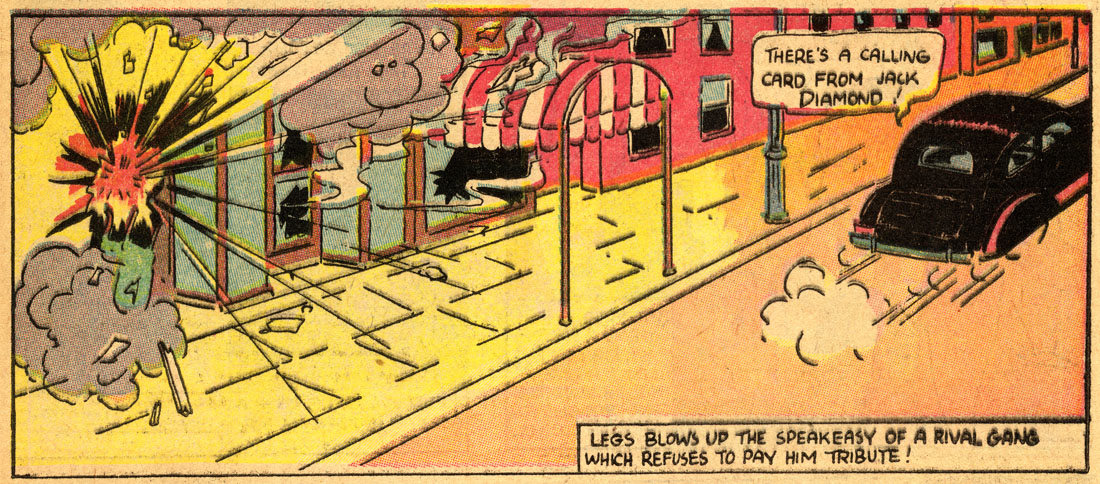
Those first engravings were beautiful things. They had the Ben Day process then and those Ben Day men were artists—they could get the colors. Then they got cheaper and cheaper and now finally there’s no Ben Day work at all. They use a different process that’s cheaper and not nearly so good.
—Hal Foster, 1971—talking about the early days of his renowned Sunday newspaper strip, Prince Valiant, which started in 1937. Quoted by Phil Normand, here.
Jack Adler: At first, the union forced them to bring in Benday artists, and they brought in ten Benday artists, but it just wasn’t adequate.
Sol Harrison: They could never have created the industry that we have today if they kept Benday men only. They had to find faster ways of making the [colour] separations.
—DC Comics’ two production chiefs discuss the early days of the comics business—the 1930s, at Strauss Engraving in New York—The Amazing World of DC Comics no.10, January 1976.
A method has been provided whereby line and halftone [sic] color plates may be made quickly and easily, without the use of color filters, halftone screens or Ben Day shading machines. It will also be apparent, since such equipment is not required, that relatively unskilled and inexpensive labor may be employed in the preparation of the color plates…
—from US Patent no. 2,224,270 for the Craftint Multicolor process (launched 1934)

DC Romance, Craftint style
INTRODUCTION:
Recap 1: Ben Day Dots
Recap 2: Line Art vs. Halftones
Recap 3: Ben Day in the Comics—up to 1938
Ancestors — Lithography & the first Sunday sections
Peak Dot — Hal Foster’s Prince Valiant, 1938
The First Comic Books — 1933 and all that
THE COMING OF CRAFTINT
The Forgotten Tints — Who remembers Craftint Multicolor?
Secret Oranges — When did Craftint take over from Ben Day?
Book of Revelation — What the heck are all these lines?
Lines of Enquiry — Searching for clues
CRAFTINT COLOUR IN THE COMICS
CMYK Again — 4 colours
Prize Comics no.44, 1944— A prize example
Craftint Multicolor: A Limited Palette
Limitations of the method — from 4 colours, 64
Self-Imposed Limitations — 32 or 24 colours
CRAFTINT SINGLETONE AND DOUBLETONE
The Craftint Manufacturing Company — Not just paint-by-numbers sets
Craftint in Black & White — Singletone and Doubletone board
The Naming of Names — Doubletone or Duo-Shade?
Range of Tints — Many dots, many lines
How Did It Work? — Chemistry
A Detailed Look at the Board — With special guest star
Singletone in Comic Strips — Superman, Noel Sickles
Doubletone in Comic Strips — Roy Crane, Floyd Gottfredson, Jack Kirby
THE CRAFTINT MULTICOLOR PROCESS
It’s Like Doubletone, But With Dots As Well As Lines — and there were 4 of it
The Problem of Screen Angles — Seriously, just forget I ever mentioned them
Multicolor Board at Work — A lot easier then Ben Day
Hypothetical Example 1 — Baby steps
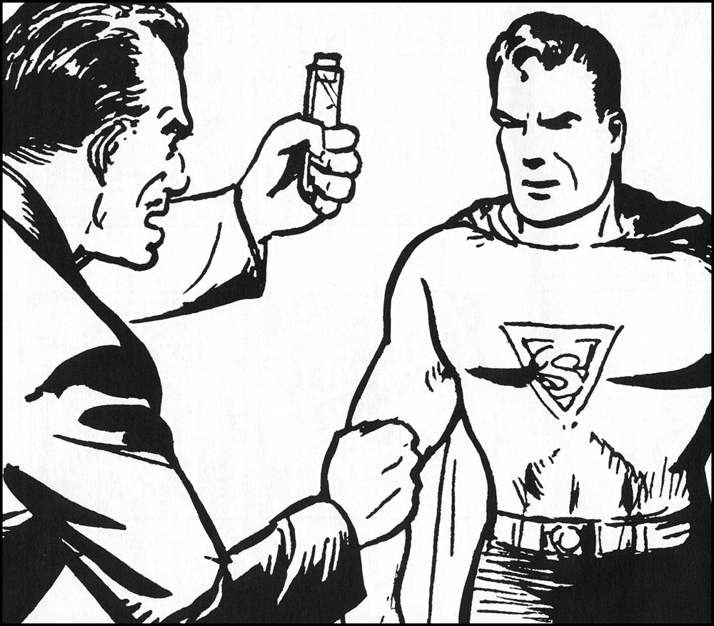
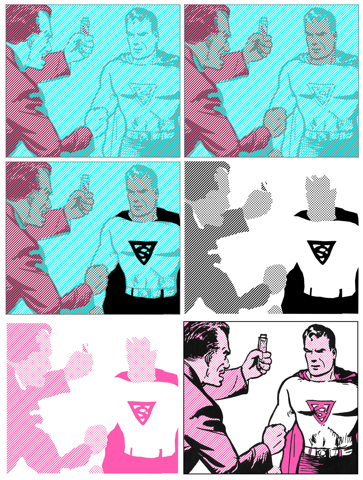
COLOURING SUPERMAN WITH CRAFTINT—Hypothetical Example 2
Superman Blue — Separating Superman
Superman Red — Step 2
Superman Yellow — It gets easier
Progressive Superman — CMY, no K
4-Color Superman — Contains K
CRAFTINT MULTICOLOR ANOMALIES
Negative Dots — An absence of colour
Graduated Tints — A Craftint overlay?
CONCLUDING REMARKS
Not The End For Ben Day — Only in the comic books
Gains and Losses —Towards a comic book aesthetic
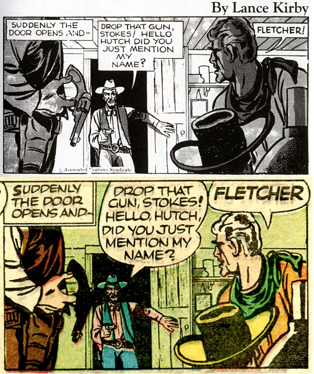
Return to 1963 — Alan Moore & co revisit the past
COMING ATTRACTIONS — There’s more?!
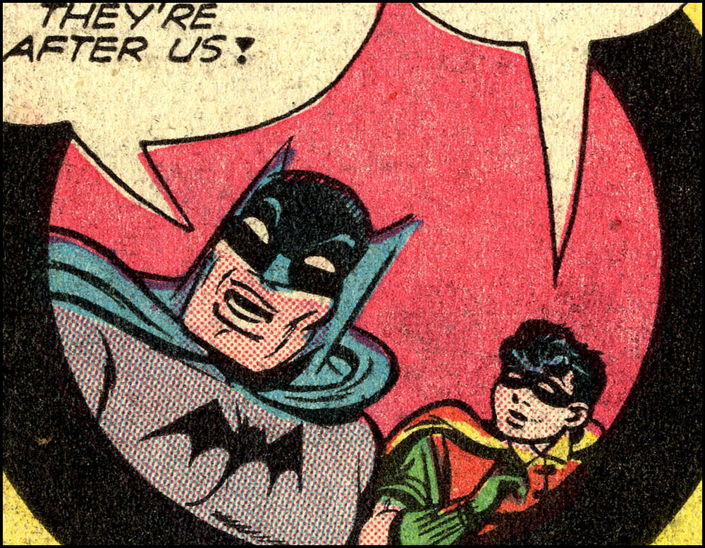
Batman and Robin, 1941 style. Contains Craftint.
Today most graphic artists, including those who draw for comics and manga, use digital methods on a computer for part or all of the drawing process. In the main that includes both colouring and the creation of dotted tints, or “screens”.
Anyone taking an interest in the more hands-on methods used in the past—Ben Day dots, say, or Zip-A-Tone—will find plenty of information online with a quick Google search—and nearly all of it will be wrong. The Legion of Andy has undertaken the task to make some accurate information readily available online—some of it for the first time.
This post will describe how the Golden Age comic books replaced the Ben Day method with something new—a faster, cheaper method for making their colour printing plates—Craftint Multicolor.
Most of this information is not available elsewhere online at all. The honourable exception is Phil Normand’s post Tarzan and the Ben Day Men. As ever, I tip my hat to Phil.
Later in this post I will show you Craftint Multicolor in action on comic book pages, and describe how it worked. First, a recap of the method it replaced, with particular reference to tints in the form of lines…
As seen in previous posts, comic strip art of the early 1930s—like many other types of illustration printed by letterpress, black & white or coloured—started with a B&W drawing, done by hand on drawing board. Both dotted black tints—for grey shading in B&W—and the dots used to make pale and mixed colours, were added later—at the stage when printing plates were made.
These were the genuine Ben Day dots, laid down by hand onto the metal printing plate, using a sheet of gelatine (the Ben Day screen) which had been moulded with the dot pattern. The gelatine sheet, backed with celluloid for strength, was supported in a wooden frame. You can see why it got the name “screen”.

A greasy black ink was rolled onto the dotted surface, and the pattern transferred to the metal plate by pressing on the back of the screen. The inky dots were then etched onto the metal with acid. (Details in Part 6.)
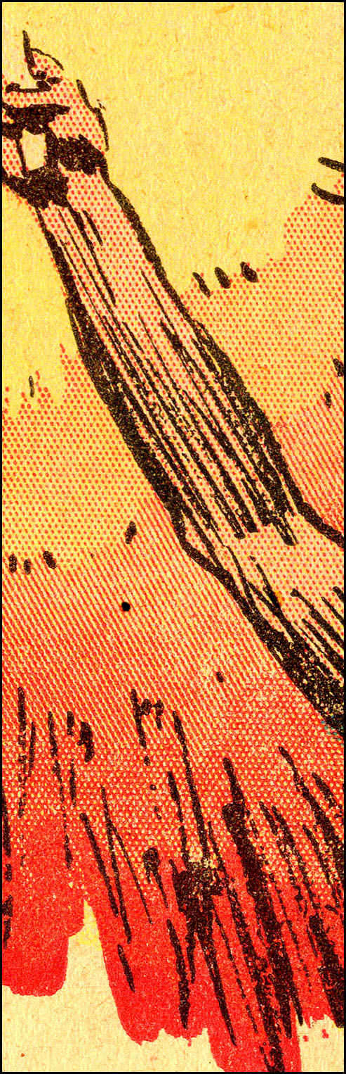
The Ben Day operatives not only laid down the dots on the metal—one printing plate for each colour—they also had to decide how strong each individual colour tint needed to be in every part of a picture, in order to obtain the colours required. An orange colour might need solid yellow plus a pale red dotted tint, for example. Or the red tint might need to get darker and darker as the orange merged into an area of red—as in this 1933 example from Hal Foster’s Tarzan newspaper strip (Part 6.1):
This hand-crafted method was called mechanical colour separation, as opposed to optical colour separation—when full-colour artwork was photographed four times using different coloured filters, to create four printing plates made with halftone screens.
And about those halftones…
^^Table of Contents
Recap 2: Line Art vs. Halftones
Since I will be discussing line tints a lot in this chapter, as well as dots, the term line art is potentially confusing. “Line tints” and “line art” have no direct relation.
The Ben Day company made dot tints, line tints, and all sorts of other patterns—as seen in this picture from a 1946 book. Screens 9,10, 335 and 336 could all be called line tints. (Click to enlarge, back arrow/button to return.)

“Line art” or “line copy” is just a term for a picture or graphic which is in pure black & white, without any greys.
A defining characteristic of line art is that it could be photoengraved onto a printing plate without using a halftone screen. A halftone screen was completely different from a Ben Day screen. It was a sheet of glass with a regular grid pattern of clear “holes” in it, otherwise blackened to block light. A halftone screen broke up continuous tones, like the greys of a black & white photo, into printable black dots (see Part 2).
The term “screen” is often used to describe any dot or line pattern used in printing, even when the pattern is made on a computer. It’s likely that both the Ben Day screen and the halftone screen contributed to this use of the word.
The example below is adapted from Advertising and its Mechanical Production by Carl Greer, 1931—small and magnified views of the same photo printed as a halftone image.

Line art and halftones were distinct categories. Ben Day dots were part of a line etch, not a halftone etch. Ben Day dots were printed from a line plate, not a halftone plate (though a plate could be made with areas of both types of dot).
Ben Day dots are not halftone dots, and halftone dots are not Ben Day dots.
The regular geometric (almost always square grid) dot patterns of halftones did however have an influence on Ben Day dots in US comic strips. The old stipple patterns, intended to resemble hand-drawn dots, were used less and less. More of the regular grids came in. Many of these were referred to as “halftone” patterns in the Ben Day catalogues—which potentially adds to confusion about what is truly what.
In which context, I note that the quote above from a Craftint patent document claims that their product can make a halftone printing plate without using a halftone screen. This is a bit of unjustified hype. It can create something that looks just like a Ben Dayed plate with a regular square dot screen, as we will see later—but that is not actually a halftone.
Many comic book covers used true halftones, either B&W or colour, sometimes both. Halftone colour plates could be used to colour B&W line art.
But halftones were costly. Comic books, at least until the 1980s, were all about cheapness of printing.
Inside the comic books, line art was all.
^^Table of Contents
Recap 3: Ben Day in the Comics up to 1938—Mostly Dots, Some Lines.
As seen in previous posts, inventor Benjamin Day‘s original patent document of 1878-79 (Part 4) demonstrated the laying down of line tints, and only briefly mentioned that the same method could be used for dots. His dots very soon came into their own, however.
Lithographic printing (Part 5) , where Ben’s dots firsts saw mass usage, sometimes used line tints just as much as dots. This included The Little-One’s Own Coloured Picture Paper, a pre- or proto-comic from 1885 (Part 5-&-three-quarters)—close-up details below (click to enlarge):
Lines were also big in Transferred Tint Chromotypography (Part 6). This colouring method, a photomechanical letterpress technique, was an alternative to Ben Day, and worked very differently. It was used on the world’s first newspaper colour supplement in Paris, 1890—the illustrated supplement of Le Petit Journal—and America’s first, that of The Chicago Inter-Ocean from 1892. (The 2.5cm or one-inch square details, below, are from The Inter Ocean, 1893. Click to enlarge.)
It looks as if some of the New York Sunday newspaper colour sections, from 1893 onwards, used transferred tints. Within a few years Ben Day tints moved into the new Sunday comic strips. I can’t yet say exactly when they took over completely from transferred tints, though I’m fairly sure it was before 1900. Once Ben Day was standard practice, the line tints were dropped pretty quickly.
As seen in Part 6.1, by the 1930s many Sunday newspaper strips were using one single Ben Day dot screen applied in different ways, often many times, to create a range of patterns and colours. I call these “Ben Day special effects.” I illustrated them with details from Hal Foster’s Tarzan of 1933.
This time, taking my cue from the Foster quote at the head of this post, I have scanned a panel from the earliest Prince Valiant page in my collection—September 4th 1938. On this page the yellow tints did not use the “single-screen” method, but the red, blue and black dots did.
(Original image size c. 11.5 x 14.5 cm, 4.6 x 5.6 inches. Click to enlarge; back arrow or button to return here.)

Prince Valiant was known for its high quality artwork, including the colouring. While Foster clearly prepared better than average colour guides, to realise his vision on the printed page also required significant efforts from the Ben Day team. Below are details showing some of the special effects they used.
These squares were approx. 1.3 cm (about half an inch) across on the page.

Very pale tints used small dots, where the Ben Day screen was lightly inked and gently applied. Larger dots used heavier inking, heavier pressure and/or multiple applications of the screen. Dots looking like irregular triangles are where the screen was pressed down three times—moving the screen very slightly in its adjustable frame for the second and third applications.
More detail on Prince Valiant and its Ben Day tints in a future post.
One final point here: In Part 6.1 I showed how the Ben Day colour artists made composite lines by running dots together. The Prince Valiant team don’t seem keen on this effect, but in Val’s reflection on the water some of the red dots form into incomplete lines:

^^Table of Contents
Finally, as shown in Part 7, the first American comic books—starting in 1933, printed on the same Connecticut presses as Sunday newspaper sections—made similar use of Ben Day dots. However, the comic books kept the “special effects” to a minimum.
Below, a panel from The Comics no.3, a Dell comic book cover-dated May 1937, uses a Ben Day effect—again, the composite line, particularly relevant to this post. The orange part of the pavement (sidewalk) has been tinted with more and more red dots from left to right, until they merge into ragged lines. The close-ups—originally 1.3 cm square—show this more clearly. (Clicking to enlarge recommended.)

Now we have reached the watershed moment where 1937 meets 1938—the year of Action Comics no.1, and the dawn of the so-called Golden Age of Comics.
This was also a watershed moment for Ben Day.
A major change was about to occur—indeed, had been under way for a few years already—in the long-established system of colouring comics. This would kick the genuine Ben Day dot out of the comic books forever…
^^Table of Contents
THE COMING OF CRAFTINT
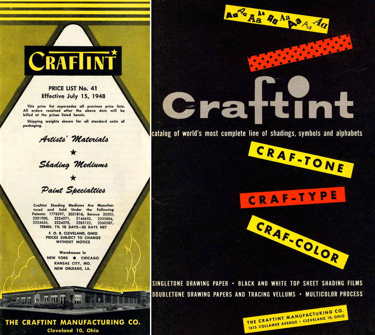
The Craftint Manufacturing Company’s 1948 price list and 1954 product catalogue.
For whatever reasons, Craftint Multicolor has not—as far as I can tell—been discussed in histories of comics.
Unlike Ben Day dots—often mentioned, if seldom truly understood—and the well-known Zip-A-Tone, the Craftint Multicolor method seems to have been pretty much completely forgotten—certainly since the age of online communication (Phil Normand excepted—and one other, who will be mentioned later). The 1959 book Printing Progress: A Mid-Century Report, may have been the last place it was mentioned in print.
(I’d be happy to be proven wrong, BTW. If you know of any previous accounts of Craftint Multicolor, please let me know— legionofandy@btinternet.com)
For historians of printing, most things to do with the comics medium have been below the radar. For historians of comics, the mechanics of printing and colour creation seem to have been of little interest.
Comics fans and collectors like to hold their comics up to the light—or put them under the magnifying glass—both metaphorically and, at times, literally. Metaphorically, when figuring out which assistants worked for Joe Shuster on art for Superman, say. Literally, when looking for restorations, micro-creases or cover chipping on individual comics.
But the difference between the Craftint process and the Ben Day dots which preceded it—and the distinctly different “Silver Age” method which followed it from 1954-55, for that matter—obvious even to the naked eye once you know what you’re looking for—seems to have escaped notice, or at least comment.
If this seems somewhat astonishing to me now—in summer, 2016—I have to remind myself that until two years ago I was as much in the dark as anyone else. I was a Silver Age baby—born late, ’58 (in England). Started reading American comics around 1966. Up to 2014, I had rarely held a Golden Age comic book in my hand—valuable objects that they are—very rarely outside of a Mylar envelope, and never up to the light or under the magnifying glass.
^^Table of Contents
Secret Oranges. (And Pinks, Greens, Purples…)
Exactly when did the Craftint process take over from Ben Day dots in (most of) the comic books? After trying for many months to track down that information, I can’t really tell you.
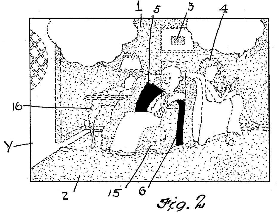
Printing Progress: A Mid-Century Report (1959) tells us that Craftint Multicolor was launched in 1934. The same patent document that I quoted from at the head of this post shows that the product was aimed firmly at the producers of colour comics—though it was newspaper strips they ostensibly had in their sights.
Below is Figure 1 from the diagrams accompanying the patent application, showing how the method worked. This is described as:
…a view of a picture, similar to those which are commonly found in the color comic supplements of Sunday newspapers, but printed with color plates which have been produced with the camera copy of the present invention as a basis.

Fig.2 showed the areas of the picture which were to be coloured either solid yellow or with yellow tint—and it went on to show red and blue, of course:
We know from the Jack Adler / Sol Harrison interview quoted above that non-union employees could use Craftint, unlike Ben Day. They were considerably cheaper to employ than union men. Again, the patent document hints at the same advantage. Publishers, we might assume, would have been happy to save money with Craftint. Printing unions might not have very been happy about it.
We can assume that the edging out of Ben Day, and the almost universal adoption of Craftint, was a gradual process—spreading through colour separating teams one publisher or one workshop at a time. Sol Harrison in that same interview estimated that there were about five different companies in New York doing the colour plate making for comic books in the early days.
He also stated that he worked on Ben Day tints for “the first issue of Famous Funnies.” I initially assumed that he was referring to its first regular issue (cover-dated July 1934). He might have meant the sole issue of Famous Funnies 1st Series, published several months earlier (see Part 7). Paul Levitz, in 75 Years of DC Comics, says that it was 1933’s giveaway comic, Famous Funnies: A Carnival of Comics.
Harrison talks about Ben Day on Famous Funnies, but does not discuss Craftint being used on this comic. Close inspection of online copies—at ComicBookPlus.com—suggest that Craftint could have been used very early on—maybe even from that July 1934 issue. The available scans are not really clear enough to be certain, but some pages appear to have signs of Craftint. They could have been trying it out, among pages of Ben Day.
Thanks to collector Steve Fry I have confirmed that other comics published considerably later than that—like National’s More Fun no.16 (cover-dated Dec 1936) and Dell’s The Funnies no.3 (May 1937), as seen above—were definitely still using Ben Day.

However, some earlier comics—like Dell’s Popular Comics no.1 (Feb 1936) and their re-launched The Funnies no.1 (October that year)—both seen at Comic Book Plus—pretty definitely used Craftint.
In addition, there are dot patterns in some comics from these transitional years which are neither obviously Ben Day nor clearly Craftint, which makes things difficult. Was there a third technique being tried out? Or simply different patterns of dot in early Craftint which did not last the course?
I will come back to this question.
We may never know whether a key issue like Action Comics no.1—cover-dated June 1938, with the first Superman strip—used Ben Day or Craftint or something else. In 2014 a copy sold for over $3 million—nobody is likely take their copy out of its vault to provide us with high-resolution scans of the dots.
Reprints of Golden Age stories, from the 1960s into the 21st century, have been unreliable sources of information about colour separations and colour printing.
A Smithsonian Book of Comic-Book Comics (1981) has photographs of “their first comic-book printings” at approximately comic book size. In most cases the coloured dots and lines have blended into flat colours. This includes Superman’s debut.

In cases where Craftint was definitely used—like the 1950s EC comics—some tell-tale signs of the technique can be made out. Less clearly, I think the first Batman strip from Detective Comics no.27 (cover-date May 1939) shows hints of Craftint.
Reprints of Golden Age stories in post-1955 comic books always replaced the old colours with new ones, using the printing methods of the day. So did the first book to show them, Jules Feiffer’s The Great Comic Book Heroes (1965) (Part 7) and later books like Marvel’s Masterworks series and DC’s Archives.
Only in recent years has a combination of digital technology and cheaper colour printing meant that some (not all) reprint books have shown us how the pages of comics really looked, prior to 1955.
^^Table of Contents
It was whilst looking at one of those books—one of Titan Books’ Simon and Kirby volumes—The Best of Simon & Kirby, with its high-resolution images of actual Golden Age pages—a couple of years ago that I had something of a revelation.
As far as I knew, all comic books were coloured with dots. That was the received wisdom, and up until then I’d had no reason to doubt it. I’d been looking at comic book dots, on and off, for over 40 years. As a ten-year-old in 1968, I’d got my first microscope. I’d looked closely at the “Silver Age” pages of comics like Spider-Man and Daredevil—and they were as dotty as anyone could wish for.
As an adult, I also had collected some Sunday newspaper strips—whole Sunday sections, and “tear sheets” taken from them—going back to the 1890s. I’d looked casually at their Ben Day dots from time to time.
By the time I looked closely at the Simon & Kirby book, I was learning about the history of Ben Day dots, and 1960s comic book colours—spurred on by the big 2013 Roy Lichtenstein retrospective exhibition. I had learnt that 1960s comic book dots were not created by the true Ben Day method. (I will look at 1955 onwards in Part 9.)
I had assumed, though, that the Golden Age books of the late 1930s and early 1940s, being in a direct line of descent from the Sunday strips, would be the genuine article—real Ben Day. Instead I found something really quite disturbing.
It gave me a deep-rooted sense of unease. My whole world-view was threatened. An angst descended over the very core of my being. I knew I could only find peace of mind by coming to a full understanding of this new paradigm.
Because certainly there were dots to be seen, and plenty of them… but what the actual heck were these cockamamie lines all over the place?!?
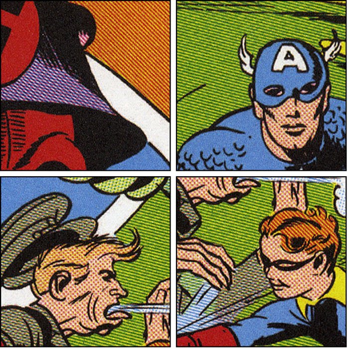
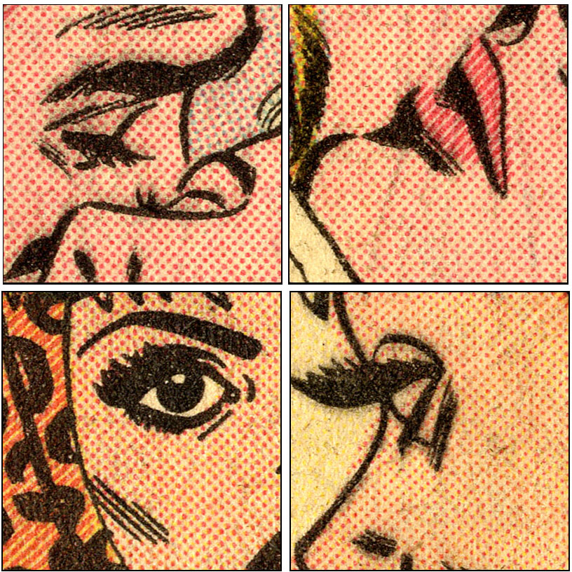
You might just be able to make out the coloured line tints on this page from Captain America Comics no. 1 (cover dated March 1941) taken from the Titan book (after clicking it to enlarge). Or better, have a look at the 1-inch (2.5 cm) squares below—also clickable.

It must be said that the colours on these Titan pages are reminiscent of the overly-bright colours seen in Jules Feiffer’s 1965 book, The Great Comic Book Heroes (Part 7). But comparison with other sources—such as Mark Evanier’s splendid volume, Kirby: King of Comics (2008)—soon reveals that the colour tints have been faithfully reproduced in the Titan books. As I noted in Part 7, this is something Feiffer’s book signally failed to do.
^^Table of Contents
At this point I hadn’t realised how the Ben Day men liked to run their dots together and make composite lines. But as I found out about that, and delved further into these ancient mysteries, I found that these 1940s lines were not the same thing at all.
These lines are visibly more uniform and straight than Tarzan‘s or The Comics’ composite lines-made-of-Ben-Day-dots. Could they perhaps have been the return of genuine Ben Day line tints? For various reasons, it became clear that they weren’t.
These lines were something new.
My first hint of what they really were came from Russ Winterbotham‘s 1946 booklet, How Comic Strips are Made. Winterbotham was a writer on many newspaper strips, including Red Ryder, Captain Easy, Chris Welkin – Planeteer, and Kevin the Bold. His pamphlet was part of a series published by the socialist Emanuel Haldeman-Julius, intended to help educate the American working man and woman. It contained only text, no illustrations.
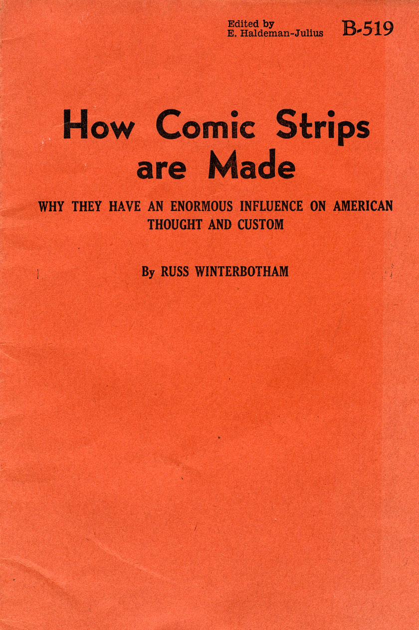
Winterbotham devoted less than 2 of his 26 pages to comic books. When he said “comics” he was generally talking about the newspaper strips. About colour separations, Winterbotham had this to say:
Laying in of color was done from the artist’s sketch by the plate maker and it was called the Benday process. This process was in use for at least a quarter of a century* and although newer types of plate making… now go into the making of comic pages the place where the color plates are made is still called the Benday room.
And later:
All the colors in a comic page are made up with the primary colors of red, blue and yellow. Benday rooms have three gradations of each color, solid, line and dot. This means that the colors may be solid, broken up in lines for a lighter shade, or broken up into dots for very light tints.
(* Half a century would have been more accurate, of course.)
Winterbotham was clearly saying that the true “Benday” method had been abandoned, and the new process he described could certainly explain the colours in Captain America Comics no. 1. (He also implied that the newspaper strips had gone the same way as the comic books. One day someone will have to look at the rise of Craftint in the Sunday comics. Any volunteers?))
I also discovered Tarzan and the Ben Day Men, Phil Normand’s invaluable post on the subject, and tracked down the source books he recommended. Phil showed a 1949 Burne Hogarth Tarzan panel using what he thought was Craftint Multicolor—reproduced below. (This was of course years later than the Ben Dayed Tarzan pages I looked at in Part 6.1.)

These Tarzan lines and dots certainly resembled the Kirby comics’ colours, and the tints I started to find in other pre-1955 comics. Books like The Eighth Graphic Arts Production Year Book (1948) and Printing Progress: A Mid-Century Report (1959) described Craftint Multicolor in some detail, and seemed to confirm that it was indeed the method in use here.
Thanks to Phil I also rediscovered that Amazing World of DC Comics interview with DC production mavens Sol Harrison and Jack Adler, which I had read long ago but largely forgotten. In that interview (conducted in 1975, published with a cover date of January 1976) they talk at length about the early days of comic book production.
Harrison says that after Ben Day colour separations…
…the second method that evolved was Craftint…
Adler describes his own creation of a new (to comics) method of color separation, using a grey painted image for each of the three colours red, blue and yellow. These could be used to make halftone colour plates to colour a B&W line key plate. Adler explained :
We went to the greys for the special stuff [like advertising pages] and used Craftint mostly for the regular stuff.
This was the final “smoking gun” evidence that I was right. Captain America 1, and nearly all US comics published during the Golden Age (approx. 1938 to 1955) had used Craftint Multicolor for their colour separations.
^^Table of Contents
CRAFTINT COLOUR IN THE COMIC BOOKS
Later I will show you in detail how Craftint Multicolor worked.
First, some examples. And before that:
As you will recall, letterpress comics in the Golden Age—1930s to 1950s—used the same three coloured inks still used in our printed media today. Along with black, these colours give four-colour printing its name. They also provide its other shorthand tag—CMYK. As seen in this picture from Wikipedia, they are Cyan (blue), Magenta (pinkish red), Yellow and blacK. Mixed in various proportions—using their transparent nature, and the white of the underlying paper—they make all the required colours. (More detail in Part 3 and Part 6).

As Winterbotham said, Craftint Multicolor’s pale tints of red, blue and yellow were made up of dots. The darker tints were the lines which got me so worked up looking at Captain America and co.. The line tints in Craftint comprise the feature which, on the page, clearly distinguishes the process from what came before and what came after.
Below are some direct scans from comic books showing Craftint Multicolor at work.
Boom Boom Brannigan & Friends, 1944
My first examples are from Prize Comics no.44, August 1944. (Thanks to ace collector Steve Fry for this comic, one of the few Golden Age superhero book I own. The whole comic can be read here, BTW.)
I’m showing the cover just for fun. Comic book covers from the 1930s to the 60s and beyond—printed on thin card, or coated “glossy” paper—used different techniques from the interior pages. This post is concerned with the newsprint interior pages, not the covers.
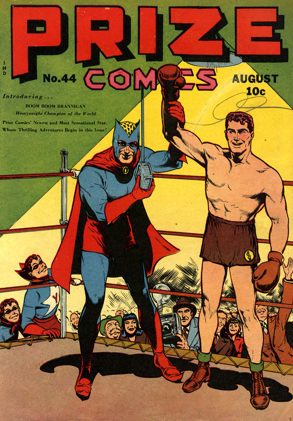
The following details from inside Prize 44 were originally approx. 1.3 cm square.
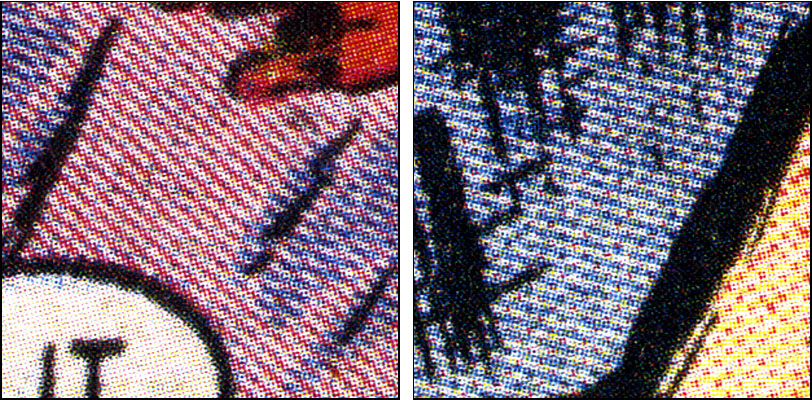
The pale tints of magenta (red) and cyan (blue) are clearly made up of dots.
Magenta and blue line tints are also seen—on white backgrounds, printed over yellow to make green, mixed for a mid-purple colour on a man’s hair (!) and combined with red dots to make a paler purple.
Also worth noting are the different “screen angles” used for magenta and blue (as detailed in Part 6.1). The lines show this more clearly than the dots.
Surprisingly, different pages of this comic use different screen angles—as seen in the red lines, above. I will come back to this.
Some, not all, of the blue lines look more ragged than they should, almost like the old Ben Day “composite lines.” Since I’m certain this comic used Craftint, I assume it was a poor etch and/or rough newsprint paper which created these untidy lines.
In the very early days, as I speculated above, there may have been try-outs of different tints, but looking at most comics done with Craftint the exact same tints are seen. We will see why later. (I will also look at some exceptions later.)
The dots are in a consistent square grid pattern, and there is no real variation in the tint. They are pretty much indistinguishable from true Ben Day dots—at least, indistinguishable from a single application of Ben Day dots. With Craftint, as we will see, multiple applications of dots—like Prince Valiant’s reflection or the orange pavement—were not possible.
Likewise the darker tints are a standardised line pattern.
^^Table of Contents
Craftint Multicolor: a Limited Palette
(1) Limitations of the method—64 Colours
In fact, the pale tints supposedly had a value of 25%—25% colour and 75% white paper—and the darker tints, 50%. This was reported in the Eighth Graphic Arts Production Yearbook, 1948. This book seems to use information obtained directly from the Craftint company.
Sol Harrison repeats this claim in that 1975 interview:
…with Craftint, they only had a 25% and a 50% value. Then you’d paint in your solids.
Colourists have sometimes reported that the tints were more like 20% and 40%, and this does look credible—at least in terms of the final printed version.
However, in practice, those 25 and 50% figures were only theoretical anyway. The tint may have started off with that value, but the final value of the tint on the printed page would vary considerably. This would depend especially on how deeply the printing plate was etched (see below)—also perhaps on the pressure used on the printing press, and the amount of coloured ink rolled onto each plate.
The same point has been made previously about the real Ben Day tones. The Craftint catalogue (1958) and price list (1948)—the ones I’ve seen—did not specify percentage values, referring only to dark and light tones.
Variable thickness of line, and size of dot, is evident even in the few examples shown above—all from the same comic—showing that variation could happen from page to page. In fact it could happen from panel to panel, and even within a panel. The red blobs seen in the 4th panel above are an extreme example.
As mentioned, with Ben Day tints, the plate makers could apply the screen twice, three times or more, to create variable patterns. They were also able to vary the pressures they used in laying down the tints, to create deliberate variation in line thickness and dot size.
Any such variation seen in comics done with Craftint Multicolor is due to random, unplanned factors. It is never due to deliberate action by the colour separators or plate makers.
Using Ben Day tints, individual panels, and small parts of panels, were given individual treatment all the time. With Ben Day, anything from a very pale dot tint—say, 10% value—to a “solid” 100% tint could be made, with a flexible choice of in-between values. Theoretically, the only limit on the colours on a Ben Dayed page was the ingenuity of the Ben Day men.
In practice, of course, they were actually limited by the need for speed and economy. But at their best, they did achieve a very wide range of tones. This is why Hal Foster was so effusive about their talent in the quote at the head of this post.
But the whole point of Craftint was of course speed and cheapness—achieved by simplicity, uniformity and time-saving.
This is worth repeating: with the Craftint method, the only choice of tints the colour separators had was 25% / light or 50% / dark—plus the “solid” 100% colours.
(Below: Mickey Finn’s Uncle Phil and Rube Goldberg’s Lala Palooza, from December 1937’s Feature Funnies no.3.)

Limited though they were, though, an impressive number of different colours were still available to the Craftint colour separators from their three primaries—cyan/blue, magenta/red, & yellow—and three values of each colour—light, dark, & 100%.
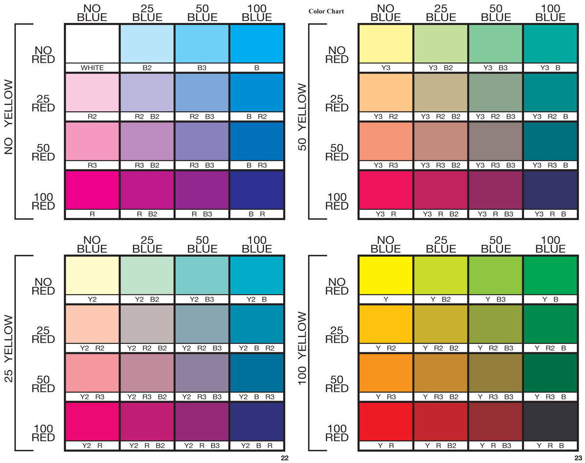
You can work it out for yourself with a pencil and paper—a valuable exercise for the determined Ben Day detective—but as you may already know, the answer is 63 colours plus white. These are the famous 64 colours often quoted when this subject comes up— 65 if you count black.
The 64-colour palette is often discussed in relation to 1960s, 70s and 80s Silver and Bronze Age comic books—comics which no longer used Craftint. It is clear though that the 64-colour scheme came in with Craftint near the beginning of the Golden Age, and later comic book colouring inherited the same palette.
This colour chart, below, is from two pages in Marvel Age no.13 (April 1984 cover date)—an article entitled How to Colour Comics the Marvel Way. Note that the tint values quoted are once again 25% and 50%. Marvel comics were then a long way from the Golden Age—in fact, they were on the brink of the next great leap forward in comic book colour printing—but in 1984, the 64 colours were still basically the same. (And worth an enlarging click, I’d say.)
In practice, many comics used nowhere near the full gamut of 64 colours. Often this was due to company policies. Fewer colours meant less cost—as discussed below.
One company which consistently did use all the tints of all three colours was EC. That is not to say that they used all 64 colours in every comic they published. In the example below, from a Bernie Krigstein strip in Weird Science-Fantasy 25 (cover date Sept 1954) a limited palette is used—and very effectively. But chief colourist Marie Severin et al did at least have the full gamut to choose from every time.

Craftint Multicolor at its best! And look at the different thickness of the red and blue lines in the dark tints, by the way. The red certainly looks like a full 50% in places, if not slightly more, and the blue a good deal less. The blue dots are likewise very faint.
You probably won’t regret clicking to enlarge. You may well regret it if you don’t use your back button to return. Below: squares originally approx. 1.3 cm or half an inch.

^^Table of Contents
DC on the other hand—home of Batman, Superman and Wonder Woman—imposed significant limitations on their colourists. For a start, DC completely avoided yellow tints for a very long time. There was no 25% or 50% yellow at all on the pages of DC comics until 1969.
If you look back to the colour chart above, you can see that, by leaving out yellow tints, DC were limiting their colourists to 32 of the 64 colours—a mere half of those available.
The lack of yellow dots meant that in a DC comic, until 1969, Caucasian flesh was always pale magenta pink. Marvel flesh, on the other hand, was a combination of magenta and yellow dots—as demonstrated below…
…with a bit of romantic DC Craftint from May 1955—from Girls’ Love Stories no.35, art by John Romita. Below that, Marvel’s Leopard Girl may not be in love, but she is getting some Jungle Action in no.1 of the eponymous comic, Oct 1954—drawn by Al Hartley.
There’s plenty of that DC skin tint on display on the Wonder Woman splash page from Sensation Comics no.68, 1947, below. (My coverless copy came at a comfortable cost from Jon Browne at They Walk Among Us. Thanks, Jon!)
This great H.G. Peter artwork, like Prize 44, shows some robust magenta lines, but no blue ones. In fact, as well as lacking yellow tints, Sensation 68 contains no dark blue (line) tint at all.
This was not unusual for DC. Many of their Golden Age comics did use the darker blue tone—there was no company-wide ban on it—but many simply didn’t.
This Wonder Woman page therefore lost another 8 colours from the total of 64, or 32 as in other DC comics. The maximum number that could be used here was 24. Still looks pretty striking, no? Click to enlarge, as ever.

Solid magenta, blue and yellow are in evidence. Blue and magenta dots are plentiful. Magenta lines are combined with blue dots to make a purple. Details were 1.3 cm square originally. (Click to embiggen.)

[EDIT: January 2024: I just discovered that Harry Mendryk, who worked on the colour restoration of the Titan Simon and Kirby books, blogged about these limited palettes as long ago as 2011! Follow this link to read his posts.]
Long before this page was published in 1947—in fact, probably by the time Captain America no. 1 was put together in late 1940—the majority of American comic books were using Craftint for their colours.
Where did this new method come from?
Did Jack Adler invent it, as he implied in a later (2006) interview, published in Alter Ego issue 56?
No, he didn’t. And it came from Cleveland, Ohio.
^^Table of Contents
CRAFTINT SINGLETONE AND DOUBLETONE
The Craftint Manufacturing Company
Craftint Multicolor might be almost completely forgotten, but depending on your age, job and/or interests, you might know the Craftint Manufacturing Company of Cleveland as makers of art supplies like drawing pads or markers, or Paint-By-Numbers sets, or as the publishers of a series of How To Draw & Paint books…
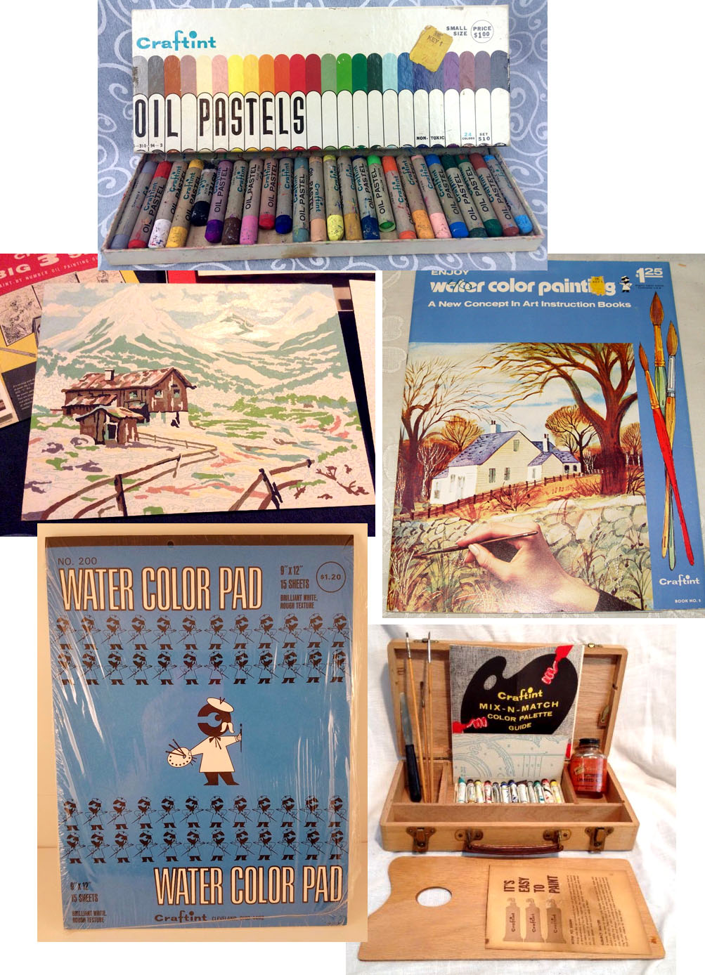
Or you might know the name from Craftint’s version of Zip-A-Tone, Craf-Tone—or their rub-down lettering, Craf-Type…
OK, I’m teasing… those were all real products, but it is far more likely that you will know Craftint as a black & white shading technique. This was used by many comics artists of the past, including Roy Crane and Noel Sickles—from the 1930s onwards—and Wally Wood and John Severin (from the 50s on). Bernie Wrightson and Ralph Reese were 1970s practitioners. In the 1980s, Howard Chaykin and Bill Sienkiewicz used varieties of Craftint—or rather, the later version, known as Grafix board.
If the name Craftint isn’t ringing any bells for you, here’s a Roy Crane Buz Sawyer daily strip from 1946, drawn on Craftint Doubletone board:
The image below is from the book Printing Progress: A Mid-Century Report (1959). It sums up the essence of this shading medium, with its pale grey tone made of precise parallel lines, and its darker, cross-hatched tone .

Here, very briefly, is how it was done—taken from Craftint’s own 1948 price list pamphlet (more detail later):

There was also Singletone board, with just one tint pattern on each sheet. I call it “board”—Craftint sometimes do too, and sometimes call it “paper.” The type I used myself was a thin board—more on this later.
This shading medium didn’t only catch on with comics artists. It was widely used in magazine, fashion and technical illustration as well.
I used Grafix Duo-Shade board in London in the early 1980s. I remember it was pricey, but irresistible. It was also becoming increasingly difficult to find. The final London stockist, as far as I could tell, stopped selling it shortly afterwards.
About those names… there are some confused and confusing accounts of these types of board around, and of the companies that made them. Allow the Legion of Andy to clear up any uncertainty:
The Craftint Manufacturing Company started up in 1929. Between 1929 and 1963, Craftint made Singletone and Doubletone drawing boards, the Multicolor process, and many other products—as seen above.
For some reason, Craftint sold their unique shading medium technology to a new company, Ohio Graphic Arts Systems, in 1963. Craftint continued in the art supplies and paint-by-numbers businesses. In 1977 the company was “merged out of existence”—merged with what or whom I don’t know.
From 1963, Ohio Graphic Arts marketed the tint boards as Grafix board (Uni-Shade and Duo-Shade) and changed the company name to Grafix in 1990. Grafix continued to market their board until 2009 in the USA, when the product finally succumbed to competition from digital methods. The Grafix company still exists, making mainly acetate and Mylar sheets of various kinds.
The 1948 Craftint Price List says there were 60 patterns of Singletone, in four different sizes. The largest was 17.5 x 24 inches (about 44.5 x 61 cm). (By 1954 the number had fallen to 59.) Here are 4 of them, from the 1954 Craftint catalogue. Each rectangle originally 1.5 x 3.5 cm (click to enlarge; back button to return here):

Doubletone came in 17 different types in both 1948 and 1954—mostly 17.5 x 24 inch sheets. Here are two examples, again from the 1954 catalogue. Each square was originally 1 inch, 2.5 cm. (Clicking to enlarge strongly recommended; back button returns you here):

You will note that the catalogue showed the patterns reduced in size by different degrees. This was important, as most artwork would be reduced from its original size when printed. Note also the lines per inch quoted with the pattern number. For newsprint, a final line frequency of a maximum of 60 per inch—after reduction—would be preferable.
Not all Doubletone / Duo-Shade used line tints. Howard Chaykin‘s American Flagg artwork, from 1985 on, used a grained tint, for example. But the line version was used in the majority of cases.
As Craftint’s own literature liked to point out: including black and white, there were four shades available when drawing on Doubletone.
^^Table of Contents
Craftint board / paper was a reasonably good quality, thin “Bristol” type drawing board, pre-printed with “invisible” tint patterns—dots, grain, or lines. In fact if you looked closely, at least some of the tint wasn’t quite invisible, but could be seen as a very pale blue (see below).
The first thing the artist did was draw the basic black & white artwork, finished in black ink. I suspect a lot of drawing was done on a separate piece of paper, and traced using a light-box, as the Craftint board could not stand too much erasing and redrawing. Likewise, any white-out used for corrections would render the tint on that part of the board useless.
To bring out a Singletone tint, you painted a clear watery liquid onto the board with a brush—very much like using India ink for inking. This was the developer. A chemical in the liquid reacted with another chemical in the pre-printed tint to turn it “black”—actually a dark brown.
The earliest Craftint patent I can find—credited to inventors Carl Maier and William Swaysland—is no 1,778,397, filed in August 1928 and granted on October 15th, 1930. Though Singletone is not named, this is clearly the product in question—the patent is listed on the cover of the 1948 Craftint price list pictured above.
The dots, when “invisible,” are made of white ink containing lead sulphate (and thickened with lead carbonate). The document explains:
The artist uses a solution of any suitable sulphide which will react with the lead sulphate to form black lead sulphide.
Lead compounds are pretty toxic, though workers in the manufacturing plants were more likely to suffer than artists using the board, I’d surmise. It’s possible that safer chemicals were substituted over the years. Further Craftint patent documents are vague on this point, though other potential chemical are discussed at times.
When photographed for printing, any pale blue in the “invisible” tint was not picked up by the camera, so was seen as white—and would print as white. The dark brown developed tint would be seen as black, and print as black.
If using Doubletone (or later, Grafix Duo-Shade) there were two different developing fluids. The first one used brought out the darker tint—that is, it developed both elements of the tint, e.g two sets of crossed lines. Once it had been dabbed dry, the second developer could be brushed on, and brought out only the lighter tint, e.g. one set of lines.

I have been unable to find any detail on how the two tones of Doubletone were developed, chemistry-wise. Any expert knowledge gratefully received.
~~~
Here is a great six-second video showing how quickly and precisely the dark tone came up when the first developer was brushed on. It was made by Colin Panetta whose web site is here.
And this one, also by Colin, shows the light tone responding to the second developer:
The developing fluid was free when you bought your Craftint board. They even made a handy blotter, reminding customers how important good blotting was in order to get the best results.

^^Table of Contents
Below is a panel of original B&W art done for Pssst! magazine, published in London circa 1982. There is a lot of Letratone—the British version of Zip-a-Tone—on this artwork, but our hero’s (strangely familiar) face was done on Grafix Duo-Shade board, cut out and pasted on.
In the close-ups that follow you will be able to see one set of lines—vertical, undeveloped—on the Grafix board as pale blue. (Other blue marks are the under-drawing, done in blue pencil.) The horizontal lines of the Duo-Shade pattern do seem to be truly white, not blue, when undeveloped.
Developed lines are shades of grey/brown.
All clickable to enlarge.

Below: these were originally one-inch, 2.5 cm squares on the artwork. Some of the lines have aged to a pale brownish grey. At the time, they were dark enough to be photographed as black lines for the printed version. (Which I have lost!) (Temporarily, I hope.)

Artists liked being able to do their own “grey” tints. They did not have to rely on a Ben Day man interpreting their instructions or following their blue-pencilled shaded areas (as seen in Part 6.) While various forms of cut-out-and-stick-down tints (early forms of Zip-A-Tone) were coming on the market during the 1930s, Craftint was more spontaneous and more like drawing with ink—something which artists were used to. Because the developer was painted on by the artist (or an assistant) by hand, the tint-work could be anything from very basic to quite expressive.
^^Table of Contents
Craftint’s Singletone board was launched in 1929. (The patent must have been “pending,” since it wasn’t actually granted until October 1930, as we saw above.)
I showed in Part 6 how the daily comic strips quite often used Ben Day tints to give their B&W artwork “grey” shading, and hopefully a bit of extra eye appeal. This Superman daily from 1943—below, shown as the original art—did not use Ben Day, but was drawn on Singletone. It’s signed by Joe Shuster but possible not actually drawn by him. It was sold by Hake’s auction house in July 2015.
The dots have aged to a grey/brown colour. I’ve taken a single panel and tried to show how it was meant to print in black and white, below. Click to see full detail.

I think this earlier 1939 daily (below) was also done on Singletone. I scanned it from the reprint book Superman: The Dailies 1939-1942 (2006), which was printed on high quality white paper, not on newsprint as the strip would originally have appeared. This looks more like Joe Shuster’s work to me, BTW.

Details are 1.3 cm, half-inch squares from the book.

And below: Singletone work by Noel Sickles from June 1936. Sickles started shading with mechanical tints in January 1935, though for the first few months he used a stick-down Zip-a-Tone type.
I have merged two half-images of a Scorchy Smith daily original art—from Joakim Gunnarsson’s 2006 post on ComicArtFans.com—and compared them with the strip as printed in 2008’s Scorchy Smith and the Art of Noel Sickles. Apologies for the curve and shadow as the left side of the strip meets the spine of this big beautiful book.
Clicking to enlarge highly recommended.

A one-panel view shows how the Singletone board has aged. Even the white areas now show a pale brown dot pattern. The dotted areas have aged to a very splodgy grey/brown—maybe Sickles wasn’t a very careful blotter—but at the time achieved a “camera-ready” image uniform enough to print as a flat dotted tint:

The tinting in the panels above is fairly simple. Sickles sometimes used his Singletone more creatively. He dropped black outlines in places, and used his brushed-on tone to create form as well as shading, as in this panel from January 1936:

^^Table of Contents
Doubletone in Comic Strips (1930s and 40s)
Doubletone was launched in 1932. This type of board—sold as Grafix Duo-Shade after 1963—has been used more often than Singletone (or Uni-Shade) by comics artists, and consequently has become more familiar in the comics community.
My first example is from a Roy Crane daily. Crane may be the world’s best-known practitioner of Doubletone artwork. This daily strip is from February 1943, and scanned from yellowed newsprint. The blacks aren’t very solid—typical of the poor quality of newspaper printing.
It was Crane’s last year on Wash Tubbs, so some of the drawing was almost certainly done by his assistant, Leslie Turner. When Turner took over the strip he continued to use Craftint extensively—as did Crane on his new strip, Buz Sawyer. (Looks better clicked to enlarge; back button to return.)

Image size of this panel in the paper was 12.5 x 7 cm:

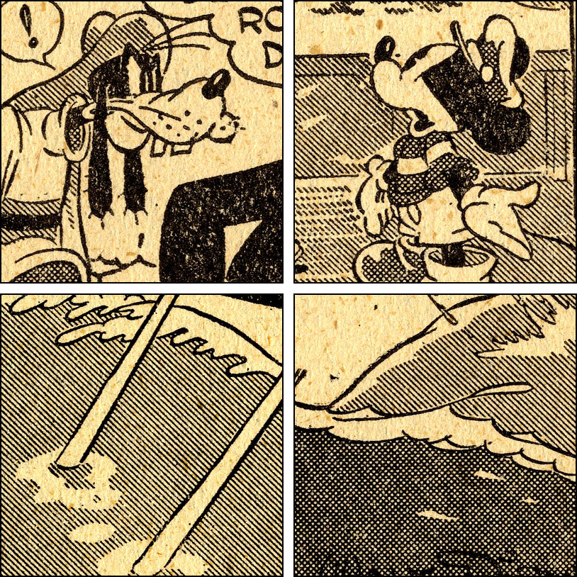
The Mickey Mouse daily, below, is from a little earlier—April 1938. Obviously, since he signed it, this must have been the work of that master cartoonist, Walt Disney…
In fact, after all this time, we are allowed to admit it was actually drawn by Floyd Gottfredson—and others. By this point, Gottfredson was probably pencilling the strip and using an inker, who may have done the Craftint as well as the blacks. This could have been Al Taliaferro, better known for his Donald Duck art, though he left the Mickey strip sometime in ’38. The name of the son-of-a-bitch who trimmed the bottom off the strip in order to fit more dailies on the newspaper page has been lost to history. (Click to enlarge etc.)
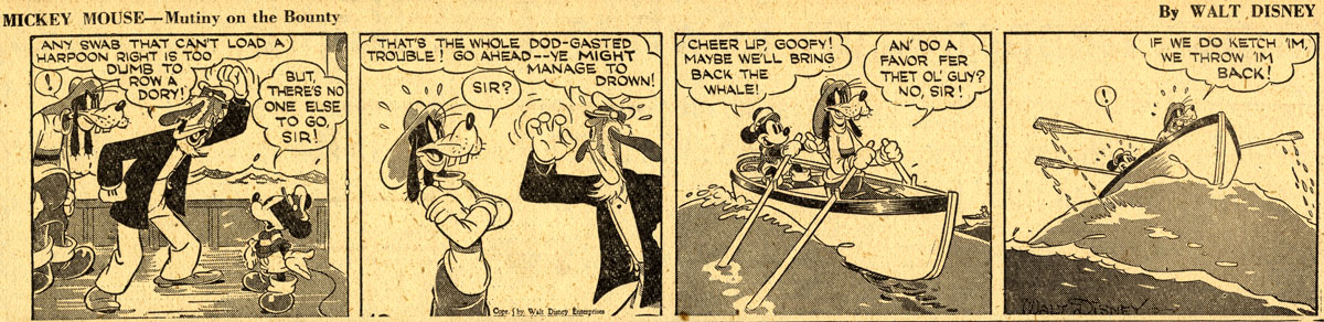
Guess what? More one-inch squares.
From 1941 onwards, the Superman daily strip started using Doubletone. It wasn’t the most imaginative use of the medium. Looks a bit better when clicked to enlarge, of course.

Finally, some more Jack Kirby. This is from even earlier in his career than Captain America Comics no.1. He used the name Lance Kirby here, which presumably sounded better for the artist of a western strip. Allan Holtz believes that Lightning and the Lone Rider probably never actually appeared in newspapers, though it was done as a daily strip, and some examples show dates in February 1939. The comic book Famous Funnies ran it in colour from no.62, later that year.
Only a few of the strips were done on Doubletone. The B&W version of the panel below is from Mark Evanier’s Kirby: King of Comics, probably taken from a proof page in the possession of the Kirby family. The coloured version from Famous Funnies no.63 is taken from ComicBookPlus.com. You can see that the strip was re-lettered, perhaps by the same poor mug whose job was whiting out all the Doubletone tints. Or most of them, anyway—a few patches remain in background areas.
^^Table of Contents
THE CRAFTINT MULTICOLOR PROCESS
It’s Like Doubletone, But Dots As Well As Lines
Having looked at some of the B&W versions of Craftint, you will probably have formed some idea of how the Multicolor process worked.
Here is the description from the Craftint Manufacturing Co.’s 1948 price list:
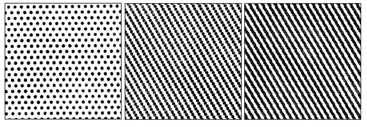
Multicolor Drawing Board. For use with the Craftint Multicolor Process. Carries an invisible dot (light tone) and an invisible diagonal line (dark tone) in perfect register on each sheet. Patterns are in proper color angles to assure maximum color combinations; 63 different color combinations are made possible with red, yellow and blue color plates. Patterns available in angles of 45 degrees, 75 degrees, 90 degrees and 105 degrees—all 60-line screens.
Each Multicolor drawing board was very similar to the Doubletone board we have been looking at. However, rather than two line tints, Multicolor had line tone (50% value) as its dark tone, and a “square grid” dot pattern as its light tone (25% value).
The lines of dots in the light pattern aligned exactly with the lines of the dark pattern.
The four types of board, with lines and the dots at different “screen angles,” were intended to be used with the four colours of CMYK. I’m not aware of any comics which definitely used the black (K) board of Multicolor. Other illustrators may have found it more useful. The B&W line art of the comic books was generally pencilled and inked on plain drawing board, though tints could be added by various means (especially in 1950s ECs, for example).
CMYK screen angles like this—not always the same ones—are still used today throughout 4-colour printing to avoid unwanted Moiré patterns when dots and lines are printed over one another (as seen in Part 6.1).
Trying to understand exactly how this worked with Craftint Multicolor, in theory and in practice, has been something of a nightmare.
The diagram below, found here, shows one set of screen angles used in 4-colour process printing in 2009. The site points out that many different standardised sets of angles are used in different countries and settings.
Note that each angle is measured “down” and anti-clockwise from the yellow “zero degrees” horizontal line.
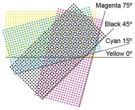
The illustration below—from The Art of Photoengraving (1952)—doesn’t agree with the 2009 version on how to measure the angles. Here they are measured down and clockwise from the horizontal. Presumably this convention changed over the years (?).
105 degrees on this diagram is the same as 75 on the 2009 one. 45 here would be 135 in 2009.

The Eighth Graphic Arts Production Yearbook (1948) states that the Craftint Multicolor boards were intended to be used at the following angles (and doesn’t say which convention is being used):
75 degrees—Yellow
45 degrees—Magenta / Red
105 degrees—Cyan / Blue
Most of the examples from real comics, shown above, use 45 degrees for red—45 degrees as defined in the 2009 diagram, that is. Captain America Comics no.1, as seen in the Titan book, doesn’t. It uses the 45 degrees definition of 1952; 135 degrees by the 2009 version. This panel from Mark Evanier’s Kirby: King of Comics confirms that Titan had the angles right:

Below, the usual 1.3 cm squares:
This didn’t just vary from comic to comic or publisher to publisher. As noted above, in Prize Comics 44 (1944) there were even different screen angles on different pages of the same comic. It seems likely that, as in many other aspects of early Golden Age comic books, the full colour separation “rules” had yet to be written.
^^Table of Contents
As well as the original drawing board type, Craftint made two different transparent film versions of Multicolor, one of which could be used directly as a negative for photoengraving in letterpress. The 1948 price list says that this letterpress negative version has line and crosshatch patterns for light and dark tones, so it doesn’t seem to match the ones seen in the comics.
The other film was a “dot and line pattern used as a positive for deep-etch offset plates“—as far as I know, not something that the comics would ever use.
Still, I can’t say for certain that the comics never used some type of film, at different times or in different workshops, during their 20-year history with Craftint Multicolor.
I’m going to describe the board version at work.
I can’t show you any actual examples of Craftint Multicolor board in use. Singletone and Doubletone (and Uni-Shade & Duo-Shade) survive as pieces of original B&W art. It is likely that Multicolor boards, once they had been photographed as part of the photoengraving process, were simply discarded. Unless people in the business kept some as souvenirs, and they have ended up in museums of printing, it seems all too likely that none at all have survived.
It would be wonderful to hear any news to the contrary!
A major point about Craftint Multicolor, as touched upon already, is that the system was much easier to work with than the Ben Day system.
Ben Day tint-laying took months or even years to learn properly, especially when it was controlled by the unionised apprenticeship schemes operating in the printing industry.
If you had some artistic skill, you could express yourself with your brush in Craftint. If you had no previous skill or experience, you could still learn to brush tints on Craftint board in a few minutes. Most of the hard work had already been done for you.
Craftint Multicolor was still a mechanical colour separating technique. The user had to have colour guides to follow. As the system was used in practice, colourists started to add to their guides numerical values defining colours on the 64-colour grid shown above. Orange made with 100% solid yellow plus 25% red was designated YR2, for example. Darker orange with 50% red was YR3.
So that aspect of the hard work of colour separating had not only been simplified, it had also been done for you. Jack Adler says that this system was evolved by him at Strauss Engraving—or Photochrome as it became, or at All-American Comics or DC later… Adler was very vague on dates and places.
Below is a diagrammatic example of the Multicolor process at work with just one colour. It’s entirely hypothetical and simplified—more interesting images will follow.
Here I’m going to make some simple shapes with magenta lines and dots. I’m choosing a 45 degree angle, like the lines we saw above in Feature Funnies no.3, Prize Comics 44, Sensation Comics 68, Jungle Action 1 etc..
This square with blue lines on it represents a magnified view of a blank, unused piece of Multicolor board, with its double pattern of lines and dots—just visible to our eyes, perhaps, but invisible to the camera which will photograph it for printing. In reality they would be much paler, or possibly actually white. Since the two patterns are perfectly lined up, I’m showing only the lines in pale blue. This is a diagrammatic version, exaggerated for clarity.

Below, I have painted onto my board a black shape, using waterproof ink. When printed, this will be a solid magenta area. I might have been better off painting this on last rather than first, come to think of it. Too late now.

When my ink has dried, I use Craftint Developer No. 21—the dark tone developer—to paint on an area around my black blob. This brings out the line pattern, in a dark brown colour. (It would have been darker than this in real life, nearly black, but I’m still being diagrammatic.) I quickly dry this area with my handy Craftint blotter.

Now I use a fresh brush, or wash my brush very thoroughly, and paint on some Developer No.23 to create the next zone of my image, a dotted area. I blot this dry as well.

I can now have it photographed. My image will look like this to the camera.

It will be turned into a negative and etched onto a printing plate (see Part 6). This is where the lines and dots might depart markedly from their 50% and 25% values. Too deep an etch—removing more metal from the plate than needed—would result in thinner lines and smaller dots. An uneven etch could result in ragged lines.
If my image is etched to perfection, then printed in magenta ink, I will have created this final image:

Doesn’t look like much, does it? But imagine it, for example, colouring a bit of Harry G. Peter Wonder Woman artwork. Might be alright.
Anyway, you get the idea. I have taken my first baby steps on Craftint Multicolor, and without any special training. It was heck of a lot easier than doing the same thing in Ben Day. That would have involved several more steps, each one requiring training, skill, and many more hours—in most shops, at union pay rates:
- Starting with the key image on a metal printing plate—masking off the parts which don’t require dots by brushing on liquid gamboge, and waiting for it to dry.
- Inking up the Ben Day screen with a roller, and getting it just right—too much ink and the dots would fill in, not enough and there might be missing dots.
- Setting up the screen in its adjustable frame (or “machine”) and lowering it into position just above the printing plate—ensuring that the machine is set at the right screen angle.
- Pressing on the back of the screen with another roller, with exactly the right uniform pressure to get the dots onto the metal at the 25% value.
- Lifting the frame away from the plate.
- Washing the gamboge—and the ink which has been imprinted on top of it—off the metal plate—without disturbing the inked dots which are now in place on the metal.
- Carefully masking off everything which didn’t need the 50% line tint. This included gamboging over the area of 25% dots—again, without disturbing the inked dots.
- I then need to re-ink the Ben Day screen, and place it back in the machine, but adjusting its position by a precise fraction of an inch up and to the right, because…
- I need to press down a second set of dots exactly the same size as the first set, just next to the first dots. This is the first step towards making the composite line tint.
- I then repeat that step one or two more times, getting both the position and size of the dots just right each time, until I have made the lines. I showed how this worked with a slightly different dot pattern in Part 6.
I might have inked in my solid area either first or last—some of Jack Adler’s remarks suggest first.
Adler reckoned it took a Ben Day artist a week to do colour separations for a Sunday page of Little Orphan Annie. With Craftint he or she could do four pages a day.
(But then, Adler also claimed to have invented Craftint. Hmm…)
^^Table of Contents
COLOURING SUPERMAN WITH CRAFTINT
(Hypothetical Example 2)
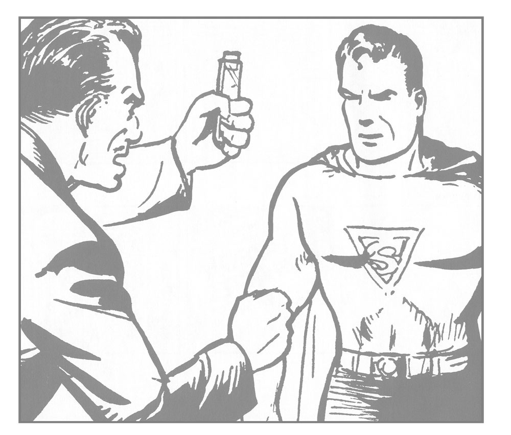
Back at my own blossoming career as a Craftint colour separator, I will now set myself the task of colouring this panel (actually, just part of a panel) from the black-and-white Superman daily comic strip. Let’s say it’s the 1940s, and this strip is being reprinted in one of DC’s colour comics.
I’ll take this in CMYK order, starting with Cyan or basic printer’s blue, “process blue” or simply…
In reality, in later years anyway, I might be working from a colour guide. In the Golden Age, I might be a colour separator who works on Superman comics all the time, and is trusted to wing it—do my own colour guide, or just make it up as I go along. As long as Superman’s costume is roughly the right colour scheme in most panels, and no-one’s hair or clothes change colour from one panel to the next—or not too often, anyway—everything else isn’t all that important. In the early days, we have testimony from Jack Adler that that’s how it worked.
Before I can start adding any solid or tinted areas to my Multicolor board, though, I need an image to work with. I imagined earlier a lightbox being used to trace an image onto Craftint Doubletone board. That could have worked for Multicolor too, but The Eighth Production Yearbook (1948) tells us that in usual practice, a blue image of the black line art was printed onto the Multicolor board. This used special Craftint Special Blue Proofing Ink, formulated—of course—to be camera-invisible.
The black “key plate” would have been used to print these images—the same one that would print the black image for the comics (after being copied as a “stereo mat,” remade as a curved plate to fit the cylinder of the press, etc.). You will note that this is directly analogous to the “staining” of the key image onto the metal printing plate before laying down Ben Day dots for a colour plate (see Part 6). In both cases an image clear enough to work on was needed, but one which would not became part of the etched image on the metal—so would not be part of the final colour print.
I’m going to represent this camera-invisible “key” image like this, in grey, not blue…
…so that it shows up on my notional Multicolor board, thusly:
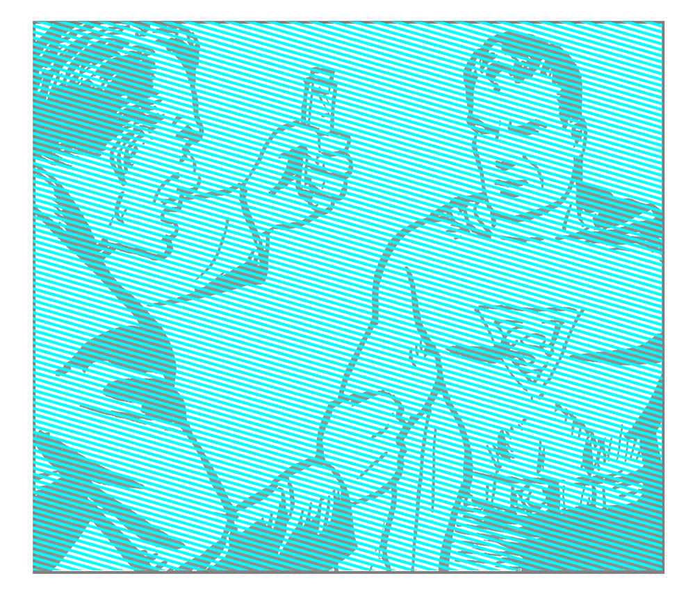
You will note that I haven’t used the same screen angle as I did for my magenta experiment. This is deliberate, of course. It matches the angle of the blue lines in Captain America 1—by the 1952 definition, 15 degrees; as per the 2009 angles, 165. This is not the angle of the blue Craftint lines we have seen in most other comics.
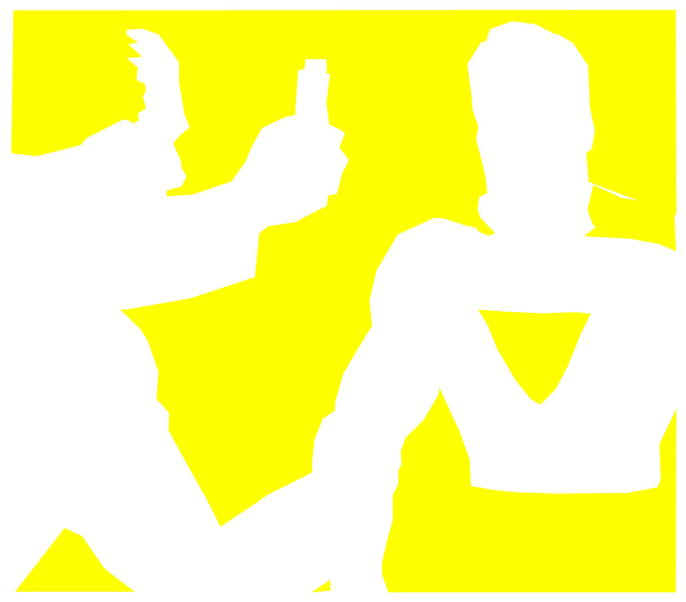
Now, I know which bits of Superman need to be solid, 100% blue. His hair, for a start. Various bits of his costume. I note that Joe Shuster hasn’t drawn a line where the end of his sleeve should be. (He’ll probably blame his inker.) I’ll have to make a careful mental note of where I end the blue sleeve.
These solid blue areas are the parts I need to ink in with black on my board—thusly:

The bad guy isn’t going to have any solid blue, but I’ve decided that his jacket and his brown hair need dark blue tint. Obviously, this isn’t one of DC comics like Sensation 68, where they try to save a bit of money by leaving out the blue line tint.
Which raises the question: on those comics, did they just save a bit of colour separators’ time, and hence wages? Or did they buy the right kind of Singletone for their blue dots, and save a few dollars there as well? The Eighth Graphic Arts Production Yearbook of 1948 mentions Singletone for Color Process, which only came as board, and in five different patterns—printed at the right screen angles, of course.
Anyhow, back at the Multicolor job: I stop procrastinating, and brush dark tone developer onto the relevant areas of my key image, bringing up the “50%” lines like so:
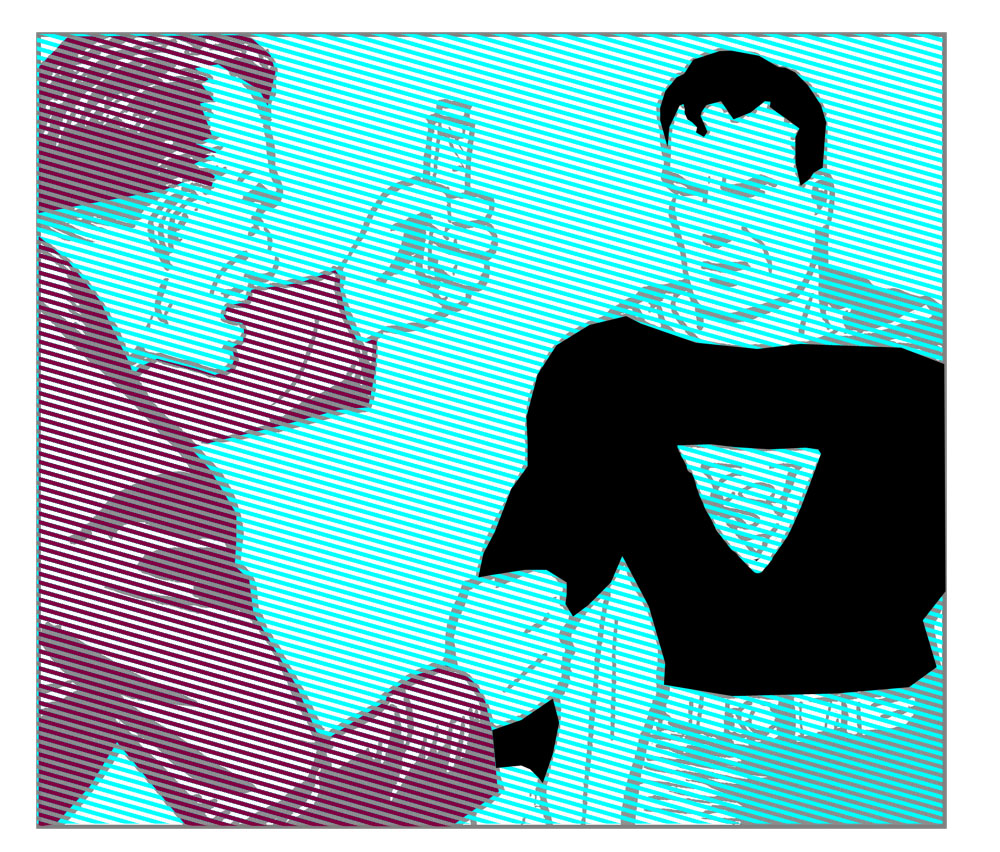
I want my background to be green, so this part of my image will get the light blue, dotted tint. Having brushed on the second developer, my board now looks like this:

In real life, I will do the whole page at one time, several panels rather than just this one. But following this single image through the process: my camera operative will now photograph the board, making sure to pick up the Craftint lines as a good blacks. The camera won’t see either the faint blue lines of undeveloped Multicolor tints, or the key image. It will photograph this image:

Of course, it will have to be made into a negative, and flipped left-right, before etching onto the printing plate. This is pretty gratuitous, but I do like a nice negative image every now and then:

This next step is purely imaginary (aren’t they all?). If a blue proof image of the plate were “pulled,” it would look something like this:

And if my hypothetical blue proof were to be overprinted with black, this would be the result:

This would be just fine if the Superman daily was being printed in a cheap two-colour edition. Many Golden Age comics did have some pages like this among the full colour. In British comics, right through to the 1970s, you were lucky if you got a few pages like this among the black & white… but I digress.
Since I’m colour-separating this image for a full-colour (4-colour) reprint, I’d better move on to…
^^Table of Contents
Or, to be precise, Superman magenta. The red parts of his costume will not be the correct scarlet colour until the magenta is overprinted on yellow—as we’ve seen in previous posts.
Now, you probably don’t want to go through the whole process again step by step, so here’s a summary I prepared earlier. The sequence below is exactly the same as seen above for the blue plate, with one exception—no gratuitous negativity. Oh, and this time I decided to ink the black (solid magenta) bits on my board after developing the lines and dots. In practical terms this is probably the right thing to do, in case of smudging.
You will see that the lines on this board are at 45 degrees again (1952 definition) as they were when I did my magenta experiment previously.
Now we are starting to see how the 4-color image might come together. As far as my imaginary job is concerned, it only remains to do the make-believe board for the hypothetical yellow plate.
Now here I can really economise. (Or imagine that I am really economising.) I’m working for DC, and 1969 is nearly 30 years away. There will be no 25 or 50% yellow tints in this comic. So I don’t need to use Multicolor board for my yellow separation. As long as registration is taken care of—outside the scope of this post, but important (see Part 6.2)—I can work on ordinary drawing board for this step.
Though I don’t know the price of, say, cheap Bristol board in New York circa 1940, I know that Multicolor board—even Singletone Color Process Board—was considerably more costly than straight drawing board. DC were saving a third of their Multicolor materials bill right there, and buying in some much cheaper stuff.
So, the key image is shown here printed onto plain board, no blue lines indicating Craftint Multicolor. And all I do here is paint on some solid black.
Note that there is continuity between the yellow on Superman’s red cape and trunks and the background colour. Similarly with the bad guy’s hair. These areas merge into one.
Also, I put the negative photographic step back in. This time it is not gratuitous, however. Without it, I would have had an odd number of pictures. That simply wouldn’t do.

As far as I know, in real life, progressive proofs would be printed only for covers or maybe for the oh-so-important ad pages ($$$!) that Adler and Harrison were so proud of. But I like progressives—they’re fun, and at this point in a long essay, we all need a bit of fun—so here they are. Hypothetical prints of imaginary steps in printing a made-up comic book panel.
The CMYK order is not honoured in progressives. They follow the order in which a comic was printed—YMCK.
So… yellow:
Yellow plus Magenta: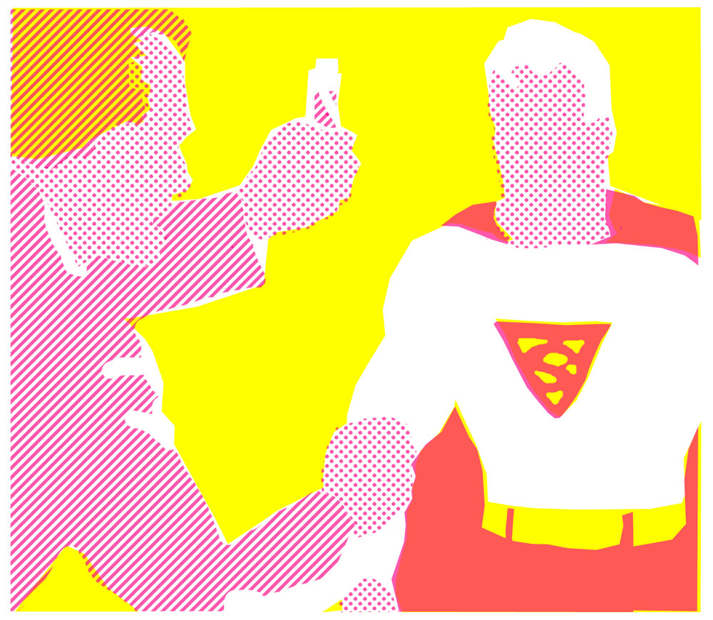
and yellow, magenta and cyan:
And… the grand finale! The 4 colours C/cyan/blue, M/magenta/red, Y/yellow, and K/black/key (or YMCK) all “printed” together. How did I do on my rookie outing?

Not bad! I’ll give myself 8 out of 10. I clearly messed up Superman’s blue sleeve—but I blame Joe Shuster for that. Or his inker.
And that top left corner… is that supposed to be brown hair or green background? Looks as if I couldn’t make up my mind.
My colours—if not my tints—look a lot like the reprinted Golden Age pages in Jules Feiffer’s book The Great Comic Book Heroes (see Part 7). They are far too bright, and so is the underlying white, to be comic book images. But at least the tints are close to genuine Craftint patterns—unlike the ones in that book.
And obviously the registration in my picture is far too good. I’ll have to try harder to emulate Golden Age printing…
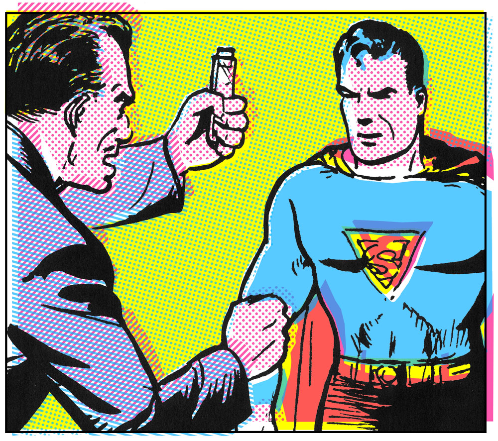
That’s a bit better. I’ll get there in the end.
And speaking of the end, to everyone’s relief we are nearly there…
In my last section: I’ve looked at the basics of Craftint Multicolor, now for some…
^^Table of Contents
CRAFTINT MULTICOLOR ANOMALIES
-
- Negative Dots
I have described above what seems to have been the standard version of Craftint Multicolor in use in the Golden Age comics, especially in later years. Earlier on, some comics seem to have used some slightly different tints.
Below is a panel from World’s Finest no.4, published in December 1941. (Art attributed to Leo Nowak.)

You will note that Superman is flying across a standard Craftint dark tone sky. But what is going on with the dark red tint on the cloud and the building? It is not made of lines, as becomes clear in the (1.3 cm wide) details below…

I believe this is a Craftint variant—though I can’t find any information about it. It seems unlikely that DC would use Craftint for blue and something else entirely for their red.
I call this pattern a negative dot tint. These dots are like holes in a grid of colour. The colour is a presence; the dots are an absence. Printed over white (the cloud above) they show white. Printed over yellow (the building) the underlying colour shows through.
(We shall be meeting a lot more of this type of dot when we watch Craftint give way to another new method in Part 9.)
I suspect this was simply another type of Craftint Multicolor board in the early days—the light tone being the standard 25% dot pattern, the dark tone being this negative dot grid. I’ve seen the same 50% pattern in other DC comics and an occasional Marvel.
Another oddity characteristic of comics done with Craftint Multicolor is the occasional panel—sometimes just one or two per comic, sometimes more—with a graduated tint, where the colour goes from light to dark. My earliest example so far is from Prize Comics no. 44 (1944)—the red background tint, below (over solid yellow). I’ve seen the same thing in other Craftint comics, through to Marvels from the mid-1950s.

We know that Multicolor itself cannot achieve any gradation of tint. However, all manufacturers of mechanical tints, from Ben Day onwards, offered graduated tints like this. In Craftint’s 1954 catalogue, the Craf-Tone version is listed as pattern no.110:

I suspect Craftint supplied a certain amount of this kind of stick-down tint sheet (or an earlier version like their “Top Sheet Shading Film”) to their Multicolor customers—possibly even free of charge, as with their developers. This might have been their way of answering criticism that Multicolor couldn’t do any gradation of tint.
Apart from sheer speculation on my part—aka deduction—there is one piece of textual evidence. In its section on Singletone, The Eighth Graphic Arts Production Yearbook of 1948 says this: Additional patterns may be obtained by using top sheet film over drawing, after Singletone pattern is brought out by developer.
Something similar could be done on Multicolor, and I think quite often was.
^^Table of Contents
CONCLUDING REMARKS
I should make it clear that, though the Ben Day dot may have vanished from the inside pages of the majority of comic books with the coming of Craftint Multicolor, the Ben Day technique continued to be used to colour comic book covers for some twenty more years. By no means all covers, though—many used halftone colours. More on this another time.
In the newspaper Sunday strips too, we have seen evidence from Phil Normand that Craftint made inroads. How quickly or completely Ben Day was phased out from the Sundays I will perhaps try to figure out some other time. Unless—did I mention this before—someone else fancies the job?
The trend towards laying down mechanical tints on the drawing board, rather than the printing plate, was of course not limited to Craftint boards. There is plenty of evidence online that artists on daily strips started using Zip-A-Tone, as well as Craftint, as the years went by. So did many comic book artists, on their B&W original art—especially a number of the EC regulars like Wally Wood and Al Williamson in the 1950s.
In other areas of printing Ben Day was facing stiff competition from ever-cheaper process colour (using halftone colour plates) but in some venues like cheap children’s books and UK comics, it seems to have hung on well into the 1950s, and perhaps beyond. My own copy of the Ben Day catalogue has some pages copyrighted 1911 and some 1936. It also has a hand-written note, indicating Line Tint no.2, saying “For Jan. 1961 cover”—proving that it was in use at least up to the end of 1960 somewhere in the printing world.
Letterpress printing itself was gradually being edged out by offset litho as the decades went by. Newspapers and comics were two areas in which it clung on longer than most—into the 1970s and 80s in Britain and the US. I wonder if it lasted even longer in other parts of the world? I’m thinking of South and Central America and India in particular—and wondering about their history with Ben Day and other methods.
As Hal Foster said at the beginning of this post, when the Sunday comics abandoned the Ben Day method, the kind of sophisticated colouring that he enjoyed on Prince Valiant went with it.
On the other hand, many Sunday strips really did not need—indeed, even with Ben Day, did not have—that level of complexity in their colouring. A 64-colour palette was more than adequate to keep Blondie or Bringing Up Father looking vibrant and attractive.
As for the comic books… as Sol Harrison said, without a much faster method of colour separation to replace Ben Day, the comic book business could never have got off the ground.
And colouring like this 1941 Craftint Superman panel—from World’s Finest 4 again—is nothing to sneeze at. (Admittedly it wasn’t always this good…!)
Original size of panel: 11 x 15 cm.
In the history of the mass-produced illustrated media, as we have seen, there have been many instances when a higher quality method has lost ground to a faster, cheaper alternative—for example when copper engraving gave way to wood engraving, which in turn was killed off by photomechanical reproduction.
Often the older, “better” method falls out of use completely, as far as the mass media are concerned—surviving perhaps as a medium for creative artist and hobbyists.
Ben Day dots themselves were criticised—loathed even—when they displaced crayon shading and hand-stippling in lithographic printing. As far as I’m aware, though, once displaced themselves, the real Ben Day dots never became an artistic or hobby choice. I’m not counting Roy Lichtenstein—he faked them! :O)
Another side to this story are the moves from colour separations drawn entirely by hand on the surface of a rough lithographic stone—via mechanical tints (like Ben Day) laid first onto the stone, then onto metal plates—towards creating mechanical tints on the drawing board itself.
Each innovation requires incrementally less skill from the craftsmen involved, until the final version can be learnt in an hour, and a page colour-separated in two.
If something is undoubtedly lost from the final printed image at each step in this process—in richness of colour and sophistication of shading—the gains are in terms of faster turnover, higher print runs, lower prices, and the enjoyment of the final product by larger numbers of people.
And of course the Ben Day dot, both the genuine article and its successors—firmly rooted in the need for economy in printing on poor quality newsprint—helped to create a whole new American aesthetic which still resonates throughout world culture.
Outside the regular readership of the comics themselves, the comic book aesthetic became widely appreciated only in the 1960s. Perhaps it needed a bit of help from Roy Lichtenstein to bring it to the attention of the art and academic worlds. But before he had painted his first dot, the mechanical simplicity of comic book colours had already achieved an appeal that transcended their origins in the parsimony of mass production.
(The appealing post-Craftint dots below are on DC romance art by John Romita Sr. You knew that.)

Arguably, in retrospect, the look created by Craftint Multicolor—with its line tints reminiscent of an earlier century—was perhaps something of an inferior anomaly on the road to the purely dot-based comic book aesthetic. The return of a non-linear 50% tint in the mid 1950s—the subject of Part 9 of my history—certainly paved the way for the continued appreciation of The Dot in years to come.
Nonetheless, the 1930s, and 40s were the decades that birthed the comic book, and cemented it (along with the superhero) as a lasting part of the American cultural scene. The 1950s almost destroyed the comic book, with a tide of crime and horror titles which provoked a national backlash, in an America paranoid about dark forces corrupting its youth. Despite that—or because of it, for some—the 50s was undoubtedly another decade of treasures—EC Comics amongst them.
And, much as I love those dots, it seems a damned shame that the distinctive comic book look created in those Golden Age years by Craftint Multicolor should have been so comprehensively banished from the collective memory.
^^Table of Contents
Not completely banished, though. I mentioned that there were two honourable exceptions to this global amnesia. One is of course Phil Normand.
The other is whoever decided to colour the Image Comics series 1963 (published in 1993) using a recreation of Craftint Multicolor. I’m hoping this estimable individual will be identified as a result of this post.

In the comments section below, 1963 artists Steve Bissette and Rick Veitch inform us that the colours were done 1980s style—i.e. manually on acetate films (to be covered in Part 9). Most comics at the time were using the relatively new computer-assisted colouring.
Ace artist and colouring maven Murphy Anderson, with his son Murphy Jnr, handled the separations.
Written by Alan Moore, 1963 was both an hommage to and a critique of Martin Goodman, Stan Lee, Jack Kirby et al’s reinvigoration of the superhero genre at Marvel Comics in the early 1960s. There is an anachronism here—Craftint never got anywhere near the originals, having been ditched by Marvel in 1954, seven years before Fantastic Four no.1.
But 1963‘s inclusion of 50% line tints and 25% dots for the first time in nearly 40 years was a nice tip of the hat to the Golden Age technique [EDIT: or maybe it wasn’t… see below]. Perhaps too it was something of a statement that the early years of the Marvel superheroes could be seen as a continuation of the “innocent” Golden Age. In 1993, Moore expressed the opinion that it was all downhill after 1963, as Marvel became more knowing and ironic, and tried to broaden its appeal to older readers.
Be that as it may, 1963 gives us a chance to see something like Craftint Multicolor in all its glory, with better printing on whiter 1990s paper. Anthony Tollin even deliberately left out the 50% yellow from a few of the stories—for reasons which I might discuss some other time.
Here is a panel drawn by Rick Veitch and Dave Gibbons, & coloured by Marvin Kilroy, from 1963 no.1: Mystery Incorporated, for your enjoyment and edification. You lucky people.
If you don’t click these pics to enlarge them, what the heck are you even doing here??
(If you do, be sure to come back via the back arrow or button on your browser, won’t you?)
:O)

[EDIT, Dec 2022: In the comments below, Steve Bissette previously shared some details about 1963, reporting that he was not aware of the Craftint-like tints, or that they had any special significance. And WB points out that a 1979 Spider-Man trade paperback reprinted older comics with some (not all, as I found) of the pages using the same tints.
I also found them in one of the Marvel Treasury editions.
Now I find that Marvel Fanfare 1, 1982 — Marvel’s direct-sales-only, glossy, expensive new comic also used the same tints (pics below). But by issue 2 the Craftint-like 50% line tint had disappeared.
I must conclude that the 50% tint lines made a very limited comeback in the 1980s and 1990s, as comics went through a variety of changes and experiments in format and printing, and on 1963 probably were NOT intended as any kind of tribute to the Golden Age. This explains the discrepancy of a Silver Age parody apparently using a Golden Age technique; it was almost certainly just a coincidence.

Below: half-inch (1.25cm) details from Marvel Fanfare 1, 1982. First three: pencils, inks and colours by Michael Golden; the fourth from a house ad.
^^Table of Contents
At some point soon I will look at predecessors of Craftint in both B&W and colour—sections that got squeezed out of this already long chapter.
I will also celebrate the look of Craftint with some more examples from Marvel, DC and other comics.
In Part 9 this history will come full circle, and describe the colour separation and plate-making methods used in comic books from the latter half of the 1950s—the next faster cheaper thing that displaced Craftint.
This will at last confront the question: If Roy Lichtenstein wasn’t inspired by real Ben Day dots in the early 60s, what the heck kind of dots were they?
Here are some to be going on with.
Be seeing you.
legionofandy@btinternet.com

Wonder Woman, Batman and Superman ©TM DC Comics. Captain America and The Fantastic Four copyright ©TM Marvel Characters. Other images may be subject to publisher’s copyright. All such images used for educational purposes / under fair use.

The ‘1963’ production work was all done with MURPHY ANDERSON and his son, MURPHY ANDERSON Jr., who did a ton of color seperation and production work for comics publishers in the 1980s and 1990s. Rick Veitch and I edited that entire series, and we worked closely with Murphy and Murphy, with the elder Murphy ensuring we ONLY used the palette available to comicbooks in 1963—since he was working in comics at that time, and he knew! Feel free to contact me directly to ask questions; I even have the original ‘film’ here in my studio to this day…
PS: We didn’t use computer coloring, BTW; old-school only, working with old-style color guides.
PPS: Communicated with Rick Veitch, who adds: “…1963 was not computer generated; was in fact done with the old system by Murphy Anderson’s studio, and might very well have been the very last books ever to be printed with the process.”
If you want to know more, feel free to email me; Rick and I would be happy to provide the details.
Magnificent series of articles—I’d love to use these in the classroom (I teach at the Center for Cartoon Studies), and were it ever to become a book, it would be an essential tome. Kudos!
Thanks very much, Steve and Rick.
I shouldn’t have jumped to the conclusion that 1963 was done with computers!
I’ll amend the text.
Were the seps done with the cut-out rubylith film then, I wonder?
The question remains of who decided to use the 25% dots, 50% line Craftint-style tints rather then the actual Marvel ’63 tints.
I hope we can answer that one.
The whole 1963 series was an absolute triumph to my mind, BTW. Re-reading it while preparing for this post brought it all back!
I’d like to see this Ben Day blog become a book. You never know.
If it is helpful in teaching I will be super-pleased!
Marvel Comics may not have used the Craftint process originally as of the mid-to-late 1960’s – but I once had a full-color book of reprints (on matte-coated paper) of old “Amazing Spider-Man” comics of the circa 1966-70 period that came out around 1979 – which included the 1970 story arc of Spidey facing head-on the scourge of drug addiction, that led to a pitched battle between Marvel and the Comics Code Authority – and from what I recall of the time, and knowing now what I do from these articles, Craftint’s handiwork (with the straight lines at an angle representing 50% shading) was, if not on all the pages, very much on most of them.
Fascinating!
What part of the world are we talking about here?
And was it a hardback, softback, Christmas annual, etc, can you recall?
I’d certainly like to track this book down!
I remember those Spider-Man stories.
Marvel published them without the CCA seal, and IIRC narrowly beat DC with their Green Lantern / Green Arrow story.
The pic of the screen angles from 1952’s “The Art Of Photoengraving” matched exactly what was used on the 1959 “Capitol logo at 9 o’clock with spires” and 1962 “Capitol logo at 12 o’clock” variants of their rainbow label on their LP’s, to wit: Cyan, 45°; Yellow, 75°; and Magenta, 105° (133 line screen). Made sense, given how the 100% yellow in that rainbow band, by the calculations of screen angles, would have been at or about 120°. The halftone of the cyan on the Capitol logo would have been 20%, by my calculations; some record companies, for their label designs, used 20% halftone cyan together with 100% black (20c/100k) for their backgrounds. (The color gradations themselves would be a story in and of itself.) For that matter, the halftone patterns of some record label designs (i.e. of Sussex Records, or what was used on other labels such as Decca and UNI) would likewise warrant their own article.
Thanks.
Good to know I have one diagram that matches with something in the real world, at least.
Every article I have read about screen angles mentions that there are various solutions to the various problems.
The main problem being that with 4 colours, and the best solution being 30 degrees between colours, there is only room for 3 colours in the 90 degrees available.
I like the ways in which different yellow patterns could be used, since yellow is the lightest colour and does less obvious Moire-ing.
E.g. CMK all one uniform dot screen, the yellow either a completely different grained screen, or a slightly different size/DPI.
I couldn’t reply to ‘Legion’s’ question in the appropriate section, so I’ll answer it here: That Spidey book was a U.S. softcover, width and height dimensions same as a comic book. And even though I didn’t know about Craftint then, the way the 50% tints were handled and the angles at which they were positioned exactly matched the characteristics of Craftint as described on here. You might want to try to find used copies on Amazon.
Thanks again, WB.
WB, I’m pleased to say that my copy of that Spider-Man book (The Amazing Spiderman, by Stan Lee; 1979, Simon and Schuster / Fireside, ISBN 0-671-24813-8) just arrived in the post.
As you say, it has at least some Craftint-like colour separations.
In fact, of the 6 comics reprinted, the first two (a continued story featuring villain the Rhino) are done Craftint-style.
The next 4 issues are done with the “negative dots” type of 50% tint as used in the 1960 and 70s comics.
I wonder if the publisher was trying out different methods to see what looked best?
It’s also notable that some of the other pages are done with the usual kind of screen angles, but many are done with the red and blue screens at the same angle. This looks odd, but mostly works really well.
for example, in some places the magenta dots of a 25% tints sit precisely in all the “holes” of a the 50% blue, looking very bright and pink.
If the screen angles were different, many of the dots would be printed over blue making a duller purple.
I have 2 other books in the same Fireside series, Origins of Marvel Comics and Marvel’s Greatest Superhero Battles – no Craftint there!
Anyway, thanks very much indeed for drawing this to my attention.
It’s a very interesting slice of history!
I’ll write it up properly soon.
INTERVIEW (video): Hip Hop Family Tree’s Ed Piskor on the weird old tools of classic comics http://boingboing.net/2016/02/01/interview-hip-hop-family-tree.html
Ed’s stuff is a BLAST!
Love this page. Detailed and illuminating stuff.
Belated thanks!
Where’s part 9?
Yes, it’s been a while since Part 8, hasn’t it?
Life got busy…
I will be talking about my History at the Dundee Borders conference in Scotland –
The Eighth International Graphic Novel and Comics Conference part of the Joint International Conference of Graphic Novels, Bandes Dessinées and Comics 2017 –
on Thursday the 29th June.
After that I’ll be putting up Part 9… but not straight after that…
Pingback: Nearly Ten Thoughts on the Bill Sienkiewicz New Mutants Run » Ben Towle: Cartoonist, Educator, Hobo
This is a great post — incredibly informative. Thank you.
wonderful post! thank you!
Information I’ve been looking for for years. Can’t believe it took me this long to find your posts.
I have bough several issues of EC comics (And Famous Funnies) in poor condition so that I could A) Study their coloring and B) Afford them.
I have seen original EC art on Heritage Auctions that shows some of the artists did use the Black CraftTint for their original art.
I’m very glad if these pages have been helpful, David. Watch out for Part 9: the ‘Silver Age’ / 1950s, 60s, 70s, any day now!
Yes, I too have a few old coverless or beaten up ECs and FF’s.
And yes again, occasional pages are seen in ECs where the artist has cut out a piece of expensive Craftint board and glued it in place just for a single panel, or more than one.
I expect you’ve also seen those ‘fake 3-D’ or ‘3-D effect’ comics with the black artwork done entirely on Craftint Doubletone board.
I also own a few affordable copies of those, with the colours also done with Craftint (Multicolor). Especially good to have them printed on paper, but also viewable online, e.g. this one which I recently bought a copy of (missing centre pages so something of a bargain):
https://comicbookplus.com/?dlid=14051
Pingback: Marc Caro, Before the Movies – Who's Out There?
Scratchboard and Craftint…. two of my favourite things! I’m looking out for this book now. Thanks!
Thank you for creating this website with all of this wonderful info. I am working on a project now as an illustrator and trying to emulate some for the techniques used during The Golden Age of Comics. I was wondering if you have ever heard of a website called “True Grit Texture Supply” where you can get digital brushes (like the “Kraft Tone” one), that create the coloring techniques of that era?
Sorry for the delay in replying… busy busy (and forgetful).
Yes, I’ve briefly looked at the True Grit textures. Their ads popped up in my Facebook feed.
They look really fantastic!
Pingback: O processo de colorização na Era de Ouro | Quadrinheiros
This contains the best information I’ve found to help me recreate a 70’s printing style for my comics – Thanks very much for your years of knowledge!
You are so welcome, Lee.
You are also welcome to tell us all where we can see some of your work.
I’m still working on the comic but here’s a link to a commission I did a few days ago using some halftone brushes I created – It’s fairly mature in nature! https://www.deviantart.com/lees72/status-update/Check-this-out-1172020197
Ha ha! I see what you mean.
Great tints.