
This post has spawned. See also:
- The History of Ben Day Dots Part 2: Halftones, Polke dots etc.
- Part 3 : CMYK / 4-colour comic book printing, RGB dots on your screen
- Part 4 : Secret origins of Ben Day dots—history and pre-history
- Part 5 : The rise of Ben Day dots in lithography, 1880 & beyond
- part 5-&-a-half: French comic strips 1886 – 1888 & the forgotten technique used to print their colours.
- Part 5-&-three-quarters: Ben Day in a litho’d kids’ magazine, 1885—anticipating the look of comic books—an ancestor?
- Part 6 : 1890s: Ben Day in the original Sunday Comics
- Part 6.1 : 1930s: Ben day dots in their prime—Tarzan Sunday pages
- Part 6.2—Registration—as in, getting the colours lined up right—or not
- Part 7—Ben Day Dots 1933 to 1937—the birth of the comic book
- Part 8 — 1930s to 1950s: The “Golden Age” of Comics — exit Ben Day, enter Craftint
- Part 9a — 1950 & 60s: The “Silver Age” of Comics, Part 1
- Part 9b — 1950 & 60s: The “Silver Age” of Comics, Part 2
guy.lawley@btinternet.com

Roy Lichtenstein, Masterpiece (1962)
The hugely successful US artist Roy Lichtenstein (1923 – 1997) remains best known for his series of War and Romance paintings, made between 1961 and 1965, using images derived from DC comics of the time. Though he then dropped this comic-book subject matter, it is well known that he continued to use three stylistic mainstays which he developed during those years, derived directly from the art and printing techniques of the comics:
- the limited, mainly primary, colour palette;
- the black outlines;
- the “Ben Day” dots which the comics used for gradations of colour.
In other words, it can be said that he owed his entire – very lucrative – career to the comic-book art which he copied in those early years.
In fact while it is undoubtedly true that these three elements remained the basis of Lichtenstein’s style, the Legion contends that none of the three, if looked at in detail, is as directly derived from the comics as one might think. It is routinely noted, even by those who decry his use of comic-book images, that Roy made more or less subtle changes to the comic-book art which he copied, changing composition, often framing only a selected part of a panel, sometimes amalgamating parts of two or more panels into one image.
What is less likely to be discussed, or may be briefly mentioned before moving swiftly on, is that his colour palette was actually quite far removed from the colours of the comic-book printing process.
He also (far less subtly) changed the very nature of the black outlines he was copying from.
And finally, Roy did not paint giant Ben Day dots. He painted Roy Lichtenstein dots, which are quite a different animal.
Here are some big Ben Day dots – or at least, some of the comic-book dots which Roy and everyone else at the time called Ben Day dots:
 John Romita, “No Cure For Love” Heart Throbs no.70, Feb-Mar 1961 (detail)
Here are some Roy Lichtenstein dots:
 Sleeping Girl, 1964 (detail)
Spot the difference?
(No pun intended.)
We shall return to this in Part Two… and very likely, Part Three… Part Four… Part Eight…
THE TROUBLE WITH ROY
We of the Legion find it hard to be objective about the art of Roy Lichtenstein. We have been huge fans of his work since we were 12, when Pa Legion took us to the Institute of Contemporary Arts (ICA) on the Mall in London, to see an exhibition called Aaargh! A Celebration of Comics in 1971.
(see Steve Holland’s blog at: http://bearalley.blogspot.co.uk/2009/07/aaargh-bumper-souvenir-catalogue.html)
Here we had our first exposure to pages of original art by Jack Kirby and Gene Colan, whose work we had been enjoying in the comics for some years. There were many other treats on display. Pa Legion took home an anthology volume of Underground comix, which was quite an eye-opener.
Amongst the cornucopia of comics art at the exhibition, we saw our first Roy Lichtenstein – a sculpture of a woman’s head. This audacious piece made a big impact. Bear in mind, the Legion had not even seen a flat canvas in this style before. And here were giant comic-book-style dots, primary colours and black outlines, on a 3D head… !

Head With Blue Shadow, Roy Lichtenstein, 1965.
We have, let’s face it, been more than a bit in love with Roy ever since.
However, as the years went by and we developed some semblance of maturity, controversies over Lichtenstein’s alleged plagiarism could not be ignored.
We became aware quite early on that the likes of Siegel & Shuster, Superman’s creators, had been treated pretty shoddily by their own publishers (a different issue to be sure, but morally related). US comic books as such started in the 1930s, and Superman first saw print in 1938. Writers and artists signed over copyright in their work to the publishers and worked for low rates of pay, as freelancers with no employee benefits such as pensions or health plans. The top brass in the comics biz made plenty moolah, had lavish lifestyles, and were not, for the first 50 years or so of their ascendancy, very keen to share the profits with the creatives.
Roy Lichtenstein had his one key idea, the one that made his own fortune, in 1961. He could paint an enlarged image of a comic-book panel (or part of one, or the similar graphics of the small ads) (with slight alterations) and create something that no-one else was doing, at least not in art galleries. Maybe that would get him out of the unprofitable (in both senses) rut that his post-cubist, abstract expressionist painting career had got stuck in.
(He didn’t know that Andy Warhol was having a similar revelation at around the same time. Roy got his canvases into a gallery just ahead of Andy’s. Andy found out very early on, felt he’d been beaten to it, & largely went off in other directions.)
At this time most DC comic-books didn’t carry writer/artist credits. The small ads certainly didn’t! Roy didn’t know whose work he was appropriating, and probably didn’t care. The graphic elements of the comics’ artwork excited his eye, clichéd features of the stories & artwork appealed to him, and he had fun picking out the “pregnant moments” in a narrative which would make a tasty canvas.
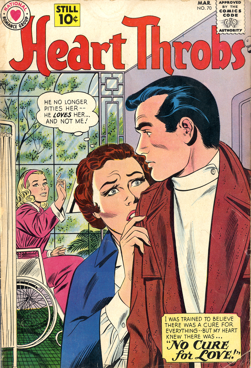
John Romita, cover of Heart Throbs no.70, Feb-Mar 1961, DC/National Romance Comics
Increasingly, the stereotyped feminine and masculine roles depicted in romance and war comics became his subject matter. He also used his paintings to make joking references to the art world itself, whether that subject was explicit in the original comic story or not.
Lichtenstein has also claimed that he was interested in how a pictorial motif such as a kiss – used a million times over to the point of becoming a cliché – could be seen as valueless junk when printed in a comic-book, but nonetheless be valued as “art” when rendered by the hand of a gallery painter / sculptor or classical artist. Confronting a gallery crowd with the same comic-book image, now rendered into a painting on canvas by an artist, would at the very least blur the distinction. The reactions of many in the art world at the time certainly proved that the comic-book medium was not just looked down on but actively despised. Less than a decade before, comic-books had of course been the subject of a significant moral panic on both sides of the Atlantic, targeted by the Senate Hearings into Juvenile Delinquency in Washington and the UK Parliament.
Roy has said that he thought the difference between artistically valueless and artistically valued images must be due to a transformative power which rests in the hand of the artist. (In saying this he may well have been slyly mocking the abstract expressionists rather than stating his own beliefs.) If the artist is not using a personal style to make the image, but mimicking closely the mechanical (style-free) means of production of the comic book picture, is that transformation still occurring? Was Roy making “art” or was he not? If the “value” of art is measured in $$$, he certainly proved very quickly that he was. Before long, that other great measure of artistic value was also stacking up; number of column inches of mainly impenetrable bullshit written about his work by critics. Or stated by himself of course.
Though he may have been implicitly or explicitly adding layers of irony and social or artistic comment to the subject matter of the comics, and regardless of his altering the images to a greater or lesser extent, the fact remains that Lichtenstein’s paintings made substantial use of other people’s created work. Depending on your point of view, he was “referencing”, transforming, appropriating, borrowing or stealing the fruits of others people’s labours.
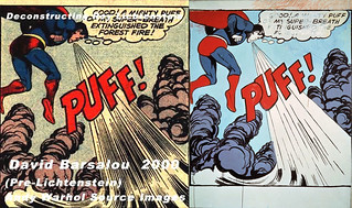
IMAGE DUPLICATOR

Lichtenstein, Kirby and Premiani – stolen from Jeremy Brautmans’ blog
http://www.jeremyriad.com/blog/editorials/deconstructing-roy-lichtenstein/
Lichtenstein has been the subject of a major career retrospective at the Tate Modern this Spring (Feb 21st to May 27th 2013) which the Legion visited twice. We had a lovely time and bought not only the catalogue but also the cushion covers. We also made it to Image Duplicator, the small but beautifully formed show at the Orbital (comic shop) Gallery which talented Brit artist Rian Hughes & his comprades mounted in response to Roy @ the Tate. This ran from the 16th May to the 31st.
https://www.facebook.com/media/set/?set=a.10152770686425405.1073741971.337036405404&type=1
http://www.creativereview.co.uk/cr-blog/2013/may/image-duplicator-pop-arts-comic-theft
Rian spoke at Paul Gravett’s Comica / Comiket weekend in April 2013, on the topic of how Lichtenstein (& others) have copied from the work of comic book artists and other “commercial” artists, sometimes making massive sums from doing so. (Richard Reynolds also spoke about the links between fine art and commercial art, emphasising how influences flowed from high or classical / historical culture into the work of Jack Kirby, for example.) Roy L. and his fellow fine artists, so the argument goes, have been very remiss in not sharing their profits with those whose artworks they plagiarised. Initially at least, they didn’t even acknowledge the individuals who drew or painted the originals.
And lest anyone should think that this habit died out with the Pop generation, Rian Hughes and Paul Gravett can tell you about two egregious cases of gallery artists working right now (Erro, Glenn Brown) who are using the works of Brian Bolland, Chris Foss and other “low” artists for their own great financial gain.
See the Gravett link below and:
Tony Abruzzo, from Secret Hearts no. 83, Nov 1962
The Orbital show cheekily borrows its name from the Lichtenstein Foundation’s own web site – also called Image Duplicator. Turnabout is fair play! Profits from the show will go to The Hero Initiative, which helps comics artists struggling with health or other issues in the living hell reserved for ageing freelancers in the welfare desert of the USA.
http://www.heroinitiative.org/
Prints can be bought through Print-Process, http://print-process.com/product/?product-id=1096. This page also provides a good way to view the images.
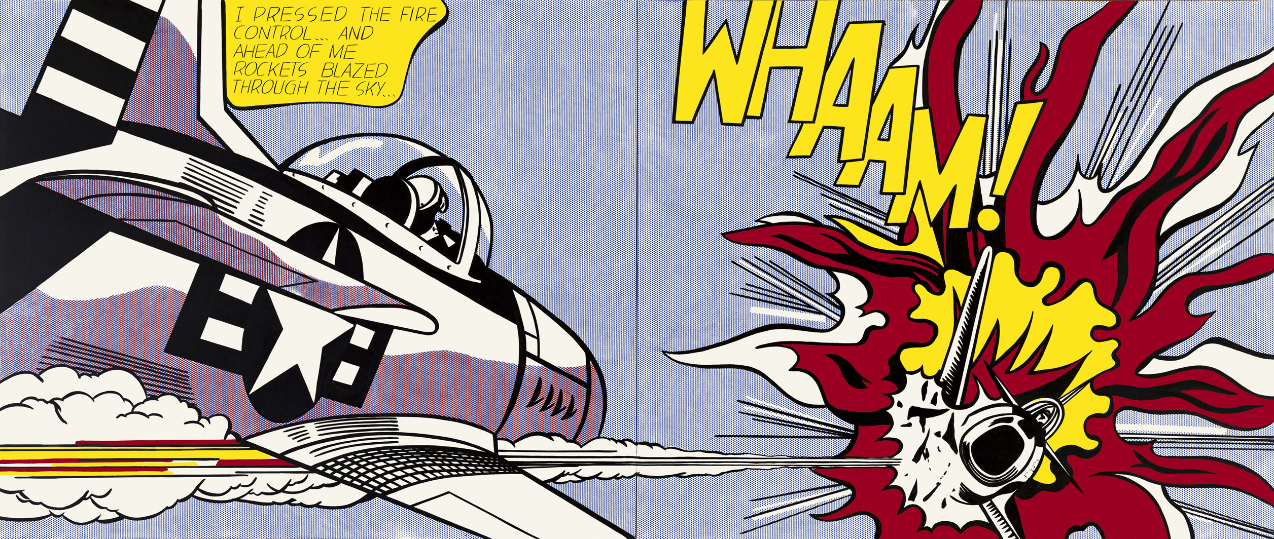
One of the central pieces in the show is Dave Gibbons’s Whaat? This parodies Lichtenstein’s huge painting Whaam! (1963), which the Tate Modern states is based on a war comic panel by Irv Novick. (This is the only comic-book panel that the Tate shows alongside – or at least, in the same room as – the painting it inspired.) Whaat? explicitly comments on the question of ownership of the image, and on the money to be made from such image duplication. (You probably can’t make out the dollar signs that replace the Lichtenstein dots in the sky of Whaat? as seen on screen below, but a larger image is just a click away.)
Several of the other pieces in the delightfully varied Image Duplicator line-up refer directly to the issues of copyright / financial theft which many perceive to lie at the heart of this matter. Only one artist, talented comic-book illustrator Mark Stafford, graces the catalogue with a pro-Lichtenstein comment. Paul Gravett has a major piece about the controversy on his excellent site, supporting the Hughes / Gibbons position.
http://www.paulgravett.com/articles/article/the_principality_of_lichtenstein
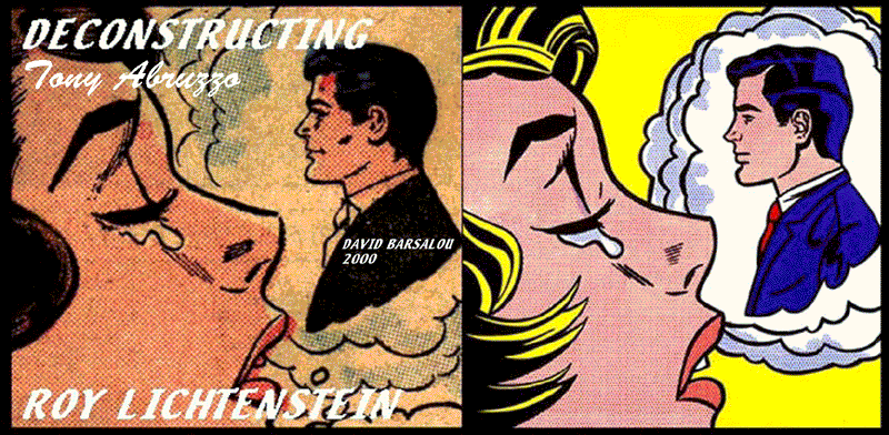
Paul also links to the Flickr site of David Barsalou, who has exhaustively researched the panels which Roy L used in his paintings. The Legion found this rich resource, known as Deconstructing Roy Lichtenstein, shortly before reading Paul’s piece, and we have to admit that we didn’t know the name of Tony Abruzzo before seeing so much of his art here.
http://davidbarsalou.homestead.com/LICHTENSTEINPROJECT.html
(If only David would share with the rest of us which comics the panels appeared in…)
It would be have been good, wouldn’t it, if Roy Lichtenstein had sat down with his lawyers and accountants at some point, and put together a financial package for Irv Novick, Tony Abruzzo, John Romita and all those other artists whose work he was making a very nice living out of. Many of them were after all not living privileged lives. Many freelancers in the comics biz have, over the years, died in poverty.
It would have been a very warm-hearted thing to have done, as one artist to a group of others. Roy’s reputation among comics professionals would have been a good deal more positive than it is today. Alas it didn’t happen. And the majority of comic-book pros today probably think Roy Lichtenstein is, to get anagrammatic about it, a Trite Shiny Clone.
Though other anagrams are available.
Indeed, alternative viewpoints are also available, online and elsewhere. Gavin Burrows, standing in front of Whaat? when it was first displayed at London Comiket, told the Legion, “I’m not bothered by [Roy L] copying from comics artists. Comics artists copy from each other all the time.” If too much anti-Lichtensteinism gets you down, you could head over to Eddie Campbell’s blog (link below) for an antidote. Eddie, with his usual incisive intelligence, musters some copyright freetardish arguments in a robust – combative even – art-philosophical manner. http://eddiecampbell.blogspot.co.uk/2007/02/plagiarism_07.html
NOW, ABOUT THOSE DOTS…
As well as alluding to the plagiarism issue, Whaat? is an attempt to justify a claim made by Gibbons in the BBC’s recent Lichtenstein documentary, in which he tells an incredulous Alistair Sooke that an exact copy of the comic book panel done on the same scale as Whaam! would look better than the Lichtenstein. Whereas Roy amalgamates two comic book panels to get his image (with additional elements from a third) (see Paul Gravett’s piece for details), leaves out the mountain and simplifies the explosion to a fault, Gibbons comes close to reproducing Irv Novick’s original panel, on a fairly large scale.
This exercise fails, unfortunately, to give us the direct comparison we might crave. Only paint on canvas, the same size as Whaam! and hung on the same wall, could really answer the question: Irv or Roy? The sheer scale of a Lichtenstein, including the actual size of its dots, really does add something in itself to the impact of the image. Only a gallery wall can give our eyes that experience. Prints, posters and books are never even a good second best. But it’s a spirited attempt by the British lad, and the Legion are very happy to have an A2 print of Whaat? for our own clubhouse wall. Available from http://print-process.com/product/?product-id=1096. Did we say that before?
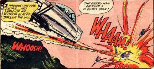 Irv Novick, All American Men of War no. 89, Jan-Feb 1962. The comic would have been on sale from around November 1961.
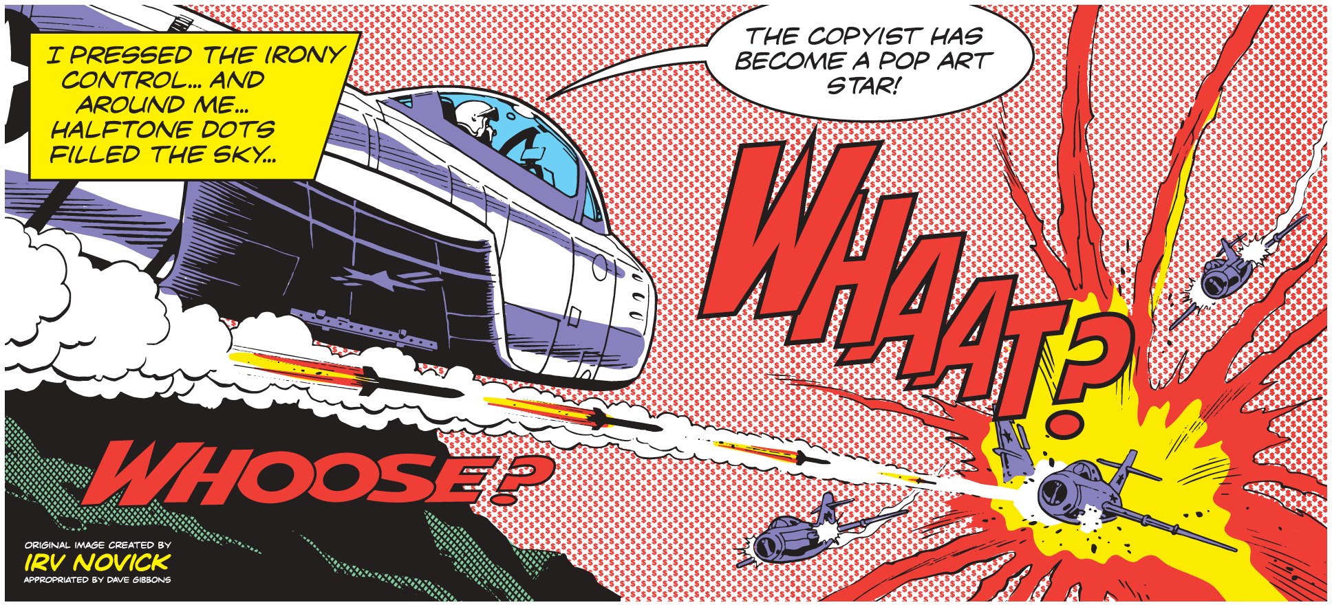 Dave Gibbons, 2013
That other fella, 1963
Text and original images copyright © The Legion of Andy 2022
To be continued…
In Ben Day dots Part Two: Halftone dots and others:

Ben Day dots Part Three: Comic books and CMYK, & how pixels make colours:

 and other fun stuff
Ben Day dots Part Four Ben Day, Secret Origins:

Part 5: Ben Day’s first big success – colour lithography, the 1880s:
Part 6: Ben Day in the early comic strips, 1890s:

Part 6.1: Newspaper comics of the 1930s – Ben Day dots in their prime – with Tarzan!

Part 7: The First Comic Books, 1933 – 1937
Part 8: The “Golden Age” of Comic Books, 1938 to 1955 – exit Ben Day, enter something faster and cheaper
Part 9a, Part 9b: The Silver Age of US comics – and the newer type of dots which Roy Lichtenstein really copied.

Text and original images copyright © The Legion of Andy 2022

ANDY WARHOL AT BONWIT TELLER NEW YORK CITY APRIL 1961

Deconstructing Roy Lichtenstein
Thanks, David.
The Legion thought someone might bring up the large Warhol Superman painting, displayed in a prominent Manhattan department store window in April of 1961. The display also includes Popeye and The Little King from the comic strips. All these Warhol pieces were probably painted during 1960, when he also did a Dick Tracy, though some sources give the date 1961.
April ’61 is pretty definitely before Lichtenstein painted Look Mickey!, his first comic-strip styled painting, so he could have seen Warhol’s painting and it could have influenced his adopting comic book imagery. David reports that Warhol believed that Lichtenstein stole the idea from him, but I haven’t seen this stated elsewhere.
We know that Lichtenstein had included Donald Duck and Mickey Mouse in a looser, sketchy form in 1958 in semi-abstract paintings. Also, Warhol didn’t do dots. So Roy had form with these characters before Andy displayed his paintings.
Other pre-pop or proto-pop artists (Schwitters, Paolozzi) had used comic strip and Disney characters in collages long before, and of course Richard Hamilton’s collage Just what is it that makes today’s homes so different, so appealing? – sometimes said to be the picture that launched Pop Art in 1956 – incorporates a romance comic cover (actually from a house ad within another comic) in its mix of advertising imagery.
So there are numerous possible sources of inspiration within other artists’ work, as well as the direct sources that Lichtenstein appropriated, if you want to go looking for them. It certainly remains a tantalising possibility that Roy saw Andy’s window display. Thousands of New Yorkers must have done!
The Lichtenstein Foundation’s Timeline states that Roy L visited Warhol’s studio in the autumn of ’61, after having painted Look Mickey!, and saw his comic strip paintings there.
TED CAREY : Warhol Biographer
It would seem that Lichtenstein was even less original than many of his existing detractors had thought.
The first time that Warhol’s large canvases of comic strip characters were exhibited publicly was in April 1961 as part of a window display at the Bonwit Teller department store. Ted Carey discovered afterwards that Roy Lichtenstein was doing similar work.
Ted Carey
“… I can remember one Saturday afternoon going into Castelli Gallery, and I was in looking at a show, and Ivan said, ‘Oh, I’ve got something to show you…’ so, we went into the closet and he pulled out this big Pop Art painting, and I can’t remember what it was, but it was a cartoon-type painting. And I said, ‘It looks like Andy Warhol.’ and he said, ‘No, it’s Roy Lichtenstein.’ And I said, ‘Well it looks very much like some paintings that Andy is doing.’ ‘Yes, we’ve heard that Andy is doing some paintings like this,’ he said, ‘Leo would like to see them. So, tell Andy to give us a call.'”1
When Carey told Warhol of Lichtenstein’s paintings, Warhol thought Lichtenstein was copying his ideas.
Ted Carey:
“… So, I went home and called Andy – no, I think, I went right over to Andy’s house… and so, I said, ‘Prepare yourself for a shock.’ And he said, ‘What?’ I said, ‘Castelli has a closet full of comic paintings.’ And he said, ‘You’re kidding?!’ And he said, ‘Who did them?’ And I said, ‘Somebody by the name of Lichtenstein.’ Well, Andy turned white. He said, ‘Roy Lichtenstein.’ He said, ‘Roy Lichtenstein used to… ‘ – as I remember, he used to be a sign painter for Bonwit Teller, and here’s where I’m a little bit confused because Andy… couldn’t get anybody to show his early cartoon paintings, so he went to Gene Moore and Gene Moore said, ‘Well I can put the paintings in the windows…’ He put them in the 57th Street window… As I remember, the implication was: Andy felt that Lichtenstein had seen the paintings in the window and gave him the idea to do his paintings. Now, whether this is true or not, I don’t know, but at this time, this is what Andy had felt.”
Lichtenstein denied that he had any knowledge of Warhol’s comic strip paintings prior to doing his own:
Roy Lichtenstein:
“I saw Andy’s work at Leo Castelli’s about the same time I brought mine in, about the spring of 1961… Of course, I was amazed to see Andy’s work because he was doing cartoons of Nancy and Dick Tracy and they were similar to mine.”
Although Lichtenstein maintains that he saw Warhol’s paintings at Castelli’s gallery in “about” the Spring of 1961, Castelli did not have any Warhol paintings at that time. The only place they had been exhibited was in April 1961 in the windows of Bonwit Teller. Lichtenstein implies that Castelli was stocking Warhol’s work prior to his own, whereas Carey’s comments indicate the opposite – and Carey’s comments are supported by the recollections of both Leo Castelli and Ivan Karp. Although Lichtenstein had been using comic book imagery in his paintings since 1957, he did not do large canvases reproducing single comic strip panels featuring speech balloons until he painted Look Mickey in the summer of 1961 4 months after he had, by his own admission, seen Warhol’s canvases. Warhol had been painting single comic strip panels featuring speech balloons since 1960 – a year earlier than Lichtenstein. It is possible that Lichtenstein, as Warhol suspected, had seen Warhol’s paintings at Bonwit Teller, although Lichtenstein never mentioned it in interviews. In any case, Lichtenstein admitted having seen Warhol’s cartoon paintings prior to doing his own single panel comic strip paintings featuring speech balloons (Look Mickey) and it is possible he was influenced by Warhol’s work.
http://www.warholstars.org/warhol1/11roylichtenstein.html
Warhol Biographer Patrick Smith to David Barsalou 2010
~ Did I tell you that I once confronted Roy on those paintings? Back in the ’80s i was teaching at North Texas and brought a pop art seminar to the opening of roy’s german expressionism paintings at the Fort Worth Art Museum…During the Q & A, I said…”now, you started your comic strip paintings during the summer of ’61..” “yes” “well, did you ever see Warhol’s paintings at Bonwit Teller during April of ’61?”…He then stared, wide-eyed, and practically shouted “NO!”…NEVER. I then turned to the kids and said…”that proves it…he did see them”.
Fascinating. Thanks very much David.
The Legion knows you have attributed the original drawing of Warhol’s Superman to the wonderful comic artist Kurt Schaffenberger.
Do you know which comic the panel appears in?
Pingback: Faire une super impression | Le Cabinet de Curiosites Marvel
I often visit your website and have noticed that you don’t update it often. More
frequent updates will give your blog higher authority & rank in google.
I know that writing posts takes a lot of time,
but you can always help yourself with miftolo’s tools which will
shorten the time of creating an article to a few seconds.
Hi Mamie, and sorry for not responding before; I’ve been super-busy and missed some comments here.
And of course being super-busy is one reason for not updating the blog.
Specifically I have gone back into studying at University over the past two years.
There will be more LegionOfAndy… eventually.
The whole Silver Age chapter is perpetually nagging at my hindbrain;
I will have to emerge into the forebrain and the laptop and the world of blog soon… maybe before year’s end.
Great stuff. I ‘discovered’ a previously unknown Lichtenstein source with Craig Yoe for our book Behaving Madly. BM is a book about the flood of Mad magazine imitaton sof the late fifties. One of the titles was Panic, one of the longer running ones (six issues instead of the usual two to four). One issue has a Bob Powell cover of a gun directed at the buyer against a blue background. The image shows only the gun and the hand holding it, with the barrel pointed directly at the reader. As any Lichtenstein fan will know, he use the same image for a litho in 1961 and again in the late sixties as a cover for Tiem magazine after the death of Robert Kennedy. The theory is that before doing comics, Lichtenstein used magazine ads as the basis of some of his art, so he must have had quite a collection of newsstand publications. It is more than likely that he would have seen (or bought) this striking image – the first ever to point a gun at the reader on a cover and so big (tehre may have been one or two panels doing that before that). So did Lichtenstein see it and did he think it was a nice metapore for gun violence? If so, he did not only use the image, he also took the underying satirical meaning of the original. Unfortunately, I have never been able to find a Lichtenstein epert to have a look at it as well. Maybe you can help? If you get in touch, I can send you images.
Just here to say thank you, this series is just what i’ve been looking for!
Thank you!
If possible, do share a few words about why it’s what you’ve been looking for…
:0)
Pingback: Ben Day Dots – More Fun Than Scurryfunge
Pingback: หนังสือการ์ตูน (Comics) มีอิทธิพลต่อโปสเตอร์ภาพยนตร์และโลโก้อย่างไร -
Pingback: FMP: Artist Comparison- Pop Art – Luke Mervyn Brookes Art
Pingback: BEN DAY DOTS Part 9b: 1950s and 60s — the ‘Silver Age’ of comics, part 2 | LEGION of ANDY
Pingback: The Funny Pages This Week part two The Daily Cartoonist - News7h
Thanks for the link! That Zippy cartoon is fabulous!
But, as I think you spotted, it refers to Rubylith which is relevant to a lot of comics, but only after the era of my history of ‘Ben Day dots’…. Lichtenstein and the comics of the early 1960s which inspired him (and what led up to that technology and that aesthetic).
So, yes… Zippy and Griffy can look back further than that here if they want to.
Pingback: Faire une super impression – Planet EcoloGeek
Pingback: Our Latest Framing Project | Bee Happy Graphics
THIS IS GORGEOUS AMAZING VALUABLE INFORMATION. Please, for the love of god, publish this series as a book. PLEASE. I can’t stare at my screen any longer, I need a book…
Thanks, and sorry I missed this comment last summer!
One day I’d love to make it a book too…!