
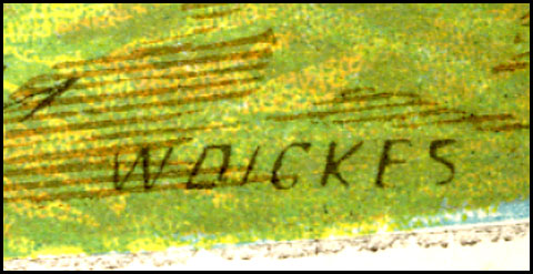
or,
THE MOST IMPORTANT COLOUR PRINTING TECHNIQUE YOU’VE NEVER HEARD OF: RESIN GRAIN CHROMOTYPOGRAPHY.
a.k.a Relief Aquatint
or,
BEN DAY DOTS, PART 5-&-A HALF—a predecessor to Ben Day in colour letterpress
Previously on The History of Ben Day Dots:
- Part 1: Roy Lichtenstein , The Man Who Didn’t Paint Ben Day Dots
- Part 2: More on Roy; Halftone and Polke Dots, etc.
- Part 3: Four Colour Comics, RGB Dots On Your Screen etc.
- Part 4: Ben Day Dots: Origins and Pre-history; 19th Century Picture-printing
- Part 5: Ben Day Dots in Lithography, 1880 – 1940
- Part 5-&-three-quarters: Ben Day in a litho’d kids’ magazine from 1885—anticipating the look of comic books—an ancestor?
- Part 6— 1890s: Ben Day in the original Sunday Comics
- Part 6.1 —Ben Day dots in their prime, on 1930s Tarzan Sunday pages
- Part 6.2—Registration—as in, getting the colours lined up right—or not
- Part 7—Ben Day Dots 1933 to 1937—the birth of the comic book
- Part 8 — 1930s to 1950s: The “Golden Age” of Comics — exit Ben Day, enter Craftint
- Part 9a — 1950 & 60s: The “Silver Age” of Comics, Part 1
- Part 9b — 1950 & 60s: The “Silver Age” of Comics, Part 2
guy.lawley@btinternet.com
Contents:
Introduction: what’s it all about?
(1) Three French Comic Strips in Colour, 1886 to 1888
- En Chasse, by Flamberge
- Chien et Chat, by Eugene Courboin
- Comment On Fait un Chef D’Oeuvre, by Caran D’Ache
(2) The Colours of Chef D’Oeuvre
(3) Relief Aquatint, or Resin Grain Tinting
- Introducing the Method
- Relief Aquatint, Gillotage and Ben Day Dots
- Use in The Illustrated London News and The Graphic
(4) The Original Aquatint Method (Intaglio)
- Aquatint and Other Intaglio Methods Compared
- Grey Tones in Aquatint
- Comparison with Mezzotint
- Spirit Ground Aquatint
- Dust Ground Aquatint
(5) Hybrid Forms
- The Baxter Print: Aquatint plus Colour from Wood Blocks
- William Dickes and the Invention of Relief Aquatint
- Lady Di and Spanker: the Chromotypograph
- French Comic Strips: Chromotypographs or Colour Line Blocks?
- A Negative View
- French Comic Strips: Spirit Ground or Dust ground?
Coming Attractions: what’s next?
Introduction
Elsewhere on this blog I am running a series on the history of Ben Day dots.
In Part 6 I will be looking at how Ben Day dots were used on metal printing plates, in letterpress printing—including the comic strips which started in U.S. newspapers in the mid-1890s.
In this post I will show some rarely-seen early colour comics, and discuss the kind of dots they used—they’re not the Ben Day kind. Along with the Nelson transfer paper used in lithographic printing (discussed in Part 5) these dots were an important predecessor of Ben Day, in this case on metal plates in letterpress printing of colour pages.
In doing the blog, I have looked at colour printing in the 19th century in some detail. During my researches—a.k.a. spending sprees—I have found several comic strips in both colour and black-and-white which as far as I can tell have rarely, if ever, appeared online or in the literature. I present three of these today—coloured pages from French magazines of 1886, 1887 and 1888. The Caran D’Ache strip is online at one site, but its visibility may not be very high. If either of the others is online and I’ve missed it, please let me know.
A good many comic strips have of course been found which predate the supposed origin of the medium in October 1896—the month of Richard F. Outcault’s The Yellow Kid and his New Phonograph.
Many of them, like my three French strips below, are “silent”—that is, they have no text either in captions beneath the pictures or inside the picture area. Others have captions under some or all of the pictures.
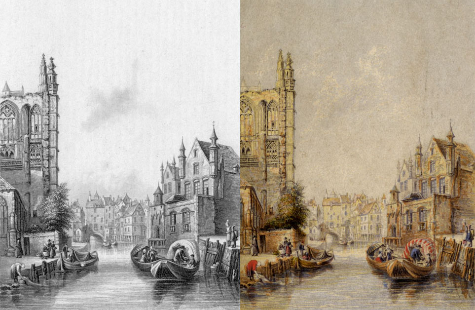
Only a few of these early comic strips have been found in colour. Thierry Smolderen, for example, has located some beauties in the pages of the British magazine The Graphic. See http://john-adcock.blogspot.co.uk/2012/01/comic-strips-of-graphic-and-illustrated_11.html though the example below is not pre-1896 (and clicking on it won’t make it any larger):
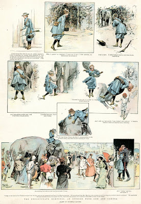
“An Unfortunate Huntress”, Reginald Cleaver, The Graphic, Xmas supplement, 1899 – posted by Thierry Smolderen
As well as the pleasure of simply discovering and reading these strips, and putting them online for a wider audience, I also want to use them as examples of the printing techniques of the time.
By the late 1880s, the French were regularly using the novel photomechanical process (see Ben Day dots Part 4 for details) in magazine illustration. British and US magazines still relied heavily on wood-engraving for their black-and-white pictures.
A black-and-white drawing printed by photomechanical means was known as a “line block.”
France got a head start because of a fundamental advance made by Parisian Firmin Gillot in 1848 (or 1850; accounts differ). He discovered how to etch a detailed image onto a metal printing plate using transfer paper—“Gillotage“. This was similar to a well-established method in lithography—see Part 5. Gillot’s key invention was the new—and very complex—method needed to achieve a deep enough acid etch on the metal plate (or “block”) for relief (letterpress) printing.
From about 1876, his son Charles extended the method, using photography to transfer the image to the metal—the photomechanical process or “photo-engraving.” This became the basis of all letterpress printing of pictures, including comics, for the next century and more. For a detailed account see this online article by Jenya Frid (now archived): https://web.archive.org/web/20160303114331/http://archive.printeresting.org/2014/10/06/gillotage-the-lost-history-of-an-influential-technique/
By 1886 “process” work included not only line blocks, but also early letterpress printing of black-and-white photographs, using halftone screens to break the photographic image into printable dots. (See Ben Day dots Part 2.) But there was no colour printing using halftone plates yet.
For the comic strips I’m showing here, a black plate—or line block—was made from the original B&W artwork by the photomechanical process, and colour plates prepared by a variety of means, all essentially still manual.
A key thing for me about these strips is the way the magazines’ engravers used various kinds of lines and dots for colour, but not Ben Day lines or dots. In theory, they could have done. Lithographers, after all, had been using Ben Day on their stone printing blocks since the early 1880s (see Ben Day Dots Part 5). At least in many countries, they had.
Historian of print Michael Twyman reports evidence that French lithographers used little or no Ben Day. It is likely that they saw mechanical tints as looking “unnatural” or “unartistic,” as did some contemporary British writers on the subject.
Some lithographers re-trained as metal plate-makers, others passed on relevant skills within the trade (as did wood engravers) as letterpress made its inexorable advance. The evidence of the published illustrations suggest that, in France, the lithographers’ prejudice against Ben Day tints was also passed on.
There may have been technical reasons as well. A lot of French colour illustrations in letterpress used a black-and-white halftone as the key plate, tinted by several colour plates. Ben Day tints, with their regular patterns, might have clashed with the halftone dots of the black, producing Moiré patterns. Instead, hand-drawn dots and lines were favoured.
By the time the comics arrived in the New York newspaper Sunday sections of the mid 1890s—printed by letterpress, of course—Ben Day dots were there to help colour them. Someone somewhere had made the leap from lithography, and learnt to put Ben Day dots onto metal plates.
I don’t know yet who, where or when that was. I’m still trying to find out. Any help gratefully received!
I will look in more detail at how these French comic strip images were printed later in this post.
Firstly though, the pages of comics, in chronological order of publication.
^^Table of Contents
(1) THREE FRENCH COMIC STRIPS IN COLOUR, 1886 TO 1888
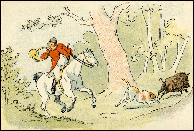
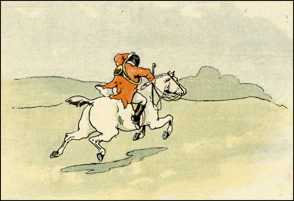
(i) EN CHASSE (On the Hunt) by Flamberge, 1886
From PARIS ILLUSTRÉ, 1st December 1886.
This issue of Paris Illustré listed two editors on its front cover, and more prominently: Charles Gillot, Directeur. In later years it would list as “Editeurs” the company Boussod, Valadon et Cie (see below).
All the black-and-white line illos inside the magazine are co-credited to “Gillot Sc” meaning that he (or his company) did the engraving—in this case photomechanical engraving. Crediting the engraver was a custom left over from the days of copper intaglio printmaking and wood engraving—both done by hand, of course. In these photomechanical times it would soon fade out. None of the colour pages in this issue, including Flamberge’s strip, had engraver’s credits.
2 pages. Original image size = approx. 24 x 32 cm (9.5 x 13 inches.). Page size 33 x 44.5 cm, (13 x 18 ins.).
As always, clicking on an image should take you to a full-sized version. Use the back button of your browser to return here.
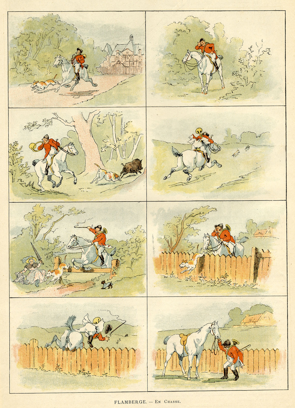
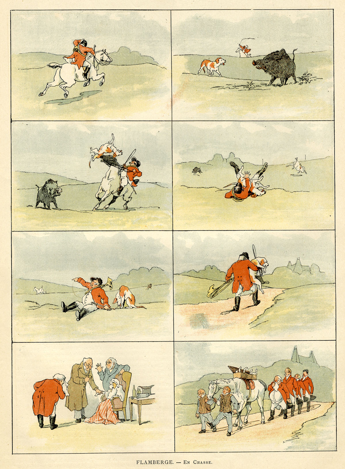
Admirers of Randolph Caldecott‘s earlier illustrated narratives in The Graphic might detect an influence here. Caldecott’s stories were always very wordy, though. Here the pictures do all the work. Except for one task… I find it curious that Flamberge doesn’t show the boar actually tossing the dog into the air. Perhaps he was too squeamish—or thought his readers were.
^^Table of Contents
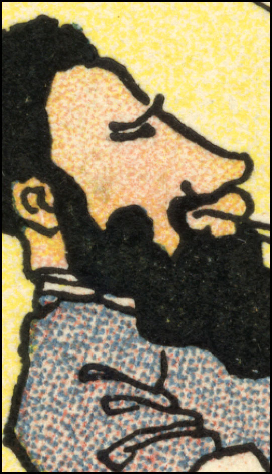
(ii) CHIEN ET CHAT (Dog & Cat) by Eugene Courboin, 1887
From LA REVUE ILLUSTRÉE, a bi-monthly magazine, which ran from 1885 – 1912. Evidently it prided itself on its high quality photographs and photo-mechanical process illustrations.
These are undated, disbound pages, sold to me as 1887, which is credible. Probably published between January and May as I couldn’t find the strip in the June to December pages available on Gallica, the online archive of the Bibliothèque national de France. (An amazing resource, by the way.)
See also: La Premiere Barbe (The First Shave) from later that year, also by Courboin, at Gallica: http://gallica.bnf.fr/ark:/12148/bpt6k200153j/f72.item.r
4 pages. Image size approx. 18 x 24 cm (7 x 9.5 inches). Page 23.5 x 32 cm (9.5 x 13 ins)
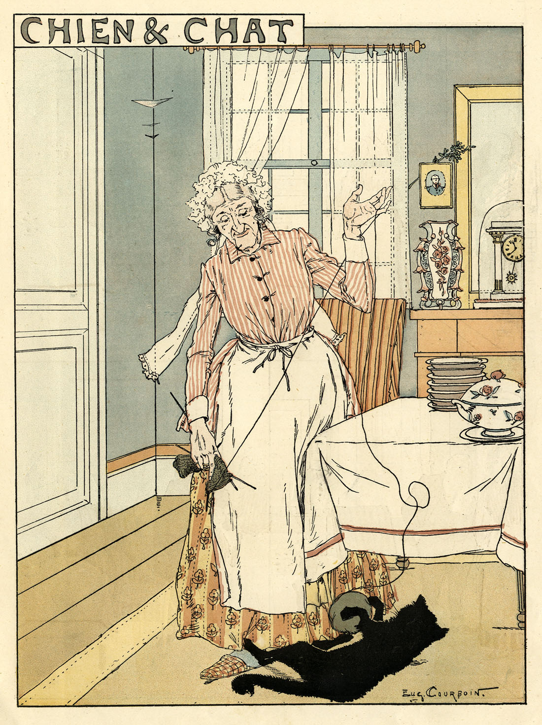
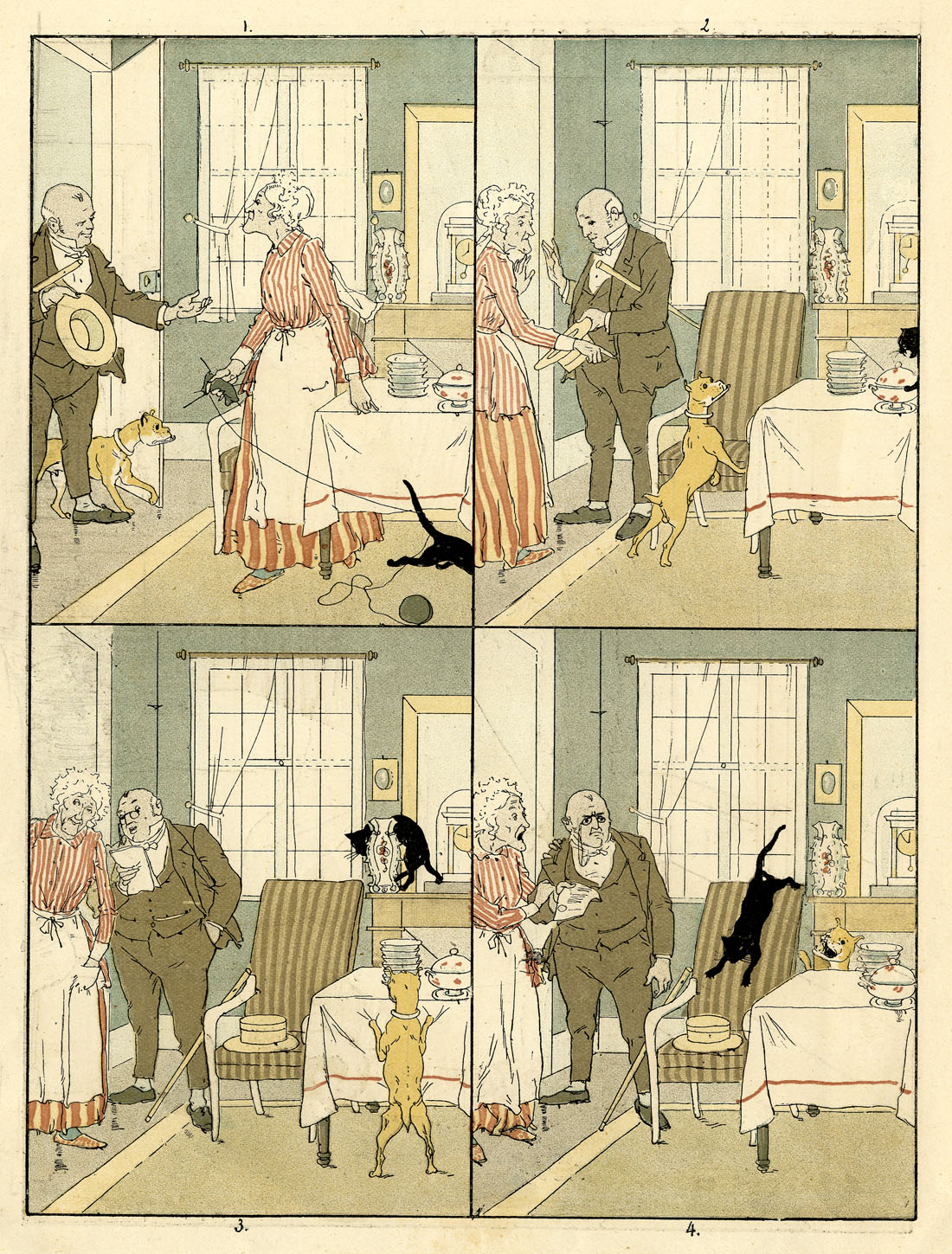
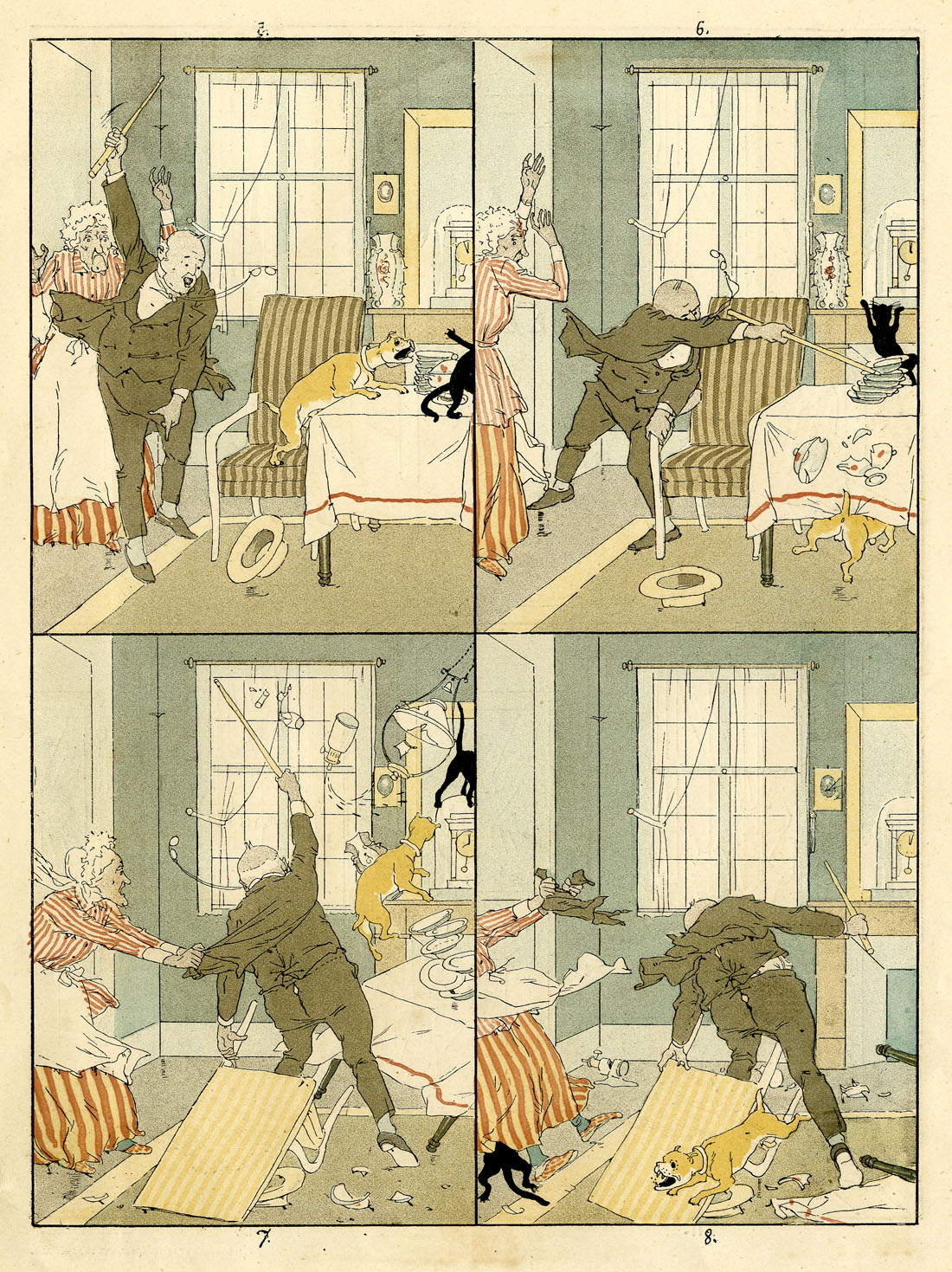
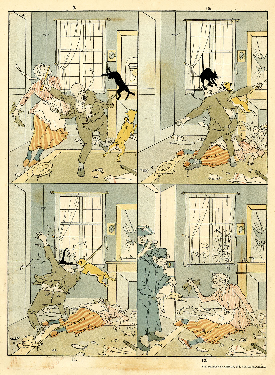
In this case there is a credit at the end of the strip: “Typ. Draeger et Lesieur.” I suspect this means that the “typogravure” for the strip was done by a company called Draeger et Lesieur. This would have included the colour separations and the engraving of the colour printing plates.
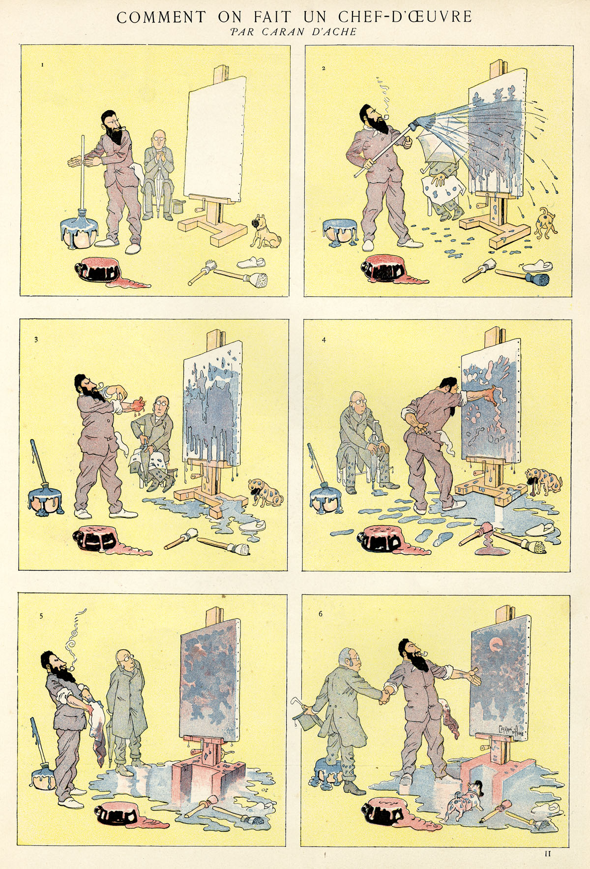
(iii) COMMENT ON FAIT UN CHEF-D’OEUVRE (How to Create a Masterpiece) by Caran D’Ache, December 1888
From FIGARO ILLUSTRÉ
Figaro Illustré started as the lavish annual supplement of the daily newspaper le Figaro. This Caran D’Ache strip is from the edition for 1888 – 1889, cover-dated 1st December 1888.
In April 1890, Figaro Illustré became a monthly, continuing directly on from the weekly Paris Illustré—where En Chasse appeared—which published its last issue on March 29th. Paris Illustré was at that time being produced by the same editorial team as the Figaro annual, at Boussod, Valadon et Cie.
Boussod, Valadon et Cie was the successor to Goupil et Cie, a massive firm of art dealers and printers. They had earlier invented the first commercially viable form of photogravure printing, and very successfully sold “Goupil-gravure” prints of artworks—cleverly cross-promoting their art dealership as they did so. The famous Vincent van Gogh was a partner in Goupil et Cie from 1861 to 1872. Later his nephew Theo also worked for them, as did his other nephew, also called Vincent Van Gogh—before he went off to become a not very successful painter.
The artist at work was a frequent source of fun for Caran D’Ache, and here he also gets an early dig in at contemporary art. He would not be the last cartoonist to extract some similarly cynical fun from the subject.
1 page. Image size approx. 25.5 x 32 cm (10 x 13 ins). Page size 32 x 42.5 cm (13 x 17 ins).
^^Table of Contents
(2) THE COLOURS OF CHEF D’OEUVRE
In the U.S.A. at this time the colour pages of Puck and Judge magazines used lithographic printing (see Ben Day dots part 4) but French strips like these did not—though they and other colour pages from French periodicals are often described (and sold) as lithographs.
All three strips shown here were printed by the letterpress method, from metal plates, on which the image areas—the solid colours, the lines and dots—stood out “in relief” above the non-image areas. As mentioned above, the black image in all three cases is made photomechanically from the original drawing.
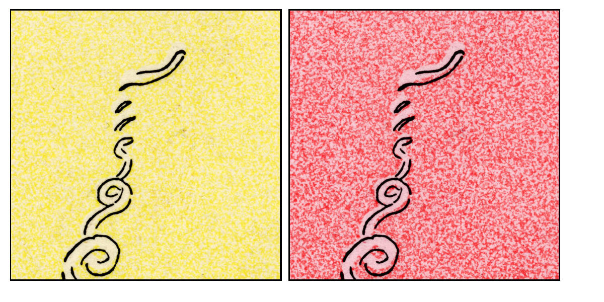
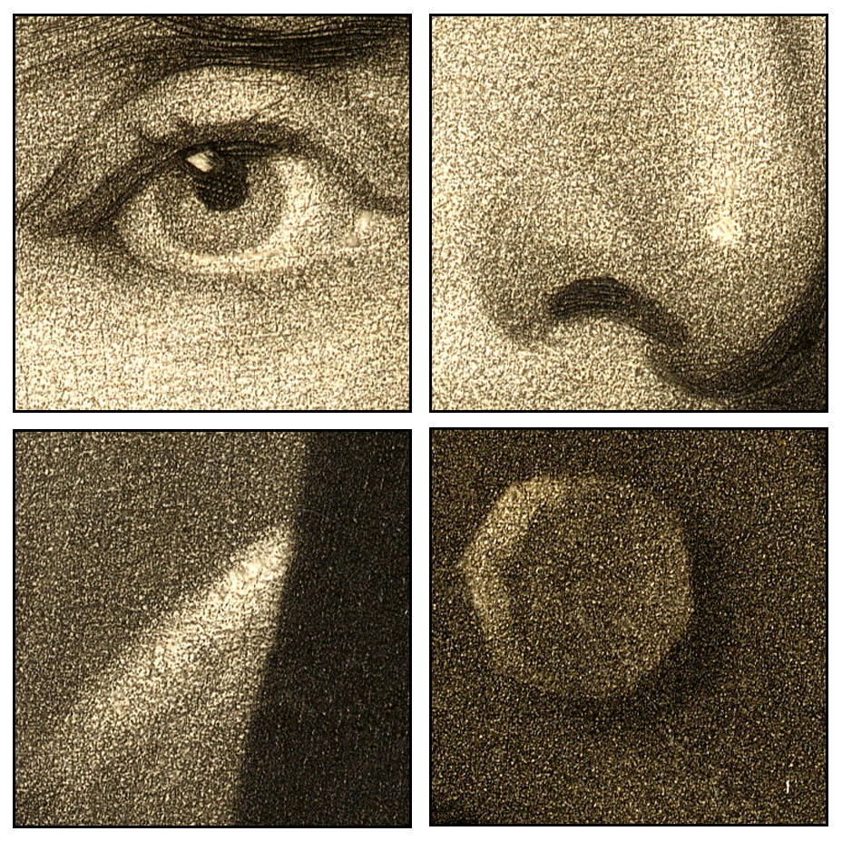
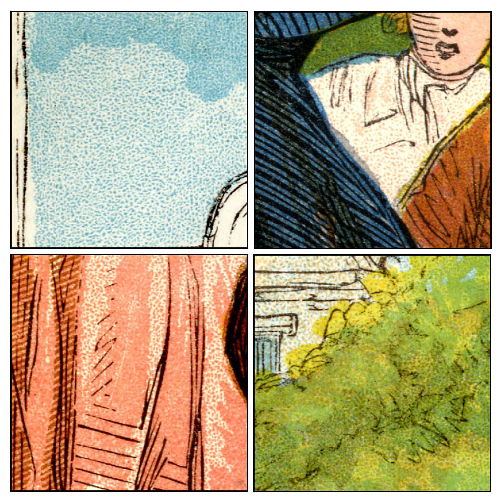
Colour-wise, the Caran D’Ache strip looks very different from the other two, though. Details are shown below. Each square is approximately 2cm on the original page.
Firstly, the yellow background is not solid colour, but a grained tint of yellow. This is not easy to see in its original form, so I have tweaked the hue to make the yellow into red. Clicking for a larger view will also help in seeing this.
A tint like this could have been made in several ways. A Ben Day pattern could have been laid down on the plate—as I showed in Part 4, Day made tints which imitated the grain of lithographic stone. However, as noted above, it looks as if this generation of French engravers was avoiding the Ben Day method.
A relief tint plate could have been prepared in a number of ways, with the pattern pre-etched all over it, and the parts needed to print white simply routed or chiselled off. Bamber Gascoigne in his book How To Identify Prints points out that molten stereotype metal could be used to make a relief copy of many different patterns, his example being sandpaper. This pretty much provided an instant printing plate with a pattern ready to use. Other writers back in the 1890s suggested such surfaces as leather, wood and even lace.
Perhaps, in the city where Firmin Gillot had invented gillotage, transfer paper would have been used to carry the pattern from a roughened limestone block to the metal plate. (Ben Day’s method was in effect a massive improvement on this previous, much clumsier, way of doing it.) Masking fluid or a cut-out paper “frisket” could have been used to prevent the white areas of the image getting the tint.
I will come back to this question.
I note that the dog in panel 6 has lost its yellow colour. Whichever method was used to tint the background, I suspect the dog was masked off by mistake along with the puddle of paint it’s standing in.
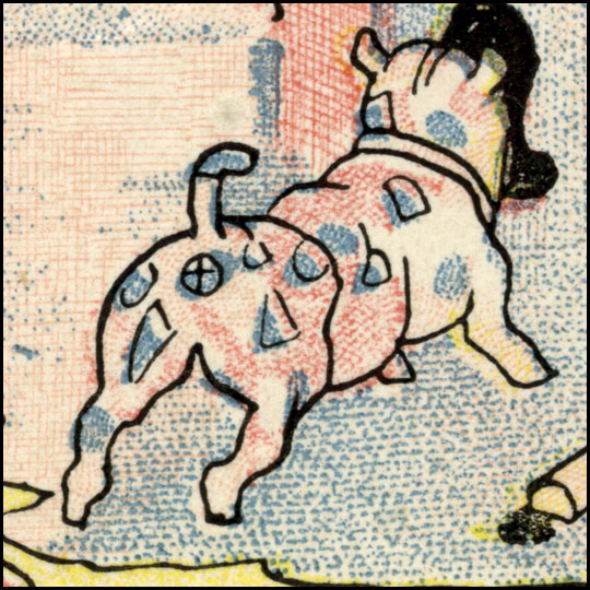
As well as the yellow, there are a red, a blue and a separate flesh/pink colour, as seen below:
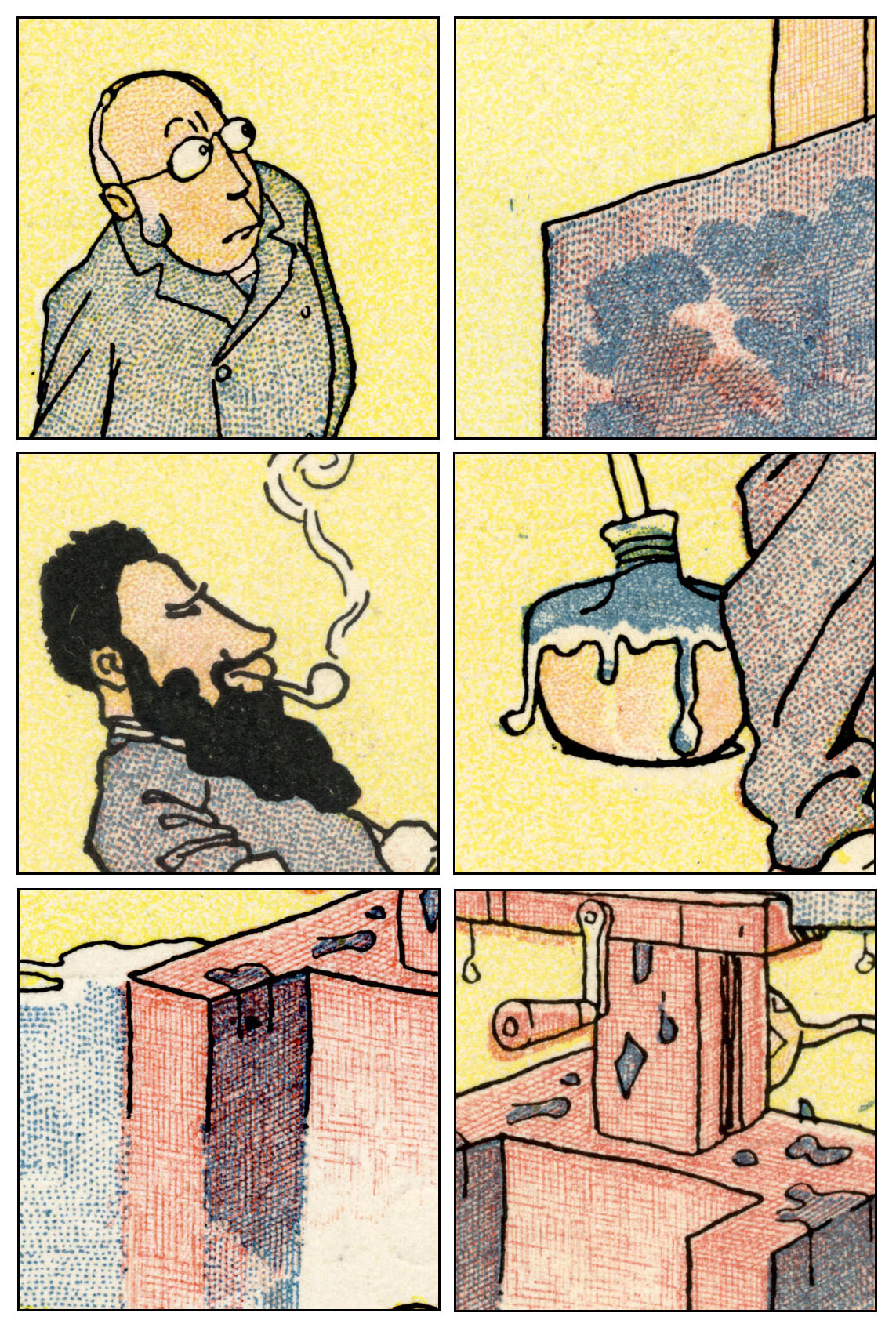
The red and blue dots and lines have an obviously hand-drawn look. They were probably drawn directly onto the metal plates—again, pretty much exactly as a lithographer would have done it. Alternatively, the drawing could have been done on transfer paper, then transferred onto the metal. I think this is unlikely. It would have added a redundant extra stage to the process, and compromised the quality of the dots and lines—such as they have.
Either way, one plate would have been used for each colour, and the ink used on the printing plate would have been black in every case. The craftsman or woman making the plates would have to estimate what the final colour was going to look like.
Apart from the flesh tone, this colouring is closely approaching the four-colour method which I looked at in Part 3. It seemed to take a long time for the trade to work out how to make flesh tones from red, yellow and occasional blue tints. Then again, using crude hand-drawn dots as these guys were doing, one can see why they wouldn’t try it yet. Another reason why they really should have embraced the reliable tints of Benjamin Day.
And while I’m on the flesh colour… it is worth taking another look at this pink colour used on the faces (and the pale orange paint pots). This tint has a very different look from the hand drawn dots of red and blue. Again it looks as if a grained pattern has been transferred to the plate, perhaps. Or it could have been done a different way, as in the other two strips. I will come back to this question.
^^Table of Contents
(3) RELIEF AQUATINT, OR RESIN GRAIN TINTING
(i) Introducing the method
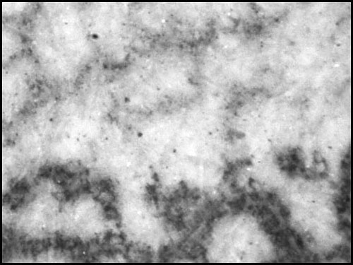
The details from En Chasse and Chien et Chat, below, clearly show the presence of much finer dotted tints. The pattern of the dots is pleasingly random, not “mechanical-looking”—and it was achieved by an ingenious method which has received very little attention from historians of colour printing. This was the old aquatint intaglio technique turned into a relief method for letterpress. It was an important process—certainly in Britain and Europe—for about half a century, and deserves some wider exposure now.
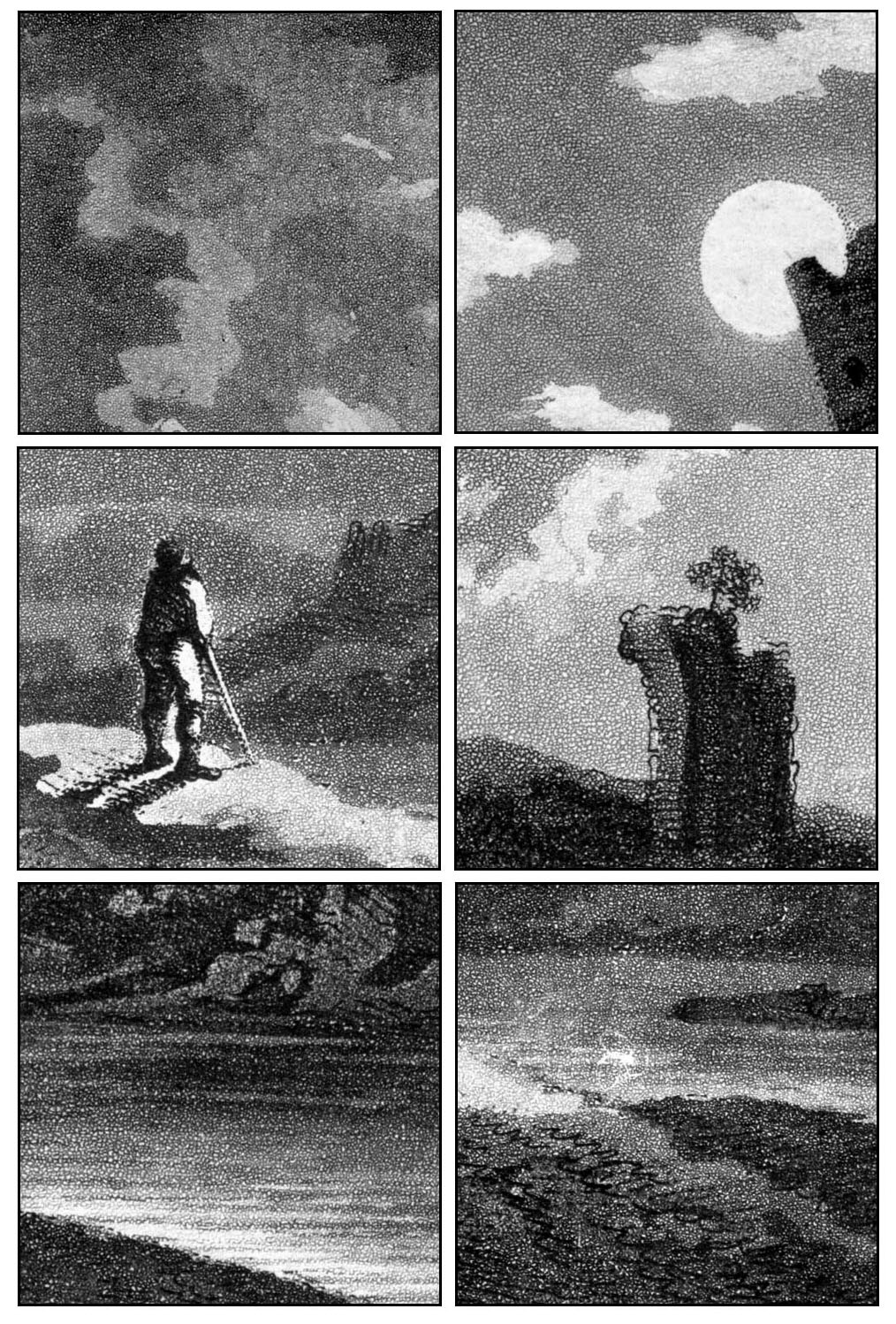
Detail from En Chasse showing colour tints: Panel 9, original size 12 x 8 cm, 4.5 x 3 inches approx. (Click to enlarge)
The technique is sometimes referred to as Resin Grain Line Engraving (e.g. a single page advertisement in Penrose’s Annual, 1908-9, with no accompanying text), or Resin-Grain Chromotypography (in The Ilford Manual of Process Work by L.P. Clerc (English edition 1924, translated from the French) which gives it a fairly detailed one-page account. I can guarantee that googling either of those two phrases will get you nowhere—except possibly, now, straight back here.
It can also be called Relief Aquatint. (Googling that will also get you nowhere fast.)
It was the first method specifically created to make printed tints from metal relief plates in the 19th century.
It arrived about 30 years before Ben Day tints, which were patented in 1879. And, though Day had predicted they might be used on metal relief plates, Ben Day dots were confined to lithographic printing for the first few years of their existence, and took several years to penetrate the world of letterpress.
We know that Day’s dots did end up in letterpress in a big way—in the comics and elsewhere—but this important predecessor produced a huge number of colour pages before Ben Day tints started to take over. Resin grain was still being advertised in Penrose’s Annual for 1908 as a commercially available method, and may have offered a useful alternative to those who still didn’t trust the “mechanical” tints.
Yet resin grain tinting / relief aquatint remains something of a forgotten secret.
Bamber Gascoigne talks about it very briefly in his excellent How To Identify Prints (in section 42a, under the heading Chromotypographs—i.e. colour prints using variable tones from metal relief plates, pre-photoengraving—see below). He mentions:
…the simple device of etching the surface of the block through a traditional aquatint ground. The aquatint pattern can often be seen in relief colour work of the nineteenth century, showing up as a network of fine white lines…
The method was in fact far from simple or obvious, and the pattern is very different from the one seen in ordinary (intaglio) aquatint prints, as I will show later. In fact there are two distinct variations as well. You are more likely to perceive it as a grainy pattern of dots than a network of fine white lines, it seems to me.
He refers again to “direct aquatinting” in his section on Prepared Tints, 63a. That’s about it, and it is one of the few printing methods used over the centuries which his generally comprehensive book does not actually illustrate. (There is a pretty good note on Ben Day dots, for example, and a clear illustration.)
Another authoritative book, William Ivins Jr‘s How Prints Look does not mention resin grain / relief aquatint at all.
One can see why this kind of printing flies below the radar of art historians. It was after all used mainly in popular periodicals, and unlike other commercial methods there is no recorded use of it by a high art practitioner like Goya, Toulouse-Lautrec or Picasso.
In his Colour Printing and Colour Printers of 1910—reprinted in 1983 as it had not been bettered, and still worth reading today—R.M. Burch refers to the method a few times, his most useful description being “tone plates… etched by a modification of the aquatint method, adapted to surface printing.”
Printer / publisher James Shirley Hodson is the only author to write about it at length, AFAIK, in his book An Historical and Practical Guide to Art Illustration. I will have more to say about Hodson another day—and about his son, Samuel J. Hodson, who reportedly took on The Graphic‘s early colour printing from about 1875. Using resin grain tints, of course.
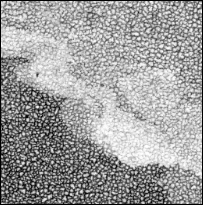
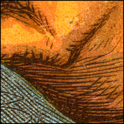
Now for a closer look at the process in action. These squares from En Chasse are again about 2 cm across on the original page:
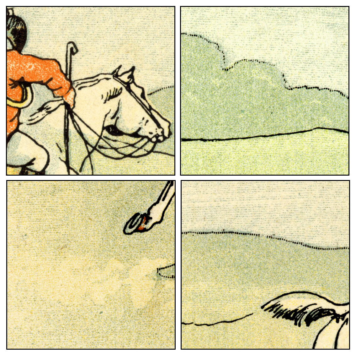
The resin grain is very evident. Lines in white, crossing the dotted tint, have been achieved by engraving onto the etched plate with a tool borrowed from the wood engravers, the multi-pointed graver or “shooter,” cutting what looks like six lines at a time here. The pale blue shadows, the dust kicked up by the horse and the shape of the clouds hint at the painterly shapes which can be made with this method.
Details from Chien et Chat:
In this strip there is less painterly detail, and the choice of flesh tone is on the grey side, and very pale. Registration of the red plate is unfortunate—a regular bane of colour printing.
Overall these two strips show the delicacy of colour which could be achieved with very fine dots of relief aquatint / resin grain. Sometimes much coarser dot patterns are used. I hope to post some more examples soon.
^^Table of Contents
(ii) Relief Aquatint, Gillotage and Ben Day Dots
The inventor of relief aquatint was reportedly a printer in London, England, named William Dickes—more on him later—though George Leighton was another very early user. It probably originated in the late 1840s, roughly contemporary with Firmin Gillot’s experiments with transfer paper in Paris.
Gillot’s invention of what he called paneiconographie—soon to be known as gillotage—changed the world of printing forever. At least, it did when his son Charles brought in the photographic element, and created photoengraving.
The original method involved a drawing, in black ink on transfer paper, being transferred to a metal printing plate, in that same black ink, then etched on. The result was a relief plate ready to print the drawing in black-and-white (or other monochrome). The original drawing could have been done directly on the paper or in reverse on a lithographic stone. (See Part 4).
As I will show later in this post, in order for his relief aquatint process to work, William Dickes had to find a way to achieve a much deeper etch on the metal plate than was previously done with traditional aquatint. This was fundamentally the same problem which Firmin Gillot had to solve to make his method work. In both cases the deep etch was the game-changer, though the two men found different solutions to the problem, suiting their different needs.
The parallel development of these two processes may previously have escaped notice. It would be fascinating to know whether Dickes and Gillot ever communicated. I throw this notion out as a gift to anyone looking for a new topic in 19th century printing to study.
There is also one more fundamental link between relief aquatint, gillotage and Ben Day dots. As I have said, relief aquatint was probably the main tinting/colour printing method for many years. Before Ben Day could take over this function, someone had to figure out how to get Ben Day patterns onto metal. As we will see in Part 6, this required the same etching technique used in gillotage—though it may have come via the emerging field of photoengraving.
Gillot père patented his method in 1850 (or thereabouts). Gillot fils was in business as a photoengraver by 1876. Printers could have borrowed the Gillot etching method and applied it to Ben Day patterns, etching them onto metal plates, far earlier than they (apparently) did. Perhaps earlier use of Ben Day on metal will emerge, but for now, it is intriguing to speculate about why the delay occurred.
It may simply have come down to the fact that the French didn’t use Ben Day dots.
This also brings me back to a question posed earlier—was transfer paper / gillotage used to put colour tints onto letterpress pages?
One great difficulty with the accounts of gillotage that I’ve seen is that they all leap quickly to the “sexy” bit—photoengraving (just as discussions of photoengraving leap forward to halftones, largely ignoring line blocks). Charles Gillot, as I understand it, first set up as a commercial photoengraver in 1876. But there were almost thirty years when gillotage in its original, transfer-paper-based form was at work in Paris.
What kind of work was done with that early version? Was it all black-and-white or monochrome? How much did it involve dots / lines / other forms of prepared or mechanical tint? With scanty available evidence, it is hard to say. Again, more room for further study here.
There is one area of gillotage by transfer paper which remains visible today—the illustration of French humour magazines. This is generally seen in black-and-white, using no prepared or mechanical tints, but exploiting the “chalk” or “crayon” texture achieved by drawing on rough lithographic stone or grained paper (see Part 4).
The famous weekly Le Charivari, for example, published one large lithographic illustration every issue up til 1870 (according to A. Hyatt Mayor in Prints & People). Switching to gillotage in that year allowed all four pages of the magazine to be printed by letterpress, cutting costs. Many other magazines in France also reportedtly used gillotage in the same way. Pages torn from them are sometimes marketed as “gillotypes.”
The results, says Mayor, were cruder than litho, but evidently acceptable for the purpose of printing satirical cartoons. He reports that Le Charivari‘s great cartoonist Honoré Daumier, eyesight failing and paid a pittance, had already simplified his lithographic style to the point where it could switch to gillotage without suffering too badly.
The Daumier image below is not my scan. I have borrowed it from Simon at Books and Boots .
The caption translates as “Appalled at the heritage.” It’s about the disastrous Prussian siege of Paris in 1870 – 71.
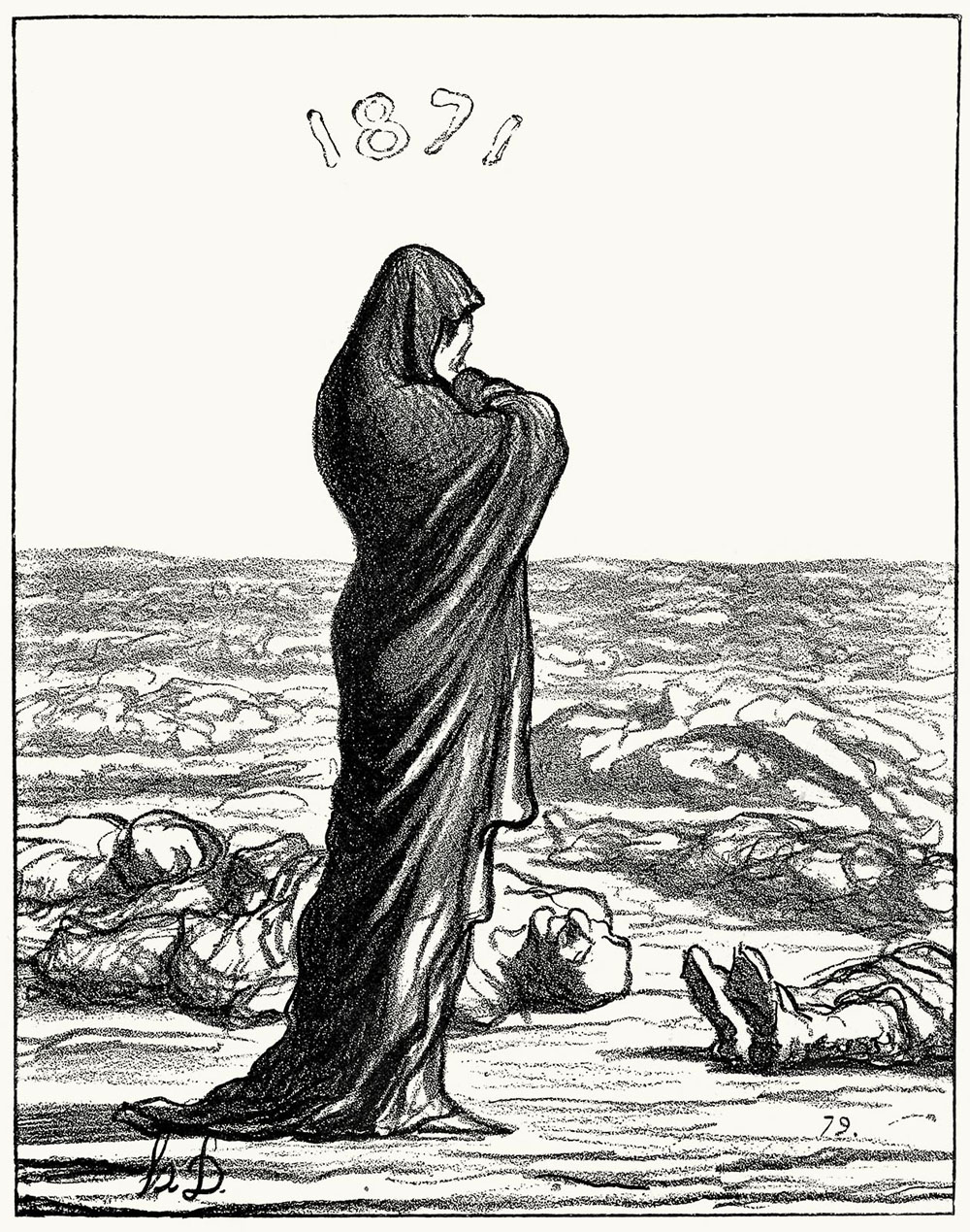
As Mayor alliteratively asserts, “The gillotype granulates the greys in a grit that disintegrates any drawing short of heroic.”
I don’t know if Daumier drew on stone or grained paper. Paper is more likely simply due to the convenience of it, compared to a chunk of heavy limestone. Either way, his image was transferred from paper to metal printing plate, then etched. Detail in the “chalk” shading would be coarsened considerably in the final printed result.
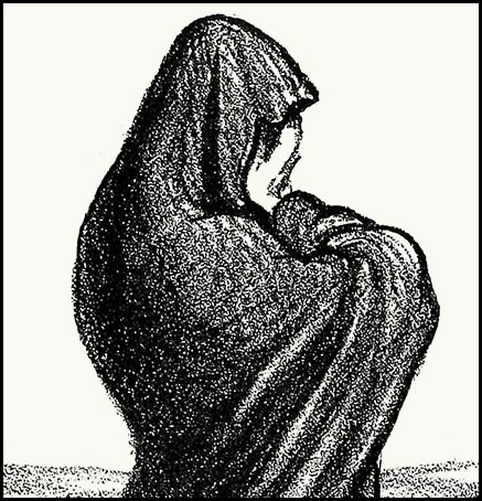
The close-up below is slightly more revealing of the texture thus created. Until I can scan some of these gillotypes myself, I cannot compare this pattern directly with the relief aquatint pattern. They are not dissimilar at first sight.
So far, the evidence suggests that gillotage had its own built-in grain or “random dot” pattern, but this was only used for monochrome work.
If I discover anything further, I will let you know.
^^Table of Contents
(iii) Use in The Illustrated London News and The Graphic
It is clear that the Parisian printing world had embraced resin grain tinting in a big way by the late 1880s. The technique probably spread from England. In 1855 The Illustrated London News (ILN) became the first weekly to start printing semi-regular colour pictures (often in Christmas and summer supplements) and by all accounts it was an immediate success. Curiously its great rival, The Graphic, did not follow suit until 1873.
Relief aquatint / resin grain chromotypography was used by them both, though the ILN reportedly switched to lithographs for its colour prints from the late 1880s, while The Graphic continued with letterpress, at least until 1899.)
Here’s the cover of that first Christmas ILN, with some 2cm square details.

Bamber Gascoigne notes in another essential book, Milestones in Colour Printing 1457 to 1859 (1997) how revolutionary this was. He also says that the huge colour pages (c. 28 x 39 cm, 11 x 15.5 inches) were only possible because of printer George Leighton‘s use of “relief blocks”—i.e. metal plates, and relief letterpress printing.
What Mr Gascoigne doesn’t explain is that Leighton was using the relief aquatint method for many of his colour tints—possibly not all the colours, though. At least initially, Leighton used a hybrid technique. The key plates (in black or dark brown) were still made from engraved wood blocks. Some of the colours probably were also.
^^Table of Contents
(4) THE ORIGINAL AQUATINT METHOD (INTAGLIO)
(a) Aquatint and Other Intaglio Methods Compared
I will cover the basics of how actual aquatint prints were made, before moving on to the relief version.
The original, intaglio, aquatint method was well established in artistic and commercial printing long before the 1880s. It was invented around 1720, and used for fine art and devotional prints, commercial prints and book illustration.
Aquatint used acid etching of a metal plate to make an intaglio printing surface. As with engraving or line/stipple etching, ink was held on the printing plate in troughs and/or pits lower than the plate’s surface, and wiped clean from the surface itself. Areas of the plate left smooth, un-lowered, and clean of ink printed as white. Using black ink, the troughs and pits printed as black lines or stippled dots in an engraving or etching, or grey tones of various shades in an aquatint.
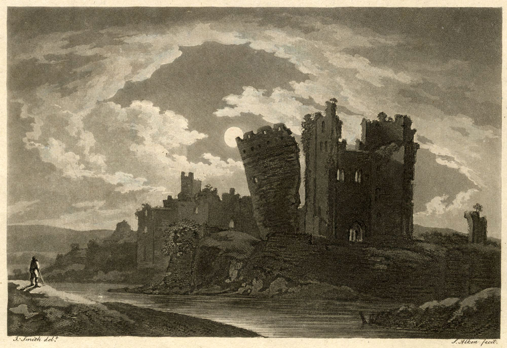
This undated print of Caerfily Castle (sic) was printed by aquatint on white paper, probably to go in a book* (from which it was removed long ago—not by me). The ink is black, but a brownish kind of black, and looks browner in scanned images. The image is approx. 13 x 19cm, 5 x 7.5 inches.
[*Update November 2025: Yes, the book was A tour through parts of Wales by William Sotheby, 1794; illustrated by J. Smith ‘from drawings taken on the spot.’]
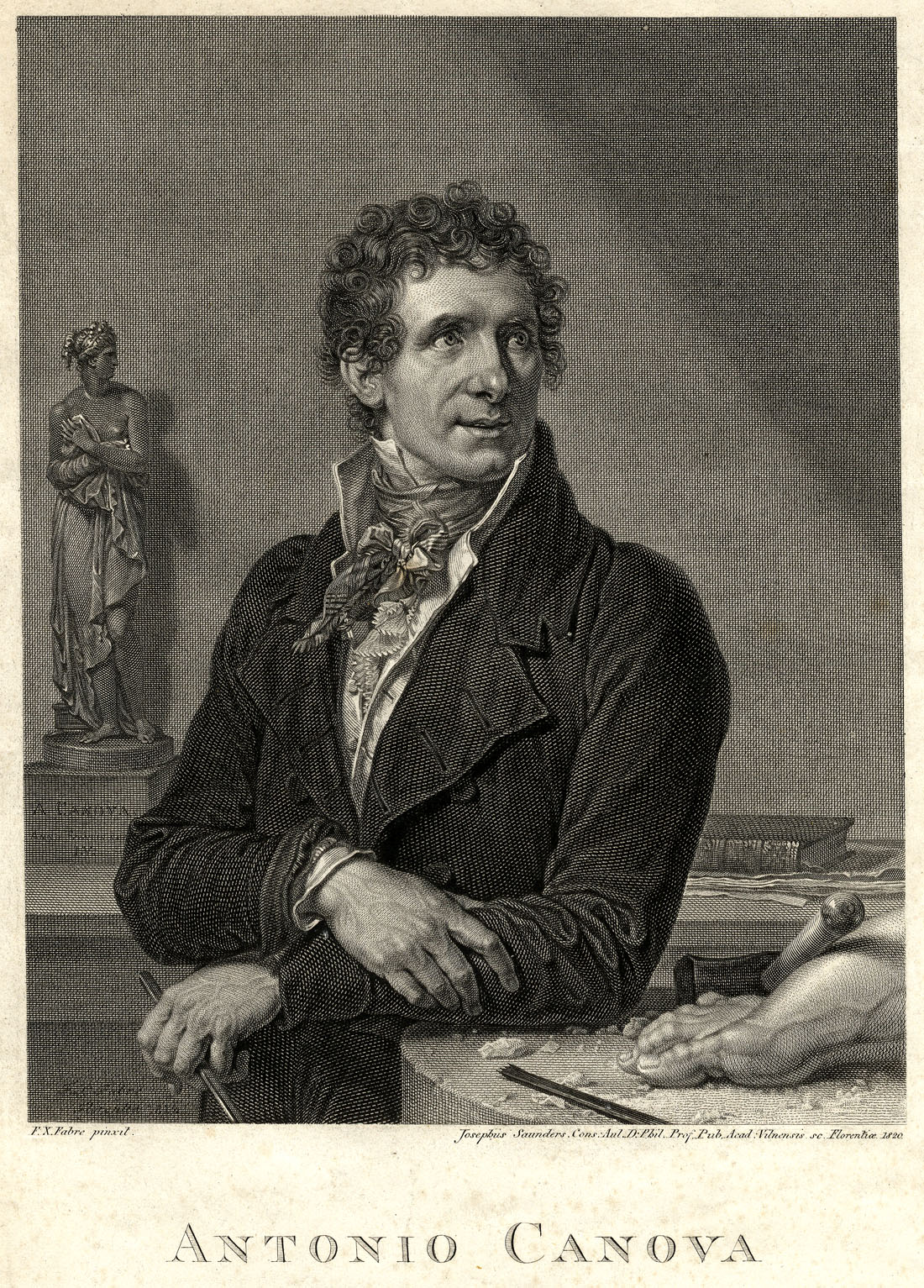
In an intaglio metal engraving, lines are essentially black. The illusion of grey is created by “optical blending”—fine lines, very close together, are seen as grey. This 1820 copper engraving of Antonio Canova (image size c. 16 x 20 cm, 6 x 8 inches) might create Moiré patterns on your screen (try it at different zooms) or might show nice grey tones:
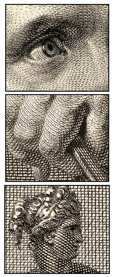
Close up, Antonio looks like this—no grey:
Robert Walpole, below, is from 1801. He is a so-called stipple engraving, and many of his dots were etched with acid rather than engraved. Original image size: 9 x 12 cm, 3.5 x 5.45 inches.
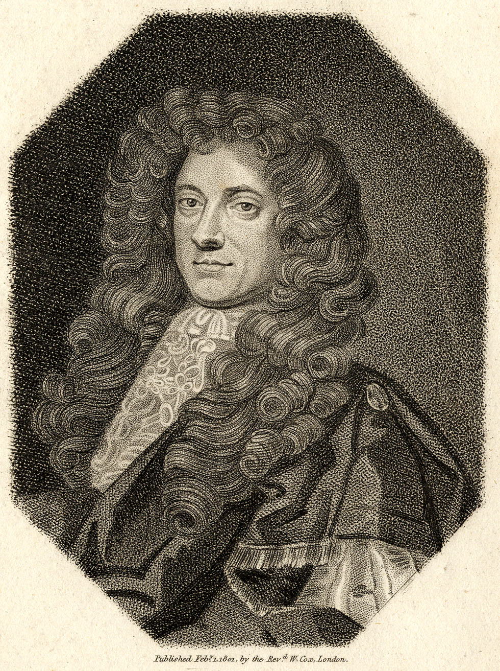
In “stipple engravings” and etchings, etched dots can be quite shallow on the metal—giving a softer, grey appearance, as seen on the face and hair. The etched lines are fairly full-on black. The background dots are larger, blacker and may have been bashed into the metal with a tool like a “mace head” or “mattoir.”

^^Table of Contents
(b) Grey Tones in Intaglio Aquatint
Aquatint creates its grey tones in quite a different way.
Firstly, it produces a fine mesh pattern, and to some extent, the paler the grey area in a print, the thinner the lines in the mesh. With more white paper showing between the lines, a paler grey is to be expected.
In an aquatint, though, unlike an engraving or etching, these lines are actually printed not in black, but in many shades of genuine grey. Or at least, the particles of black pigment are far too small to see, as in a photographic print. And the shade of this grey can be carefully controlled over large areas, which with ordinary etched dots is not feasible.
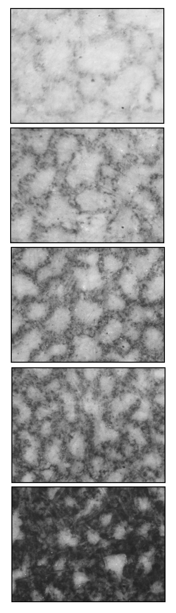
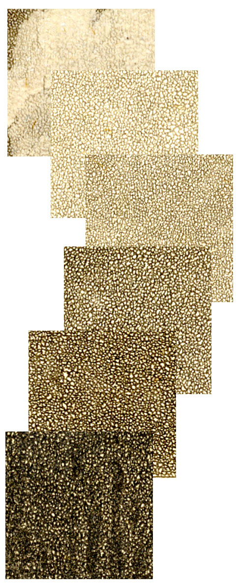
The details below show these grey tones in the Caerfily Castle print [1794]. Each square is approx. 2cm across in the original image. (I turned these images into greyscale, as some unfixable colour variations crept in during scanning.)
A closer view of a 1 cm square shows the grey effect more clearly:
And here are some microscope views of different tints:
^^Table of Contents
(c) Comparison with Mezzotint
Aquatint shares this property with another type of intaglio print, the mezzotint. Mezzotint was a finer process, capable of amazing shading, but also much slower and more expensive. It was only used for high-end luxury items.
I don’t know who this guy is, but his undated and trimmed mezzotint portrait is about 18 x 24 cm, 7x 9.5 inches.
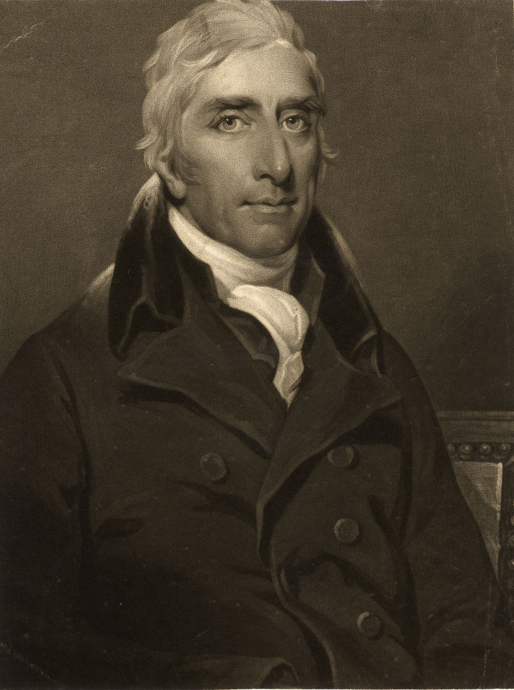
These details are 2 cm squares:
Meanwhile, back at aquatint…
^^Table of Contents
(d) Spirit Ground Aquatint
How was this grey printing achieved in aquatint with black ink?
The plate was acid-etched through a spotty “ground” and the ground could be made by two different methods.
My example, Caerfily Castle, used the “wet” or “spirit ground” version.
This used resin dissolved in a mixture of water and alcohol to make the ground. A layer of this solution was allowed to dry onto the plate, leaving patches of resin behind, dried and stuck onto the metal, in a reticulated pattern.
Each patch of resin now formed an “island” (my word for it) on the plate. The plate now had thousands of these irregularly shaped dots of resin on it, with what I call “channels” in between them, where the metal was still exposed.
The picture was either drawn onto this ground, or traced from the original, or imprinted by transfer paper.
The first stage in creating the drawing on the metal was to paint over, with an acid-resistant varnish, all the areas which needed to print as white. These parts of the plate would remain untouched by the next stage in the process.
Nitric acid (known as aqua fortis) was used to etch the plate. Each one of the resin “islands” would form a tiny acid resist, protecting that area of metal surface. But the “channels” between the islands would be eaten away just a little by the acid, i.e. etched down by a small amount. This shallow etch would form the palest grey tone of the print. Each island would be a white dot in the grey.
The shallow channels would not hold much ink, and it was thinly spread, which is how it was able to print as a grey. At this stage, the white dots were also of quite large size, representing the full size of the islands. Thus etch number one produces a very pale grey tone—Grey Number One.
The acid was washed off with water. The waterproof resin islands of the ground remained in place. So did the original areas of varnish which had been painted on, protecting the white areas of the picture from the acid etch.
Now a second etch was going to be done, but first those areas which needed to print as Grey Number One needed to be protected from the acid. A second painting-on of varnish was therefore done, extending the varnish protection to those areas of the picture as well.
The second etch deepened the channels. Perhaps each island now started to shrink slightly, as the acid undermined the resin layer. Now the unvarnished parts of the plate would print with a darker grey, Grey Number Two.
The microscopic detail of Caerfily Castle below shows a transition between a pale grey and a much darker etch.
A number of further varnishings and etches were done, each “biting” a little deeper. Eventually the acid really undermined the resin, and channels got wider as they got deeper, until the islands had been eaten away almost completely.
The grey got darker as the channels held more ink, becoming blacker when printed, and at the same time the white dots between the lines got smaller. The last etch produced areas of metal which would print almost black.
As well as aquatinting, which produced no outlines, lines—and indeed dots—could be engraved or etched onto the metal as well. The print above shows some outlines on the buildings and shading on the figure, for example, which look as if they have been etched on.
This was very laborious process. Caerfily Castle must have had at least six, possibly seven etches. I show six magnified squares below, each 1cm wide, in progressively darker greys—and here you can see the brownish tinge. I think there are two pale greys in the top square (and the bottom square has some etched black lines on it).
^^Table of Contents
(e) Dust Ground Aquatint
In the “dry” or “dust ground” method, a powdered resin was dusted directly onto the metal printing plate. The powder could be quite coarse or very fine depending on the final appearance required.
The resin had to be melted onto the plate by heating the metal, then cooled before it had spread out too far and filled in the “channels”. Some of the tiny pools of liquid made by particles of resin would merge together in any case.
Once the ground had been made, the process was the same as the wet method.
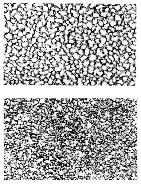
The appearances when printed were quite different. Bamber Gascoigne shows the two in How To Identify Prints—spirit ground above, dust ground below:
Once all the varnish and resin remnants had been cleaned off with solvent, the plate was ready for intaglio printing. A printing press using very high pressure was needed to force the paper into the channels, grooves and pits of the metal plate. The same press could not be used for relief printing, which used lower pressure and different methods.
^^Table of Contents
(5) HYBRID FORMS
(i) The Baxter Print—Aquatint plus Colour from Wood Blocks
The relief aquatint process evolved because printers were looking for ways to improve on the colour printing methods of George Baxter, in particular. (The Charles Knight / Stephen Sly team was another important antecedent , but will be discussed another time.)
George Baxter patented his method of colour printing in 1835. Though he was building on the work of many previous colour printers, Baxter did effectively create a new technique and set a new standard in naturalistic colour printing. Also, he brought colour printing back into a world which, prior to the rise of chromolithography, was accustomed to seeing to prints only in black-and-white, or coloured by hand—pretty crudely, and often by child labour.
He also started a new movement which, in Britain at least, produced thousands of coloured pictures in the form of prints, book and magazine illustrations, and (a speciality of Baxter’s) smaller items like needle box covers. It also produced many followers, imitators and much evolution of his techniques.
Baxter’s method used a detailed intaglio print as the key image. In most cases this carried all the information needed for a “reading” of the image, and the colours he added were effectively decoration. His ambition was to create a facsimile of a painted picture (and he was always keen to stress that he printed in “oil colours.”) At his best he approached his goal.
His intaglio key print was most often an aquatint, usually with stipple and line etching on the plate as well. He sometimes used copper or steel engraved plates for this stage (and his patent covered use of a lithographed key, though he may never have used one in a published print).
Colours were added by any number of wood-engraved plates, occasionally over twenty, more often around ten. (Later he used some engraved metal plates for colour, but he is best known for his wood-engraved colours.)
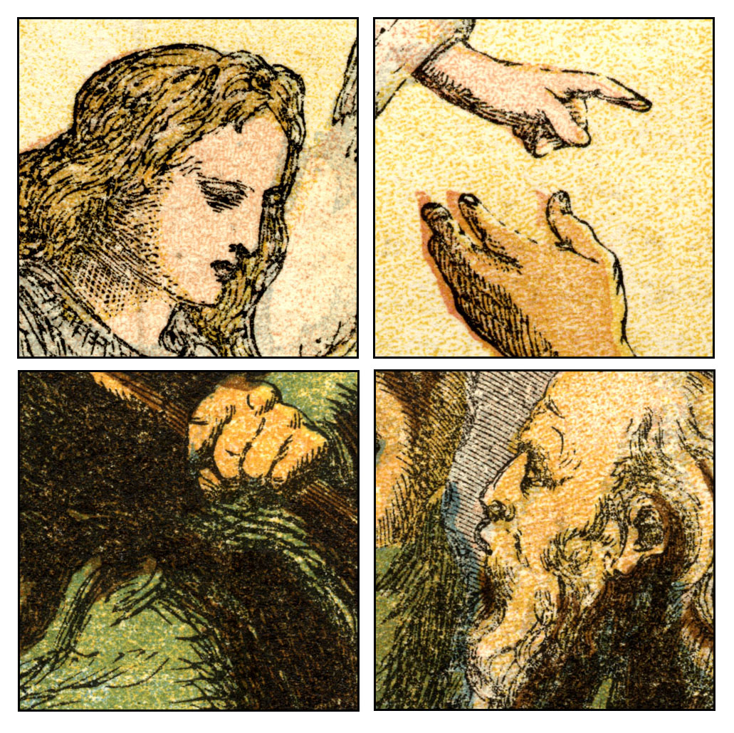
Below I show a small Baxter print of Abbeville in northern France. This is only 5.5 x 7.5 cm, or just over 2 inches wide by about 3 inches tall. I have a fairly dark print of the key plate on its own—it is aquatinted and line-etched, very finely, and printed in black. It may have been printed much later than the colour version.
The coloured print (1847) was done very delicately. The key plate was printed lighter than it was on my monochrome print. (Some grey marks in the blue sky on my colour print are smudges, I’m afraid. You can see where Baxter put his bits of grey cloud.)
Below is another Baxter print scanned by me—The Third Day He Rose Again (1854). This is a large piece by Baxter’s standards, at about 17 x 21 cm (6.5 x 8 inches) and a more ambitious work than Abbeville.
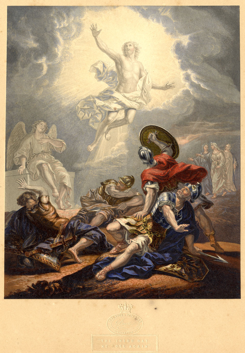
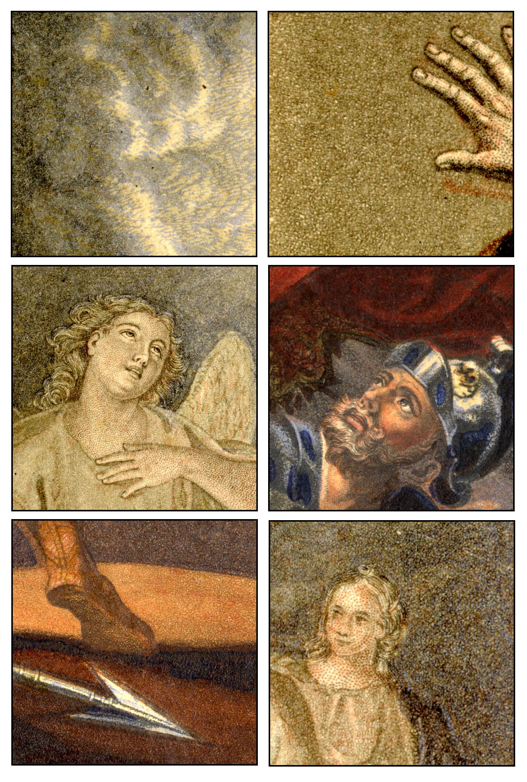
The square details below are just over 1.3 cm or half an inch. Again intaglio aquatint, and stipple & line etching, are apparent on the key plate. Much of the wood-engraved colour is overprinted onto grey areas of the key image, but some is clearly printed over white areas left open on the key.
In 1849 George Baxter was able to renew his patent for another five years, arguing that he needed more time to make some profit out of it. He never really did, and died in debt. But, as advised in the patent court by the judge, Lord Brougham (more of him another time), he started selling licenses to other printers to use the method. For their money they also got lessons in how the Baxter print was done.
One of his licensees was a lithographer and wood engraver called William Dickes. Below is one of his Baxter prints, including the standard Baxter-style intaglio aquatint grey key, from Charles “Water Babies” Kingsley’s non-fiction book Glaucus; or, The Wonders of the Shore.
Original image size 8.5 x 14 cm, 3.5 x 5.5 inches.
Details, 1 cm square originally:
^^Table of Contents
(ii) William Dickes and the Invention of Relief Aquatint
Dickes did a lot of Baxter prints, but was keen to find ways of working more quickly.
He realised that the intaglio key plate was a major stumbling block. It had to be done on a hand press, separate from the wood-engraved (relief) colours. Also, there were various technical reasons why printing over the intaglio key was not helpful for registering the colours accurately.
And, as Dickes knew, the future belonged to those who could print colour on the new steam presses. He was looking for a method whose elements were all in relief.
A standard intaglio aquatint plate cannot simply be used to print in relief. The channels between the islands are too shallow.
Black (or whichever colour ink is used) should print only from the raised surface parts of a relief plate. If an aquatint plate were inked as for relief, the shallow grooves would partly or wholly fill up with ink. Whereas they should remain empty, and so print white, they would partly or wholly print black. The result would be an awful mess. I’d bet Dickes and many others had tried it!
Etching the channels more deeply was possible, but of course this also undermined the resin islands more. You couldn’t get much of a range of tones.
In any case, even if the grooves were somehow made deep enough, relief-printing an aquatint plate which had been made for intaglio would produce a negative image. The smooth surface parts would print black, whereas they should be white. The parts supposed to be the palest grey would print as the darkest, and so on.
As explained in The Colour Prints of William Dickes, by Alfred Docker (1924) Dickes solved both problems. He found a method which produced a deeper etch, using what I presume was a tougher ground, made of “resin, Burgundy pitch and gum.” Dickes apparently learned this method from “an old aquatinter” called Hunt who had devised it himself. It was laid using the wet, spirit ground technique.
And secondly, Dickes worked his etchings in the reverse order from intaglio platemaking. He protected his black (or solid colour) areas, not his white ones, from the first etch; his darkest grey (or darkest colour tint) from the second etch, not the palest one—and so on.
Eventually he etched his palest tint, leaving only tiny “colour” islands and wide “white” channels, then cut away metal from the parts which needed to print white.
Dickes called his method Chromographic printing and exhibited at London’s Great Exhibition of 1851, alongside George Baxter. The catalogue described Dickes as “the Inventor and Producer” of his method of “printing in oil colours from raised surfaces.” But Dickes never patented his process.
The printed result lacked the delicacy of the intaglio aquatint. Relief aquatint made marks on the paper from raised dots, not sunken grooves. Like other relief methods, and most lithography, each chromographic mark could only be black (or solid colour).
Unlike the intaglio version, then, no actual grey (or tint of a colour) was possible with this method. Tints had to be created solely from optical blending of a pattern of irregular dots.
Also, since the plate was to be used in relief, unlike the intaglio version, you could no longer etch or engrave lines onto it.
Perhaps for these reasons, having solved the intaglio problem, Dickes did not simply follow the Baxter style. He often abandoned the aquatint grey key, and adapted his new aquatint relief method for use as coloured plates instead.
Overall, the Chromograph method was fit for purpose. After perfecting it on his hand printing presses, Dickes was eventually able to print mechanically.
^^Table of Contents
(iii) Lady Di and Spanker: The Chromotypograph
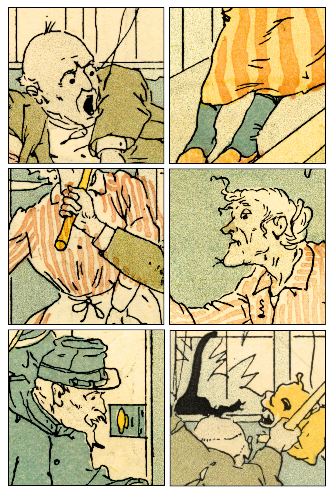
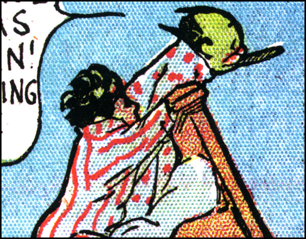
Below is one of Dickes’ less ambitious plates. He did a lot of this kind of cheap commercial material, but also a good deal of more accomplished work. I hope to show some of it another time. I chose this picture because the dots are very obvious.
This is an illustration from Moral Tales, by popular children’s author Maria Edgeworth (undated, but published between 1865 and 1873; 9 x 13 cm, 3.5 x 5 inches). It’s a good thing we know the tales are moral, or we might have thought that Lady Di thrashing Spanker sounded a bit kinky.
(Eric Hayman has pointed out that ‘spanker’ was a word used to describe a fast horse, one that was likely to win a race; the same word which gave us the term ‘to move at a spanking pace.’ The OED confirms this; ‘A horse which travels quickly and smartly; a fast-going horse.’ Thanks, Eric! As you say… nothing kinky about this at all.)
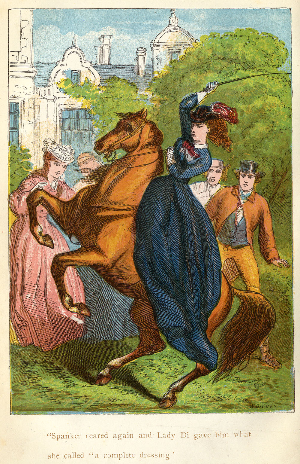
The characteristic pattern of Dickes’ relief aquatint can be seen below.
Like a Baxter print, this was a hybrid technique. The key was printed in a very dark brown, almost certainly from a wood-engraved block. (These are very sharp lines, and it is just possible they were engraved in relief on metal, but this would have been an extra expense, and is less likely.)
Some of the colour is done in lines also suggesting a wood block—e.g the orangey brown seen at top left in the square below, and I think the same colour, over blue, at bottom left. It also appears in the grass.
It is very obvious that, like the chromolithographers, Dickes was using many colours and not attempting to combine three primaries to make all his hues. However, you are probably thinking he might have made his green out of blue and yellow, which was a favourite trick of colour printers of all persuasions. The detail below, taken from the bottom edge of the image, gives the game away. The yellow and blue inks show themselves quite clearly here. Elsewhere, the yellow might be taken for a yellowy green.
Dickes’ own name for his technique, the Chromograph, never really stuck, even within his own workshop. But a very similar 19th century name for this kind of hybrid print has survived—the Chromotypograph. Or rather, the name chromotypograph covers a number of different types of print, of which Lady Di and Spanker is but one variation.
Bamber Gascoigne in How to Identify Prints is of the opinion that this old-fashioned word is worth holding on to. I agree; it is analogous to chromolithograph (printed from stone) and chromoxylograph (printed from wood) and defines the distinctive properties of this type of print.
If one wished to explain to an eBay seller, for example, or the British Museum, that they have mislabeled some of their prints as chromolithographs, how useful to be able to say, “They are in fact chromotypographs.” (As enny fule kno.)
Mr Gascoigne says:
…the term chromotypograph (implying colour printed from raised metal, as type is) was used for a wide variety of colour prints which made use, partly or exclusively, of metal relief blocks… such prints may include colours engraved on wood… or they may be entirely composed of the more random tones made possible by etched metal blocks.
This is where he also notes that various tones can be transferred to metal plates (a.k.a. blocks) by transfer paper (gillotage) and he has noted elsewhere the alternative method of casting textures like sandpaper in stereotype metal, which could also be part of a chromotypographic process.
The key thing here is that there is no “line block” yet, i.e. no photomechanical process is involved in a chromotyopograph—at least as defined here.
The early colour pages in the Illustrated London News and The Graphic were certainly chromotypographs. There is evidence that some later pages in The Graphic used line blocks—photoengraved plates—as their key plates. I will come back to this another time.
^^Table of Contents
(iv) 19th Century French Comic Strips: Chromotypographs or Colour Line Blocks?
The French comic strips I showed above are another hybrid form—their blacks come from line blocks (photoengraved plates) and their colours are the resin grain / relief aquatint type. Because they have a photomechanical element, they don’t really fit the above definition of a chromotypograph.
Bamber Gascoigne has another definition which almost fits, the Colour Line Block. This is where we meet, at last, the world of the comic strip, since a colour line block is a black photoengraved image coloured by mechanical tints (such as Ben Day dots).
But the tints in our French strips are hand-originated, not mechanical.
Can Mr Gascoigne help here?
The term chromotypograph could be extended, he says, to include all colour prints from metal blocks where no halftone screen has been used.
Our French strips would then fit the definition. And so would a Sunday newspaper comic strip from The Yellow Kid onwards. But hold on…
… as Mr Gascoigne continues:
However, there is a clear distinction to the eye between the nineteenth-century version where the blocks were prepared by hand with a wide range of delicate textures and its twentieth century successor, familiar mainly from comic strips and advertisements, where the colours are in mechanical tints. In this book the former are referred to as chromotypographs and the latter are called colour line blocks.
We are allowed to use the term chromotypograph for our French strips, then, since despite using line blocks (and despite being comic strips!) they use hand-originated tints.
Phew! Glad I cleared that one up.
^^Table of Contents
(v) A Negative View
Before leaving Dickes, one final thing. If a relief aquatint is effectively a negative version of an intaglio aquatint, you are probably wondering, “How do William Dickes’ tints compare with a negative image of an ordinary intaglio aquatint?”
I’m glad you asked that question, because here is one I prepared earlier. It shows in close-up part of Caerfily Castle, then a B&W negative version of that, then some Dickes’ paler blue sky tint from the above, turned into B&W:
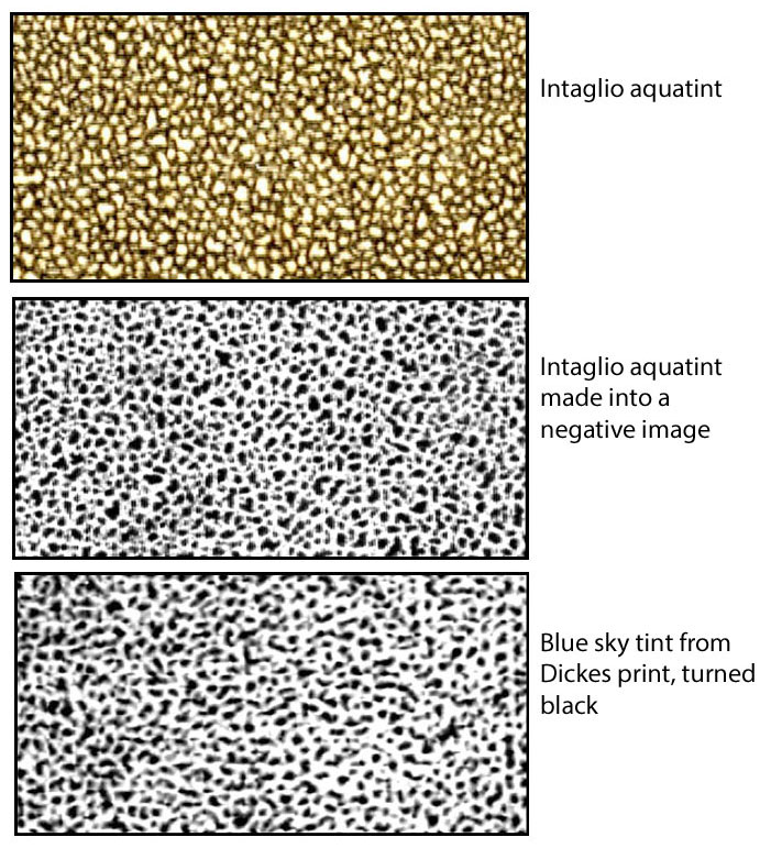
Allowing for slight differences in technique, I reckon this is close enough for rock’n’roll. It’s not just for fun either. It’s proof of concept for one final investigation:
^^Table of Contents
(vi) French Comic Strips: Spirit Ground or Dust Ground?
We know that Dickes used a spirit ground method for his relief aquatint, because Docker tells us in his book. In the other 1924 book quoted above, The Ilford Manual of Process Work, L.P. Clerc tells us that Resin Grain Chromotypography was at that time done by the dry, or “dust ground” method.
Which of these two did the French comic strip engravers use in the late 1880s?
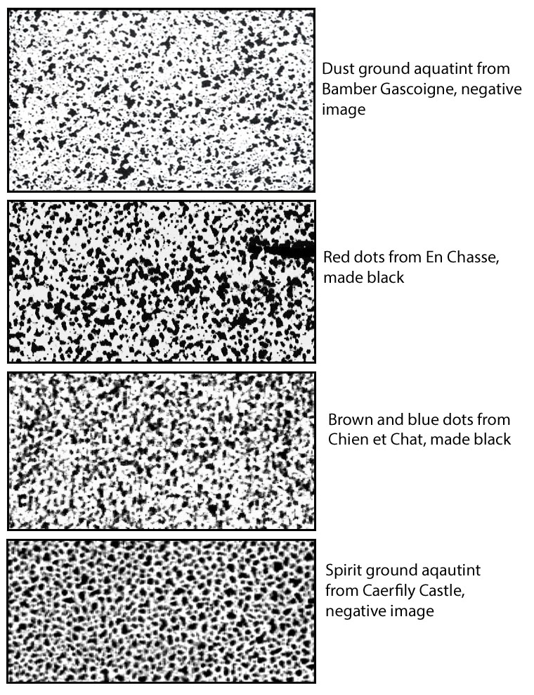
My only current source for enlarged images of dust ground aquatint patterns is Bamber Gascoine in How To Identify Prints. I have therefore taken the middle tint of the three he shows in his book, and turned it into a negative image (below). I compare it with two patterns from the strips which clearly used resin grain tints, En Chasse and Chien et Chat.
This shows fairly close similarity of pattern. Certainly the spirit ground pattern at the bottom—a negative image of the Caerfily Castle tint again—is not very similar. Its dots are too rounded and regular. I conclude that these engravers used the dust ground method.
How they overcame the difficulties of deep etching remains a mystery. Dickes, as I said, needed to use his wet method derived from Mr Hunt. I must assume that the later resin grain tinters had some way of improving on the old intaglio aquatint dust ground etch.
Finally, to return to that yellow background tint from the Caran D’Ache strip, which I turned into red so it was easier to see:
Comparing that, in black, to Gascoigne’s palest dust ground tint in negative form:
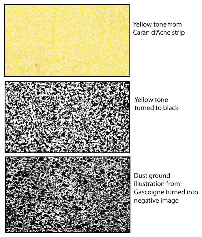
Again, allowing for slight differences in scale and technique, it looks as if that strip too used some resin grain / relief aquatint tinting, as well as its hand-drawn dots and lines.
And that is where my story comes to an end… for now.
Text and original images copyright © The Legion of Andy 2016
legionofandy@btinternet.com
Coming attractions:
^^Table of Contents
I will take this further in future posts.
I will look at the history of colour printing in relief—going back to the 1400s—with:
- more chromotypographs!
- chromoxylographs!
- and more detail on important printers like George Baxter, Charles Knight, Stephen Sly, Edmund Evans and Benjamin Fawcett than you will find anywhere else online (or most other places).
Another post will present some picture narratives from The Illustrated London News and The Graphic, including some borderline comic strips, and some out-and-out sure things.
Next time though:
The early adventures of Ben Day in the world of letterpress.
Wid dis guy…
…and dese guys.
Be seeing you.

Pingback: 08/29/2016 – Comics Workbook
There is nothing “kinky” in Lady Di’s horse being called Spanker. A spanker was anything or any animal that might ‘beat’ a competitor in a race. Thus, to spank was also to win.
Ah, I didn’t know that of course; and it was just a wee joke. Anyway, very interesting. Thanks for the info, Eric. I will incorporate an update soon. Shall I include your name?
My turn to say “Glad to have been of service, sir”! One dictionary definition of spanker: “one that moves smartly, esp. a fast horse.” From the Concise Oxford Dictionary 1964 edition: “fast-going horse; person or thing of notable size or quality; stunner, whopper. also (nautical) fore-and-aft sail set on [the] after side of [the] mizzen mast.” Another dictionary definition: “A usually gaff-headed sail set from the aftermost lower mast of a sailing ship.” A fast and easy moving vehicle (or horse) was said “to be moving at a spanking rate”. Of course spanker also meant someone (a school master, for example) giving a pupil (the ‘spankee’) a spanking. Very common when I was at school; and, yes, I got spanked more than once. It made me the man I am today! Please include my name.
By the way, in the music hall song Burlington Bertie from Bow – often sung by a woman dressed in male attire (now that is kinky) – there is the line. “I had a banana with Lady Diana”. That was Lady Diana Cooper, a British socialite from the thirties.
Thanks again Eric. Text updated to incorporate your comment.
Again a pleasure, ‘Andy’.