
BEN DAY DOTS, Part 5-&-Three-Quarters
A New Find That Looks Very Much Like a “Missing Link” Between Lithographic Printing and Letterpress Comics
See also:
- Part 1—Roy Lichtenstein etc.
- Part 2—Halftone dots, Polke dots, More Roy
- Part 3—Four-colour comic book dots / CMYK & RGB dots on screens
- Part 4—Pre-history, Origins & Ben Day in the 19th century
- Part 5—Ben Day in lithography
- Part 5.5—A forgotten Ben Day predecessor in letterpress
- Part 6— 1890s: Ben Day in the original Sunday Comics
- Part 6.1 —Ben Day dots in their prime, on 1930s Tarzan Sunday pages
- Part 6.2—Registration—as in, getting the colours lined up right—or not
- Part 7—Ben Day Dots 1933 to 1937—the birth of the comic book
- Part 8 — 1930s to 1950s: The “Golden Age” of Comics — exit Ben Day, enter Craftint
- Part 9a — 1950 & 60s: The “Silver Age” of Comics, Part 1
- Part 9b — 1950 & 60s: The “Silver Age” of Comics, Part 2
guy.lawley@btinternet.com
Contents
(1) Introduction
(2) Front Covers
(3) Inside Pages—Proto-Comic Strips?
- (i) What the Little One’s [sic] Can Do
- (ii) Sharing the Burden
- (iii) Dolly’s Portrait
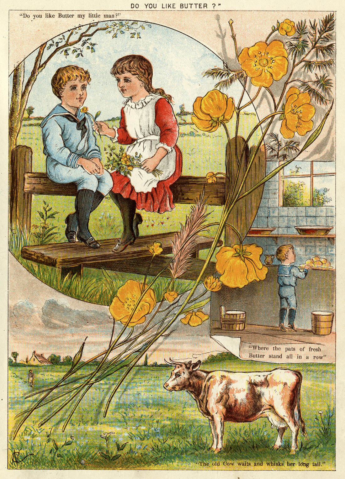
- (iv) Do You Like Butter?
(4) Further Reflections
- (i) Proto-Comic or Pre-Comic?
- (ii) Back Covers
(5) The Little One’s Own Coloured Picture Paper—a cheap magazine of the 1880s
- (i) As a publication
- (ii) As an innovative lithographic product
- (iii) As illustration for children:
- (a) Previously… hand colouring
- (b) After that… wood-engraved colour printing—chromoxylography
- (c) Lithography in the age of steam—Ben Day dots & four coloured pages for a penny
(6) Ben Day tints in the Little-One’s Own Coloured Picture Paper
- (i) Blue stippled dots
- (ii) Red dots in an almost-familiar pattern
- (iii) Complex colour mixes
- (iv) Emulating wood engraving
- (v) Moving towards four-colour printing
1. Introduction
In Part 5 of my History of Ben Day Dots, I detailed the arrival of Day’s “mechanical tints” in the nineteenth century world of lithographic colour printing (or chromolithography).
That world included many heavily illustrated children’s books which were verging on graphic narrative or comic strip continuity. (Though many of these were also printed by other means, including a lot of chromoxylography or coloured wood engraving—as we shall see later.)
The reason for squeezing in another post before Part 6 of my History is to discuss a newly acquired children’s magazine from 1885, which looks very much like a “missing link” between chromolithographic printing and Ben Day in the letterpress comics.
Benjamin Henry Day Junior patented his new method in 1879. Ace historian of print Michael Twyman reckons the Ben Day tints were probably used in Britain from about 1883.
A few days ago a copy of George Newnes’s rare and elusive 1890s magazine The Million arrived in the post. I was very excited about this, as it is key to my researches into early use of Ben Day in letterpress. (More on all that in Part 6).
From the same seller I had also bought two copies of a children’s magazine from 1885, which I thought might be slightly interesting. I hoped they might just have some Ben Day tints in them if I was lucky, but really, I had no great expectations. I thought they were probably too early—most likely they would be full of hand-stippling.
One glance at them told the tale, though. Only two or three years after Ben Day came to the UK, The Little-One’s Own Coloured Picture Paper—snappy title, isn’t it?—was clearly an early adopter.
It’s positively crawling with Ben Day!
As I hope you can see if you click on the picture to enlarge it, and possibly click again for full-full-size. (Use the browser’s back button to return here.)
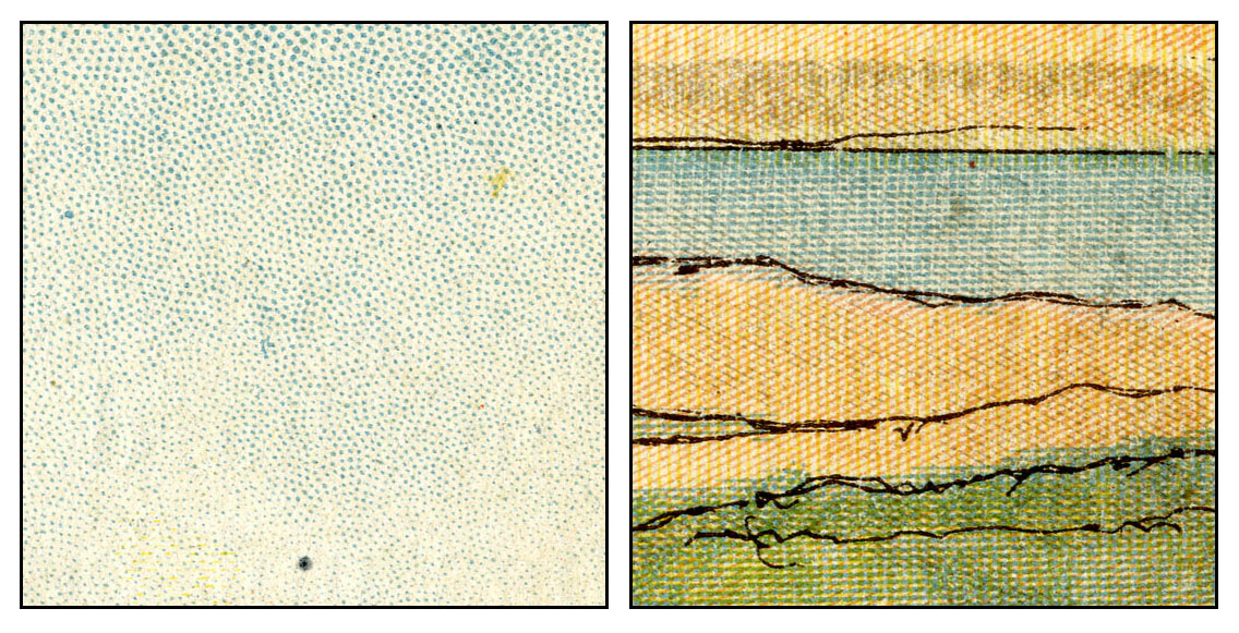
If you have read Part 5, you will have no hesitation in identifying the festoons of dots in the blue sky on No.29 (below left) as the very popular Ben Day stipple style, or the tints in the second panel below as Ben’s less famous lines—nevertheless much used, especially on maps.
I will show more full pages and detailed views later.
Another thing that was really striking about The Little-One’s Own is how much it resembles a 20th century comic book.
At roughly 17.5 x 23.5 cm (7.5 x 9.5 inches) it is a little smaller. And each issue is very thin by comparison. My copy of no. 29 has just two folded sheets for 8 pages—very possibly at least one sheet is missing. No. 32 may be complete—it has 3 sheets, 12 pages. Each copy has 4 coloured pages, the rest black and white and text-heavy, with a few simple B&W illos here and there.
Interestingly, it carries no advertising. All profitability must have come from its sale price alone. [EDIT: June 7th 2023: I was wrong about that, at least in part. The weekly ‘numbers’ like no.29 above, and no.32 below, carried no ads in their 8 pages, but I can’t be sure that they didn’t have ‘wraps’, external covers with ads, removed from my copies. I now have some monthly ‘parts’ (collecting 4 or 5 weekly numbers) and these definitely have advertising wraps; outer front covers in (litho) colour on stiff paper, almost thin card, and B&W pages too (at least some printed by letterpress relief, not litho).]
It is the coloured pages which are of course most exciting. At first glance, with their pulp paper and fairly obvious Ben Day, they could be four-colour comics—albeit a characteristically British version, without the glossy covers we associate with the standard U.S comic book. (See Part 3 for details of four-colour printing.)
A closer look shows that they were not actually four-colour, but used a flesh-coloured ink and a grey one as well, as will be seen below.
Not only did the package resemble a comic, but both issues had some pages which come very close to being comic strips. As you will see, a couple of them probably qualify as proto-comics. Which I would argue makes The LOOCPP at least a borderline proto comic book.
According to this history of publisher Dean & Son http://www.vintagepopupbooks.com/Dean_Son_Publishers_History_s/1853.htm#axzz3zJsLhfGL The Little-One’s Own Coloured Picture Paper was announced as the first lithographically printed magazine. Dean & Son were also pioneers of pop-up and movable books for children, which is presumably how they had honed their lithographic skills.
According to the British Library The Little-One’s Own Coloured Picture Paper as such ran from May 1885 to 1892, when it changed its name to The Little One’s Own before morphing into Dean’s Magazine from 1893.
^^Table of Contents
2. Front Covers
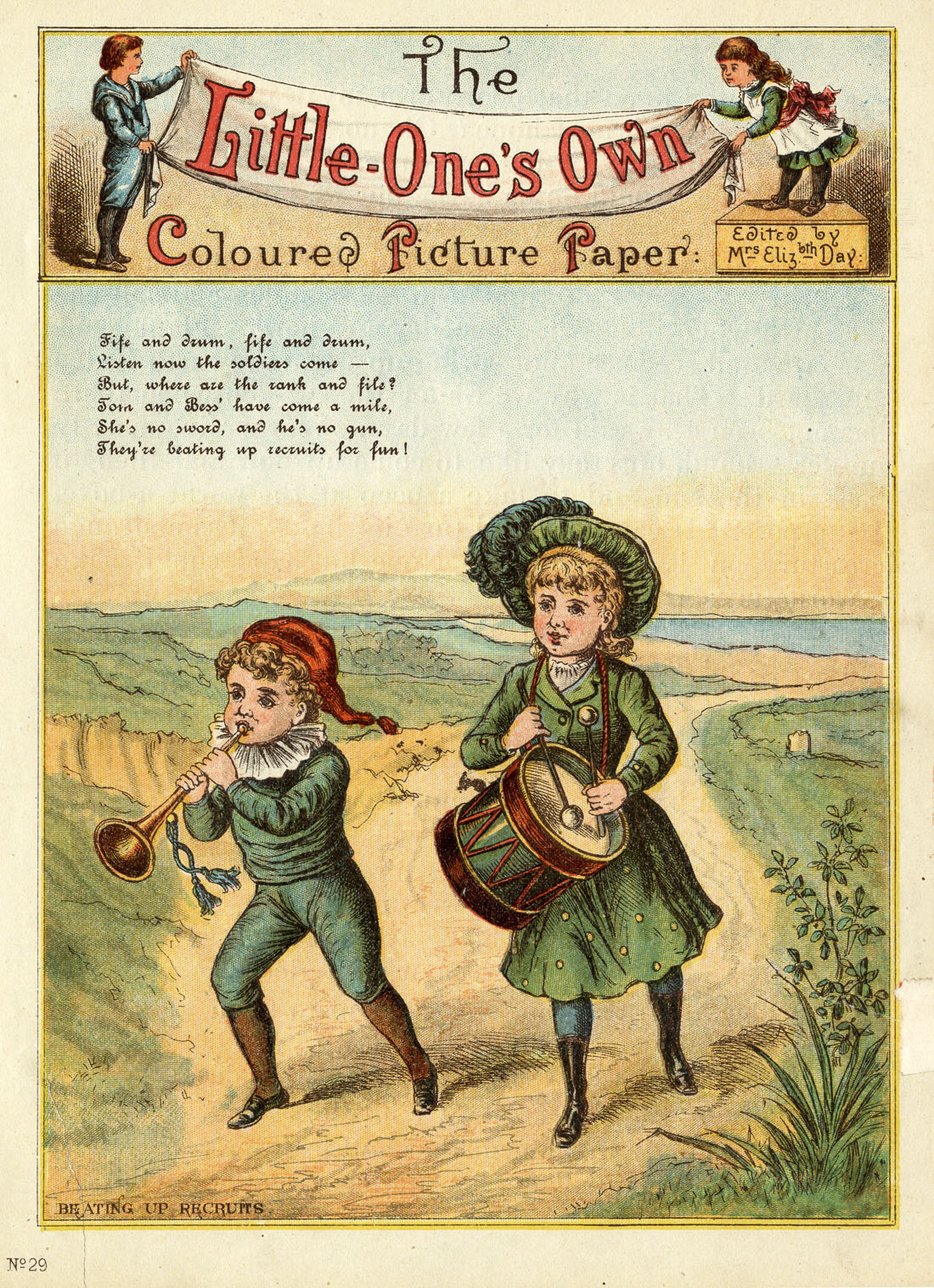
The front of no. 29 (November 14th 1885) is shown above.
(If you are puzzled by the assertion that Tom and Bess are “beating up recruits,” they are playing at being a recruiting team for one of the armed forces. As such they are drawing attention to themselves by beating the drum and playing the bugle, as also heard in the expression “beating the retreat.”)
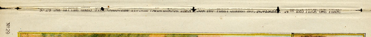
Below I show the strip of text which runs along the spines of both covers. There were no staples or stitching in the weekly paper, I suspect, but there are stitching holes in these copies because they have been removed form a bound volume.
There has been a lot of wear to the spines as well, but on a full-sized view I hope you will be able to make out details like the dates, and the price—one penny.
![]()
The cover of no. 32, below, has a two-panel structure that makes it almost a comic strip in itself. Some might argue that it unequivocally is, though the action between the panels is quite disjointed. The goat in panel 1 is not wearing any of its harness gear, for example, let alone actually attached to the carriage. An awful lot goes on “between the panels” here.

^^Table of Contents
3. Inside pages—Proto-Comic Strips?
(i) What The Little One’s Can Do
No 29, unpaginated, but seems to be 4th page
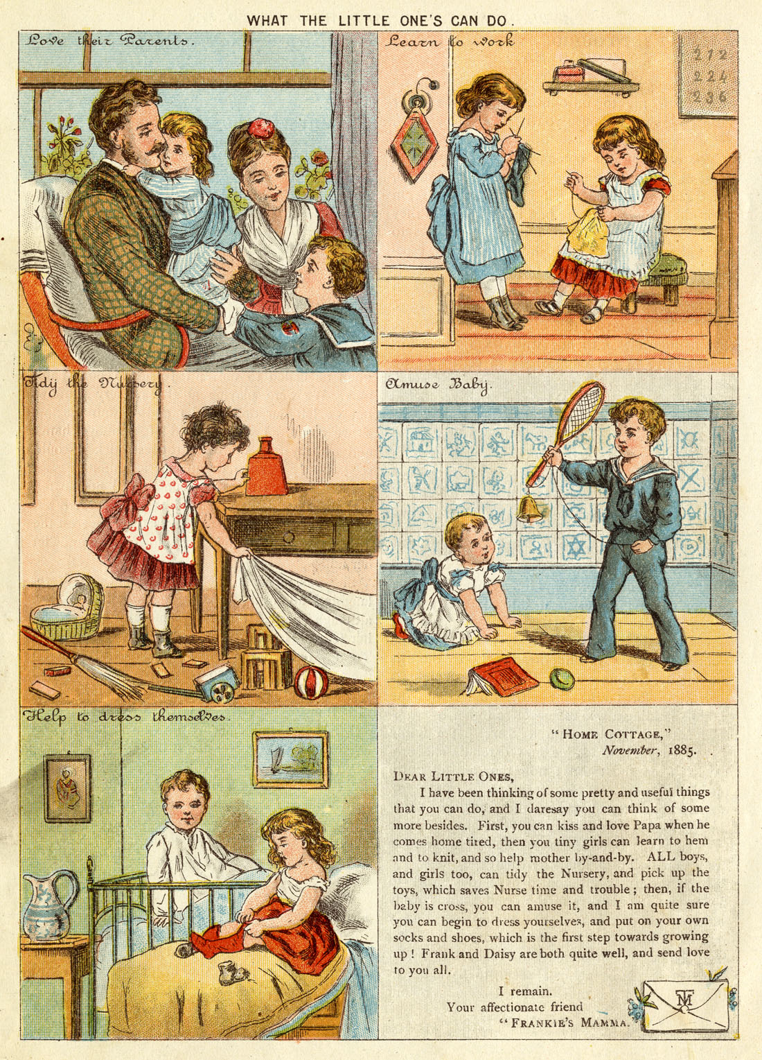
This page might be considered suitable for children’s moral and behavioural improvement, but surely even in 1885 the “grocer’s apostrophe” (or is that “grocers’ apostrophe”?) disqualified it as grammatical education.
Anyway, as a possible piece of graphic narrative it must be considered at best borderline. The five illustrations may at first glance appear to be to be laid out to be read from left to right, then down the page, as a comic strip. In a sense they do carry a story, but they are not really in continuity—rather, they show activities separated in time, space and personnel.
Eventually we see that the pictures are linked by the suggestions made to the Little Ones in the letter from Frankie’s Mamma, though placing this at the end of the sequence seems perverse to me.
Perhaps child readers were expected to read through the whole page again having appreciated that the pictures are not just a series of editorial admonitions, but friendly advice from this august personage.
I suggest that What The Little One’s Can Do, rather than a true comic strip, instead shows a type of page design widespread in British periodicals of the period, possibly originating in The Illustrated London News. The images are linked by a shared subject matter and a continuity of theme, established in a separate piece of text, but do not have a true narrative continuity.
However, once the format of such an illustrated page had become a routine part of the periodical world, it was a relatively small step for editors, journalists, writers and artists to introduce a narrative element.
^^Table of Contents
No 29, unpaginated, 5th page in my ?incomplete copy. If it was originally a 12-page issue when complete, this would be the 9th page.
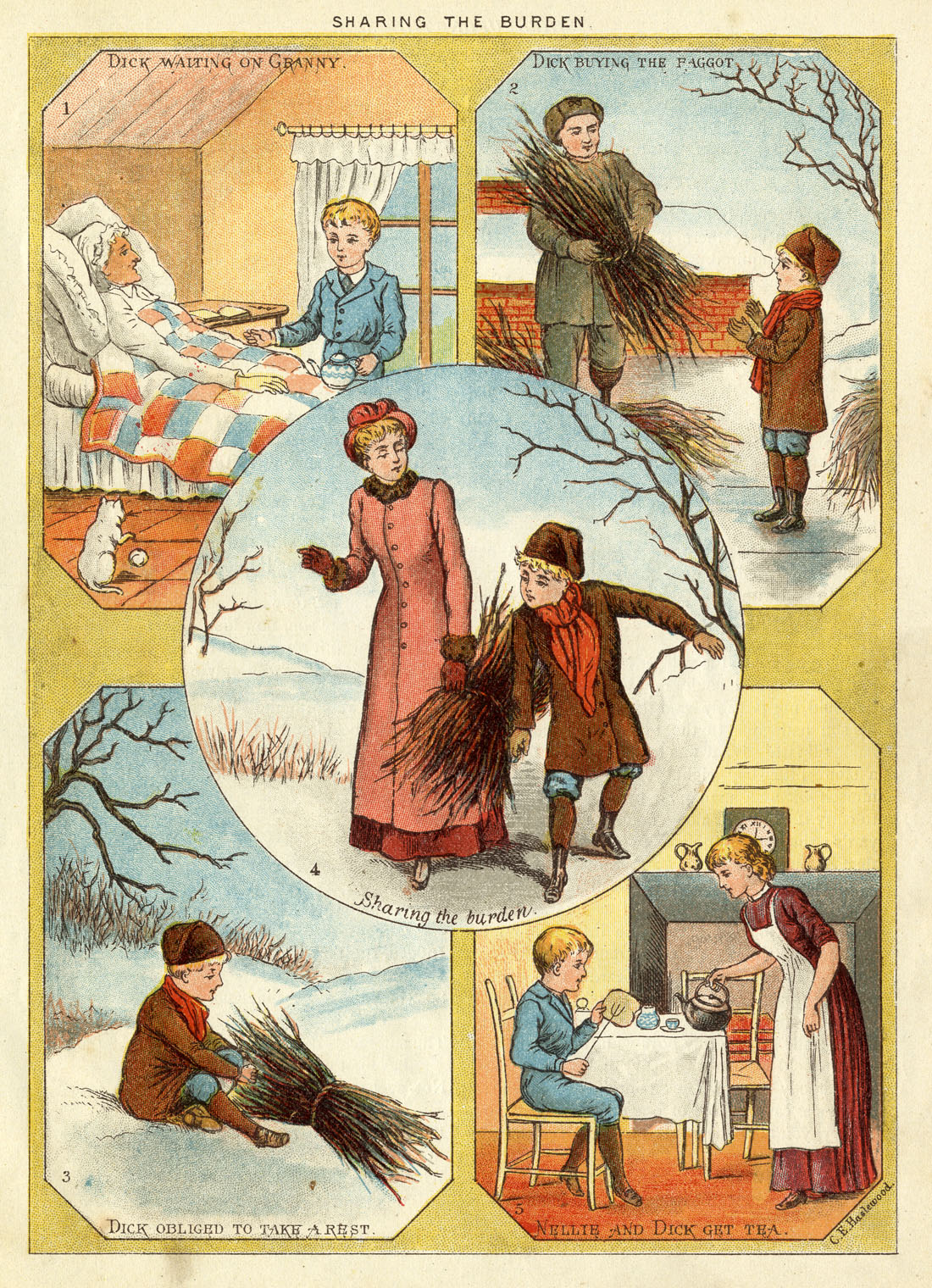
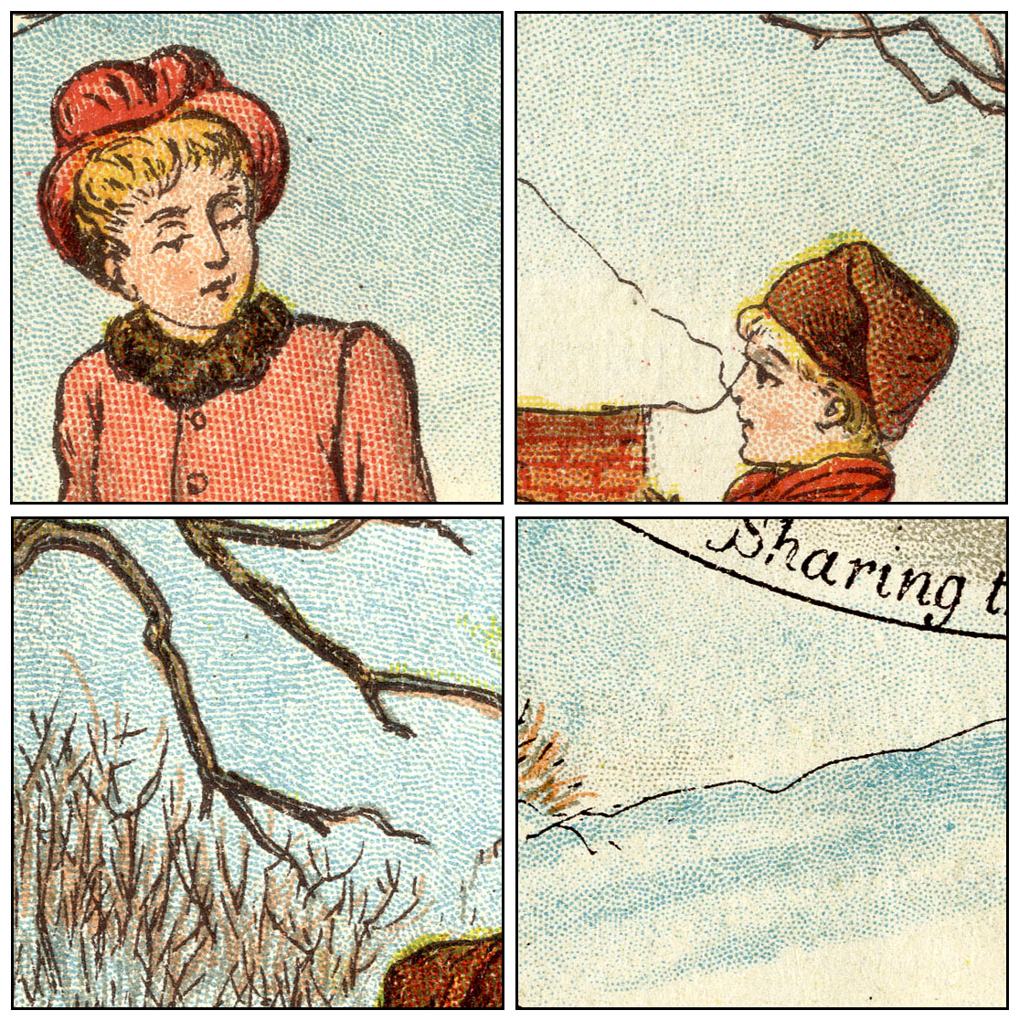
Sharing the Burden is more like an actual graphic narrative. Its action can be followed through the numbered panels, with the sparse captions filling in almost enough information to make it fully comprehensible (especially if you know that a faggot is a bundle of sticks bound together for burning on a domestic fire).
But it definitely has a sense that some information is missing. The caption to panel 1 is hardly a great scene setter. From panel 2 onwards, with its reference to “the” faggot rather than “a” faggot, I got the feeling I the missing preceding page may have had some more text relating to this story.
Panel 4, too, is decidedly odd in itself. Who is this lady who helps Dick? In panel 5 we learn her name, but nothing else. And what has happened to the faggot? And Granny—is she part of this story any more?
The answer came when I turned the page. The little text story which accompanies these pictures fills in the gaps.
The text stands alone as a story. The illustrations, on the other hand—though almost constituting a narrative—are found to fall short without these extra words.
Victorian children might have been more accustomed to finding linked text on a separate page than we are. Certainly their parents were. The Illustrated London News and The Graphic, in common with most contemporary books, routinely had images quite far removed from the text which explicated them. Clearly this was not ideal, but was understood by readers as a convention of the time.
Many readers probably even understood that it was consequence of the limited technology available for printing text and images, and the differing conditions of “make-ready” etc required. To some extent, both lithography and letterpress (with wood engravings) were capable of presenting image and text together. But the methods of production still encouraged separation.
One side of a sheet of paper tended to be run through a press with cylinders set up for pictures, while the other side went through the same or a separate press, with a cylinder set up for type / text. Having coloured images intensified this constraint—they required several passes through a press—and having only a few such pages per issue, a strong inclination to maximise the area taken up by attractive colour was understandable.
Again though, in this particular case, having the text come after the images seems clumsy. If, like my copy of no.29, there really were four B&W pages in the middle of no. 32., the text of Sharing the Burden would have been better placed on the page facing its illustrations. Perhaps those four text pages really weren’t there after all. Some issues of The Little-One’s Own might have been thinner than others.
At any rate, Sharing the Burden in my opinion reveals itself to be another case of a not-quite comic strip.
^^Table of Contents
No. 32, Dec 5th 1885, unpaginated, probably 4th page
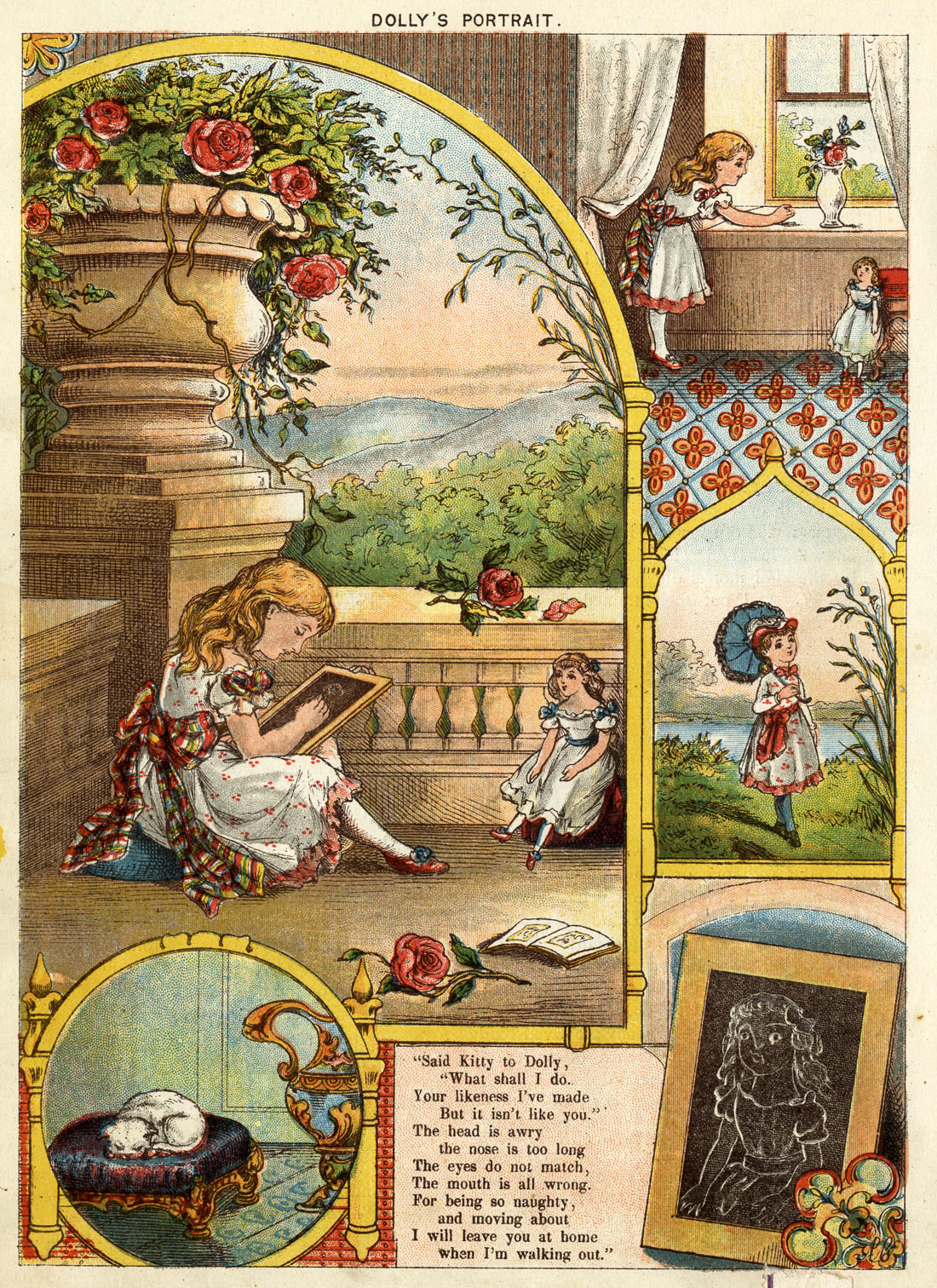
Decidedly odd, this one. The individual pictures are not numbered and nor do they follow an obvious left-to-right / top-to-bottom layout.
However, there is a narrative sequence of sorts, at least running through the main picture, the one at top right, and the one below that. The girl Kitty is seen sketching her doll on a chalk-board, looking out of the window, then walking outside without her doll.
These actions are again explained more fully in the short poem which, this time, appears on the same page as the illustrations. And again, the text is really needed to make full sense of the picture sequence.
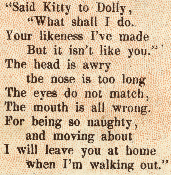
In particular, we see the drawing Kitty made (with its various faults) at bottom right, but we would not understand its place in the story without the text. Even it was placed in the picture sequence as the second picture, it really would not explain itself fully without some verbal assistance.
Finally, what place does the sleeping cat have in the narrative?
Good question.
So, to sum up, Dolly’s Portrait is not a satisfactory example of an actual comic strip, though with its text on the same page and a partially sequential graphic narrative, it is perhaps our closest yet.
^^Table of Contents
No.32, apparent 9th page.
This page is perhaps the most at-a-glance obviously not an actual narrative, but a set of three disconnected illustrations. It will not surprise you by now to learn that, over the page, another short poem is to be found:
And again, once the text is read, the pictures assume their full meaning; without the separate text, they cannot be said to constitute an actual graphic narrative or comic strip.
^^Table of Contents
4. Further Reflections
I don’t know whether we have a clear definition of a proto-comic, or proto-comic strip. My Concise Oxford English Dictionary says that the prefix proto- can mean “original, primitive, first”—or, quite differently, “anterior, relating to a precursor,” meaning something that came before.
As precursors to actual comic strips, I would accept the title “proto-comic” for all four of the above pages.
As primitive or early examples of actual comic strips, as explained above, I don’t think any of the four really makes the grade.
The same dictionary defines the prefix “pre-” as meaning “before (in time, place, order, degree or importance)” of which only “before (in time)” need concern us now.
The second dictionary meaning of “proto-” is evidently pretty much the same as “pre-” which would make a “proto-comic strip” the same thing as a “pre-comic strip.”
Perhaps though, the fact that proto- can also mean “original, primitive, first” implies that the term should be reserved for those sequences of pictures which come really, really close to being actual comic strips.
Which could mean that Sharing the Burden and Dolly’s Portrait are both pre-comics (or pre-comic strips) and proto-comics (or proto-comic strips) while What the Little One’s Can Do and Do You Like Butter? are pre-comics but not proto-comics.
Arguably.
Equally, can we call The Little One’s Own Coloured Picture Paper itself a pre-comic (or a pre-comic book) or a proto-comic (or proto-comic book)… or both?
I’d like to know what the wider community thinks, if you’d like to let me know.
^^Table of Contents
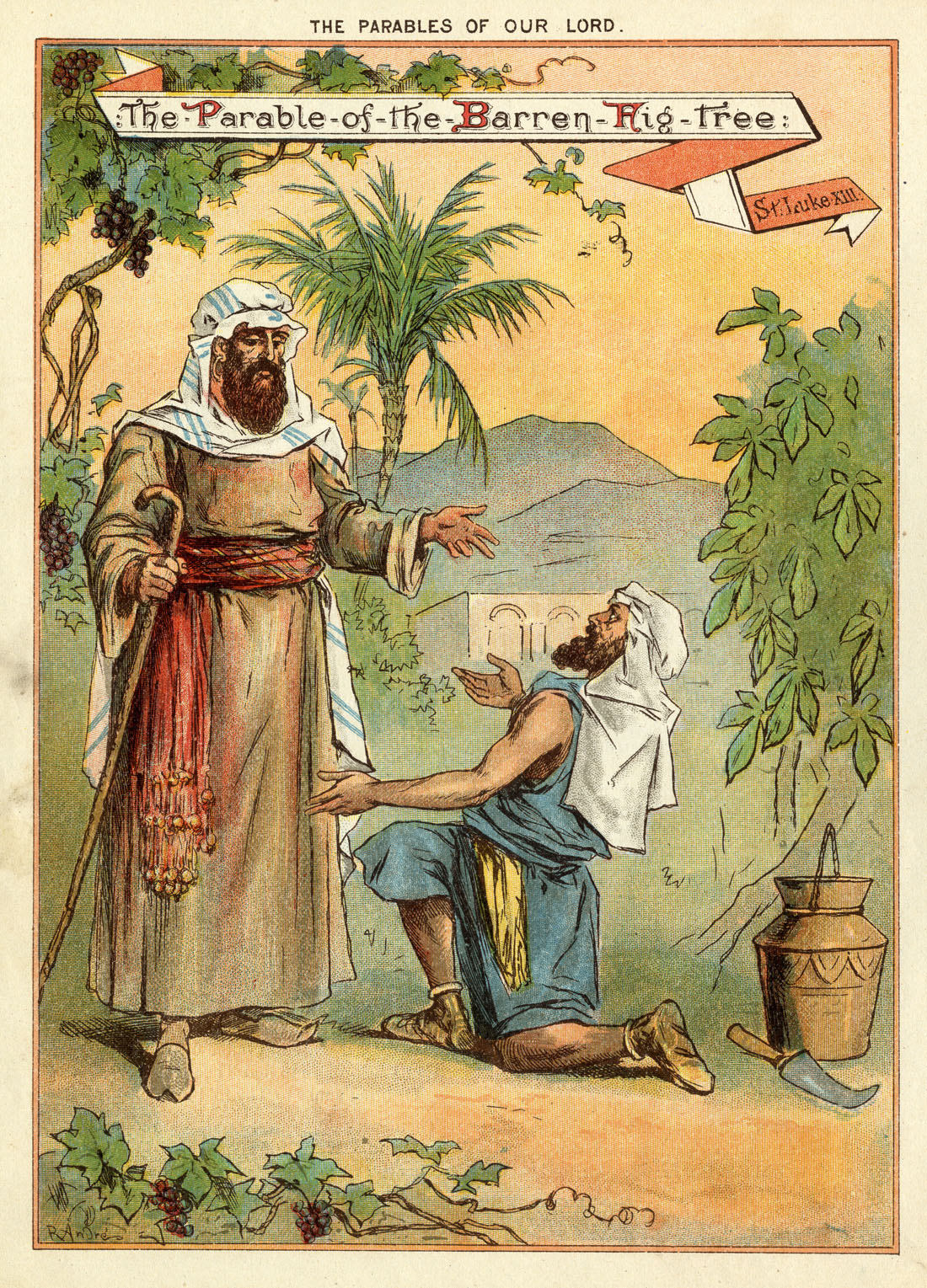
Both my copies have a brief version of one of Christ’s parables in text on their inside back cover—with kid-friendly explanation—and a rather good illustration of the same parable in colour on the back, drawn by Richard André.
No. 29: The Parable of the Barren Fig Tree:
No.32: The Parable of the Unjust Steward
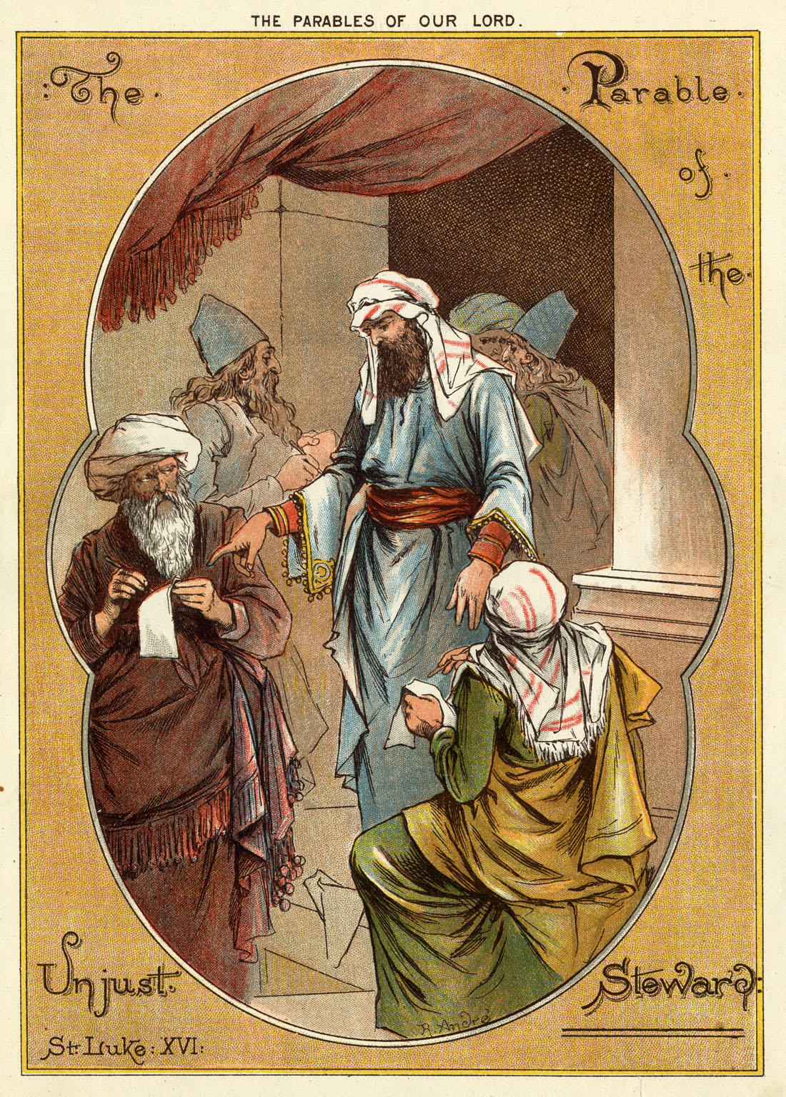
Two interesting points about these: firstly, illustrator André, a rogue and a ne’er-do-well, was by this time on his third different name, following various scandals. You can read some details here (recommended!) and see some more of his pictures. Perhaps by 1885 he was a reformed soul. Perhaps New Testament imagery just paid well. I couldn’t possibly speculate.
Secondly: nothing remotely like a comic strip here. Obviously enough.
^^Table of Contents
5. The Little-One’s Own Coloured Picture Paper—a cheap magazine of the 1880s
The Little One’s Own Coloured Picture Paper (LOOCPP) was published by Dean and Son, a secular publisher. However it was very much in the tradition of previous cheap, mass market publications by the Society for Promoting Christian Knowledge or SPCK (The Saturday Magazine, 1832 to 44) and the Religious Tract Society (The Boy’s Own Paper, 1879 to 1967). These were aimed at encouraging reading and instilling good Christian virtues. There was also a strong trend of using plenty of illustrations, to make these papers attractive. The LOOCPP may have been the first, or one of the first, penny weeklies aimed at very young children.
Charles Knight‘s penny magazine for adults—imaginatively named The Penny Magazine— launched in 1832, with as many black and white pictures as Knight’s wood-engravers could produce on a weekly schedule. It was great success, and from the point of view of the Society for Promoting Christian Knowledge, a dangerous one, because Knight’s organisation was the cheekily-named Society for the Promotion of Useful Knowledge. The SPUK, an upstart rival to the SPCK, was robustly non-religious.
The SPUK was started by Lord Brougham and his pals. We met him in Part 5-and-a-half as the presiding judge at George Baxter‘s patent hearing, advising Baxter to issue licences for his colour printing process—another great contribution to the new media of the 19th century.
The SPCK launched its own Saturday Magazine a few months after the SPUK’s Penny Magazine, and many others followed, some Bible-orientated, others more secular. The competition to supply the increasingly literate population with something to read in their increasing leisure time was on. Souls may have been at stake, but so were pounds shillings, pence—indeed, whole new publishing empires.
(ii) As an innovative lithographic product
Throughout the Victorian age (the 1830s to 1900, approx.) increasing demand allied to waves of new technology, arriving at an unprecedented pace, made it cheaper and cheaper to mass-produce printed matter. In particular, coloured images became ever more affordable. Also, printed coloured pictures increasingly came to replace hand-coloured ones.
In children’s illustration, where the highest quality of printing was not crucial to success, and colourful simplicity was acceptable, the future sometimes arrived a little earlier.
As noted above, The Little One’s Own Coloured Picture Paper is said to have been the first lithographed weekly magazine. We have seen that it contained four coloured pages every week. It represents not only a step forward in children’s papers, but also a technological and an economic feat of some note. Adult weeklies like The Illustrated London News and The Graphic—printed by letterpress, not lithography—only had coloured pages in occasional special editions.
As seen in Part 5, steam-powered lithographic printing had made the economically viable production of large print-runs possible. Ben Day tints had played their part in this, by speeding up production compared with the previous hand-drawn or transfer-paper methods. The LOOCPP was made possible by these advances.
Whether its pages were printed by the old stone method or the new zinc plates I do not know. Dean and Sons might have used the newer method, which was certainly available. Martin Hardie in English Coloured Books (1906) reports that Walter Crane drew children’s books on zinc litho plates from 1885 to 1891, for example. In the USA zinc had been used for a decade or more by some companies.
Many writers of and on the period remark that cheaper, faster lithographic printing was displacing the previously preferred high-quality colour printing method of wood-engraving, which I will briefly discuss below.
(iii) As illustration for children
(a) Previously… Hand Colouring
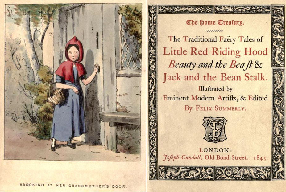
The 1840s had seen a new wave of British children’s books, less dull and didactic than previous generations, which according to Hardie had been full of “depressing moralities and melancholy instruction.” Now offering fairy tales and fun alphabets, these new books had illustrations printed as wood engravings in black, then hand-coloured—often by child labour.
Sir Henry Cole, first director of the Victoria & Albert Museum, was the pioneering publisher of these Home Treasury editions under the pseudonym Felix Summerly. Printing was by Charles Whittingham at the famed Chiswick Press. The edition below was illustrated by T. Webster. It cost two shillings and sixpence coloured, one shilling in black & white. A shilling, let us remember, was in those days 12 pennies. This book had four coloured illustrations for a cost of 30 pennies.
(b) After that… Wood-Engraved Colour Printing—Chromoxylography
The next wave of innovation came in the 1860s, and owes much to the colour printer Edmund Evans. He had worked on a wide range of adult books since the early 1850s, initiating for example the popular “yellow-back” covers for cheap paperback books.
Evans is always referred to as a wood engraver, and it is true that he revived and developed the craft of chromoxylography—printing in colour from a number of engraved wooden blocks. In this he followed on from George Baxter, but leaving out Baxter’s patented aquatinted key image (see Part Five-and-a-half).
(What is not generally known is that Evans often printed some of his colours by the relief aquatint method (also see Part Five-and-a-half) with metal plates in combination with his wood blocks. Some of his supposed chromoxylographs are really chromotypographs (ditto). I will return to Evans another day, and to the only printer who both beat Evans on quality and printed solely from wood—the astonishing Yorkshireman, Benjamin Fawcett.)
As in the Home Treasury series, Edmund Evans in his children’s books used a wood-engraved key image printed in black. He did not colour by hand though. He printed in colour using a number of other relief blocks—mostly wood—one for each colour. Early on he experimented with limited colours, including four-colour printing, but his best and best-known work is done with a wider range of at least six colours. E.g., like many other colour printers of his time, he used a flesh colour, not only for skin, but also as a colour for mixing—to create oranges and browns, for example.
Edmund Evans’s greatest hits in the children’s field were books by Walter Crane and later Kate Greenaway. Greenaway in particular was a massive overnight success once she teamed up with Evans on the 1879 book Under The Window, and was widely copied. So too was Evans’s publishing model, that of the “toy book.”
These hardback books had up to forty, or even sixty, pages. Some pages would have full-page, full-colour images, some perhaps just text or smaller illustrations, some pages might have illos with limited colour. Typically the books cost one shilling—12 pennies. High production costs were offset by huge prints runs, in the tens or hundreds of thousands.
Below: From Under The Window by Kate Greenaway, 1879—click to enlarge, click a second time if possible for full size, back button to return here:
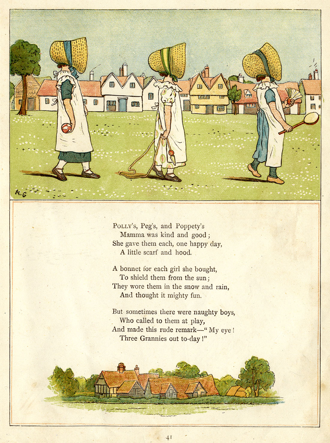
A few points, seen best in the details below:
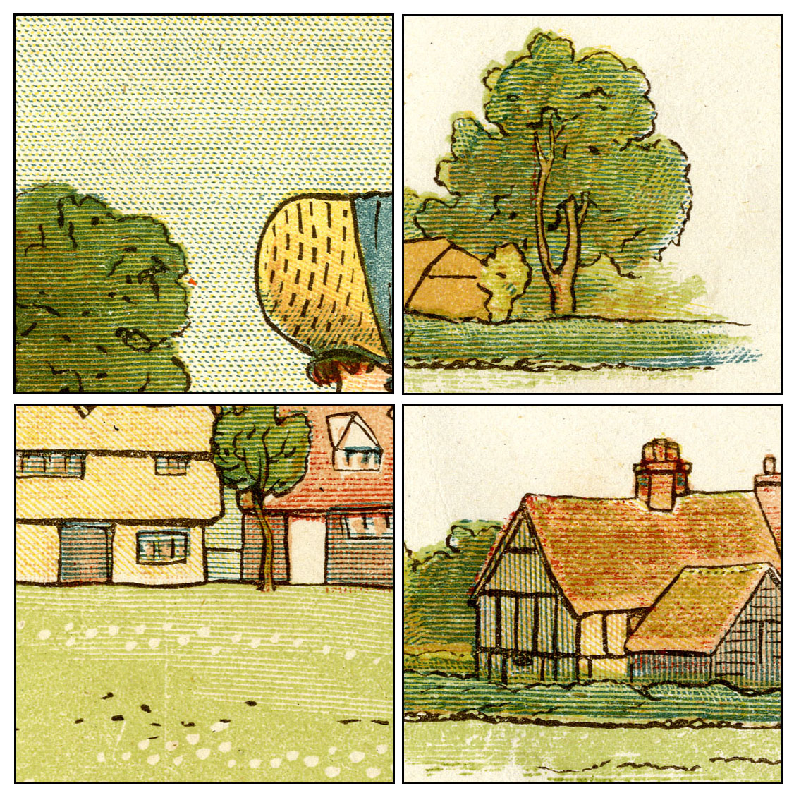
- Pretty much all colour tinting is done using lines, as with the “grey” tones of black-and-white wood engraving—as seen here in the Illustrated London News:
- The dots in the sky might at first look like Ben Day dots, but a closer look reveals the typical marks of fine wood engraving—”white” cross-hatching done by hand, but with the aid of a line ruling machine.
- White lines and cross-hatching clearly seen on grass, trees and houses
- Note too that Evans has used not only blue dots in the sky but also yellow dots, to attempt a close colour match with Greenaway’s original water-colour painting.
- Flesh colour used for orange shading on the bonnet, and on house roofs.
- Evans has used a pale green ink, rather than mix his green from blue and yellow.
- His dark green is not another ink, though, but green and blue mixed.
- Finally some spottiness in the blue on the bonnet is not a sign of any special tinting, I think, but an effect sometimes seen with a “solid” colour, where tiny particles or patches of darker ink gather.
(c) Lithography in the age of steam—Ben Day dots, and four coloured pages for a penny
Greenaway’s style in particular, and those of her imitators, created the illustrational climate broadly prevalent when The Little-One’s Own Coloured Picture Paper was born in 1885.
Dean and Sons would have wanted something close to that “look” for their new paper.
In books, colour pages may have been printed by chromotypography, chromoxylography or the increasingly cheap and fast chromolithography. The kind of letterpress printing used in the 1890s for Sunday newspaper colour sections and comic strips simply didn’t exist yet.
Lithography was Dean & Son’s choice for a weekly publication.
Whereas a wood engraver could produce a few dozen pages a year for a small number of books, Dean & Son’s speedy new lithographic printing allowed them to offer four coloured pages every week. The quality may not have matched up to Evans’s productions, or the best pages found in other books, but it didn’t have to. It was good enough for a weekly paper costing one penny.
Arguably it was considerably better, and better value, than the hand-coloured books we saw above, in which four pages of colour were had for 30 pennies.
^^Table of Contents
(6) Ben Day Tints in The Little-One’s Own Coloured Picture Paper
I could fill 47.6% of the internet with details about these colours, but I will confine myself to a few key points.
Plus one plea for help.
Starting simple: those who followed the Ben Day stipple pattern story in Part 5 will (as in the sky close-up at the beginning of this post) recognise the pattern used in the sky and on the snow in the one-inch (2.5cm) squares below.
(Click once or twice to enlarge, back button to return here.)
As also seen in Part 5, one of the strong points of the Ben Day system has been brought into play—the Ben Day screen has been applied twice or three times to “multiply” the dot pattern and darken the tint. In addition the screen has been pressed more or less firmly in different places to produce smaller or larger dots. (These were usages which Benjamin Day discussed in his patent documents—see Parts 4 & 5—anticipating what lithographers would do with his screens in practice.)
Unlike the Greenaway sky seen above, though, this is a simple blue, with no nuances of colour. In itself this epitomises the move towards a simpler approach—a trend which will eventually bring us to four-colour comic strips.
 ^^Table of Contents
(ii) Red dots in an almost-familiar pattern—but not quite
I have chosen the next four details to show a pattern used in the scarlet/red dots. At first I thought this was a first sighting of the regular “square” grid of dots, mathematically precise and resembling a halftone screen pattern, which was to dominate comic book printing decades later.
However looking closely at the woman’s coat, and the applying a ruler to the screen, convinced me that these dots are in fact on a very gentle curve, both vertically and horizontally, not set in a square grid.
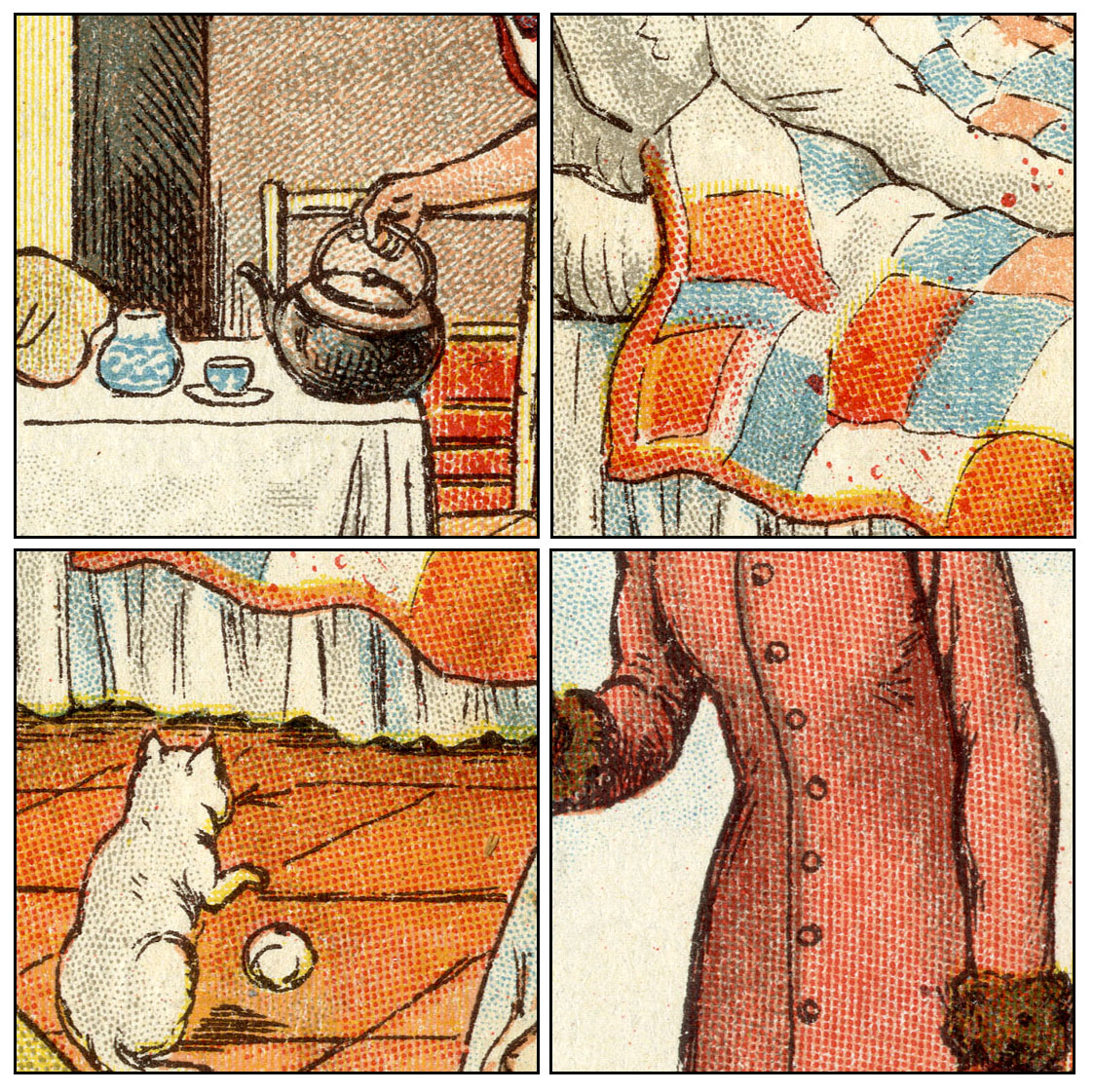
This is puzzling. Full disclosure here: this pattern does not appear in my 1911-dated Ben Day catalogue, though a number of line patterns with very similar curvature do.
So—was it an early Ben Day pattern which was later abandoned? Was it in fact not a Ben day pattern at all but some other kind of mechanical tint—perhaps a Nelson transfer paper (see Part 5)? I think it is unlikely that they would have mixed the two technologies, but not impossible.
Anyone who can shed light on this, do please let me know. You can reach me here:
guy.lawley@btinternet.com
Meanwhile, though I have noted a trend towards simplicity, many of the squares above do show quite sophisticated colour mixes. For example, on both the floor and the quilt we see an orange made up from solid flesh tone, some yellow and some red dots.
In general, in the transition to letterpress printing on newsprint—e.g. the early comic strips, ten years later—a simpler set of tints and mixes was employed. Later comics used only four colours—cyan/blue, magenta/red, yellow and black (CMYK—see Part 3.) In four-colour work, orange would be made from various tints of red and yellow only.
Later on, too, comics strips mostly had regular grid dot patterns, not stipples. However the comics did not immediately adopt a unified four-colour printing scheme, nor did they abandon stippled dots for regular grids of dots straight away.
The relative sophistication of a letterpress comic strip like Little Nemo is often praised, and rightly so. I will look at Nemo in a later post. For now, we can see that a comparable degree of sophistication is achieved by these earlier lithographic artists.
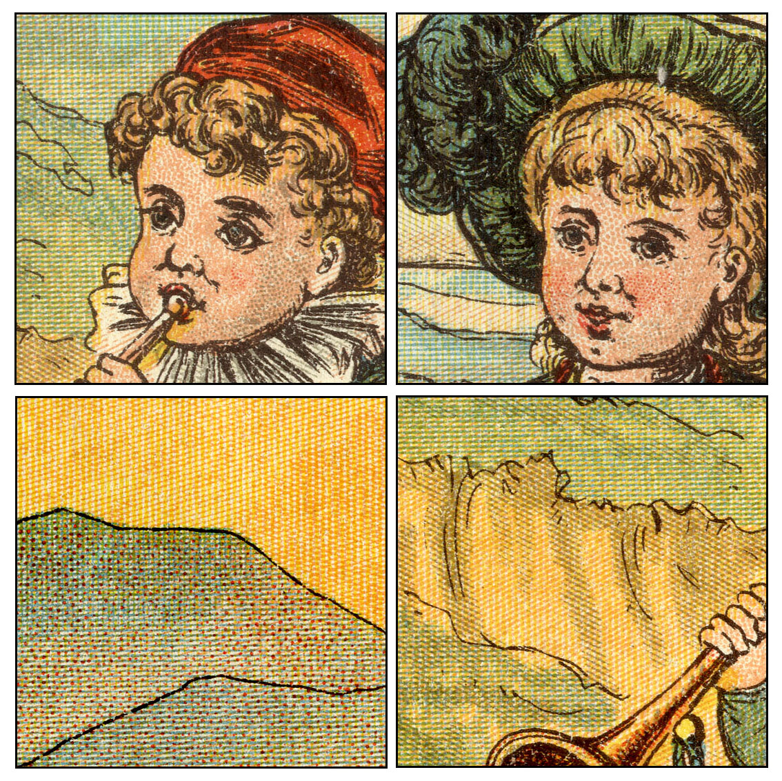
The four squares below (from the front of no.29) show the use of hand-stippling on the faces, and red dots added to the landscape by hand in the third square. The flesh coloured ink is used a lot, including in brownish green, as is the grey ink. Both hand-stippling and the flesh & grey coloured inks were luxuries which the comics had to do without.
 ^^Table of Contents
Lines are used extensively in the colouring of the LOOCPP, often with cross-hatching. I’m certain this was a deliberate attempt to emulate—up to a point—the look of wood engraving, i.e. the kind of colouring seen in Edmund Evans /Kate Greenaway page shown above.
As with the doubling-up of dot patterns, as I remarked in Part 4, Benjamin Day appeared to be implying in his patent notes of 1878—though less directly this time—that his tints might be used to create a look similar to wood engraving. Parallel lines are the signature note of wood engraving’s shading methodology.
Day also noted that cross-hatching could be achieved much more easily with his mechanical tints than it could in wood engraving. Indeed, white lines crossing each other are easily done in wood engraving, whereas black (or coloured) cross-hatching can be only be engraved using time-consuming trickery—the diamond shapes between the lines must be engraved out.
Not so with Ben Day lines. Two or even three sets could easily be laid down directly on top of each other at any angle(s) required. By this I mean lines on one stone, for one colour of ink. For example, a pale blue might be made from one set of tint lines, a darker blue by crossing a second set of lines over it. Both sets of lines would be laid down on the same stone and printed at the same time.
The mixing of colours by crossing flesh-colour lines over blue lines, for example, is also seen here. In that case, the lines were laid down on two separate stones, of course, and printed one over the other.
(v) Moving towards four-colour printing
If Day anticipated colour printers using his tints so extensively, he did not give it away in his patent text, however. His mention of colour use was very minimal, perhaps guarded—was he really not seeing beyond black-and-white, or was he saying as little as possible, not wanting to “give the game away”?
Below is another quartet of colour mixes, this time from the back of no. 29. As you will have noticed, unlike Edmund Evans, who used a green ink, these guys are mixing yellow and blue for their greens. As noted before, this was a favourite trick, saving one printing plate or stone, one whole run of paper though the press, and the cost of the green ink.
The cost—in time, effort and expertise—of designing and making the yellow and blue patterns as required was of course to be factored in. Overall it must have worked out as a money-saving exercise.
This was the kind of economic consideration which eventually led to standardised four-colour printing, of course—a topic for another day.
^^Table of Contents
(7) Concluding remarks
In terms of its colour printing, if nothing else, The Little-One’s Own Coloured Picture Paper is certainly an interesting publication.
Comparing it to the contemporary “gold standard” of children’s book illustration, like the Edmund Evans / Kate Greenaway team, is instructive. The LOOCPP is an example of what lithographic steam-powered printing could supply at a fraction of the cost of Evans’s books. It would perhaps, even at the time, have been seen as one more danger sign for the chromoxylographers, who must have known that their days were numbered.
In that sense it is a pointer to the future of cheap colour printing, even though with hindsight we know that before long, lithographic printing of this sort would in turn be priced out by letterpress.
The coming of photomechanical halftone reproduction—in B&W from the early 1890s, in colour from the early 1900s—would play a big part in this, and this is the story which gets all the glory.
But for decades, especially at the cheaper end of the commercial market, there would be a golden age for cheap letterpress printing from “line blocks”—printing plates without expensive halftones—with Ben Day tints at the very heart of it.
This was particularly notable in colour printing, as I will discuss next time, in Part 6. And within cheap colour letterpress printing, the comic strip and the comic book have a special place—with Ben Day tints at the very heart of that too.
The Little-One’s Own Coloured Picture Paper, with its extensive use of Ben Day tints, and the “comic book” look of the artwork, even in its size and format, also provides a pointer to the future in one specific way—it looks uncannily like a comic book.
In calling it a “missing link” between chromolithography and comics I am not necessarily suggesting that the colour separators, engravers and printers of the actual letterpress comics of the 1890s specifically used the LOOCPP as a model for their methods—though they could have done.
I am not aware of similar publications in the USA or elsewhere which might have played a similar role. Additionally, while the pamphlet-like comic book came to Britain a good deal sooner, in the USA there were several decades when the Sunday sections, not the pamphlet, were the home of the comic strip. If the LOOCPP had any direct bearing on the evolution of the comic book, it is much more likely that it was in the UK.
The story of similar publications in Europe and elsewhere, if any, is something I hope to hear from others.
Alternatively, the LOOCPP may be more like those archaeological finds of ancient species of pre-human which actually died out, rather than proving to be true “missing links” on the evolutionary pathway from primate to Homo sapiens—a side branch on the tree of life.
There is no doubt that it shows what could be done with Ben Day in limited colours, in a mass-market penny paper, with a very similar look and feel to a primitive comic book—perhaps indeed a pre-comic or a proto-comic.
At the very least, I would award The Little-One’s Own Coloured Picture Paper an honourable mention.
~~~
Text and original images copyright © The Legion of Andy 2016
