
How the original Ben Day dots got into the original American comics
See also:
- Part 1—Roy Lichtenstein etc.
- Part 2—Halftone dots, Polke dots, More Roy
- Part 3—Four-colour comic book dots / CMYK & RGB dots on screens
- Part 4—Pre-history, Origins & Ben Day in the 19th century
- Part 5—Ben Day in lithography
- Part 5.5—A forgotten Ben Day predecessor in letterpress
- Part 5.75—A Lithographic Protocomic (?) from 1885
- Part 6.1 —Ben Day dots in their prime, on 1930s Tarzan Sunday pages
- Part 6.2—Registration—as in, getting the colours lined up right—or not
- Part 7—Ben Day Dots 1933 to 1937—the birth of the comic book
- Part 8 — 1930s to 1950s: The “Golden Age” of Comics — exit Ben Day, enter Craftint
- Part 9a — 1950 & 60s: The “Silver Age” of Comics, Part 1
- Part 9b — 1950 & 60s: The “Silver Age” of Comics, Part 2
guy.lawley@btinternet.com

Many images can be clicked to enlarge. Use the back arrow or button on your browser to return to this page.
CONTENTS OF PART 6:
Introduction:
(a) What has gone before
(b) And now for something completely new… the Sunday Funnies
(c) Comic strips, comic books, Ben Day dots and benday dots
PREAMBLE no.1: The Forgotten History of Letterpress
PREAMBLE no.2: A Brief History of the Metal Relief Printing Plate
PREAMBLE no.3: Hommage à Gillot
Photoengraving a “Line Block”—No Ben Day yet, but this is key…
Adding a Grey Ben Day tint to a B&W Line Block… it’s a start
Ben Daying the Negative
A Ben Day Man in Action… a historic short film
BEN DAY IN COLOUR
Preamble—what did Benjamin Day say about photoengraving and colour…?
Why Weren’t the French the First to do Ben Day in Colour Letterpress? The Tinted Halftone
The First Colour Supplements — no Ben Day dots in these…?
BEN DAY IN COLOUR LETTERPRESS… at last! How It Was Done
Adding Solid Colours
Colour Separation — the (Very) Basics
Did the Sunday Funnies use Ben Day from the Start? — Yes and No.
Yellow Kid, Red Dots, Blue Lines—examples of early Sunday Comics Ben Day
Letterpress, Ben Day & the Comics—Made for Each Other… but Ben also has a finer, glossier future
The Outroduction — coming attractions
INTRODUCTION
All pictures should be clickable to enlarge, often twice on a PC for full size. Back button to return to text.
In previous posts I have looked at:—
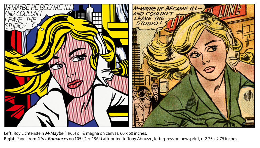
So-called “Ben Day dots” (or rather, “benday dots”) in the paintings of Roy Lichtenstein, and in the 1960s comic books which he used as source material…
 …and the origins of the real Ben Day dots, including inventor Benjamin Henry Day Junior’s original patent of 1879:

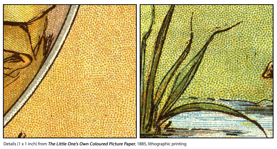
…and the first wave of success for Ben Day dots—and Day’s less famous lines—in coloured lithographic printing from the 1880s onwards. This English penny magazine for children, for example, is from the cheaper end of the lithographic market, in 1885. It was the first weekly paper in the U.K. to have regular colour pages, and remained a rare example. In the U.S.A. humour magazines Puck and Judge published lavish colour pages weekly, also lithographically.

Close-up views from this cover show the Ben Day dots and lines used to make pale and mixed colours:
^^Table of Contents
(b) …AND NOW FOR SOMETHING COMPLETELY NEW—THE SUNDAY FUNNIES
Now it is time to watch Ben Day and his “shading mediums” extend their domain from lithography to new territory in letterpress printing—the kind of printing used for the text pages of most books, newspapers and magazines.
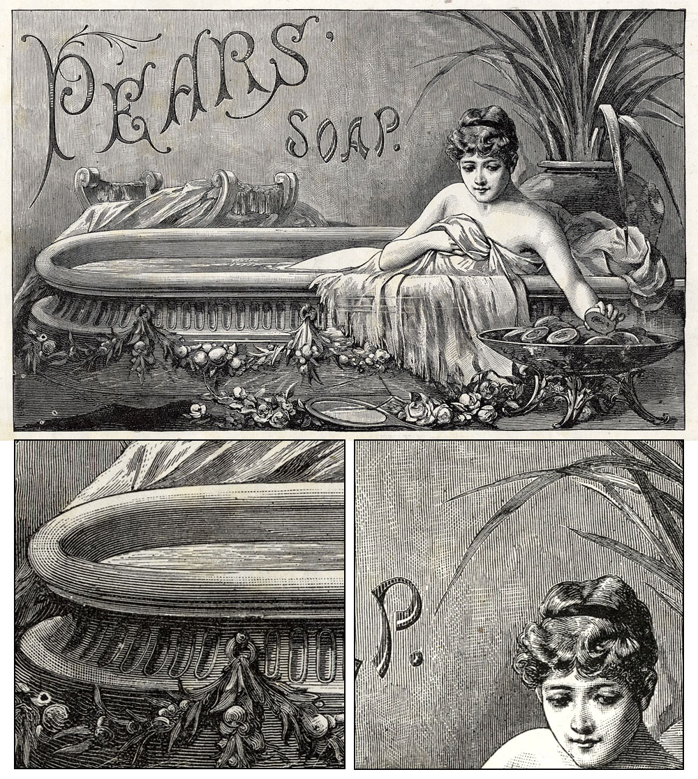
Wood-engraved illustrations previously dominated this field, as seen in Part 4—mostly in black & white. This was essentially done by hand, with the aid of ruling machines. By the 1880s, wood engravers had become very skilled at reproducing photographs, paintings and line drawings. They could make a variety of “greys” for shading pictures, using lines and dots, as seen below in this advertisement from the Illustrated London News, 1886 (image size 20 x 12.5 cm, 8 x 5 inches. Details approx. 5cm square.):
During the 1880s and early 1890s, direct photo-mechanical engraving of illustrations, onto metal relief printing plates, was gradually replacing wood-engraving. This was still almost exclusively a black & white technology.
Then in the 1890s, something completely new arrived in the letterpress pages of American newspapers—the weekly, usually Sunday, colour section. Very soon the Sunday section became home to another lasting innovation, later hailed as a new American art form: the comic strip.
Or, to be more precise, the regular weekly comic strip, a.k.a. the Sunday Funnies.
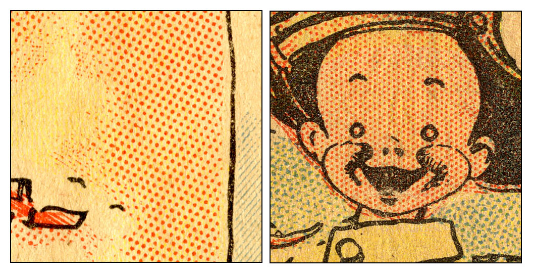
Early U.S. Sunday strips included The Yellow Kid, Happy Hooligan, The Katzenjammer Kids and Little Nemo, as seen below. And it looks as if Ben Day dots were pretty much in there from the start. (I’ll fact-check that assertion later.)
These three details are from 1897, 1902 and 1907. Click to enlarge, and the dots should be easy to see. Not hugely different from the lithographic details shown above, are they?

^^Table of Contents
(c) COMIC STRIPS, COMIC BOOKS, BEN DAY DOTS & BENDAY DOTS
We are still a long way from the war and romance comics which directly inspired Roy Lichtenstein some 60 years later. But it is a fact that the 1890s Sunday strips and the 1960s comic books were printed by very similar letterpress techniques. Printing presses advanced in many ways, but essentially used the same methods for almost a century.
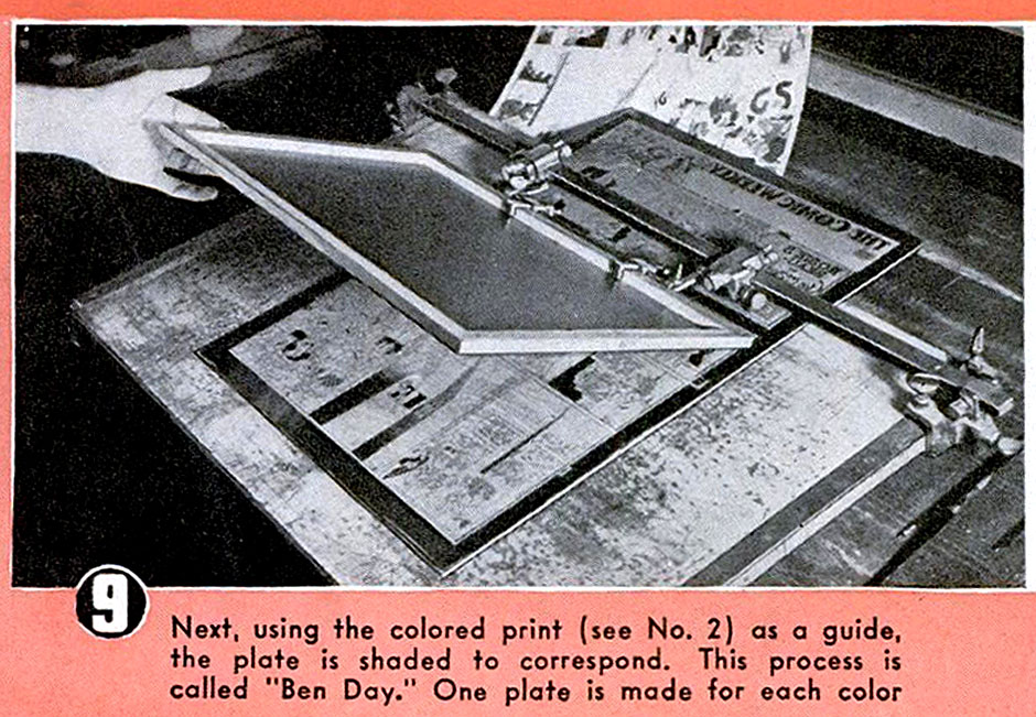
The amazing John Adcock at Yesterday’s Papers has reproduced a magazine article from 1940 showing the production and printing of a full page comic strip (George McManus’s Bringing Up Father). A sequence of photos shows several stages, including a Ben Day screen at work, and details of the letterpress printing process on a four-colour rotary web printing press—unmissable!
I will show much more detail on the Ben Day method, as used in letterpress, below.
The classic American comic book of the 60s was in pamphlet form, typically 32 pages plus covers, and about 18 x 26 cm (7 x 10 inches) in size. This format originated in the 1930s, though back then the page count was typically 64 (see Part 7—The Birth of the Comic Book).
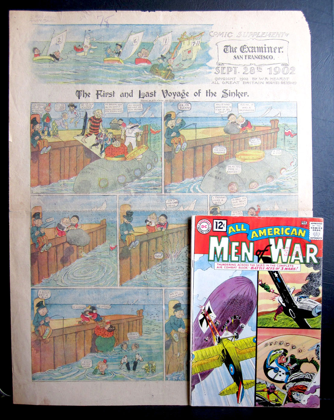
As today’s birds descended from dinosaurs, so the comic book’s early ancestors were much larger beasts. The early Sunday sections had full-sized broadsheet newspaper pages, about 41 x 56 cm (16 x 22 inches). Below is a Sunday from 1902—a “jam” page by Frederick Opper, Rudolph Dirks and “Bunny” Schultze—shown with DC comics’ All American Men of War no. 89, dated February 1962. This isn’t Roy L’s copy of All American, but he certainly owned one at the time.
The comic books had glossy covers which the Sunday sections lacked, but otherwise their newsprint paper, and the methods used to print them, were not very different.
They both used colour techniques previously established by the lithographers of the 1880s—paler tints and colour mixes created using those familiar patterns of tiny dots and thin lines. And yes, the end result looked very similar to the 1885 lithographic printing shown above, though the “relief” printing of letterpress was actually quite different from the “planographic” printing of lithography.
Also, increasingly, there were influences from the technology of the halftone screen—in particular, colour halftone printing, creating a full-colour image from three or four halftone-screened printing plates. The main contribution from this technology was the geometrical regularity of its dots.

This prompted a gradual farewell to the “pseudo-hand-made” look of stippled Ben Day dot patterns. These had previously been preferred as more “artistic,” less “mechanical.” (Perhaps also less likely to make Moiré patterns when one set of dots was printed over another—I’ll be coming back to that.)
The stipples would never completely disappear from the repertoire, but in the early Sunday comics shown above, more regular dots grids can already be seen, alongside stippled dots.
As for the lines… they would also stick around, but—as a future post will discuss—the U.S. comic books gave up on lines completely after a watershed moment in 1954, using only standardised, regular, dot patterns from then on—as in this 1964 example. Note that the dots are in a “square” grid. Lines of dots can be seen at 90 degrees to each other. I’ll be coming back to this, too.

In the 1960s Roy Lichtenstein—and everyone in the comics business at the time—called these “benday dots”.
In a later post, I will chart how the true Ben Day tints of the 1890s became the so-called “benday dots” of the 1960s — but that is a story for another day.
This time I will take the story as far as the original Sunday comics.
I will demonstrate in detail how a Ben Day tint was put onto a metal printing plate as part of the letterpress process—for both black & white and colour printing.
^^Table of Contents
PREAMBLE no.1: THE FORGOTTEN HISTORY OF LETTERPRESS
In the 21st century you can read some confused and confusing material about letterpress. Here’s an online example from 2012:
Following a revival that took place in the 1990’s, led by many design schools introducing the teaching of letterpress, the previously specialist and expensive form of printing has become widely used once again.
This site shows many attractive examples of contemporary artistic letterpress:

But “specialist and expensive” is an odd way to talk about the process which was used to produce nearly all books, newspapers, pulp magazines and comics for hundreds of years. Many of those products of course relied on using the cheapest possible printing.
When I was a teenager in 1970s England, I read a daily newspaper whose ink—black only—came off on my fingers, and the very similar New Musical Express every week. Both were printed by letterpress. Letterpress was only finally edged out by its longstanding rival, offset litho, in the 1970s and 80s.
Clare Humphries took these photos, below, of what is said to be the last letterpress edition of the UK newspaper The Guardian, and its stereotype plate, at the newly reopened St Bride Foundation Library (in March 2016—http://www.sbf.org.uk/). This newspaper was published in June 1987, and after that it was offset litho all the way.

From the 1620s to the 1980s, it had been letterpress that gave us newspapers and a lot more besides. Evidently this is, for many people, the forgotten history of letterpress printing.
Letterpress was generalised and cheap for most of its lifetime—the very opposite of “specialist and expensive”! Though having fallen out of mass commercial use, by the 1990s it seems that specialist and expensive is what it had become.
LETTERPRESS BEFORE BEN DAY
- The technology started around 1450 when Gutenberg used movable metal type to print books for the first time.
- In the 1880s, to refer to the “letterpress” in a magazine meant talking about the written material, i.e. the text—e.g. “Some good illustrations sadly let down by poor quality letterpress.”
- Soon after that, the name letterpress was applied to the printing process itself.
- Letterpress printing used raised printing surfaces which were inked by rollers, then printed the ink onto paper.
- The raised areas were said to be “in relief,” standing up above the non-inked areas.
- This contrasts with (intaglio) engravings and etchings, where ink is held in grooves and pits, lower than the surface of the printing plate
- and lithography with its planographic (flat) surface.
- The diagram below shows a wooden relief block, an engraved intaglio metal plate and a flat lithographic stone.
- In fact by 1890, very little printing was being done directly from wooden blocks. Blocks were engraved on wood, then copied in metal by stereotyping or electrotyping before printing.
- The next big advance in letterpress was the invention of the metal relief plate suitable for mass production printing—not a metal copy of a wood block, but a whole new thing. This is so fundamentally important that I will take a couple of brief diversions from my main narrative to discuss it.

^^Table of Contents
PREAMBLE no.2: A BRIEF HISTORY OF THE METAL RELIEF PRINTING PLATE
By the early 1890s, photomechanical or “process” printing had arrived in the commercial market. This was the introduction of the metal relief plate, often still called a “block,” to mass production (although it had an earlier incarnation starting in the 1850s—see below).)
Previous use of metal plates in relief for illustrations had been very limited. In the 1450s a short-lived trend started in Europe for metalcut religious prints—like woodcuts, but engraved on metal. Hand engraving of metal was even more laborious and slow than wood engraving. It was never an option for mass commercial printing.
In this example of the dotted metalcut style—St Francis receiving the stigmata, artist unknown—from around 1475, white dots on a black background have been created by punching hundreds of small holes in the metal. © Trustees of the British Museum

Over the centuries, there were other short-lived attempts at metal-relief printing. I will look at these in more detail another time. Here’s a summary:
- Elisha Kirkall tried out direct engraving of metal plates, but it was not a lasting success. Metal-engraved illustrations probably by Kirkall for Aesop’s Fables (1722) inspired Thomas Bewick‘s new art of wood engraving in the 1770s , though, so Kirkall may have had a major indirect legacy.
- In the 1780s, William Blake, who had trained as an intaglio engraver of copper plate, needed a faster cheaper way to print his own illustrations with written text, called “illuminated books”. Blake borrowed the acid etching technique from intaglio etchers, reversed it, and invented the hand-drawn, relief-etched metal plate. He could only print one at a time, by hand. His etch was too shallow to produce a large number of prints quickly. Hardly anyone else took up this highly personal method.
- Another Brit, Edinburgh printer W.H. Lizars—an accomplished wood engraver and lithographer—also tried out relief-etched metal plates, around 1819. Reportedly his etch was also on the shallow side, needing hand-work to deepen his grooves. He may only have done one published frontispiece in one book using this method.
- Charles Knight, publisher of The Penny Magazine, bringer of edutainment to the masses, patented a new colour printing method in 1838. He called it “Illuminated Printing” which surely must have been a nod to Blake. Knight printed four colours one after the other onto the same sheet of paper, from four metal relief printing plates arranged on one adapted hand press. He anticipated both 4-colour printing and its “wet ink-on-wet ink” component, but his method was slow and cumbersome and could not be adapted to mass production. He soon gave up.
- He sold his machines and his method in 1841, to Stephen Sly, who failed to make lasting commercial headway with it. Sly illustrated a few books, and started a subscription series of prints which soon failed. His etched metal plates used solid colours only, no line or dot tints. This tiger is probably his best colour work. It was the frontispiece to a Charles Knight book, The Pictorial Museum of Animated Nature, c. 1850. And yes, Sly had gone beyond the restrictive four plates / four colours.

- After George Baxter sold licences to use his patent method of colour printing in 1849 (see Part 5-&-a-half), some of his licensees might have used engraved metal plates—rather than engraved wood blocks—for some or all of their colours, and possibly their key images. I have seen a claim that Joseph Kronheim and William Dickes used only metal plates for some of their work, but I’m not sure if this is true.
- William Dickes seems to have invented aquatint in relief—using the “wet” or “spirit ground” aquatint method—for his colour plates in the late 1840s (Part 5-&-a-half). This was a metal relief method, and it was successful, widely used, and lasting—but only used for colour plates. The key image in these prints was usually a black & white wood engraving.
- Printer George Leighton took up relief aquatint enthusiastically. It got him the job of colour printer (from 1855) for the Illustrated London News, and he later became its publisher.
- When The Graphic took up the same type of colour printing from the 1870s, they used London-based printer Samuel Hodson.
- By the later 1880s, though, there is evidence that The Graphic had shifted colour printing to Paris, where it appears that the “dry” or “dust ground” relief aquatint method was now used, called resin grain chromotypography.
- Though many of the key plates in The Graphic‘s colour prints continued to be wood-engraved, by the late 1880s and 1890s they were also using the new photomechanical process.
Dickes, Leighton and their successors put relief metal plates for colours firmly on the map. But as noted, most of their black key plates, and most black and white illustration, was still printed from wood engravings.
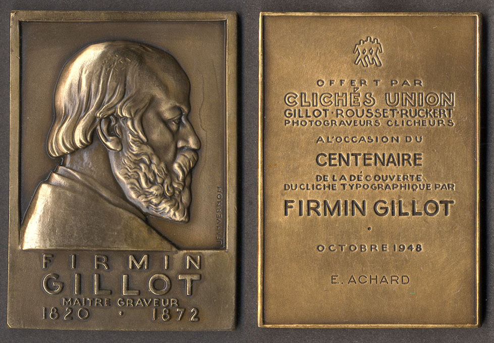
Until the inventions of Firmin and Charles Gillot.
^^Table of Contents
PREAMBLE no.3: HOMMAGE À GILLOT
Before the photomechanical process, a photograph or drawing could be printed onto the surface of a wood block, but in order to be printed in a magazine, the wood block had to be engraved by hand—a process which could take many days, and only indirectly reproduced an artist’s work. The original artist of a drawing had to watch other hands shape the final look of the printed picture.
Now, thanks to the inventions of Firmin Gillot and his son Charles in Paris, images could be acid-etched onto a metal printing plate directly, in relief, then printed alongside text.
Firmin Gillot solved the problem of getting a deep enough acid etch for this purpose.
I’ll mention how he did it later, and where Charles fits in. The Gillots’ revolutionary achievements underlie all the letterpress printing of pictures in newspapers, books, magazines and comics right through until the 1980s.
Gillot père was celebrated in 1948 with this centenary medallion, by the successor to his old company. The “cliché typographique” mentioned here is essentially the etched relief metal printing plate. Firmin is not being accused of inventing a tired old trope.
Medallion size 6.5 x 9 cm, 2.5 x 3.2 inches approx. Front and back shown together.
Photomechanical process work very soon became known simply as “process.” The name photoengraving also stuck, and stuck for longer—despite the fact that it is in fact a photo-etching process—probably because it was replacing wood engraving.
Thanks to the Gillots, by the early 1890s, three types of image could be printed in the mass media, in print runs of several thousand or tens of thousands, without needing the extra stage of wood engraving:
-
- A black & white “line drawing”—which could also use dots, and of course areas of solid black
- A grey-toned drawing, in ink wash or pencil for example—using the technology of the halftone screen (though this added considerable expense, and additionally needed smooth, costly paper)
- A black & white photograph, also via halftone screening—which could be a photo of a coloured painting
^^Table of Contents
PHOTOENGRAVING A LINE BLOCK—NO BEN DAY YET, BUT THIS IS KEY…
Starting with a simple example: a black & white (B&W) image of a line drawing. I’ll bring on the Ben Day dots very soon. First I’m looking at the making of a photoengraved printing plate without Ben Day, since the dots were added by the engraver during this process.
Ben Day could be applied to paper or drawing board, but in practice, it very rarely was. For technical reasons, much better results were obtained by adding the dots directly to the metal printing plate. The Ben Day dots used in newspaper and magazine advertising and illustration, and in the comics, were pretty much always done this way. (I will note one major exception below.)
Firstly then, the B&W photomechanical or “process” line block itself.
A process line block was defined as a printing plate with any artwork which didn’t need a halftone screen—because there were no grey tones in the original artwork which needed breaking up into dots for printing. (See Part 2 for halftone screens.)
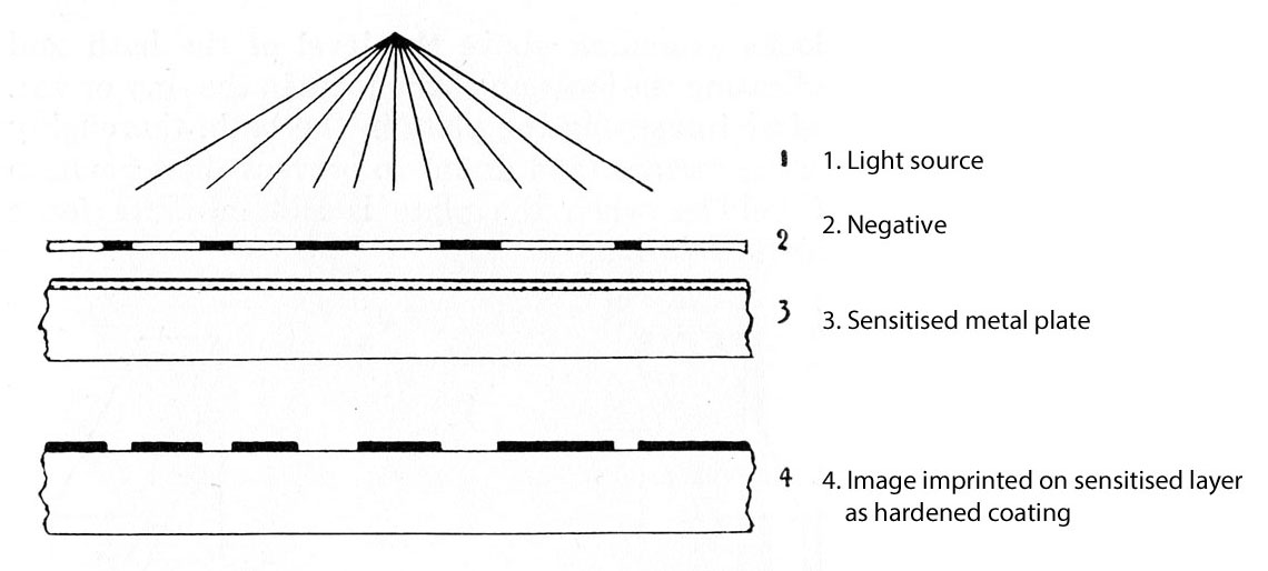
In Part 4 I showed how an image is etched onto a metal plate from a photographic negative. I’m going to show this again now.
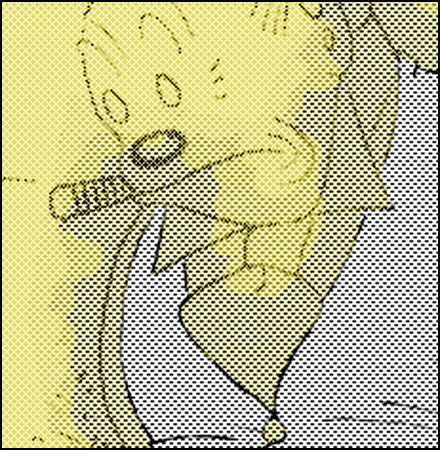
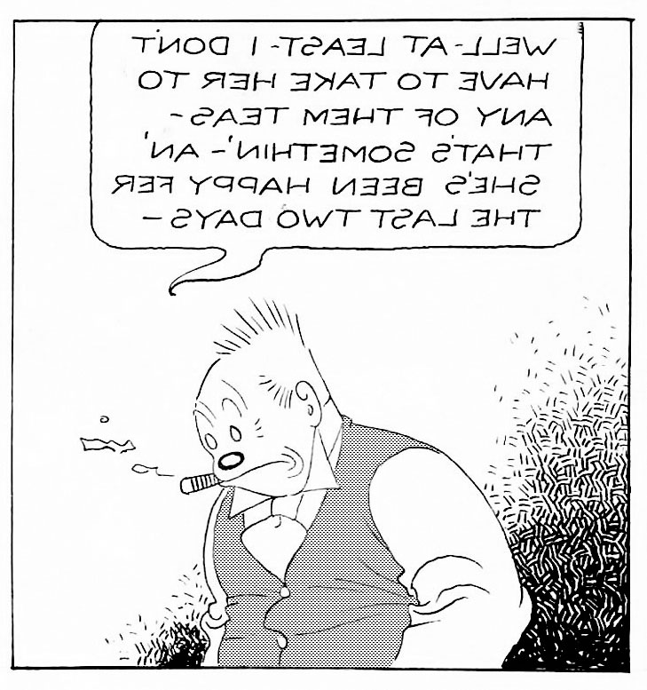
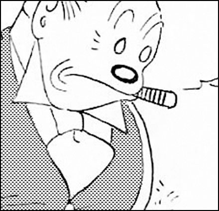
This time, I’m using a George McManus daily strip—Bringing Up Father, admittedly not from the 1890s, but from 1933—as an example. There were no daily strips in the 1890s, but similar things were being done with Ben Day on black & white illustrations. Later on, once the daily strips were established, they used a lot of Ben Day. It’s a fun way to show the process at work.
This is what the original artwork looks like, after 80-plus years of yellowing over time. Note: no dots.

For simplicity’s sake—and because it isn’t really that simple!—I’m going to look at the photoengraving of just one panel. In real life, the photoengraving team would do the whole strip in one go, of course. In fact they might do several strips and/or other illos, ads etc. on one large printing plate for economy, and cut it up afterwards (see Part 4).
Here’s my single panel. It shows Jiggs, one of the stars of this long-running strip (alongside wife Maggie).

Following just this one image through the process, then: after the completed artwork has arrived at the engraving workshop, a camera operative photographs the picture—not making a positive print on photographic paper, but a negative on transparent collodion. At this stage, it is reduced in size from the larger original art to the size needed to print in the newspaper.
Before the negative is laid flat on a printing plate, it must be turned upside down, so it is left-right flipped, or mirror-imaged. The image on the printing plate has to be like that, so that it will print the right way round. Here is the flipped negative:
Now, to get the image onto the metal printing plate, strong light is shone through the negative. “White” areas seen on the negative above—black on the original artwork—are in fact not white but transparent. They let light through. The black areas block all light.
There is a light-sensitive coating on the metal plate—generally, in the early days, a layer of bichromatized albumen (made from egg whites). Before exposure to light, this coating can be washed off the plate easily with water. Where the light hits it, the coating goes hard, will no longer dissolve in water, and sticks firmly to the metal plate. Crucially, it also becomes resistant to acid.
As seen at line 4 in the diagram below, the “white” areas from the negative image—the blacks of the Jiggs picture—now exist as hardened areas of coating, firmly stuck to the metal. But this coating is not easy to see in this state, so the whole plate is now “rolled up” with special black ink from a roller. This is similar to the ink used in drawing on lithographic stones, and very different from printing ink.
The parts of the albumen layer which have not been hardened—corresponding to the white areas of the picture—are now washed off, along with the ink which lies on those parts. The remaining, light-hardened, areas now form an “acid resist” on the metal, in the shape of the line drawing—and it’s been blackened with ink, so is clearly visible.
The ink sticking to the hardened albumen also strengthens its acid-resistant properties.
The acid resist looks just like the original drawing, but mirror-imaged:
It is essentially flat though, and so is no use for printing multiple copies. The image needs to be brought into relief. Black lines and other black areas need to stand up from the surface, or rather the areas required to print white need to be made lower.
When the metal is etched with acid, the white areas on our stained image above are eaten away. They end up lower than the surface of the metal, so won’t take any ink when the image is printed, so will print white.
The black lines are acid-resistant, and remain at their original level. After etching, they are now “in relief” and will take ink from a roller, and print black.
The diagram below sums this up, in a simplified cross-sectional way.

Note that only the first, shallow etch is possible using the original acid-resist (line 5). A number of further etches are needed, to get the “white” areas deep enough—usually three or four. To do this, the acid-resist needs to be strengthened by brushing on, and melting into place, a powdered resin—such as the famous “dragon’s blood”(Part 4)—between etches (line 6, above). If this is not done, or not done carefully, these areas will be “undercut” by the acid, as it eats sideways into the metal as well as downwards.
This process of protecting the edges of the image with resin was the genius move made by Firmin Gillot somewhere around 1848. This was how he achieved a deep enough etch for relief printing, which had not been possible before.
His images were imprinted on the metal not from photographic negatives, but from transfer paper using modified lithographic ink—a process taken directly from lithography (Part 5). That took him to somewhere approximately the same as line 4, above, and he then etched the metal in much the same way.
The photographic element was the genius addition of his son Charles—said to have made his first successful photo-engraved print in 1869, and to have offered a commercial service in Paris from 1876. It looks as if Firmin (1820 – 1872) lived just long enough to see photomechanical engraving get off the ground.
NB: The photomechanical process may not be as time-consuming as making a wood engraving, but it still takes several hours to complete—and requires the hands of a skilled craftsperson.
At the end of this process, the image is on the metal printing plate “in relief”. It is now bare metal. All the black ink and resin that once stuck to its lines has been cleaned off. If its raised-up parts were once again “rolled up” with black ink it would look like:
Just the same as the acid-resist image above. But the difference is, it is now ready to print. It would produce this image on paper:
Job done!
Here’s what a real zinc plate one looks like, from a much later Popeye comic:

Thanks to Firmin and Charles Gillot, illustrators could see their work go from art board to printed paper without other hands—the wood engravers—imposing their own style on it.
But, on the plus side, the wood engravers had often added a wide range of shading to their work, using lines and dots to create textures and shades of grey—as shown in my introduction. Some of these could of course be drawn by hand—and McManus or his assistant have done some linear shading in the background here—but Ben Day tinting was a very popular method of putting some grey into B&W line block work.
Let’s see how it was done.
^^Table of Contents
ADDING A GREY BEN DAY TINT TO A B&W LINE BLOCK
On the image below, I am imagining that McManus, or an assistant, has used a blue pencil to show the engraver where to put an area of tint. (His best-known assistant, Zeke Zekley, didn’t join him until 1935—two years after this panel was drawn.) In real life, or on eBay, you will see plenty of B&W artwork marked up like this. (And yes, it’s true that Jiggs’s waistcoat was generally tinted with a pattern of plaid squares, not a grey tint—but this is just a hypothetical example!)
My Photoshop version looks more like marker than coloured pencil, but you will get the idea. The blue doesn’t have to be very carefully done—it’s just a guide. The engraver will understand where the tint is wanted.

This pale blue was called “non-reproducing” or “non-repro” for short— it would not be picked up at all when a photographic negative was made of the artwork. The negative would look just like it did before, and be flipped for transferring to the printing plate just as before:
But we don’t want it printed just the same. We want Jiggs’s waistcoat to have a Ben Day tint. How does the engraver do that?
First he or she takes the process as far as step 4 in my diagram above. The plate is inked, parts of the coating which have not been light-hardened are washed off. There is an acid-resistant, inked image of Jiggs on the metal, again looking like this:
Now the engraver refers to the original artwork, with its blue-pencilled area. He or she paints the parts of the printing plate which do not need to be tinted with a liquid gum called gamboge. Traditionally this is coloured yellow. It dries quickly into a thin rubbery layer, which is semi-transparent. The printing plate is now masked, and looks like this:

The engraver probably knows which Ben Day tint George McManus wants. The engraving workshop would have used a limited range of basic tints, and comics characters often had the same look almost every day. If something special was needed, or if this was a one-off job, details would be written in the borders of the artwork or attached to it.
You may remember from my previous look at Ben Day tints in lithography (Part 4) how the next step is done. It’s very similar in photoengraving. Here’s a reminder (Figs. 20 to 22 from Dalgin, 1946):
The engraver has a number of screens on a rack waiting to be used. The screen is a wooden frame with a semi-transparent sheet of gelatine & celluloid stretched on it. The underside of this sheet has the Ben Day dots (or lines) moulded onto it as tiny raised “pimples” (or ridges) in relief.
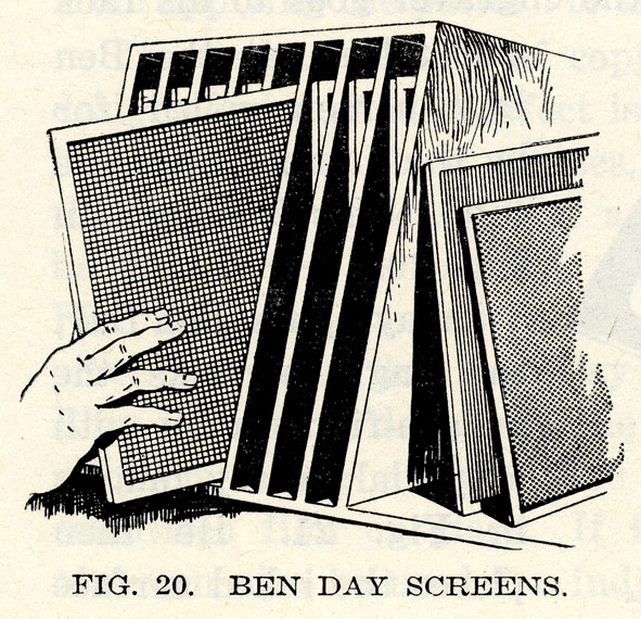
The engraver inks the underside of the screen with a roller, using a thick greasy black ink which is similar to that used by lithographers on their stones or zinc plates. Only the tops of the “pimples” get inked. The screen now has thousands of tiny dots, in wet black ink, all over it.

In the picture below, on a simple job like our imagined Jiggs panel, the engraver lays the screen down on the metal plate manually. Alternatively, especially for a more complicated job, the screen could be held in an adjustable frame. Again, this is something I previously looked at in lithographic work (see Part 5).
Rubbing down on the back of the screen transfers inked dots onto the metal. In real life the screen with ink on it is still partially transparent, as only the dots are black with ink. The engraver can still see the image on the metal.

However, he or she does not have to be too precise in rubbing down the tint, as the areas which do not need dots have been masked off with gamboge.
The result of this step might look something like this:
Or, in close-up:
And when the gamboge—which is soluble in water—is washed off, it takes with it the dots which have “gone over the lines” onto the mask. Greasy black dots remain on the metal only where they are wanted. The plate now looks like this:
It is now ready for etching. It has two sets of acid-resistant areas:
-
-
- the original black line drawing, created by light hardening the light-sensitive coating of the metal
- lots of tiny dots made of greasy black ink from the Ben Day screen, added by hand.
-
Once etched, my printing plate will have a pattern of dots, standing out in relief, no longer actually black of course, but each one a little metal hillock. All traces of the original Ben Day ink, sensitised coating and resin will have been cleaned off the plate. Each hillock will become black again when printing ink is rolled onto its top, ready to print onto paper.*
When printed, the composite image will now look like this:

Or in close-up again:
George McManus’s artwork is ready to be printed in the newspapers*, exactly as he intended it—with added Ben Day dots.
(*At least, it’s ready once it has been mounted on wood to bring it to “type height,” placed among the other cuts on the complete page, “matted” or “stereotyped,” and remade as a curved printing surface ready for the cylinders of the rotary web printing press… but that is a story for another post.)
Here’s another example, and this is a real one—thanks to Les Daniels and Chip Kidd in their beautiful book Batman: The Complete History (2004). It’s credited to Bob Kane, which means that we might not know who actually drew it, but there is one person we can say certainly didn’t draw it—Bob Kane.
Firstly the 1943 daily strip as published (click to enlarge):

And close-ups of two panels from the original art and the printed copy:
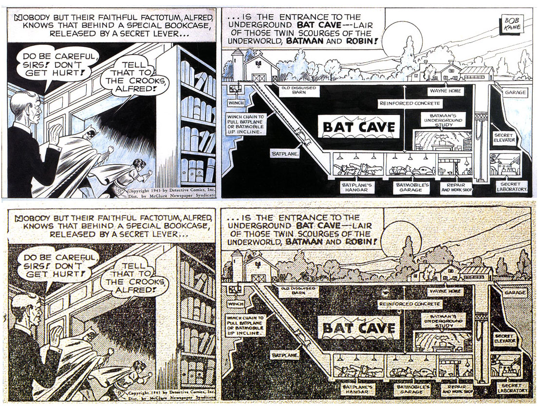
(Curiously, someone went to great lengths to remove Kane’s signature from the right hand panel. Made a right mess of that top right hand corner while they were at it—must have seemed a price worth paying.)
^^Table of Contents
I noted above that Ben Day tints were nearly always laid down on the printing plate, but there was one major exception to the rule. This is it: tints of black could also be placed on the white areas of the negative.
When printed, the tint would appear as a white pattern on the black area of the image.
Every Ben Day tint on the photoengraver’s shelf therefore was potentially two tints.
In the example below, I have Ben Dayed the shaded area behind Jiggs on the negative—best seen at the bottom right corner of the negative—and I show how that would print:

Making white dots on black like this was a common device in the preparation of newspaper and magazine small ads, in particular.
^^Table of Contents
Finally in this section on B&W, here’s a great film of printing plates being photoengraved in a New York engraving workshop, probably in the 1950s. The first part is about a halftone plate being made from a photograph—really interesting in its own right. Starting at about 21 minutes and 12 seconds you can watch a segment titled BENDAY about a B&W single-panel gag cartoon having Ben Day dots put onto it.
If the film isn’t working here, you can see it at the original page—scroll down ’til you find The Art and Technique of Photoengraving. Lots of other good stuff to see too!
http://printingfilms.com/#preserving-the-visual-history-of-the-printed-word
Or have a look at some screenshots (click to enlarge etc.). Note this gentleman is using the adjustable frame to hold his Ben Day screen. (Or it might be a benday screen, of course.) In the final panel, impossible to see clearly, he is using a small roller to press down on the screen.
^^Table of Contents
BEN DAY IN COLOUR
In a daily newspaper, comic strips would normally be printed in black on white paper, though sometimes the paper was another colour—pink or a green, for example.
And of course the image on the printing plate could be printed in any colour the printer wanted. Which starts to suggest how the Ben Day tints were used in colour work…
What I have shown above has laid down most of the basic elements of the method used for coloured Ben Day work. It’s almost time to look at the details—after two brief detours:
First: when he patented his new method in 1878-79, Benjamin Day Jnr was evidently aware that the world of lithographic printing was ready to make use of it (see Part 4 & Part 5). However, his patent text makes very little mention of either photoengraving or colour printing—though there are hints that he understood more than he was letting on about how his tints might be used in these fields.
As mentioned, Charles Gillot had been photoengraving for French publishers since 1876—but it’s is fair to say that the use of “process” was still barely taking off in Ben Day’s launch year of 1879. For most publishers it was still not an option, and if it was, the results were far from perfect, and looked down on by many artists.
In Paris they were perfecting the technique ahead of everyone else. Which prompts a question, and Detour No. 2:
^^Table of Contents
WHY WEREN’T THE FRENCH THE FIRST TO DO BEN DAY IN COLOUR LETTERPRESS? — THE TINTED HALFTONE.
I have asserted that the cheap lithographic colour printing used for The Little-One’s Own Coloured Picture Paper in 1885 was a forerunner of later comic strip printing. In claiming this, I do not need to assume that early pioneers of Ben Day in letterpress had actually seen copies of The Little-One’s own Coloured Picture Paper.
I do assume that they would have been aware of what was being achieved with cheap lithography, using a limited range of colours, and using mechanical tints (particularly Ben Day).
At some point, someone somewhere realised that something very similar could be done by etching Ben Day dots onto metal relief plates, which started nothing short of a new printing revolution.
For me, there are two big questions about this: why didn’t the revolution start in or shortly after 1885? Between London and Paris, all the necessary ingredients were in place. And the second question is, why didn’t it start in Paris? Why was it delayed almost ten years, until the mid-90s in New York?
I’ll attempt an explanation now, based on what I know. Any more expert opinions gratefully received (via legionofandy@btinternet.com)
As discussed above, France was where the earliest breakthroughs were made in photoengraving. And, as seen in Part 5-&-a-half, early strides were made in Paris with comic strips and process line blocks in the later 1880s. British weekly The Graphic was getting a lot of its process work done in Paris, including the colour pages for its special editions—including proto-comic strips.
I’ve said that process work was almost exclusively black & white at this time, but Charles Gillot and others also pioneered the use of tinted letterpress halftone illustrations. These were common in the colour pages of French magazines years before the Sunday sections arrived in the U.S.A., and even more years before actual full colour mass printing of halftones was possible.
In the tinted halftone a black halftone key plate was made, often photographed from a painting. Paintings were good photographic subjects—they tended to stay pretty still. Things that moved around, like people, were still a problem—cameras needed long exposures to make their negatives. The era of the “snapshot” was still a long way off.
The B&W halftone image did most of the work in a tinted halftone, with a number of other relief metal plates adding colour. Colour tints may have been done with the resin grain / relief aquatint process described in part 5-&-a-half, or were often drawn by hand. This involved a lot of hand-stippling / line-drawing. The lithographers of Britain and the U.S. had substituted the much faster Ben Day tints for much of that hand work. And Ben Day would have been faster than resin grain, too.
The tinted halftone process was not unlike the production of a chromolithograph. (Indeed, by this time the technology existed to do the same thing lithographically.) Many chromolithographers must have moved over to letterpress work, or passed their skills on to those who did it. Why were Ben Day dots not part of that legacy?
Let’s look at a tinted halftone illustration in detail.
Paris Illustré was a weekly magazine, each page 30 x 41 cm in size, 12 x 16 inches—about A3 or tabloid newspaper size—half the size of a broadsheet page like those of the early Sunday sections. It had a colour cover and two interior pages in colour—every week. As noted last time, Charles Gillot had been the “directeur” of this paper.
This picture below is called École Buissonière—a buisson is a bush or undergrowth, “école buissonière” means playing truant / hooky. It’s pun! It’s the best example I have of a hand-tinted halftone. (Also: a charming celebration of the innocence of childhood? Borderline child pornography? It’s so hard to tell with the Victorians.)
It’s a reproduction of a painting (clearly proper art, then) printed in the issue of March 15th 1890. Image size 28 x 22 cm, c. 11 x 9 inches:

Close-ups show:
-
-
- halftone black dots
- hand-drawn dots and lines used to tint the B&W halftone image
- use of only three colours, already very close to the standard cyan, magenta and yellow of later CMYK printing
- no flesh-coloured ink, but magenta and yellow used for the skin. This also points the way forward. Many printers, before and after 1890, cut costs by using no green ink, but as noted before, flesh-coloured ink for faces and hands was more difficult to let go of. This is not hard to understand—faces in particular are such focal points in a picture. Artists and publishers would want them to look good. These guys were confident they could do without it.
-

But these French colourists / engravers, at the forefront of colour printing technology, did not yet make the leap of adding Ben Day tints to their repertoire. As previously discussed (Part 5-&-a-half) there is evidence that French lithographers avoided Ben Day tints in favour of hand stippling—and this may also have applied to letterpress. It is assumed that this was on aesthetic grounds.
As I have noted previously, it is possible that the French also tried Ben Day on their tinted halftones, and got too many Moiré patterns—the unwanted shapes that occur when you impose one set of regular dots or lines on another, as seen here (from esko.com):

Or below, as made by me. In my examples, I have tried to show what can happen if you print blue and black dots of the same pattern over each other—but the registration slips in a fairly “real-life” fashion. One the left, by the width of one line of dots (one tenth of an inch at original size)—on the right, by an angle of 2 degrees. I hope you can see banding—vertical lines—on the left, and a Moiré pattern on the right.

Hand drawing of dots was one way of avoiding this effect, but in the long run it was not going to survive. Printers had to find other ways to overcome—or minimise—these problems, especially once they were printing 3- and 4-colour halftone images. .
The French of the 1880s could have used Ben Day tints for their comic strips, where there were no black halftones to produce the unwanted patterns seen above. Similar Moiré effects could still happen with overlapping coloured dots on coloured dots, though, not just with colours on black. Nonetheless, British and American lithographers had been overlapping coloured Ben Day dots for some years. As we saw in the Little-One’s Own, 1885, they could get good results from this fast, cheap method.
But, as we saw in part 5-&-a-half, for whatever reasons, the French also avoided Ben Day tints in their comics. This panel from a one-page strip by Caran D’Ache (1888) uses hand-drawn red and blue tints, with yellow and flesh supplied by the resin grain method.

^^Table of Contents
THE FIRST COLOUR SUPPLEMENTS — little or no Ben Day
From 1890 Paris was the first city to have a major daily newspaper, Le Petit Journal, with a weekly colour supplement—printed by letterpress on newsprint, on a brand new type of printing press—publisher / engineer Hippolyte Marinoni‘s revolutionary colour newsprint rotary press.
Marinoni is the third Parisian hero of this post—like the Gillots, largely forgotten today. He previously made the first successful steam-powered lithographic cylinder press in about 1869, but Richard Hoe bought the U.S. licence and rebranded it as a Hoe Press. Hoe got all the credit for that advance.
Marinoni and his son-in-law also made the first press capable of printing four colours on newsprint in one press run, which made possible the coloured Sunday supplement—which eventually gave us the Sunday comics (though Le Petit Journal‘s supplement did not contain any comics). Also, it defined the early Sunday supplements as a four-colour phenomenon.
But, importantly for my story, Marinoni’s Petit Journal colour pages didn’t use Ben Day tints. I have referred to the longstanding French distrust of Ben Day, which also meant that the relevant expertise simply wasn’t available in Paris. When I first looked at some early Petit Journal supplements, I thought they used a method called transferred tints, and said so in an earlier draft of this blog. Further research has indicated that this was probably not correct; I will write about my later findings at some future date.
Marinoni also didn’t adopt resin grain colours as seen in many books published in France, in the more expensive Paris magazines, and in the single-sheet Images Enfantine. French printer L.P. Clerc, in the Ilford Manual of Process Work, 1926, says that the resin grain method “is not very adaptable to high speed rotary printing such as is used for the colour supplements of several daily papers.”
In London, George Newnes, of Strand magazine fame, bought two Marinoni colour presses, and printed a new weekly called The Million on them (1892 to 1894). For most its run The Million didn’t use Ben Day; in fact, the front cover of its first issue is the only page of The Million where I have seen definite evidence of Ben Day tints. Newnes and his team might have tried out Ben Day, and for whatever reason, not adopted it in the long term. Exactly how they did accomplish their colour tints is also something I am not yet certain about; despite Clerc’s caveat above, some of the Million‘s tints do resemble resin grain.

The Chicago Inter-Ocean newspaper launched the first Sunday colour section in the USA later in 1892, before any of the New York papers—my thanks to Richard Samuel West for the scan of its first issue, above. Richard writes about this historic achievement here: http://john-adcock.blogspot.co.uk/2012/11/americas-first-color-newspaper.html
The Inter Ocean‘s proprietor H. H. Kohlsaat apparently tried to import a Marinoni colour press, but ran afoul of some U.S. patent laws. He reported that he commissioned engineer Walter Scott build a close copy.
Copies of the Inter Ocean’s colour supplement are not easy to come by. I have found no clear evidence of Ben Day tints in use, although there may be some in the latter part of the supplement’s short (less than three year) history. Kohlsaat’s team may have largely relied on the ‘transferred tints’ method; again, I will write about this after my ongoing research has yielded firmer results.
It was left to the New York Sunday sections—the Herald, the World and The Journal—to pioneer Ben Day in colour, perhaps as early as 1893 with the World‘s first colour pages.
And here, in basic form, is how they did it.
^^Table of Contents
Looking again at my panel of Jiggs in his waistcoat, let’s now say he is part of a colour Sunday strip, and I want his waistcoat to be pale blue. If I use the same method as I did for B&W, I could have a printing plate ready to print blue that looks like this:
And, used to print blue, it will produce this image:
But this is not what I need. No doubt you have spotted the problem already. I only need the waistcoat in blue. The rest of Jiggs, even the outline of his waistcoat, just needs to be on the black plate. If we printed four colours lik this, each with its own complete version of the black outlines, the alignment of the four printing plates—the registration—would have to be absolutely perfect to avoid an awful mess. And when did you ever see a comic strip printed with perfect registration?
No, I need a black printing plate that will print this:
and a blue plate that will print this (in the correct position):
…so that, when they are printed progressively, black on top of blue, I get this (or, when the registration slips, something close!):

How do I achieve this?
The answer is: I make a plate that has the B&W image only stained onto it, not actually present as an acid resist.
Bear in mind, this happens at Line 4 on that diagram from a while back:
The image exists as parts of the albumen layer, hardened by light to make an acid resist, no longer soluble in water.
For my B&W plate, with or without Ben Day, I “rolled up” image this with black ink so that I could see it, and to strengthen the acid resist. I will do this again now, but…
For colour work, I need to turn this into a different type of “stained” image—
-
-
- clear enough that I can paint my gamboge onto it in exactly the right places
- but an image which is not an acid resist
- and one that will not end up on the final printing plate.
-
I have read various accounts of how this “stain” was made. There seem to have been different methods in use at different times and places.
The account below is taken from the Pictured Encyclopedia of the World’s Greatest Newspaper, published by the Chicago Tribune in 1928—though I’ve rewritten it a little for clarity. I believe it explains pretty much what would have been done in the early days of colour comics.
Remember, our B&W image is on the plate as an acid-resist, made out of hardened bichromatized albumen solution, and rolled up with black ink. The Tribune book says:
The usual method protects [from the acid etch] all the lines originally photographed; and if these lines remained protected on the plate being worked up for color, they would appear on the finished plates, printing in colored inks what should be printed only in black.
The hardened sensitizing solution protecting these lines must therefore be removed. But if it were removed forthwith, the sheet of zinc would be blank, and the Ben Day man would have nothing to serve as his guide in applying his tints. This problem is solved as follows:
By chemical treatment, the Ben Day operator creates a frosty appearance on all parts of the sheet not protected by the acid resist. [That’s all the Trib has to say. This “chemical treatment” may have been a dip in a very weak acid bath. Possibly other chemicals may have come into use later.]
The acid resist, the hardened sensitizing solution in the shape of the black image, is now washed off. [This must have been with a suitable solvent—we know that water would not do this job. In fact it must have been a very thorough cleaning job. The plate needs to be pristine for the next steps.]
The metal that was underlying the acid resist remains shiny and silvery, and shows in strong contrast to the “frosted” parts, giving a good guide to the operator in applying his tints; but since the metal is exposed all over, it will etch all over, except where the Ben Day tints are applied.
Thus the plate will print its color only where the Ben Day shading has been applied, and will not duplicate the lines of the black key plate.
So, in this account, the Ben Day operator has a silvery image of the black artwork to work on, with the white areas of the image being “frosted.”
In the film clip seen above, the images on the zinc plate look darker than that. Perhaps by the 1950s, in New York, they were doing it this way:
L.P. Clerc again, in his 1926 Ilford Manual of Process Work, describes a method of blackening the surface of the zinc plate all over with a chemical called oxychloride of antimony—before exposing it to light under the negative. Once the light-sensitive coating has been hardened, the black antimoniated coating is removed from the “white” areas by immersing the plate briefly in weak acid. After washing off the acid resist, the image is left on the plate in black. Clerc calls this a “set-off” rather than a “stain.” It’s clearly a very similar process, but creates a blackened rather than a silvered image.
Anyway, we can accept that some version of this process was done back in the 1890s, and in 1933 when George McManus drew Jiggs, and in 1943 when Bob Kane drew Batman (or claimed to).
I will represent my “stained” or “set off” image of Jiggs on the zinc plate like this, in purple:
I won’t go through the gamboging and the application of the Ben Day dots again. You will appreciate that I can apply my black inky dots where I want them, and end up with a printing plate that looks like this, ready for etching:
And, crucially, the stained silvery image (shown as purple) is not acid-resistant. It will be removed in the etching process—the metal in the purple areas above will be eaten away, etched down along with the “whites”.
Only the Ben Day dots are acid resists, and they will be etched on in relief, as I wish.
My etched plate will have only this dotted area in relief:

and will print like this, in just the right place (or near enough!)…
…and when printed with the black plate will give me the desired result—Jiggs in a pale blue waistcoat:
Hurrah! Cracked it.
^^Table of Contents
If I also wanted the background to be 100%, or “solid”, blue, I could paint an area of solid black onto my stained plate—using acid-resistant ink with a brush—in addition to the Ben Day dotted area, before etching; thusly:

And then etch as per usual. My blue printing plate will now print something like this:

And we are starting to see how the magic is done.
What about the other colours? If we are doing four-colour comics (see Part 3) we still need yellow and red.
^^Table of Contents
COLOUR SEPARATION—THE (VERY) BASICS
If I was colouring this panel fully, in addition to my black and blue plates, I would need to make another plate for my red dots/lines/solid colour, and a fourth plate for my yellows.
Jiggs’s face would probably have red dots on it to make a pink.
That blue background I made above might also have red dots (or lines) on it, to make a purplish blue. Or it might have solid yellow in addition to the solid blue, making dark green.
Equally, Jiggs’s waistcoat could become a pale purple, by adding red dots to the red plate, and printing them with my blue dots. Or it could be a lime green, if I added solid yellow to it on the yellow plate.
Whichever of these I chose, the blue printing plate would be made just as I have shown above. Only the red or yellow plates would be different.
This is a very simple introduction to the idea of colour separation. I have written a bit about this before in the context of lithographic colour printing. During the printing process, the full-colour image has to be built up from just four colours. (In lithography there were typically nine or more). In making the printing plates, the colour separator must do the opposite—either mentally or with the help of sketches, break down the colour picture into its component blue, red and yellow parts.
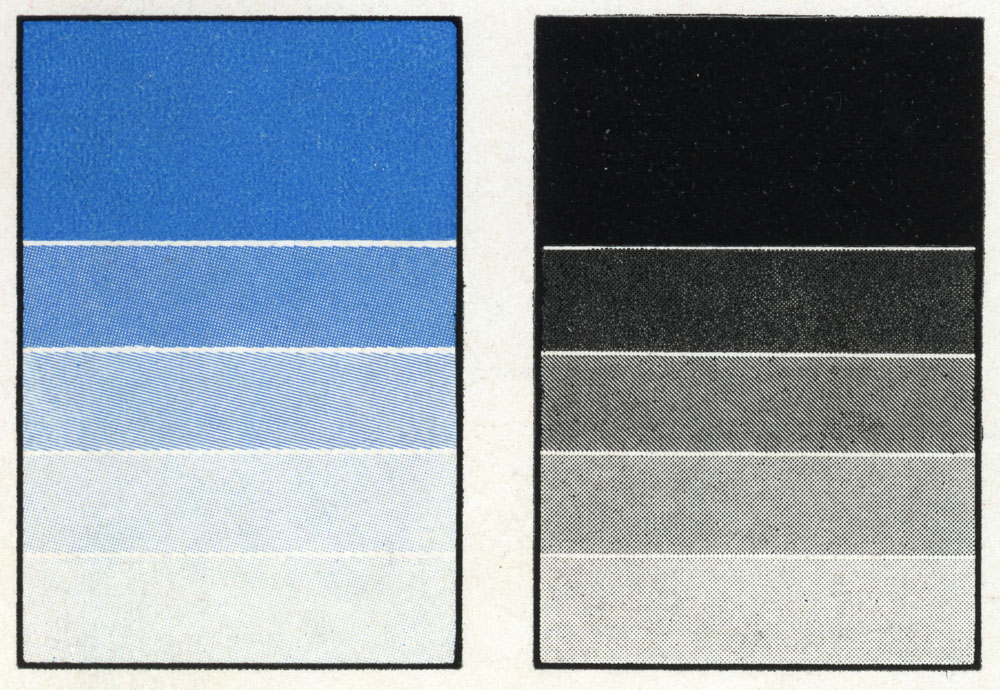
Below is a chart showing just some of what you could do with Ben Bay, in mixing colours for letterpress. This was a 1927 ad, showing off the services of The Standard Photo-Engraving Company of Chicago. Note that by this time CMYK—Cyan (blue), Magenta (red), Yellow and blacK—is, if not universally standardised, at least approximately assumed by this company.)
The tints shown here are much finer than those used in the comics. The chart was printed on glossy paper, not newsprint. Newsprint could only take coarse tint screens, perhaps 55 or 65 dots per inch. The Standard Company was showing off what it could offer clients in glossy magazine advertising, maybe using up to 200 dpi. Hence the statement that they used copper plates—more expensive than zinc, and used for finer detail.
Apart from illustrating colour mixes very nicely, this chart also reveals how, by the 1920s, Ben Day tints had escaped from the newsprint world and into glossy illustration—including advertising. This was another very successful arena for our favourite dots.
Original image size 16 x 24 cm, 6.5 x 9.5 inches. The chart was probably made with real Ben Day, actual size.
Below the main picture I will explain it further. (Click to enlarge, natch.)

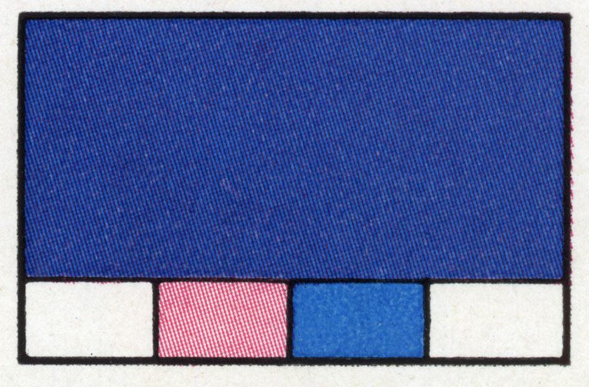
At the top, the ad shows the four solid colours and four tint gradations of each one—perhaps 75%, 50%, 25% and 10%, I don’t know exactly—see close-ups of blue and black boxes below. In the standardized comic book printing of the 1940s to the 1970s, only three percentages of each colour could be used—approximately 100%, 50% and 25%—solid colour, a middle tint and a pale tint.
In the early days of the Sunday comics, though engravers were limited to four colours, otherwise the rules hadn’t been written yet. Ben Day operators were in theory free to use many different patterns of dots, and any percentages they wanted. However, individual workshops would have settled into grooves of their own, using the patterns and shades they knew best.
You will notice that some of the tints below are regular dot patterns and some are lines. The Standard Co. doesn’t explain why it chose these different Ben Day patterns for different percentages. Perhaps it was just to demonstrate they could do either.
Here are a couple of the mixed colour boxes. The lower row on each one shows the two tints which have been mixed to make the main colour.

That’s the general principles of Ben Day in colour covered. I will look at some specific examples from The Yellow Kid below. But first, a question I said I’d come back to:
^^Table of Contents
DID THE EARLY SUNDAY FUNNIES USE BEN DAY FROM THE START?
The short answer is: probably yes.
But… after months of searching, I still can’t tell you when and where the first Ben Day dot was applied to a metal printing plate for letterpress printing. And I can’t say for sure that the first Sunday comics used Ben Day.
The aesthetic, creative, publishing and social histories of comics have been studied quite exhaustively over the past few decades. Technical aspects—like printing and colour separation—are less well documented. This is despite the fact that the dots and lines used to print the comics are widely seen as part of their aesthetic appeal.
It is occasionally assumed, if rarely mentioned, that the earliest New York Sunday colour sections—and therefore the earliest Sunday colour comics, in about 1894—were printed with Ben Day dots. Until high resolution scans or close-up photos of these early pages are published, this must be regarded as unproven. Other colouring methods, as we know, were available.
I have pages from the New York Herald, 1895, with illustrations coloured with transferred tint, others where transferred tint appears alongside Ben Day. From May 1896, I have a Herald section which uses only Ben Day.
The first regular Sunday “comics” character, i.e. the first to appear every week, was Richard F. Outcault’s Yellow Kid. He first appeared in small single panel cartoons of Hogan’s Alley in Truth magazine (1894-5), which were reprinted in The New York World‘s Sunday section, first in B&W, then colour. The Kid went on to star in large half or full page colour illustrations, and from October 1896, a few actual comic strips.
Happily, we do know that the first appearance in colour of Hogan’s Alley, in May 1895, was coloured—at least partly—by Ben Day tints. (There had been earlier Sunday comic strips in colour, and this of course is not actually a comic strip itself, but a single-panel cartoon.) Bill Blackbeard’s splendid Centennial Celebration book of the Yellow Kid, 1995, has a large enough reprint of this cartoon that the dots and lines are visible—especially in the 1-inch wide details below. As these are scans from a photograph printed in a book, small halftone dots are visible as well as the original Ben Day dots and lines. The picture goes across the book’s gutter.
And yes, in this early version the Kid is dressed in pale blue, which is perhaps a good thing—if he was already sporting his famous yellow he wouldn’t have been dressed in Ben Day, would he? :0)
^^Table of Contents
YELLOW KID, RED DOTS, BLUE LINES—EARLY SUNDAY COMICS BEN DAY
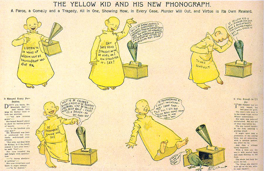
In 1996, the U.S.A. officially celebrated the “100th anniversary of the comic strip.” The very first comic strip was supposedly The Yellow Kid and his New Phonograph—published in The New York Journal on October 25th 1896. (The Journal had hired Outcault away from the World by this point.)
Of course, we know that there had been many comic strips before this, but this is not the time to get into that subject.
Looking closely at Blackbeard’s book, I am fairly certain that these New York Journal Yellow Kids were also coloured with Ben Day.
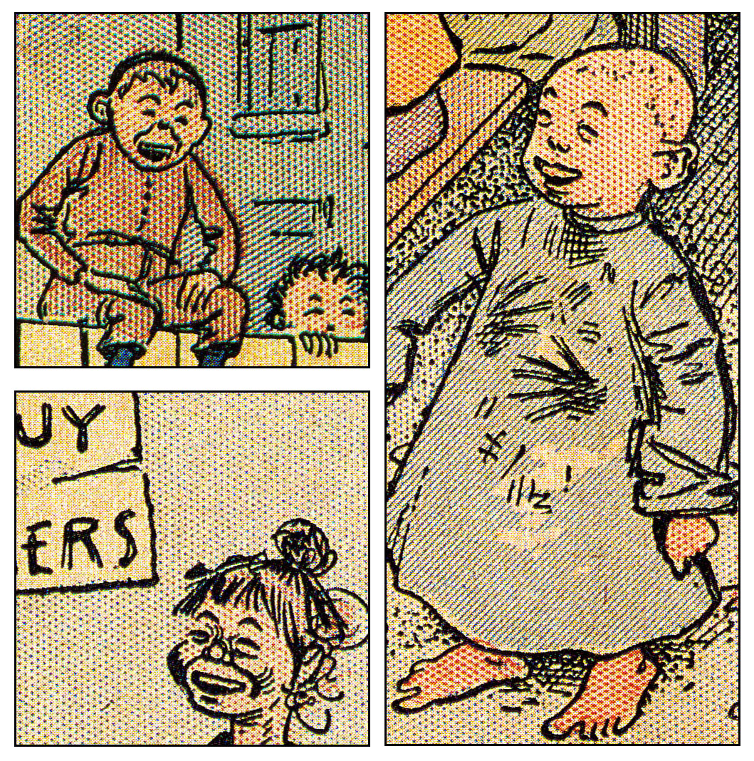
My own earliest Yellow Kid is from 1897. It isn’t by Outcault and it isn’t from the Journal. It’s by George Luks, who was hired by The New York World to continue Hogan’s Alley with the Yellow Kid, where it ran for about a year alongside Outcault’s own Journal version.
I am indebted to Paul Gravett, who very kindly gave me this page. http://www.paulgravett.com/
The Hogan’s Alley / Yellow Kid cartoon takes up half of a full broadsheet page. Original image size: 41.5 x 25 cm, 16.5 x 10 inches approx.

Here’s a close-up of the Kid which will give you more idea what the engravers were doing with the Ben Day. You will see lines as well as dots, and geometrically regular dots as well as stippled ones:
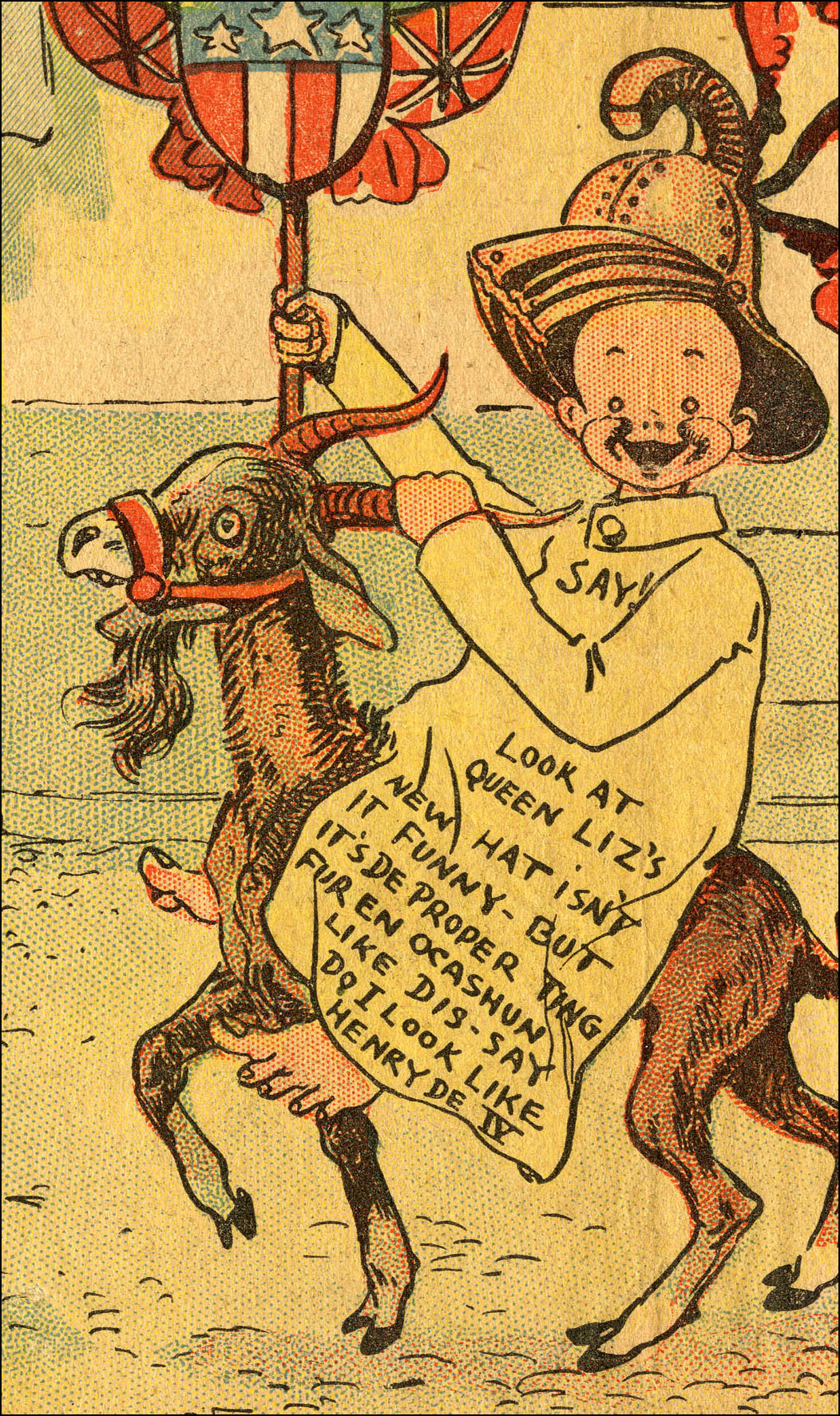
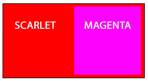
Also, it’s fairly clear from the image above that the World is not using a CMYK palette. Yes, it’s 4-colour printing, but the red is scarlet, not magenta. This seems to have been typical of the early Sundays. Here is a reminder for anyone who has forgotten Part 3 and CMYK.
In later 4-colour comics, with their standardized CMYK printing, scarlet would be a composite colour, made by printing magenta over yellow.
Here are a few close-ups, originally about 2cm across, which show some other features of the red tints. Firstly, note that both red lines and red stippled dots are used—blue lines too. This is very reminiscent of the lithographic printing seen previously on The Little-One’s Own Coloured Picture Paper:

Next, looking at the wall on the left and the Kid’s face on the right, it is clear that at least two different patterns of regular red dots have been used. Regular grids of dots were far more rarely seen in lithography. The New York Sunday engravers seemed to have lost any former prejudice against these “unartistic”, “mechanical” dots. I think this was partly because they had been working with B&W halftone photos, with their precise dot grids, and come to appreciate them.
A super-close-up on the Kid’s face, below, shows two things of interest. Firstly, he has been given yellow dots as well as scarlet, to make his flesh tone more orangey.
Secondly, the Kid’s Ben Day pattern is different from the standardised 1960s comic book dots, which were in a square grid—i.e. one line of dots can be always be seen at 90 degrees to the other—see the Girls’ Romances panel in the Introduction, and the second picture below.
The pattern we see here is called “60-degree offset.” You can see vertical lines of dots but no horizontals. One direction of dots is in fact at 60 degrees to the vertical, and another at a further 60 from that one.

You will see no squares of dots in this grid, but hexagons and equilateral triangles.
Compare and contrast: below left is the standard 1964 DC comics magenta-dotted skin tone, rotated to show the square grid more clearly. On the right is a detail from a Roy Lichtenstein face. After a few early experiments with home-made stencils, Lichtenstein consistently painted his dots with 60-degree offset stencils, and his skin tone with scarlet. When he was “copying” a DC romance heroine or war hero, he never gave them their original skin tone, either in colour or in dot pattern.

A final red-tint detail from my 1897 Yellow Kid: Below are Alex and George, the twin Scrappy-Doos of George Luks’s Kid. It appears that something went wrong with the tinting of George’s face, and it ended up too dark. The engraver has performed one of their favourite tricks on the red printing plate—using a multi-pronged graving tool to cut lines into the metal, six at a time I think. This creates white lines across the red dotted areas, lightening the tint.

To some extent, this effect could be achieved at the gamboging stage—by painting on lines of gamboge which will mask the tint like this. But, from what I’ve read about engravers touching up halftone plates, I’m certain they treated Ben Dayed plates the same way. B&W halftones often lacked good white highlights, for example, which were added by scraping some dots right off the metal.
Some blue areas also show this effect—not correcting mistakes here, but deliberately used to break up blue lines on a window pane or patch of sky. The two squares below also show a feature which Benjamin Day Jnr explained way back in his original 1879 patent—by pressing harder on the back of the Ben Day screen, you could make your lines thicker in places:

And a final red-tint detail which isn’t seen in my 1897 Yellow Kid: the ruddy cheek effect. This was a favourite of the later Ben Day men—it’s a sure-fire indicator of Ben Day at work. If you’re not sure if a strip was coloured with Ben Day or by some other method, and you see ruddy cheeks like these… it’s Ben Day.
To illustrate this I’ve jumped ahead to 1931 and an Ella Cinders strip (written by Bill Conselman, drawn by Charles Plumb). The ruddy cheeks —and the deeper tint on Ella’s shirt—are made by pressing harder on the dots for the red plate, and/or making a doubled-up tint, by applying the Ben Day screen twice. Doubling or trebling up tints is where the adjustable frame is essential, as seen in Part 5. You might also notice that Ella, in 1931, is sporting plenty of magenta, not scarlet. CMYK has arrived!
^^Table of Contents
LETTERPRESS, BEN DAY & THE COMICS—MADE FOR EACH OTHER
I am fairly certain that Ben Day tints were first used in letterpress—etched onto relief line blocks—before the New York Sunday sections started up. For all that I’ve said about Paris not launching the colour Ben Day revolution, I think the French did do some limited Ben Day letterpress, and I’m also hoping to find some earlier examples from Britain, the U.S.A. or elsewhere.
But it seems that the New York Sunday papers provided a well-funded laboratory where a wholly new type of printing was developed:
-
-
-
- Letterpress printing
- On cheap newsprint paper
- With photomechanical line blocks
- And some photographs / halftone blocks in non-comics features
- Using limited colour, usually 4 colours or fewer
- Using Ben Day tints for colour
-
-
The New York papers had tried other subjects in their colour pages before the Funnies took over—e.g. “Cosmopolitan Sketches” at the Recorder, and reproductions of famous paintings at the World—but found that their new colour printing just wasn’t up to the job.
But this kind of printing suited the comics perfectly—or perhaps the comics suited it. After all, comics were:
-
-
- Relatively simple images, needing only a few colours
- Early on—crude, slapstick, even “vulgar” in subject matter and execution
- Seen as a “giveaway” and “throwaway” item—sophistication of artwork and printing neither expected nor required for popular success
- No expensive halftone screening needed, all done with cheap line blocks
- Black outlines on everything, so precise registration of colour plates was not essential—just as well, since it was rarely achieved.
-
As the Sunday newspaper acquired glossier magazine sections, the newsprint “funnies” section persisted for over a century—and, of course, spawned its smaller descendant, the comic book, around 1933, which achieved a longevity of its own.
But letterpress Ben Day did not stay confined to the Sunday newspapers. This kind of printing also provided magazine and book illustration, and the advertising industry in particular, with an affordable, widely used alternative to expensive halftone printing for decades to come. Often these images were printed on smoother whiter paper, and used much finer Ben Day tints, as we saw above.
Not all comic strip artwork was crude or vulgar, though.
in Part 6.1, I’m looking at the Tarzan Sunday pages of the early 1930s. Here the artwork of Rex Maxon and Hal Foster gets the “Ben Day men” working very hard on their colour effects. Surprisingly, they are using just one Ben Day tint, but getting a lot of different colour values out of it. Details here.
And much earlier, from 1905, Winsor McCay’s Little Nemo in Slumberland had laid down a new challenge to Ben Day operators everywhere…
^^Table of Contents
With Nemo, the American Sunday strip—and with it letterpress Ben Day—reached an early peak. This is well-documented elsewhere. I do not need to repeat the praises which have, deservedly, been heaped upon Nemo and his creator.
What I would like to suggest is that, having looked at exactly how Ben Day tints were used in colour printing, you might now have a new set of tools with which to appreciate a Nemo page in a fresh way.
For example, from the 1907 page below I have selected one panel, and from that, two 1-inch / 2.5 cm squares. Worth clicking to enlarge these if you can. The original is of course on a BIG broadsheet newspaper page. Image size of actual strip = 38 x 49 cm, 15 x 19.5 inches, approx.
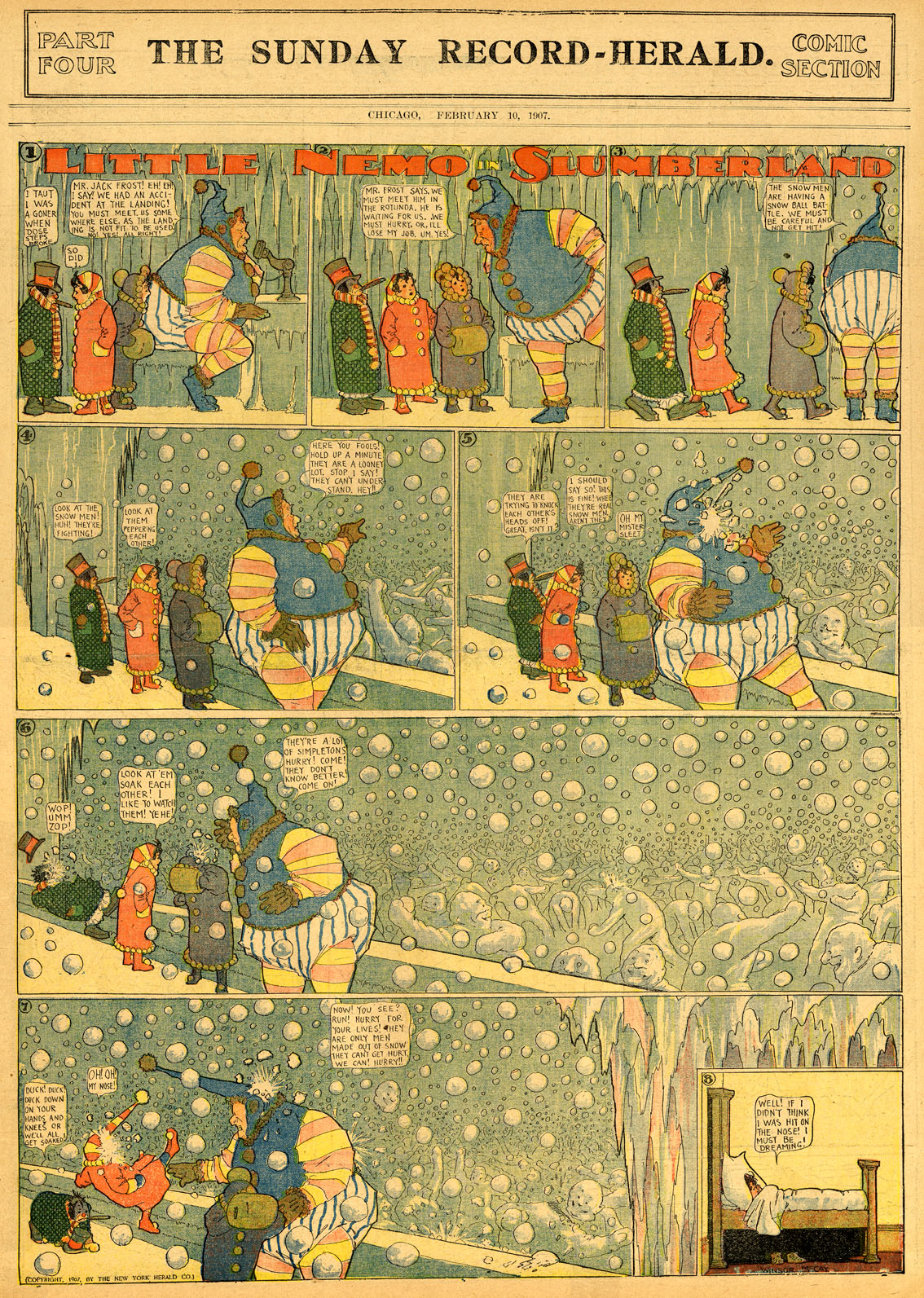

On the right you can see that, no matter how good the “Ben Day men” were, plates were liable to slip during the fantastically fast printing of hundreds of thousands of Sunday pages, and poor registration could compromise the most beautiful of pages. (There is also a nasty blob on the newsprint paper.)
This is still a lovely page, though, and you can see the creative use of Ben Day. Dots have been doubled up to create darker blue areas, for example.
This is a good argument for buying original old Sunday sections or “tear sheets”—pages taken from old sections—the only way to appreciate fully the colours and printing technology of these pages. They are still reasonably affordable, though good Nemo pages may be more expensive than others.
Thankfully, as you may know, there are some great reprints of old Sundays now available. Peter Maresca’s Sunday Press books, for example, where he presents strips at their original size, with printing quality so good that you can make out the Ben Day dots and lines.
http://www.sundaypressbooks.com/
With a Sunday Press volume and a magnifying glass you, are well on your way to being a Ben Day detective! (Warning: can be addictive.)
Books on Nemo and many other strips are available, and the strips are augmented by scholarly essays. Society is Nix! in particular presents an amazing overview of the origin years of the Sunday strips.
^^Table of Contents
In a previous post I asked a question, and answered it, thusly:
“How did the Ben Day men get from this:

to this:

…in a few easy steps?
(Clue: there were quite a few steps, and it wasn’t easy.)”
I hope I have justified that answer in this post… and there is a lot more on this particular topic in Part 6.1.
To put it another way, here is another quote—this is from Weekly Newspaper Makeup and Typography, by Thomas Barnhart, 1949 (University of Minnesota Press). (Prof. Barnhart, BTW, is one of the few people at that time to remember that the correct name for “benday” still ought to be “Ben Day”):
Ben Day shading is costly, takes considerable time, can be done expertly at few plants, and also takes part of the creative work of illustrating out of the hands of the original artist. These combined conditions have resulted in considerable activity to find faster methods which would give the appearance of Ben Day effects.
He goes on to describe various ways artists can put tints onto their artwork directly; Craftint Duotone Board with its chemical developers, early versions of Zip-A-Tone that you cut out and stick down, etc..
Similar thoughts went through the minds of comics publishers in the 1940s and 1950s, but they weren’t looking at ways their artists could reproduce Ben Day-like tints on their drawings.
They were looking for faster, cheaper ways of getting colour tints onto their printing plates.
In Part 7 I will show you what they found. Fun and surprises lie ahead!
Before that, Part 6.2 will have more fun with registration, and Part 6.3 will look back at another 19th century Ben Day predecessor.
Eventually, I will also come full circle, to one of the questions I asked myself at the beginning of all this: did Roy Lichtenstein really paint Ben Day dots?
There shall come an answer. Possibly more than one!
Be seeing you.
Text and original images copyright © The Legion of Andy 2016

I want to thank you for this wealth of information. It was exactly what I searched for and couldn’t find anywhere else. The project I’m using this for is creating classic paintings in a Ben Day style (which I saw talked about in this article.) I have cracked many of the problems of taking the physical medium of Ben Day dots and offset printing into the realm of Photoshop and digital printing but it’s still a long road till I get the results I’m looking for. Most of that progress was due to this set of articles. Thank you for your diligence. If you’re curious as to how I used all this information I’ve garnered from you, please visit my web site where I have posted my projects.
http://dave-columbus.squarespace.com/cosplay-portrait/
You made this seemingly impossible project a reality by collecting all this material that I could not find elsewhere on the internet. So again, thank you.
Fantastic work. Really glad to be of help.
Sorry I missed this comment a few months back.
Distractions abound!