
The Platinum Age of Comics and the Dawn of the Golden Age — Ben Day was there.
All images should be clickable to enlarge. Use the back button on your browser to return here.

Contact: guy.lawley@btinternet.com
Original text copyright © 2016 Guy Lawley. If quoted, please give link and credit—thank you.
See also:
- Part 1—Roy Lichtenstein—the man who didn’t paint Ben Day dots
- Part 2—Halftone dots, Polke dots, more Roy
- Part 3—CMYK / Four-colour comic book dots vs. RGB dots on screens
- Part 4—Pre-history, origins—Ben Day in the 19th century
- Part 5—Ben Day in lithography
- Part 5.5—French comic strips of the 1880s. Coloured by relief aquatint.
- Part 5.75—A lithographic protocomic (?) from 1885
- Part 6—Ben Day meets the Sunday Comics in the 1890s
- Part 6.1—Tarzan and the Ben Day Dots—secrets of 1930s comic strip colour
- Part 6.2—Fun With (Mis-)Registration—when colour printing plates don’t line up
- Part 8 — 1930s to 1950s: The “Golden Age” of Comics — exit Ben Day, enter Craftint
- Part 9a — 1950 & 60s: The “Silver Age” of Comics, Part 1
- Part 9b — 1950 & 60s: The “Silver Age” of Comics, Part 2
~~~
- Introduction
- THE BIRTH OF THE COMIC BOOK
- COMIC BOOK PREHISTORY—The Platinum Age—1897-1937
- “COMIC BOOKS”—Books with comic strips in—Cupples & Leon etc.
- ORIGIN STORIES—New Forms Follow Old Functions
- 1. Early British Colour Comics—no Ben Day to be seen here
- 2. Early US Colour Comics—contains Ben Day
- COMIC BOOKS AS WE KNOW THEM
- 1. Promotional Giveaways—Funnies On Parade etc.
- 2. Comic Books Go On Sale—Famous Funnies, Series 1 & Famous Funnies no.1
- 3. Inside Famous Funnies—Pictures. We got ’em.
- COMIC BOOK SUCCESS, PART 1—The Distinguished Competition arrives
- BEN DAY IN THE EARLY COMICS
- Looking for Evidence (1)—reprints and modern editions
- Looking for Evidence (2)—back to the source
- EARLY COMICS—A CHILD FAN WRITES—the reminiscences of Jules Feiffer
- COMIC BOOK SUCCESS, PART 2—the Reign of the Supermen
- ONE LAST THING ABOUT JULES FEIFFER’S BOOK—two, actually
- NEXT ISSUE—To Be Continued…
I set out a while back to try and answer the question: when Pop artist Roy Lichtenstein painted huge, transformed versions of comic book panels in the early 1960s, and said he was painting Ben Day dots… was he really?
This series has followed the Ben Day dot from its beginnings in lithographic printing (1879) through its comic strip ascendancy in letterpress (1890s) to the mature, complex Ben Day techniques used on the giant broadsheet US Sunday strips of the 1930s.
And it was in the 1930s that those same huge pages found themselves reprinted, but shrunk down into a new format—a mere quarter of the size they were made for. This was the birth of the comic book, and from humble beginnings it would go on to achieve great things.
In the beginning, the American comic book was full of Ben Day dots. But that wasn’t going to last. By the time Superman made his debut in 1938—bringing with him the Golden Age of comics—the new baby was finding its own new ways of doing things.

Colour separations needed to be faster (than a speeding bullet), simpler and cheaper. My next post will cover that ground.
This one is about the early years… the really early years…
^^Table of Contents
THE BIRTH OF THE COMIC BOOK
By the 1930s, most newspapers didn’t employ their own comic strip writers or artists. Instead they bought the rights to print Sunday and daily strips from a number of large-scale producers—like William Randolph Hearst’s King Features Syndicate (Blondie, Popeye) or the Chicago Tribune-New York News Syndicate (Little Orphan Annie, Dick Tracy).
During the 30s, entrepreneurs on the fringes of the newspaper printing business realised they could buy reprint rights to the Sunday strips fairly cheaply, and print them on reduced-size pages, using the same presses that made the Sunday sections—which stood idle for part of the week.
After a few false starts, this was how the Sunday comics section (a.k.a. “the Sunday Funnies”) spawned its stunted new offspring—the comic book.
COMIC BOOK PREHISTORY—THE “PLATINUM AGE”—1897-1937
“COMIC BOOKS”—AS IN, BOOKS WITH COMIC STRIPS IN
There had been colour reprints of newspaper strips before the 1930s, in book form—starting with a Yellow Kid compilation in 1897, followed by Foxy Grandpa (1900), then Happy Hooligan, The Katzenjammer Kids, and others from 1902.
Cupples & Leon started an enduring series of books in 1906 with Outcault’s Buster Brown, then Little Nemo in 1909. Once daily newspaper strips got under way in 1907, with Mutt & Jeff, Cupples & Leon moved on to black-&-white hardback books, about 10 inches (25 cm) square, reprinting dailies like Mutt & Jeff, Bringing Up Father and Little Orphan Annie.
(Keep on clicking to enlarge, won’t you? Back button should get you back here.)

Cupples & Leon, Gifford reports (The International Book of Comics, 1984), stopped publishing these books once the 10-cent comic book format took over—at a fraction of the price, and with many pages, if not all, in colour. 50-cent hardbacks in B&W, he says, apparently couldn’t compete.
In fact, Cupples & Leon’s standard format—52 pages—sold at 25 cents, and their larger 96-pagers at 60 cents. Also, it looks as if Cupples & Leon wound down their comic strip reprints during 1933 and published their last few in 1934.They might have been responding to other cheaper competition in book form—e.g. Whitman with their Big Little Books (from 1932)—rather than the new colour comic books, which, as we will see, were only just getting started in 1934.
Perhaps we shouldn’t blame the new “floppies” or pamphlet-style comic books for the demise of Cupples and Leon’s old hardback comic books. I’m grateful to comics historian Andy Bleck at konkykru.com for pointing out Gifford’s apparent error.
^^Table of Contents
ORIGIN STORIES—New Forms Follow Old Functions
Coloured—or part-coloured—weekly comics had been tried out in Britain on an occasional basis from 1896 (e.g. special issues of Comic Cuts) and regularly from 1898 (The Coloured Comic). (Pictures below scanned from photos in The International Book of Comics, by Denis Gifford, 1984.)
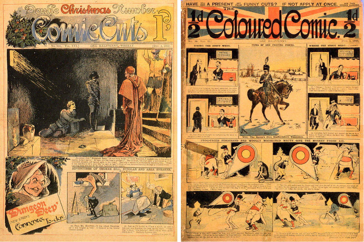
These pioneers met with little success, but Puck (1904)—no relation to the American humour magazine of the same name—was to last 36 years, and give rise to a host of imitators. (Puck 1’s cover from Comicvine.)

These British comics were larger in page size than later standard U.S. comics books, and unlike them, did not have covers printed on thicker glossy paper. (This newsprint-only format would last until the 1980s in the UK.)
From the examples I have seen in the British Library, these comics did not make their colour plates with Ben Day dots.
Like their predecessors, Le Petit Journal in Paris (1890) and The Million in London (1892), they used Transferred Tint Chromotypography. (See Part 6—also, more later.) They did so because this was the method which their letterpress printers, specifically the people doing the colour separations and making the colour plates, knew from before.
And the comics, to be economically viable, had to use the fast letterpress presses of the type developed in the early 1890s by Hippolyte Marinoni in Paris for his Petit Journal colour supplement. The time had passed when a comic book-like format could be printed by lithography—using Ben Day dots—in 1885. (see Part 5-&-three-quarters.)
^^Table of Contents
In the U.S., by contrast, the earliest comic books did have colours printed using Ben Day—because they were printed on presses used for Sunday comics sections, again using printing plates produced in the same way as usual.
Modern architects had a catch-phrase, “form follows function”—the principle that a building’s look should reflect its purpose. For the new colour comics, in both Britain and America, it was a case of “new form follows old function”—and it was a matter of necessity, not artistic principle.
The new colour comics, tentative try-outs that they were, had to use the methods available close to hand.
In both Britain and the U.S., within a very few years, they would adapt to changing circumstances by adopting new methods—as we will shortly see.
The first experiment with newsprint-only, weekly “pamphlet” format in the U.S.—similar to the British model—was not a rousing success. The Funnies was launched in January 1929 by George T. Delacorte Jr‘s Dell Publishing Co..
Like many Sunday sections of the time, it was tabloid sized—twice as big as the later standard size for comic books. The early New York Sunday comics sections had been full-sized or “broadsheet” sized—twice as big as a tabloid—and set the majority trend for years to come. But the earliest Sunday newspaper colour section ever in the US had been tabloid sized, in the Chicago Inter Ocean (see Part 6). Other tabloid-sized Sunday sections had appeared throughout the decades—The Philadelphia North American was first to convert its broadsheet comics section to tabloid in 1913. They became more common in the 1930s. Allan Holtz at Stripper’s Guide, as so often, has the full information on this topic.
Cover of The Funnies No. One from John Adcock’s amazing blog, Yesterday’s Papers.
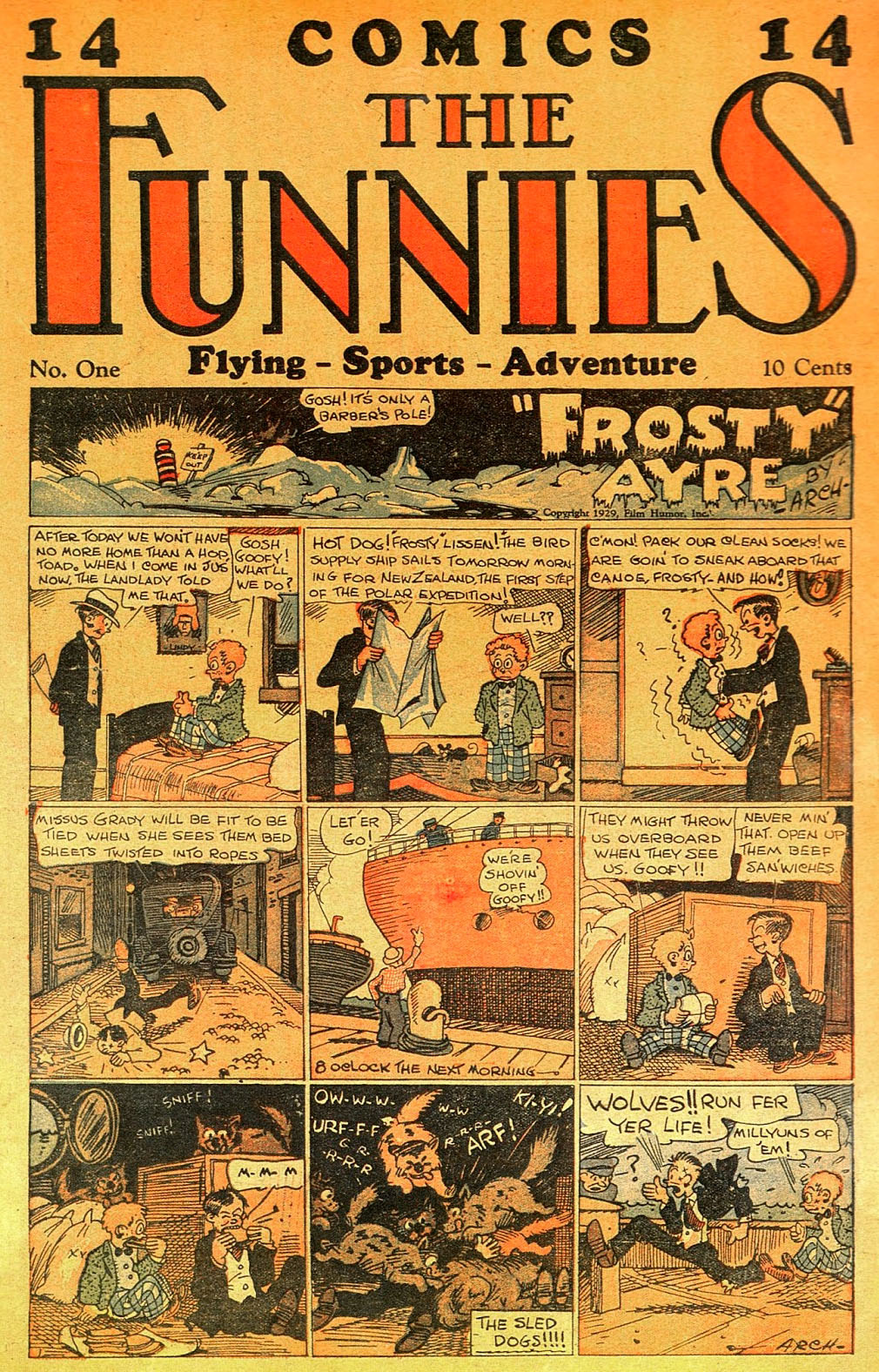
The strips in The Funnies were not reprints of Sunday or daily strips, but new material apparently previously intended for newspaper syndication. Like a tabloid Sunday section, its colour strips each ran for only one page each week. We might speculate that, like other strips in later comic books, these were try-outs which didn’t make the grade with the syndicates—Superman (1938) being the best-known, but not the only example.
Gifford (1984) reports that Gordon “Boody” Rogers, later of Sparky Watts fame, had a number of early strips in The Funnies.
Like its British forerunners, The Funnies mixed colour and B&W, comic strip and text pages. Gifford also tells us it had 4 colour pages upfront and four at the back, with 16 pages of B&W in the middle—mostly text stories and features with illustrations.
And, like the U.K. comics, it was sold to the public on newsstands or in stores. Gifford believes that children (or their parents) were not keen to spend 10 cents on a weaker version of something they got free with their newspaper every Sunday—so The Funnies struggled. It became a monthly with no. 5, later reverting to weekly. Even a price cut to 5 cents couldn’t save the comic. It failed after 36 issues, in October 1930.
Delacorte very soon made his fortune from the humour magazine Ballyhoo (1931). He also returned to the comics, as we shall see below.
^^Table of Contents
COMIC BOOKS—As We Know Them
With an eye on the maxim that new form follows old function, consider this: The Funnies had been printed by The Eastern Color Printing Company, of Waterbury Connecticut. Eastern printed both glossy covers for pulp magazines and Sunday sections for twenty or more north-eastern newspapers.
Later I will look for evidence that the first US comics used actual Ben Day dots. I haven’t yet laid eyes on original copies of these valuable items, or found pictures capable of proving this one way or the other.
The fact that Eastern Color’s main business was printing Sunday sections—which we know used the Ben Day method—is important indirect evidence in favour of Ben Day in the comic books. Eastern used the same presses to make The Funnies.
As we will see, they also went on to publish and/or print many other important comic books. It is hard to conceive of any colour-separating / platemaking method other than Ben Day being used on the first comic books. I will look at direct evidence from a 1937 comic below, and evidence from texts published in the 1940s and 1970s in Part 8.
In 1933, Eastern’s sales manager Harry Wildenberg produced a comic much like The Funnies for the Gulf chain of petrol (gasoline) stations—as a promotional giveaway. Gulf Comic Weekly changed its name to Gulf Funny Weekly with its fifth issue. (Details here.) At first it was just one single piece of broadsheet-sized newsprint paper (about 15 by 21 inches) folded in half, making a slim four-page tabloid-sized comic—each page about 10.5 x 15 inches.
Clearly this was not the first modern U.S. comic book in the format we know—with its 7.5 x 10.5 inch pages, and its glossy covers. However, Gulf Funny Weekly was hugely successful—claiming a circulation of 2,700,000 at its peak—presumably as kids up and down the land pestered their parents to get their petrol from a Gulf station. This paved the way for other promotional comics from the Eastern Color Printing Co.
And this was when the new half-tabloid-sized format was launched—very close to the modern comic book shape. Coulton Waugh‘s 1947 book The Comics says:
Eastern Color had printed some broadsides for the Philadelphia Ledger syndicate, which were reductions of the Ledger‘s Sunday comics. [Which included Hairbreadth Harry, Connie and Somebody’s Stenog.] These plates were seven by nine inches…
Ron Goulart, in Comic Book Culture: an Illustrated History, says that the reduced “broadside” pages were “made as a promotion” for the Ledger Syndicate.
I suspect “broadsides” could refer to landscape format comic sections, which looked like a comic book on its side—7.5 inches tall, 10.5 inches across, approx.. Some Sunday papers over the years have had two-part comic sections, often one broadsheet and one tabloid. A few of the smaller sections were in this small half-tabloid-size, sometimes aimed more explicitly at younger children—sometimes in the landscape format. Was this “broadside” an early example at the Ledger?
Below is a 1940 example—some years later of course, and its name showing that the term “comic book” was by 1940 well-established. This came printed on a large broadsheet-sized page, and had to be folded and cut to assemble it as a landscape comic book. (The kids had a new hobby as well as their own comic.)

Either way—Sunday section or promotional material—this picture at least serves to illustrate the likely format of the “broadside” Waugh refers to—a link in the chain that led to the comic book as we know it.
Someone at Eastern—maybe Wildenberg, maybe a colleague like Maxwell C. Gaines—thought of tweaking the smaller format in two ways. The landscape configuration became “portrait” and a glossy cover was added.
Eastern was clearly very well set up for this job, printing both newsprint Sunday comics and glossy covers for the pulps. New form followed two old functions.
The result was Funnies On Parade (1933) which closely resembles a modern comic book in format. Gifford says it had 32 pages, or 36 if the covers are included—just like a 1960s Marvel or DC comic book. It contained reprints of Mutt & Jeff, Joe Palooka, Hairbreadth Harry, Somebody’s Stenog, other Sunday strips, and eight pages of magic tricks.
Front cover from ComicConnect…
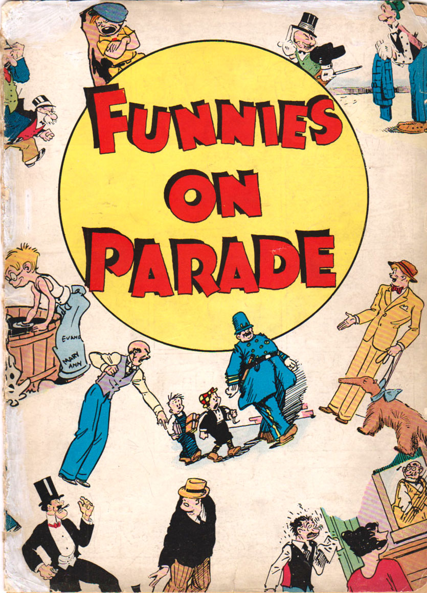
…and I made this view of the wraparound cover from two photos of a slabbed copy at icollector.com:

Funnies On Parade was given away as a promotional device or “premium” for Procter and Gamble, the famous soap manufacturer. (Their sponsorship of radio programs reportedly gave rise to the term “soap opera.”) Generally “premiums” were mailed out to anyone who sent in, for example, a number of packet tops from the company’s product.
Eastern Color’s second 32-page promotional comic of 1933, Famous Funnies: a Carnival of Comics, added Frank Godwin’s Connie and a few other strips into the mix. To get it, you had to mail in the top from a box of Wheatena, one of America’s original branded breakfast cereals.
Gifford (1984) reports an ad for Carnival of Comics in the Chicago Sunday Tribune‘s comics section, ending with the words: If you haven’t a Wheatena package in your home, ask your mother to get you one from her grocer the first thing tomorrow morning! A clear indication that the endeavour was mainly aimed at children, and an early example of pester power.

A third premium comic book was published by Eastern in the same format, but with 100 pages—hence the name, Century of Comics. Gifford reports it was used in promotions for Wheatena, Milk-O-Malt, Wanamaker’s toy stores and Kinney’s shoes.
Again, I’ve made this image of the wraparound cover from two photos, this time from liveauctioneers.com

Below is a very rare premium edition printed for Wanamaker’s, with a new Christmas cover (from GlobalGear1). As far as I can tell this is Century of Comics on the inside, though the cover uses artwork from Funnies On Parade.

^^Table of Contents
Famous Funnies has gone down in history as the first continuing American comic book in the modern format to be sold directly to the public. Famous Funnies no. 1 was published in July 1934—the first in a series that ran for 218 issues, lasting until 1955.
However it also had what today might be called an “issue zero” but is known as “Famous Funnies Series 1″—as its own cover states, and as it was listed by Gifford (1984, and American Comic Strip Collections, 1884-1939 (1990)).
This seems to have been a joint venture between Eastern Color and George Delacorte. Like the ongoing series which followed, the single published issue of Famous Funnies Series 1 was sold at 10 cents a copy—”one thin dime.”
It went on sale in February 1934, and was sold in chain stores rather on newsstands—because no newsstand distributor would take on this untried ne product. My image below comes from Jamie Coville’s TheComicBooks.com which has a lot of detail about this and all other early comics.
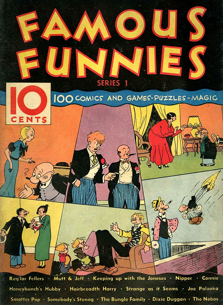
The new Famous Funnies had twice as many newsprint interior pages as its premium predecessors—64—plus 4 cover pages on glossy paper. Otherwise it was in the same format as the giveaways.
This established a standard size, and page count, for the original Golden Age comics. Paper shortages and economies meant 48-pagers (52 with covers) and even 32-pagers (36 with covers) were to come later. Multiples of 16 pages were dictated by the newspaper presses, set up to cut broadsheet-sized pages. One broadsheet, printed both sides and folded, made 4 full-sized newspaper pages, 8 tabloid pages, or 16 comic book pages.
The Series 1 comic did sell out its print run, and, as Jamie Coville reports:
The results were enough to convince publisher George Delacorte and printer Eastern Color Inc. to again attempt to bring a regular comic series to the newsstands. Again the newsstand distributors rejected the idea, remembering George’s first attempt in 1929 with The Funnies. Delacorte then sold his 50% of the partnership and the rights to the Famous Funnies name to Eastern Color. [My emphasis]
Clearly Famous Funnies might have gone no further… but if it hadn’t, the history of the comic book as we know it might have been very different—possibly even non-existent. But Eastern Color, it seems, was determined to keep trying with this new format.
To appreciate the difficulty Eastern had getting their new comic book onto the newsstands—of New York City and points beyond—it is necessary to think our way back in time to 1934. The newsstands of America were crowded with newspapers, the “glossy” higher tone magazines, and—at the bottom of the cultural pecking order—something like 150 different “pulps.” The pulps provided thrills, spills and derring-do in the fictional worlds of spicy detectives, alien planets, the exotic orient, romantic encounters and horrible evils. Most pulps were decidedly aimed at adult buyers—with plenty of appeal for the bolder teen, no doubt.
This photo below shows a Manhattan newsstand in 1935. Parenthetically, this shows some other things you could buy for a dime that year—or for half that much; 5 cents or “a nickel.”
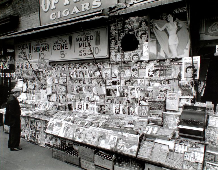
The comic strips had their home in the Sunday papers, and bringing them onto the newsstands in an almost pocket-sized edition was an entirely untried proposition. A distribution company was needed to transport a product to thousands of points-of-sale, and collect money and unsold return copies.
Evidently, Eastern Color had tried and failed more than once to get a distributor to take on their comic, but they didn’t give up. Jamie Coville reports that Eastern eventually persuaded distribution company American News to take the comic for the newsstands, after the newspaper The New York Daily News reported how important its Comics Section was to its success.
John Adcock tells us that:
The 20th-century term ‘comic book’ originated… with Eastern Color which first described them in May 1934 in Patent Office records as “Comic Booklets Consisting of Comics, Comic Strips, Puzzles, Tricks of Magic, Etc., Published in a Series.” The first mention of ‘comic booklets’ by Eastern Color was on May 1, 1934, listed under Trademark Applicants.
Eastern Color must have thought the name “comic booklet” could catch on, but as with so many other things, the name with the fewest syllable won out pretty quickly.
I don’t know if Eastern’s trademark application was successful, but its timing clearly coincided with their ongoing plans to launch the first ever monthly series of American comic books/booklets in the modern format—Famous Funnies.
^^Table of Contents
The three pics of Famous Funnies no. 1 below—complete with water-damage and “show-through”—were scanned by movielover for Comic Book Plus. Here you can read this and many other out-of-copyright classics—free, or for a voluntary donation which helps support the site.
We must be grateful for the water-damage. It meant that movielover was prepared to scan the whole comic. If it had been pristine mint I doubt he/she would have done.
The scans don’t show the tints used to print the colours, but we can be fairly sure that Famous Funnies 1—covers and interior pages—would have used Ben Day dots.
Sol Harrison, DC Comic’s production chief, said in a 1975 interview that his first job was gamboging (masking) the plates for Ben Day tinting—at a company called Rex Engraving in New York. “The job was the first issue of Famous Funnies,” said Harrison. He didn’t say whether this was the newsstand No.1, rather than any of the giveaway Carnival of Comics or Series 1.
Anyone with high res scans or close-up photos, please do get in touch. I can be found at legionofandy@btinternet.com

Famous Funnies 1’s contents, as was the custom by now, were straight reprints from Sunday pages, including the one-tier “topper” strips which ran at the top or bottom of the page. Below is page 2, the inside front cover, printed on better, whiter paper than the interior pages. It also has the publishing details, confirming the July date and monthly publication schedule.
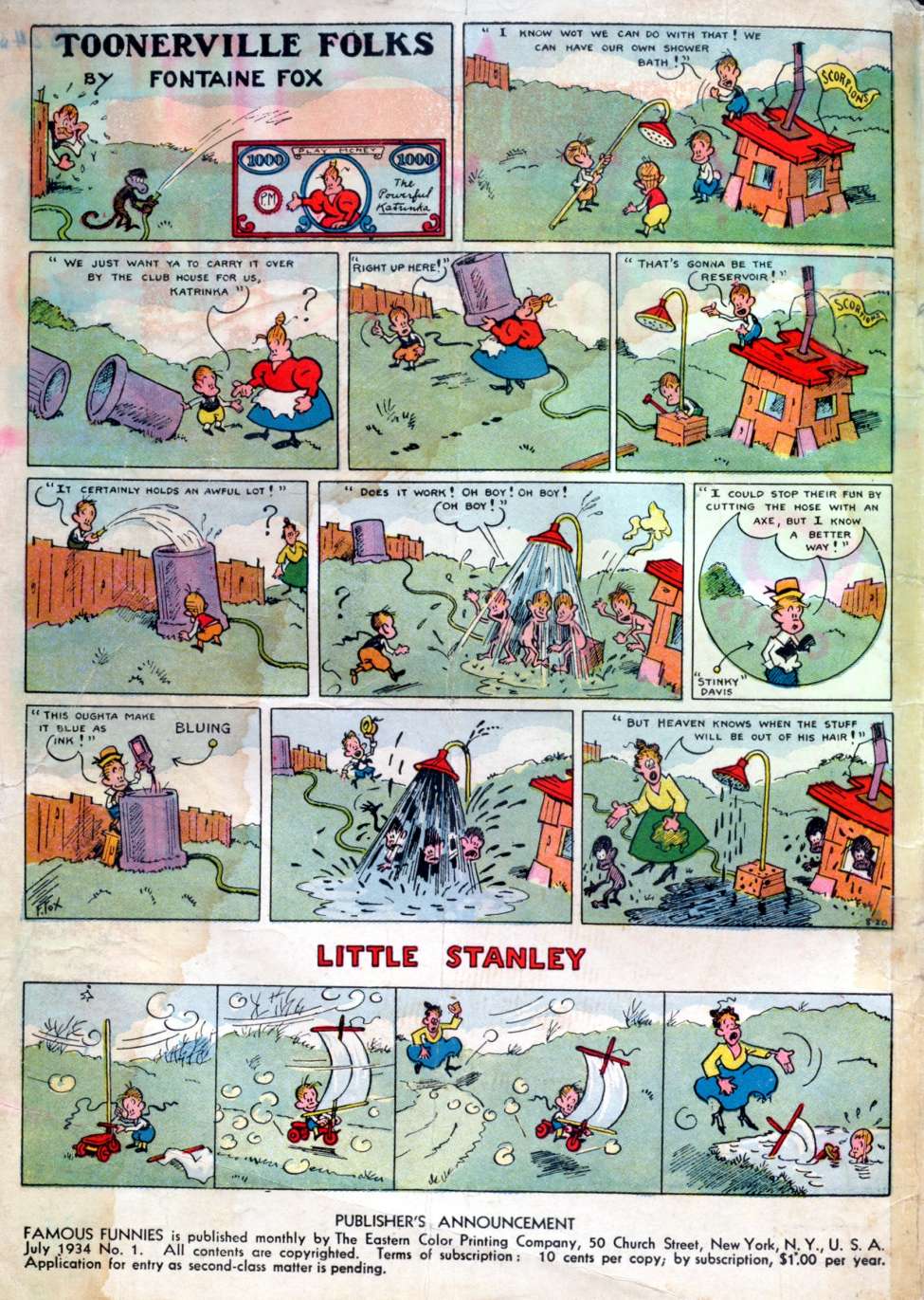
There were four pages of Toonerville Folks, and four of Connie, but scattered throughout the comic rather than in continuity. The same applies to the other features.

Even if you click to enlarge, you may find the lettering of Connie in particular—printed on newsprint, unlike the Toonerville page—a struggle to read. The strips were of course greatly reduced in size from their original broadsheet newspaper page size, word balloons and all. (A broadsheet page was twice as wide, twice as tall, and four times the area of a comic book page.)
It didn’t take long for Gaines and his colleagues to solve the legibility problem.
Gifford (1984) reports that from Famous Funnies no. 2 the balloons were re-lettered, but with unattractive results. Looking at Hairbreadth Harry below we might agree with him, though Dixie Dugan has emerged relatively unscathed. Perhaps only some strips were judged to need re-doing. Both toppers seem to have been left to their own devices!


Oh, and about that monthly schedule… Famous Funnies no. 2 was dated September 1934, two months after July’s no.1. Perhaps the need for new lettering held it up.
Eventually the practice of simply reprinting the strips as reduced copies was dropped, and they were repaginated—cut up into panels, pasted down with about six panels to a page. This way, each panel ended up a good bit larger—no re-lettering required.
^^Table of Contents
Famous Funnies struggled at first, and Eastern must have invested quite heavily in keeping it going. It only started to make money after its 7th issue.
Looking at the covers of no.6 and no.7 gives us a powerful clue as to why the seventh was the watershed issue:


You get the picture. Famous Funnies had started selling advertising. This was to be the secret of comic book profitability for a very long time to come.
Very specifically, Famous Funnies 7 was also the start of a long relationship between the comic books and Daisy air rifles. Guns for kids—got to love that.
George Delacorte had been unwilling to go on investing in comic books that could not be sold on the newsstands. Ian Gordon, in Comic Strips and Consumer Culture 1890-1945 (1998) also reports that Delacorte was not interested unless they could sell advertising in their pages. He was an experienced publisher of pulps and humour magazines, and knew the importance of the advertising dollar.
Dealcorte must have been sniffing around again by now, scenting profit in this new format at last. But Delacorte’s Dell company did not publish the first new comic to start up in the wake of Famous Funnies.
The first issue of New Fun was cover-dated Feb 1935, so it would probably have gone on sale in the December of 1934. New Fun didn’t directly imitate Famous Funnies‘ comic book format or its Sunday strip content. Pulp writer and entrepreneur Malcolm Wheeler-Nicholson tried out a tabloid with new strips, like Delacorte’s original The Funnies of 1929-30. It advertised itself as All New! All Original!… and Easy to Read!—an obvious dig at the shrunken artwork of Famous Funnies.
New Fun 1 was reportedly all black & white apart from its covers. No.2 certainly was, as seen here. Both contained advertising pages. Colour pages were introduced from no.3.

From its 7th issue New Fun became More Fun, and it shrank down to comic book size from no.9. It also picked up a companion title, New Comics, which was comic book sized from the beginning (December 1935).
More Fun and New Comics may not have sold very well on those crowded newsstands at first, but they hold two major distinctions in comics history. Firstly, they were the foundation of what was to become that huge, enduring edifice, DC Comics. By that time the comics were owned by Harry Donenfeld, printer and magazine distributor—whom the struggling Wheeler-Nicholson had taken into partnership because he owed him money—and Donenfeld’s accountant, Jack Liebowitz. This dynamic duo did very well out of DC in the long run.
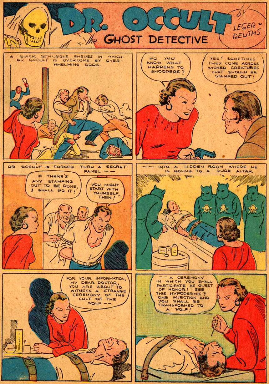
Secondly, from New Fun no. 6 onwards, New Fun / More Fun started to publish the work of Jerry Siegel and Joe Shuster. This rather splendid page by the pseudonymous “Leger & Reuths” is from More Fun 13, and I found it here:
Once word got round that the comic book business was becoming lucrative, direct imitators sprang up fast during 1936:
- George Delacorte’s Dell, unsurprisingly, with Popular Comics and a new comic book version of The Funnies, this time actually reprinting Sunday “funnies”
- King Comics, with King Features Syndicate strips like Flash Gordon and Mandrake The Magician
- Tip Top Comics, with rival United Features characters like Tarzan and Li’l Abner.
From 1937, with success breeding even more comic books, some of these—like new Dell title The Comics—were mixing new material with the newspaper strip reprints. The syndicates were reportedly charging $10 a page for the reprints of established strips, so the comics looked for artists and writers who could produce pages more cheaply. “Shops”—groups of creators, often still in their teens, run by employers following a garment sweatshop model—sprang up to supply the new demand.
The new material was often a good deal more crude than the Sunday strips, but the kids still seemed to be lapping up the early comic books by the hundreds of thousands.
Were they getting plenty of Ben Day for their dime?
^^Table of Contents
BEN DAY IN THE EARLY COMIC BOOKS
Looking for Evidence (1):
There’s more to life than books, you know. But not much more.
For the Ben Day detective, until recently, there was no substitute for looking at the original pages of an old comic in its actual printed edition. But these are very valuable old comics, some fetching prices in the millions of dollars, so how often are we going to see them scanned at high enough resolution to analyse their colours?
Scans like the ones above are invaluable for understating the contents of the comics, tracing the work of individual creators etc.. This is of historical importance, and of no little aesthetic value. Web sites making such pages available are to be applauded and supported, in my view.
But I would argue that the material practices of colour separation and plate-making are also important aspects of comic book history. And indeed that “Ben Day dots”—whether real or misidentified—are themselves an intrinsic part of the comic book aesthetic. Only under a real or notional magnifying lens can this part of the comics story be followed through the timeline.
Some of the scans of Golden Age comics at Comic Book Plus are almost good enough to see the types of tint that the plate makers used.
Most of Famous Funnies no.1, as seen at Comic Book Plus, seems to be coloured with solid colours and pale simple dot tints. Very occasionally, as in the panel from Nipper, below, a darker tint made up of lines can be seen—is this a multiple application of Ben Day dots? Or something else—an actual line tint? Here it is the darker green (blue lines on solid yellow) seen amidst paler green (dot tint on solid yellow). With these scans it is hard to be sure—especially as, about this time, a different type of line tint was launching on the US market… which will be the subject of Part 8.
(Click to enlarge, back button etc.)

Thankfully, in recent years, several books have followed the example of Chip Kidd and Craig Yoe—pioneers of appreciating the comic book aesthetic, who showed very close-up views of comic book panels, and details of panels, in their books. Some of these illustrations, and whole strips or issues scanned straight from Golden Age comics, do allow Ben Day detectives to spot the Dot—or not. (“Not”, that is, after the phase-out.)
Titan’s series of Simon & Kirby books, are other key examples. Fantagraphics and PS Publishing have also produced numerous titles with similarly helpful close-up views.
Even here, though, the actual printed images use their own tiny CMYK dots to recreate the dots on the old comic pages. The 1.3 cm squares below are scanned from a Titan Simon & Kirby volume. You can see the dot tints, which is very helpful for historical investigations, but they are themselves dotted and somewhat fuzzy. (Click to enlarge; they won’t look any clearer.)

Places where you should not look to find authentic colour reproductions include:
- Reprints in comics from the 60s and 70s, e.g. Marvel’s Fantasy Masterpieces and DC’s dollar comics. These re-make the old strips using a different colour separation/platemaking method (see below).
- Marvel and DC’s hardback reprint books, like Marvel Masterworks and DC Archives, or their paperback equivalents. These have digitally-coloured versions often bearing little or no relation to the original pages.
- Any pages online which have been scanned from these comic or book reprints. Most of the time you won’t be told where the scans are from, or that the colours are not authentic.
- The new digital downloads which can be had, often at very reasonable prices, from the big companies. They too are recoloured, and they too will not inform you of the fact. To them it is irrelevant.
Also, while there are plenty of scans and photos online of the covers of Golden Age comic books, it is worth bearing in mind that the covers used very different printing methods from the interior pages. Indeed they were even printed on different presses. Glossy whiter paper allowed for more expensive printing techniques. Cover images are not representative of the inside pages.
There really is no substitute for the real thing. Thanks to the generosity of my friend Steven Fry—not the polymath television personality, but the Golden Age comic collector—I have been able to scan some fairly early comic books, and can report on my findings.
^^Table of Contents
Looking for Evidence (2):
The mother lode, the source, the real deal.
The comics themselves are really the only place to look, if you want the whole big picture.
When reprinting Sunday strips, the publishers had only black & white art to work from. B&W line art was kept by the syndicates as printed proofs and for re-use. It could be re-photographed, at reduced size if need be.
In the main, the separate colour tints for the Sunday strips only ever existed as inky Ben Day dots on metal plates, before etching—and after etching, as relief dots on the printing plates. After use, the printing plates were melted down, and the metal re-used. There were no printed proof copies of the colour separations which the comic book printers could make use of.
Even if there were, they would have had to reduce them in size, as they did the B&W line art, and etch new plates from them. The reduced dot size on the plates would have been even more of a problem than the barely-legible word balloons. Newsprint needed chunky 55 or 60 lines-per-inch dot screens. Halving the height of image would have doubled the dot frequency to 110 or 120—impossible to print in the comics.
No, the comic book publishers had to get their own Ben Dayed colour plates made—as simply, quickly and cheaply as possible. I will look into this a bit more in Part 8.
Consequently, the comic books used fewer of the “Ben Day special effects” which the Sunday strips had in their original incarnations. (See Part 6.1)
But it is the presence of some of these special effects which allow us to conclude, beyond any doubt, that a comic like Dell’s The Comics no.3, cover-dated May 1937, used Ben Day dots. The cover, a fairly atrocious Roy Crane rip-off, is shown for interest only. (It is Ben Dayed but with much finer dots than the inside pages, befitting its higher quality, whiter paper.)
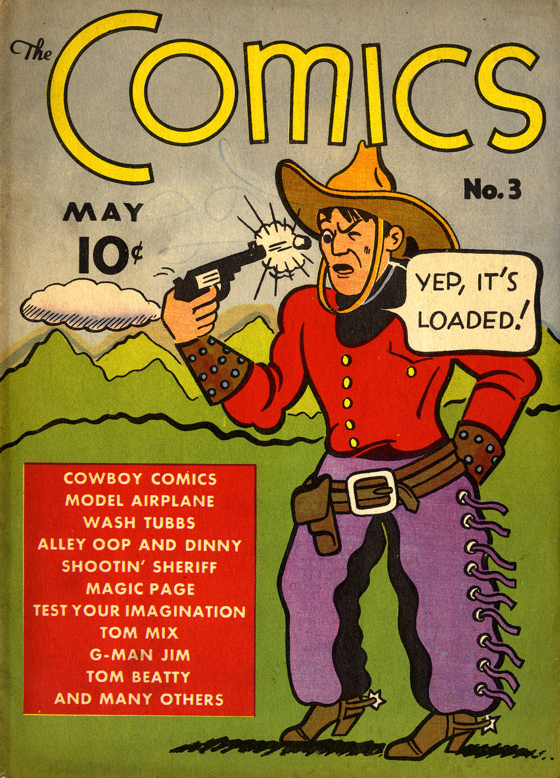
The examples below are scanned from a reprinted Alley Oop newspaper strip by V.T. Hamlin, inside The Comics no. 3.

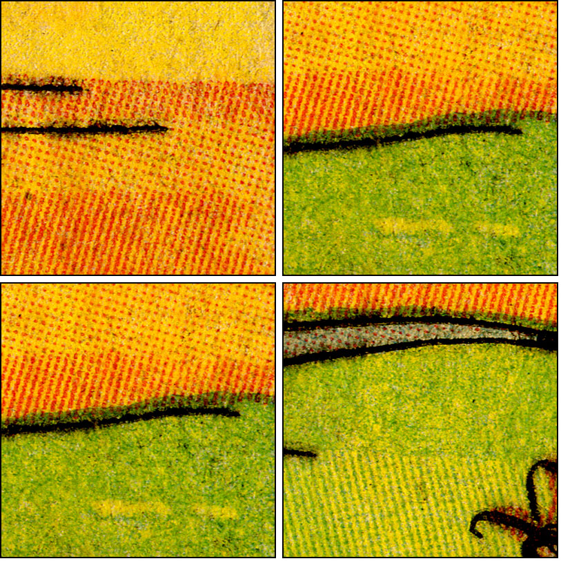
The skin tone is made of a simple red (magenta) dot screen, applied just once. The orange cave wall shows doubling up of red dots. The sky uses blue dots applied several times, merged into wobbly lines. The darker orange rocks have zig-zag red lines, similarly made up from several applications of the dot screen.
Like the newspaper strip reprints, the new material in early comic books was prepared as B&W line art, then colour-separated by the Ben Day method. Again, this followed the production methods of the Sunday strips closely, if generally keeping things fairly simple.
This is a panel from one of the western strips in The Comics no. 3. Artist unknown, but Denis Gifford (1984) reports that these newly-originated strips were packaged for Dell by Stephen Slesinger, who later developed the newspaper strips Red Ryder and King of the Royal Mounted.
1.3 cm square details again definitely show Ben Day dots in use. (Click to enlarge.) The fuzzy green areas are where “solid” blue is printed over “solid” yellow. Neither colour ends up truly solid or flat. This is another defining characteristic of the actual printed comic book aesthetic, and something lost in higher-quality reprints—of which, more later.
In terms of trying to imagine oneself back in the 1930s, and experiencing these strange new forms at first hand, I recommend a book called The Great Comic Book Heroes (1965) which I am about to quote at length…
^^Table of Contents
EARLY COMIC BOOKS—A CHILD FAN WRITES
Jules Feiffer, born in 1929—later assistant to Will Eisner on The Spirit, internationally acclaimed cartoonist, playwright, novelist and film writer—was one of millions of American kids whose dimes made the new comic books of the late 1930s a rip-roaring success.
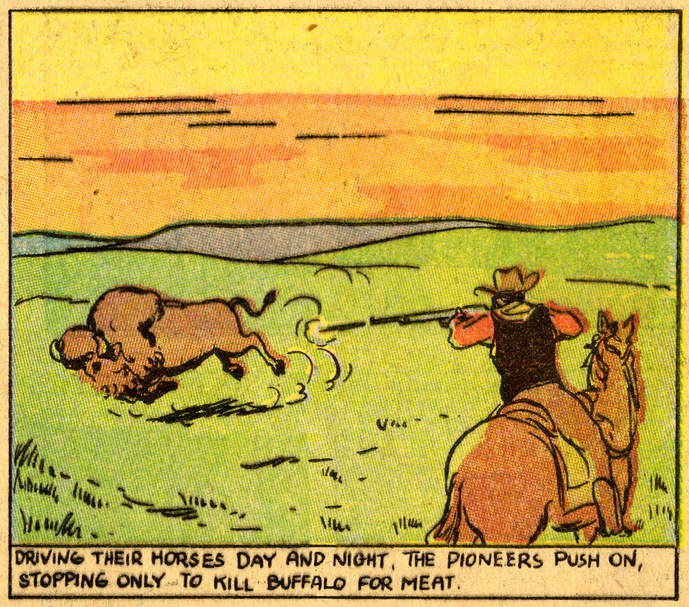
Before the comic books arrived, he had both devoured and studied the newspaper strips. Early favourites were Roy Crane’s Wash Tubbs, featuring two-fisted adventurer Captain Easy—a major influence on Superman‘s Joe Shuster—Capp & Van Buren’s Abbie an’ Slats, and the huge broadsheet marvels that were Raymond’s Flash Gordon and Foster’s Prince Valiant.
In his seminal 1965 book, The Great Comic Book Heroes, Feiffer tells how he couldn’t often see Hearst papers because his father wouldn’t have them in the house, and continues:
It should have been a relief, then, when the first regularly scheduled comic book came out… Famous Funnies… in sixty-four pages of color, minutely reprinted many of my favourites from the enemy camp...
All elisions… [and interjections]… are not Feiffer’s, but mine. He goes on:
Instead my reaction was one of a [silent] movie purist when first confronted with sound: this was not the way it was done. This new form, so jumbled together, so erratically edited and badly colored, was demeaning… I read them, yes… Famous Funnies first, then Popular Comics, then King—but with always a sense of being cheated. I was not getting top performance for my dime.

Feiffer, like Gifford, notes how carelessly these anthology comics were thrown together—a problem dating back to the first comic strip reprints in hardback, which famously printed strips out of chronological order. The young Jules was also annoyed by the tiny size of the comic book reprints, and their bad colouring.
But changes were coming. Here’s Feiffer again:
I was not getting top performance for my dime. Not until March 1937, when the first issue of Detective Comics came out. Original material had previously been used in comic books, but almost all of it was in the shape and style of then existing newspaper strips.
Detective Comics was the first of the originals to be devoted to a single theme—crime fighting. And it looked different. Crime was fought in larger panels, fewer to a page. Most stories were complete in that issue (no more of the accursed “to be continued…”). A strange new world…
And it was soon to become stranger yet, when two new factors entered the comic book universe.
One was a new kind of colouring, which the comics would make their own.
The other was a refugee from a doomed and distant planet—an alien strong enough to kick what would later be called Golden Age of Comics into top gear.
^^Table of Contents
COMIC BOOK SUCCESS, PART 2—THE REIGN OF THE SUPERMEN
The problem in pre-super days, wrote Feiffer, was that, with few exceptions, heroes were not very interesting.
Most heroes, whatever magazine they came from, looked like members of one or two families: Pat [Terry and the Pirates] Ryan’s or Flash Gordon’s. Except for the magicians, all of whom looked like Mandrake. The three mythic archetypes.
Villains… were infinitely better equipped than those silly, hapless heroes. Not only comics, but life taught us that. Those of us raised in ghetto neighbourhoods were being asked to believe that crime didn’t pay? Tell that to the butcher! Nice guys finished last; landlords, first. Villains… were miles ahead.
It was not to be believed that any ordinary human could combat them. More was required… When Superman at last appeared he brought with him the deep satisfaction of all underground truths: our reaction was less “How original!” than “But, of course!”
This page of Superman no.3, by Jerry Siegel and Joe Shuster is taken from Feiffer’s book.

The superhero boom, with a little help from World War Two, was on a scale which put previous comic book successes in the shade.
At DC comics, Superman famously arrived in Action Comics no. 1, cover-dated June 1938—it would have gone on sale about two months earlier.
Precisely when The Golden Age of Comics ended is open to debate, but most comic collectors and historians agree that Action Comics 1 defines its beginning. Everything from 1897 to then, some would suggest, was The Platinum Age. (Cynics might suggest that “The Platinum Age” is more of a marketing concept—a way to shift antique books from dealers’ stockpiles—than a serious comics-historical notion. I couldn’t possibly comment.)
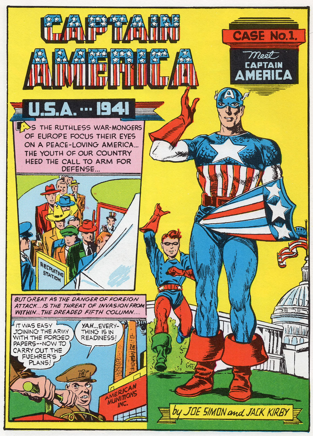
Superman had his own comic by Summer of 1939. Batman was first seen in Detective Comics no. 27 (May 1939), and got his own no.1 in Spring 1940. The Marvel heroes launched with Marvel Comics no.1 in October/November 1939, featuring the Sub-Mariner and the Human Torch. Captain America Comics no. 1 didn’t arrive until early 1941, cover-dated March (image below again from Feiffer, 1965).
Feiffer has a lot more to say about Superman, and the host of superheroes who came in his hugely profitable wake—Batman, Captain America, Captain Marvel, the Spirit—especially, the Spirit—and others. One half of The Great Comic Book Heroes is intelligent, witty, irreverent, highly personal commentary—read his remarks about Robin and Wonder Woman, for example!—the other half, a treasure trove of Golden Age superhero comic strips in (overly) bright colour. (Warning: the 2003 reprint from Fantagraphics is readily available, but contains only Feiffer’s text and a some B&W illos.)
And about those newsstands… by 1947, the superhero boom was in decline, and publishers were struggling to find other genres that would keep their sales figures up. But the comic books were a permanent and major feature of newsstand displays. Check out this girl—pulps to the left of her, pulps to the right, but she’s sat in the middle in a treasure cave of comic book ecstasy.

William Wordsworth understood. As he put it:
Bliss was it in that dawn to be alive,
But to be young was very heaven!
^^Table of Contents
Coda: A Couple of Last Things About Feiffer
Back to that Feiffer quote about “badly colored” comics, and one major problem with his book, which generally I would highly recommend for your shelf…
The Great Comic Book Heroes gives its pages of Golden Age artwork an overly brash look—a common problem with many “high quality” reprints. Unlike some reprints, the book deserves credit for recreating the CMYK colours very nearly as they originally appeared in the comics.
But those original colours were shoddily applied to pulpy, creamy-yellow, absorbent comic book newsprint. In Feiffer’s book, the C, the M the Y and the K are (nearly) all in the right percentage tints in the right places. But they are much too well-printed to be authentic, too uniformly flat and bright. The paper they are printed on is similarly overly white and overly bright.
But there is another very specific issue with the colouring. The Great Comic Book Heroes presents its Golden Age reprints with their colours remade and remodelled using the same methods as 1965 comic books—completely different from Golden Age colour separations, as we will see in a later post.
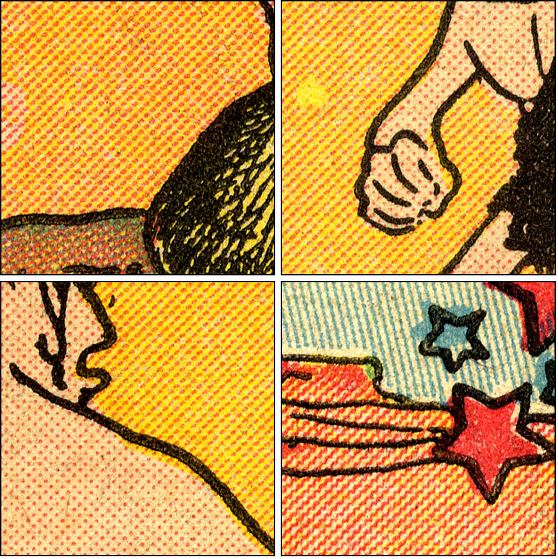
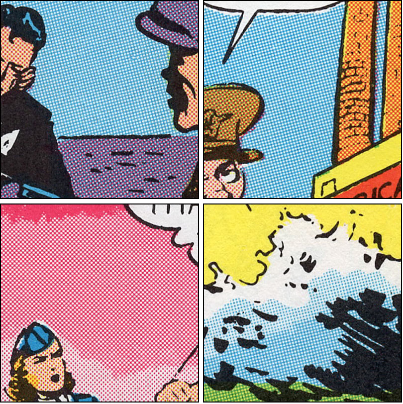
These details from Feiffer’s pages below simply do not have the kind of tints you would see in most Golden Age superhero comics. In particular, the darker blue and magenta tints—the backgrounds of the first three squares, the orange chimneys, the lower part of the wave in the fourth—would have been made up of lines. The Nancy panel at the bottom of my post shows this in close-up. And you will see a lot more in Part 8. And you can click to enlarge, of course.
Feiffer’s publisher, Dial Press, really had no choice. To photograph comic book pages, to show them as they were actually published in the 30s and 40s, would have been prohibitively expensive at the time.
(A Smithsonian Book of Comic-Book Comics, 1981, did photograph Golden Age comic books and printed the photos (as Feiffer’s book did) close to their original size. In most cases, the dots and lines merged into flat colour, so cannot be usefully studied—more in a later post. Direct reprints—scanned, rather than photographed—are now much more affordable for publishers, and hence more common.)
In my view the text of The Great Comic Book Heroes really should have mentioned this issue. Dial Press presumably thought it simply didn’t matter.
The Great Comic Book Heroes, then, must join the list of sources which can potentially mislead the Ben Day detective—as mentioned above—60s and 70s comic book reprints of Golden Age stories, recoloured hardback Marvel Masterworks & DC Archives, and digital downloads of old comics.
In fact, I believe Feiffer’s, splendid though it is, may have done a kind of harm by suggesting that Golden Age books used the same dots as 1960s comics. I will discuss this more fully in another post.
And then, almost as serious… the issue of Bucky’s green right boot on the Captain America page above. I’m sure you spotted that unforgivable error. How can one trust a book that does something like that?
:O)
^^Table of Contents

Next time, in Part 8:
- More about the Ben Day dots in early US comic books
- The faster, cheaper method which replaced Ben Day—Craftint Multicolor—the most important comics colouring method you’ve never heard of. Probably.
- Best-kept secrets of the Golden Age of Comics revealed for the first time.
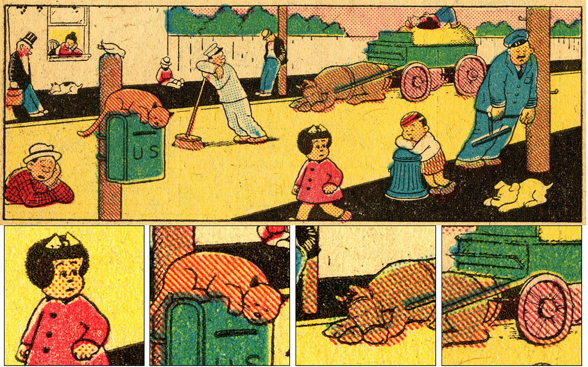
Click Nancy—from Tip Top no. 107, 1945—to enlarge, and… be seeing you.
Superman copyright © DC Comics. Captain America © Marvel Characters Inc. Nancy © United Features Syndicate. Used for educational purposes and under fair use.

Pingback: Exploring the Secret History of Ben Day Dots in US Comic Books | downthetubes.net
This is wonderful! Great series. Given it another plug here: http://downthetubes.net/?p=32823
Thanks x 2, John!
The only continuing serial I read with bated breath… and groan every time I get to the continued… box.
Thanks very much Bob.
I’m only going to take this to the 1960s.
Two more substantive episodes to go, plus a few spin-off pieces as usual.
(10,000 words on Transferred Tint Chromotypography anyone?)
This is all new (and fascinating) information as far as I’m concerned – so thanks for sharing it!
Can’t wait for the next instalment..
Couldn’t have done it without you, Steve, so huge thanks once again.
More thrills to come!