
ALSO LICHTENSTEIN, HALFTONE AND POLKE DOTS… plus the ones in the comic books.
Also available:
- Part One: Roy Lichtenstein, the man who didn’t paint Ben Day dots.
- Part Three on Ben Day, comic books, CMYK colour and pixels on your screen
- Part Four on the pre-history and history of Ben Day dots
- Part Five: Ben Day dots in Lithography, 1880-1940-ish
- part 5-&-a-half: French comic strips from 1886-1888 and the forgotten technique used to print their colours
- Part 5-&-three-quarters: Ben Day in a litho’d kids’ magazine, 1885—anticipating the look of comic books—an ancestor?
- Part 6— 1890s: Ben Day in the original Sunday Comics
- Part 6.1 —Ben Day dots in their prime—on 1930s Tarzan Sunday pages
- Part 6.2—Registration—as in, getting the colours lined up right—or not
- Part 7—Ben Day Dots 1933 to 1937—the birth of the comic book
- Part 8 — 1930s to 1950s: The “Golden Age” of Comics — exit Ben Day, enter Craftint
- Part 9a — 1950 & 60s: The “Silver Age” of Comics, Part 1
- Part 9b — 1950 & 60s: The “Silver Age” of Comics, Part 2
guy.lawley@btinternet.com
Many of you reading this post will know what Ben Day dots are… or at least, you might think you do. They are the yellow, red and blue dots used in 1960s comic books to make lighter tones of those primary colours, and secondary colours like orange, green and purple. Yes… I used to think so too!

The familiar Ben Day dots. Or… are they?
Ben Day dots are not exactly a common topic of conversation in households across the land, but thanks to Roy Lichtenstein, they have had a new lease of life. When they come up, it is very likely that they are associated with Lichtenstein’s name and art.
After all, he was the man who created the single best-known Pop Art style using those dots—a style which has come to define for many people how both Pop Art and comic book art look since the early 1960s.
Previously on this web site I asserted that Roy Lichtenstein did not, in fact, paint Ben Day dots. I illustrated the point with a simple comparison of two pictures. I showed some dots from a comic book and some of Roy’s dots and suggested that they did not look all that alike. I suggested that Roy painted “Roy Lichtenstein dots,” something of his own invention.

Comic book dots. Magenta colour, regular “square” grid (Art by John Romita)

She’s so square

Roy Lichtenstein dots (detail of Sleeping Girl, 1964). Scarlet colour, offset grid (no squares), exaggerated size.

Triangles, hexagons… no squares
In fact most academic writers on Lichtenstein agree that he painted dots “derived from” or “similar to” the Ben Day dots of the comics. It is mainly journalists and non-professionals who actually state outright that he painted Ben Day dots. Or, more commonly, Benday dots. Or… hang on, Wikipedia currently has an entry on Ben-Day dots, with a hyphen. Webster’s online has “benday.”
OK… how are we spelling this, exactly?
Like pretty much everyone else who ever wrote about them, I originally called the dots in the comic books Benday dots. Most of the time that’s how they are referred to. In printed interviews with Lichtenstein, from early on, this spelling was used. In his 1946 booklet How Comic Strips Are Made comic strip scripter Russ Winterbotham refers to the “the Benday process” and the “Benday room” where it was done. Marie Severin’s colour guide for the cover of the EC comic Weird Science Fantasy no. 25 (cover date September 1954) refers to “Benday” in the margin notes. Adam Gopnik, in his dissection of comics and art in High & Low (1990), calls them Benday dots. So does Harry Cooper in his essay ‘On The Dot’ in the catalogue of the Tate Modern’s 2013 Lichtenstein retrospective.
However, looking into their history, I soon found out they really ought to be called Ben Day dots—two words, both capitalised, no hyphen. (I have gone back and corrected my original post.)
Why Ben Day? Luckily that’s an easy one to answer. They were invented in 1879 by a man called Benjamin Henry Day Jr, and the company he founded to market his invention was called the Ben Day Company.
After that everything gets more complicated. In fact, whereas I thought I knew a lot about Ben Day dots, I found that most of what I knew was wrong. Starting with the Ben Day dots on the pages of the comics themselves. It turns out they aren’t really Ben Day dots either—not if you want to be really accurate about it.
So… what actually are Ben Day dots?
Firstly, something which they are definitely not—halftone dots. Ben Day dots and halftone dots are often referred to as if they were interchangeable, or Ben Days were a type of halftone. Neither is strictly correct, though even Roy Lichtenstein was known to have made this rookie error.
OK… what is a halftone dot?
The halftone screen was perfected in the 1880’s (after many failed attempts at something similar). It provided a method for breaking up a continuously toned image, made up of shades of grey—such as a photograph—into thousands of tiny black and white dots. (A similar process can be applied to colour images, but let’s keep this simple and 19th century.)
And yes, a photographic print is already made up of a lot of very very tiny dots—but they are irregular in shape and greyness and too tiny to be of any use in printing the photo. They effectively make up continuous grey tones, as far as both the human eye and the printer’s engraving process are concerned.
Halftone screening was needed because continuous grey tones could not be printed by simple, cheap letterpress printing, of the kind used for newspapers, magazines, comics and most packaging. Letterpress either prints black (or solid colour)—where metal coated with ink meets paper—or leaves a white area, where no metal presses on the paper, and no ink transfers.
Letterpress can handle a line drawing, words set in metal type, or a solid block of black (or another colour). Before halftones, a photograph could not be transferred effectively to a printing plate. In the acid-etching stage of photoengraving, the metal printing plate would keep only the darker parts of the picture as a solid printing surface—printed black in the image shown below. The lighter areas would make a crumbly mess which would literally break away from the metal, leaving non-printing areas—white in this example.
 A photograph and an unscreened print
(taken from the book Advertising Production by Ben Dalgin, 1946)
The original version of the half tone screen was made by engraving two pieces of glass with parallel lines of mechanical exactitude, very close together. These were filled with black paint, leaving clear lines in the glass between black lines. When the pieces of glass were placed at right angles to each other, the resultant “screen” allowed light to pass through a regular grid pattern of clear squares, acting like thousands of tiny pinhole cameras.

Close-up of part of a halftone screen (from Dalgin)
Placed at the correct focal distance from a photograph or negative, the screen could be used to project a clear image in which the grey tones now appeared as patterns of dots. Pale greys became regular areas of small dots, darker greys were made up of larger dots, mid tones looked like a tiny chequerboard, and darker greys were white dots on black. With good technique, white remained white and black black. A positive or negative image could be made, according to requirements.
The same image printed after screening
This image was suitable for letterpress printing. The number of lines per inch (or lpi) used to create the dots was varied according to the final print quality. Glossy magazines might use 150 or even 200 lpi. Printing on newsprint most commonly used 65 lpi in 1946, according to Dalgin.
Detail of the halftone image, from Dalgin

Another fun one. This is Joseph P. Kennedy—JFK’s dad
The key thing about halftone dots is that they vary in size. Ben Day dots, as we shall see, are all the same size in a regular pattern. Halftone dots create the illusion of continuous shades of grey. Ben Day dots are intended to create an illusion of areas of “flat” tone or colour.
Sigmar Polke is probably the best-known artist to incorporate halftone dots, blown up to large (easily visible) size, in his work. Quite different from Roy L’s dots, as you can see.
Polke dots—Bunnies, 1966
Roy Lichtenstein used some halftone-like, varied-size dots later in his career, but for the first few years his style was based on uniform dots similar to those produced by the Ben Day Process.
Roy Lichtenstein, Self Portrait, 1978
Plus: Now up:
In Part 3: How colour is made by comic book dots, CMYK 4-colour printing, & the pixels on your screen
In Part 4: The Secret Origin of Ben Day dots

Back to Part One: Roy Lichtenstein, the man who didn’t paint Ben Day dots
Text and original image copyright © The Legion of Andy 2016

Pingback: ROY LICHTENSTEIN: THE MAN WHO DIDN’T PAINT BEN DAY DOTS | LEGION of ANDY
Pingback: CARD TALK – FALL 2016 HIGHLIGHTS | The Toronto Postcard Club
Maybe the hyphen in Ben-Day is a crosscontamination of the Ben-Gay gel that was advertised in the newpaper sections in the fifties with the Peter Pain comic strip ads by Jack Betts working for the Johnstone and Cushing company. See the samples on my website: http://allthingsger.blogspot.com/search/label/Ben%20Gay
Apologies, Ger; I should have replied to your comment long ago.
Good point about Ben-Gay. I’d seen some of those ads around and never made any connection.
But… could be!
Great collection of articles you have there!
You wrote that newsprint used 65 lpi in 1946. Do you happen to know if this was still in used by for printing Marvel comics of the silver age? From observation, I was thinking 75 but I would love to know for sure as I’m in the process of recreating/simulating the silver age color and print for a Fantastic Four.
Hi, Krackles.
This is a really good question; thanks very much for asking it!
Firstly: I have checked before and found different numbers.
I’ve never tried to pin down anything definite, including dates when things might have changed.
(Too busy recently in the 19th century…!)
Secondly, I have to say I’m away from my collection right now due to Covid-19 restrictions.
I have a limited number of (recently purchased) old comics to play with.
Thirdly, as you probably know, counting the lpi has to be done ‘square on’ to the lines of dots.
I can say this with some confidence:
Fantastic Four 39, Marvel, June 1965: 60 lpi.
Superboy 184, DC, April 1972: 67 lpi.
These numbers are pretty consistent with what I’ve found before, from what I can remember.
So, did the printing change between “Silver” and “Bronze” ages?
And what’s up with that 67? Sounds like a crazy number!
Anyway your answer for Silver Age FF seems to be a pretty definite 60.
Also, may I ask, is this for a personal project or a professional job? Just curious.
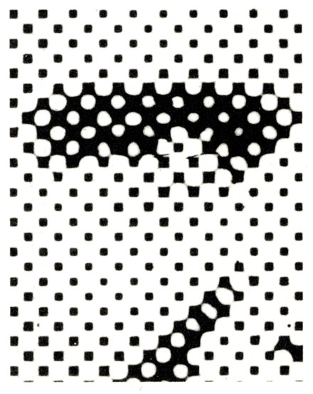
And did you see my enlarged views of Silver Age dots right at the end of Part 8?
In those examples, you can see how the 25% tints are ‘positive’ dots; dots of coloured ink.
The 50% tints have a grid of coloured ink containing ‘negative dots’; holes in the grid.
If printed on a white background, they are white dots.
If a magenta grid is printed over yellow, they are yellow dots in a scarlet grid.
Or a cyan grid over yellow creates a green grid with yellow dots. Etc.
You have probably seen that already.
Anyway, best of luck with your FF project!
Please let me know how it works out.
If you’d like to see examples of my actual dot counting, or discuss further, please email me at
guy.lawley@btinternet.com