

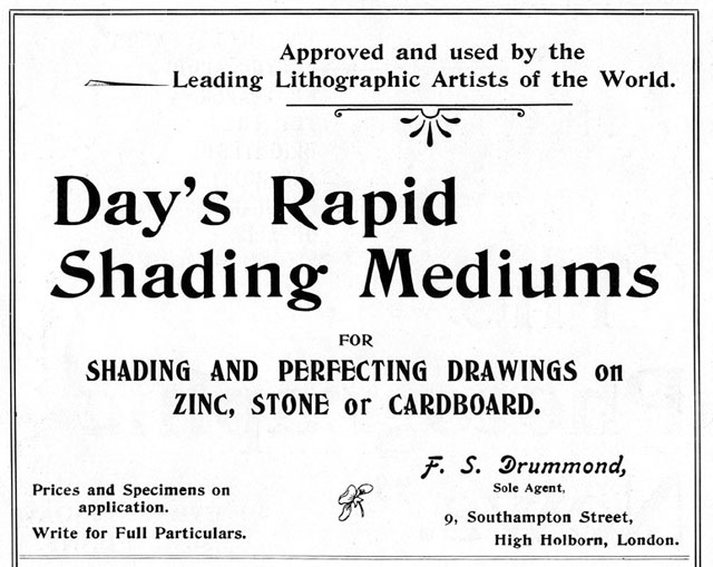
From the Eighth Production Yearbook, 1948. Ad may date back as far as 1919.
See also:
- Part 1: Roy Lichtenstein, The Man Who Didn’t paint Ben Day Dots
- Part 2: Halftone Dots and Polke Dots
- Part 3: RGB dots on your screen, CMYK dots in your old comic books
- Part 5: The Forgotten History of the Ben Day Dot: Lithography 1880 -1940
- Part 5-&-a-half: French comic strips from 1886 – 1888 and the forgotten technique used to print their colours
- Part 5-&-three-quarters: Ben Day in a litho’d kids’ magazine from 1885—anticipating the look of comic books—an ancestor?
- Part 6— 1890s: Ben Day in the original Sunday Comics
- Part 6.1 —Ben Day dots in their prime—on 1930s Tarzan Sunday pages
- Part 6.2: Registration: getting the colours lined up right — or not.
- Part 7—Ben Day Dots 1933 to 1937—the birth of the comic book
- Part 8 — 1930s to 1950s: The “Golden Age” of Comics — exit Ben Day, enter Craftint
- Part 9a — 1950 & 60s: The “Silver Age” of Comics, Part 1
- Part 9b — 1950 & 60s: The “Silver Age” of Comics, Part 2
guy.lawley@btinternet.com
Contents
Introduction 1—Just what are these Ben Day dots, anyway?
Introduction 2—The Roy Lichtenstein effect
Part (i)—Printing Pictures Before Ben Day
The Press Before Pictures—Letterpress
The Arrival of the Illustrated Press
The Printed Image: Means of Production
- Earlier Inventions by Benjamin Day
- U.S. Patent no. 214,493
- What did Ben Day Design his Printing-Films For?
Introduction 1
Since this is Part 4 (of a series that just keeps getting longer) it’s about time I showed you some honest-to-goodness Ben Day dots.
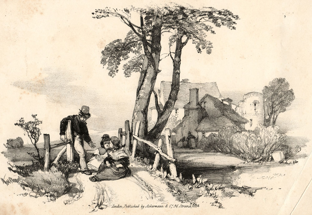
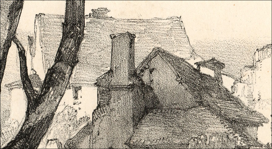
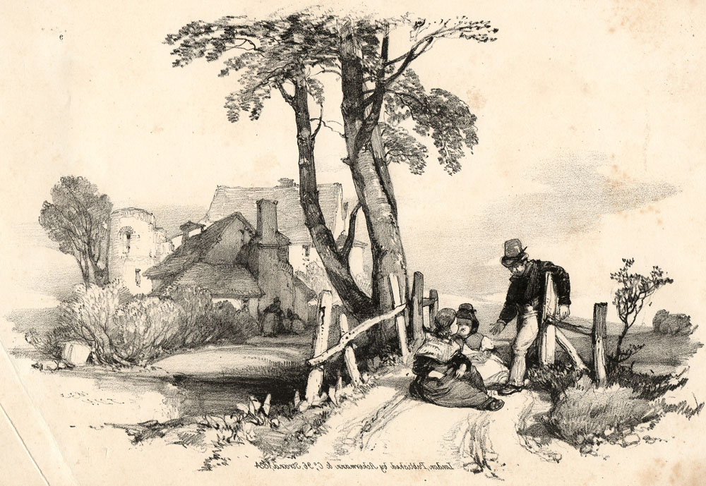
This is an illustration from a book on advertising production—(Dalgin, 1946; see footnote 1). After reading a footnote, use the back arrow in your browser or the link provided, if using iPad etc. to return to the text.
(Clicking on any image takes you to a larger version, some of which may also be clickable/further enlargeable. Again, use the back arrow in your browser to return here.)

Are these at last actual Ben Day dots? The real thing?
Well… these are pictures of dots from a catalogue selling the products of Ben Day, Inc. Or rather, once upon a time, they were photographed from that catalogue, then printed in a book. Now, having been scanned by me and posted online, they are a bunch of pixels on your screen. Are they still Ben Day dots?
Ben Day dots originated in the 19th century. One way of defining the “real” Ben Day dot would be to look at the original process as used in the Victorian era. This could lead to an unreasonably narrow definition—or, as I hope to do, lay the groundwork for a definition of Ben Day dots which takes into account how the concept has survived into the 21st century.
Benjamin Henry Day Junior patented his new shading method in 1879. Later in this post I will be looking at his actual patent document.
Day patented a new way of producing what would later be called “mechanical tints.” His idea was to save some of the time and effort which was being spent drawing dots and lines by hand in the printing business. His was not the first such idea, but it was the one which dominated the field for decades to come.
From a 21st century perspective it is impossible to imagine just how many dots and lines were being hand-drawn (and/or engraved) in those days.
Printing on paper in 1879—in particular, the printing of pictures—was done using methods which have largely vanished from today’s world. I’ll be looking at those methods in detail before moving on to look at the Ben Day process itself. Understanding how pictures were printed back then will help to explain why and how Day’s invention became a success.
For about 60 years, that success was on a huge scale. By the time Dalgin (1) was writing about Ben Day dots in 1946, their glory days were over. The method was still in use, but newer, faster ways of printing similar-looking tints were rapidly taking its place. This makes defining what was and what was not a “true Ben Day dot” after, say, 1940 more problematic than it might at first seem.
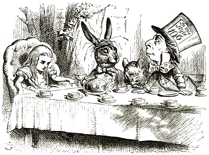
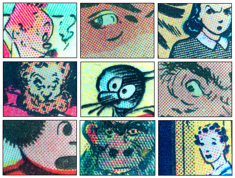
Does this image from a 1964 DC comic contain Ben Day dots, for example? (2)
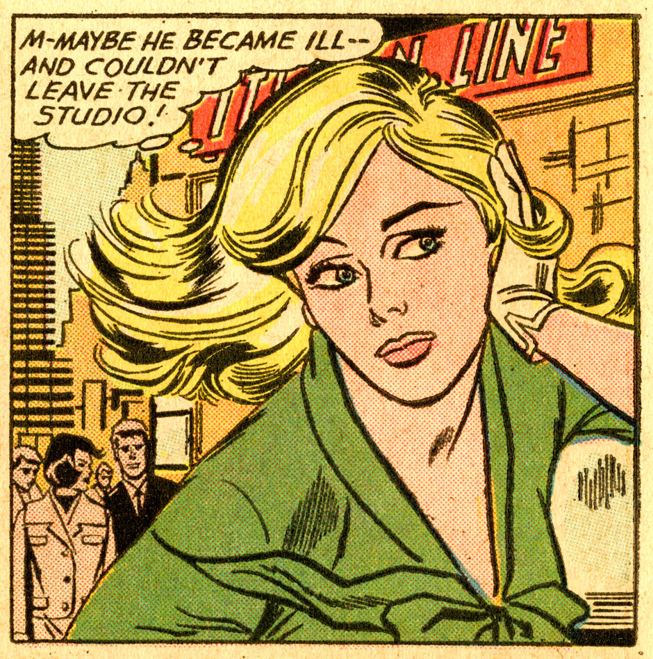
Here’s a close-up which makes the question easier to answer… or does it?

Perhaps the precise question should be, “Did the original comic book, printed on paper, contain Ben Day dots—for example, the particular copy of the comic book obtained at the time by New York artist Roy Lichtenstein?”
What about the painting which Roy made based on this comic book panel, M-Maybe (1965)? Any Ben Day dots on that?

^^Table of Contents
Introduction 2
This series started with a post about that famous Pop artist and his comic book paintings. Prior to 1961 the phrase “Ben Day dots” was part of the specialised language of graphic art, of publishing, production, engraving and printing. From that year onwards, Lichtenstein’s paintings brought the dots from obscurity into the public consciousness. As a helpful short-cut, I would like to designate this popularising of the dots “The Lichtenstein effect.”
A lot of the dots I looked at in Part 2 and Part 3—comic book dots, half-tone dots, inkjet & process colour dots, those pixels—are trying to create the illusion of something they’re not; an area of flat colour, a continuous graduated tone, a full-colour image.
And some of these other dots get mistaken for Ben Day dots. Perhaps it’s no surprise that the “real” Ben Day dot is an elusive thing.
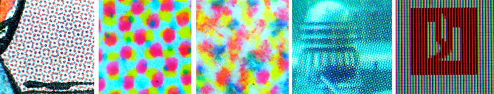
Various dots—in a comic, a newspaper, from an inkjet printer, in a magazine, on a screen—pretending not to be dots.
The sub-title of my first post was “The Man Who Didn’t Paint Ben Day Dots,” a slightly mischievous but also quite serious assertion.
Roy Lichtenstein didn’t simply paint magnified versions of the dots he saw in the comics and small ads of the day. He painted his own personal vision of them, his response to them—Roy Lichtenstein dots. His dots were arguably doing the opposite of creating illusory tones—rather, being much larger than the originals, they set out to unmask the illusion. These, for example, are dots from his painting M-Maybe, as seen above.

Roy Lichtenstein dots, being themselves
After the Lichtenstein effect set in, not only did a lot more people know about these dots—whole new levels of meaning attached to the phrase “Ben Day dots.” In fact, an online search reveals a great deal of misunderstanding about what they are, and what they are not.
Partly this reflects confusion about the technique itself, which gets muddled up with some of its 20th century successors such as Zip-A-Tone, seen below in this 1950s panel from the IDW book Wally Wood’s E.C. Stories.
Partly it is due to issues arising from the Lichtenstein effect itself.
This post attempts to dig out the truth about Ben Day dots—or at least, to make a start. It will include their “Secret Origins”—perhaps not actual secrets, but much of this stuff has not appeared online before, or is not easy to find. Nor is it covered in the histories of the comics. (3)
In this post I will:
- look at how images were printed before the coming of Ben Day dots—this will be a lengthy section, setting the scene in various ways
- Look in detail at Benjamin Day’s original 1879 patent
In future posts I will also attempt to answer these questions:
- Who was Benjamin Henry Day Junior?
- What did he do apart from invent dots?
- How was his process used in the printing industry?
- How successful was it?
- Precisely how were Ben Day dots used in the comics?
- If and when the comics stopped using them, what did they use next?
Finally I will return to 1961 and ask again: did Roy Lichtenstein really paint Ben Day dots? This time my answer will be totally and utterly definitive. ;0)
^^Table of Contents
Part (i): Printing Pictures Before Ben Day
By “printing pictures” I don’t mean single works of art, or short-run limited editions of a few copies—though they may use the same methods I’m about to discuss. Artists making prints today (2015—and doubtless beyond) have kept many of the old techniques alive, long after their use in commercial printing ended.
Here though, unless specifically noted, I’m referring to mass production—the printing used for newspapers, magazines, illustrated books and postcards, for example. I include the colour lithography used to make early advertising posters and large editions of cheaper prints for framing on the wall.
Printing at the time Ben Day patented his dots was very different from what we see today. Clear accounts of this online are hard to come by. Some detailed explanations will help to clarify where Day’s invention fitted into the contemporary world of graphic art and printing.
If you read through this historical material, you will start to see why Ben Day did what he did, and why his new method had 60 or more years of success.
^^Table of Contents
The Press Before Pictures—Letterpress.
In 1879 newspapers and magazines, in general, were printed only in black & white. Special editions—e.g. Christmas numbers—or colour inserts, occasionally appeared.
Newspapers as such were also almost exclusively made up of text—with no illustrations. (4)
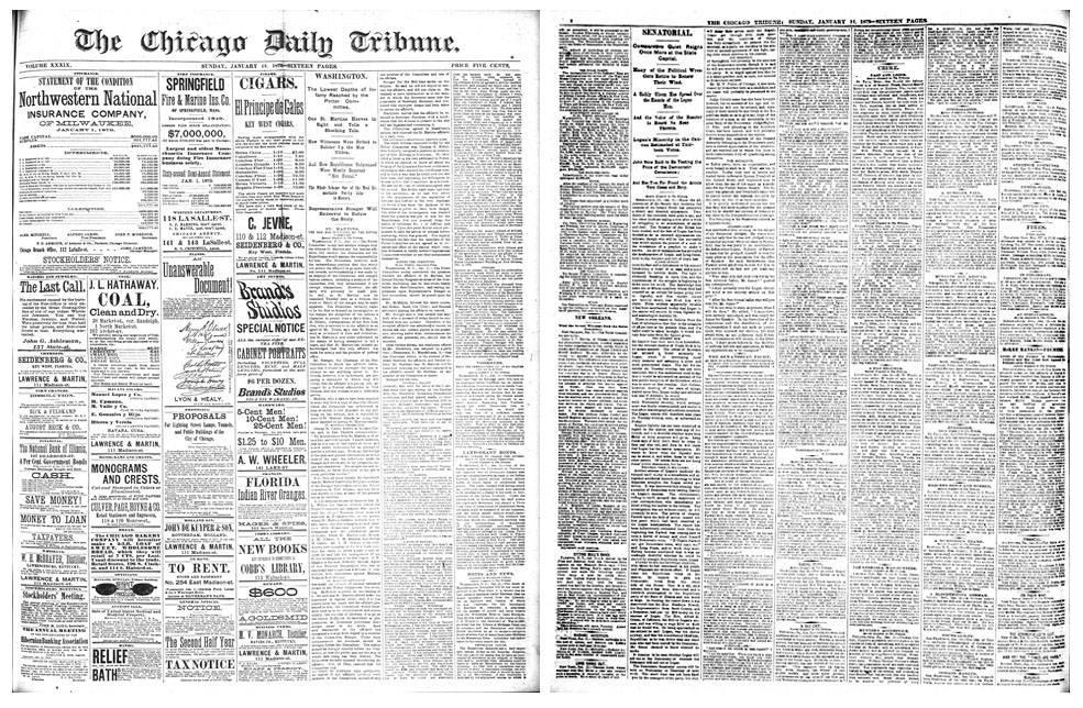
A Chicago paper, 1879, pages 1 & 2. Front page mainly advertisements, as was the custom.
When printing text pages, in books, magazines or newspapers, ink was transferred to paper from raised areas on metal surfaces, a process known as relief printing. Two other basic types of printing are possible, as shown below—intaglio (ink below the surface level of the plate; lines and dots engraved or etched into the surface) and planographic (flat plate surface, mainly lithographic stone, later zinc (metal); lines and dots drawn on with pen & ink or a crayon)—more on all these later.

From Dalgin 1946 (see footnote 2)
Text was printed from metal “movable type,” set into frames letter by letter and locked into a “forme” before printing. Since early newspapers and magazines used only type, the name letterpress was used for this kind of printing. The name stuck around even after various radical changes had occurred—e.g. the old flat “formes” had to be copied as curved “stereotypes” to go on the new rotary steam presses which came in during the 1870s.
The inclusion of pictures was another, earlier radical change to letterpress. If pictures and text were to be printed together on a page, involving only one “print run”—paper going through the same printing press only once—the illustrations had to be in relief at the exact same level as the type.
For technical reasons, until the 1840s, illustrations had mainly been printed by intaglio or planographic methods, incompatible with letterpress, and included only in relatively expensive books. (The exception to this was the crudely produced pamphlet known as the “chap-book” which we will meet below.)
Result: newspapers and periodicals in which pictures only rarely appeared—outside of humorous magazines like Le Charivari and Punch anyway—until 1842, that is.
^^Table of Contents
The Arrival of the Illustrated Press
From the 1820s, low print-run radical magazines in Britain were among the first periodicals to take up wood engraving — a new relief technique used for printed pictures, originally used in illustrated books since the 1780s (see Section 1, below). In 1832 a key publication, The Penny Magazine, achieved mass market success, but limited by its encyclopaedia-like educational mission. In France, Le Magasin Pittoresque (1833) was the first of many close imitators.
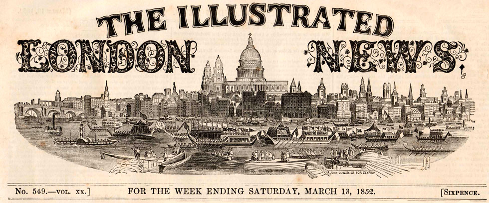
Starting in 1842, The Illustrated London News (ILN) was the first weekly illustrated newspaper — a periodical containing topical and entertaining articles. Prior to this, the newspaper press would only occasionally include a limited number of illustrations of, for example, some royal special occasion or a sensational murder trial. ILN Founder Herbert Ingram realised that his newsagent’s business always sold a lot more copies of these editions.
His great innovation was to fill his publication with illustrations every week. (For a detailed account of the ILN, a lot of archive material, and interesting links, see http://www.iln.org.uk/ )
After an uncertain start, the ILN became a real success, and many imitators followed, on both sides of the Atlantic. The combination of words and pictures was clearly something which the public was very much ready for. This was a major development in the media, comparable to the coming of cinema in the 1890s or radio in the 1920s.
And these magazines didn’t just need illustrations for their stories. They contributed to the irresistible rise of another institution that we now take for granted—the advertising industry. Increasingly, advertisements used pictures to draw attention to themselves, and this was a snowball that would keep on rolling.
Both editorial illustrations and advertisements would later be major users of Ben Day’s method, but they had to get by without him for the first 37 years.
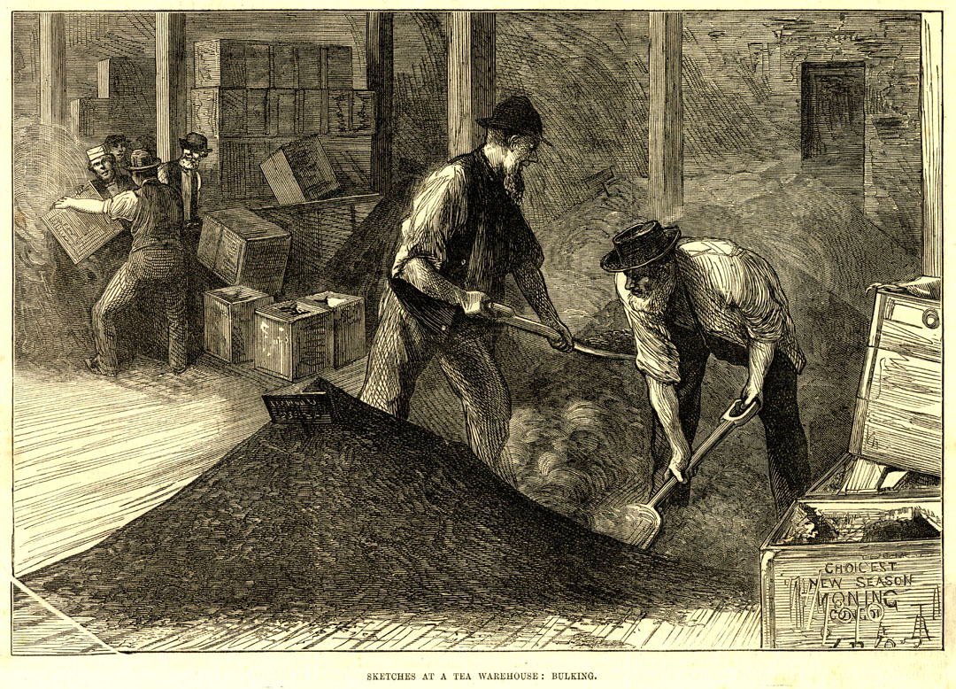
The London Tea Trade, ILN, Dec 1874
Some key points must now be made about this period—from the arrival of the ILN in 1842 to Ben Day’s first patent in 1879. There were a few exceptions to these statements, and things were rapidly changing as we will see, but on the whole between 1842 and 1879:
- Books remained relatively expensive, and book illustration was a different world from the periodicals and papers. From the 1860s, high-quality photographic prints (Woodbury-type, collotype etc.) could be used as book illustrations — thanks to a number of advances in intaglio printing techniques. But these were costly, slow, often limited in the number of prints they could produce, and could not be printed alongside text because they were not relief methods. (5)
- Thus magazines and newspapers by 1879 still did not include photographs. That would require the halftone screen (see Part 2, and footnote 6) currently still in its infancy — widespread use of halftones only came in during the 1890s.
- Gillotage, or panicongraphie, had been patented by Firmin Gillot in Paris in 1850. It allowed a print (often a lithograph) or a drawing (not a grey-tone photograph) made on special ‘transfer paper’ to be turned into a relief printing surface — more on this later. Potentially revolutionary, but technically challenging, gillotage had some success in French periodicals, but limited usage elsewhere. However it led directly to:
- The photo-mechanical process, or photoengraving (Section 5, below). Following earlier more complex methods, the technique which really was to revolutionise the relief printing of illustrations was developed by Gillot’s son Charles in 1872, and entered the world of commercial mass printing during the 1880s.
- For most mass production during this 1842-1879 period, a drawing, photograph or painting—even a simple line drawing on paper—had to be re-created by hand in printable form, on a printing surface made of wood, metal or stone.
- Wood and metal had to be engraved or etched, and the lithographic stone was drawn on.
- Furthermore, pre-halftone, the relief printed black & white image could not have any shades of grey.— at first, even photoengraving was limited to black-and-white images with no greys.
- Grey shading or “tonal effect” had to be achieved by varieties of line and dot work.
- (Aquatint and other types of etching (intaglio) and lithographic crayon work did achieve grey effects.)
- Coloured images were being printed (from lithographic stone, and from wood). Mostly these also required dots (stippling) and lines to create “tints” or paler tones from any given colour of ink.
- These lines and dots were essentially hand-drawn/hand-engraved, though by the 1870s the human hand was starting to get some mechanical help.
^^Table of Contents
The Printed Image: Means of Production
The main methods used to make images for printing at the time Ben Day was working on and patenting his technique were:
- Wood engraving—mostly black & white (B&W) periodicals and books, colour possible for special editions.
- Copper engraving—steel also used; mostly B&W; for high-end prints and books, maps, sheet music, currency
- Lithography (monochrome)—mainly B&W; books, art prints, maps, advertising and promotional meaterial
- Chromolithography (colour)—special colour inserts for magazines; books, art prints, posters. Increasingly, mass production of greetings cards, cheap art prints etc.
- Photoengraving—in its earliest stages at this time; not yet widely used; however, a major bombshell whose fuse had been lit.
^^Table of Contents
Looking at these in more detail:
1. Wood engraving
The large-scale publishing of illustrated magazines in the 1840s and 50s greatly expanded the wood engraving trade, which had previously been a fairly minor craft. Though it was gradually edged out by newer methods, wood engraving remained the dominant form of illustration in the mass-printed press from the 1830s until the early 1890s.
The precursor of the wood engraving was the woodcut—printed from a carved wooden block, originating in China, developed in Japan. It came to Europe around 1400 CE/AD—just in time for the movable type printing revolution started by Johannes Gutenberg. Like letterpress, woodcut was a form of relief printing. This meant words and pictures could be locked into the same frame and printed together.
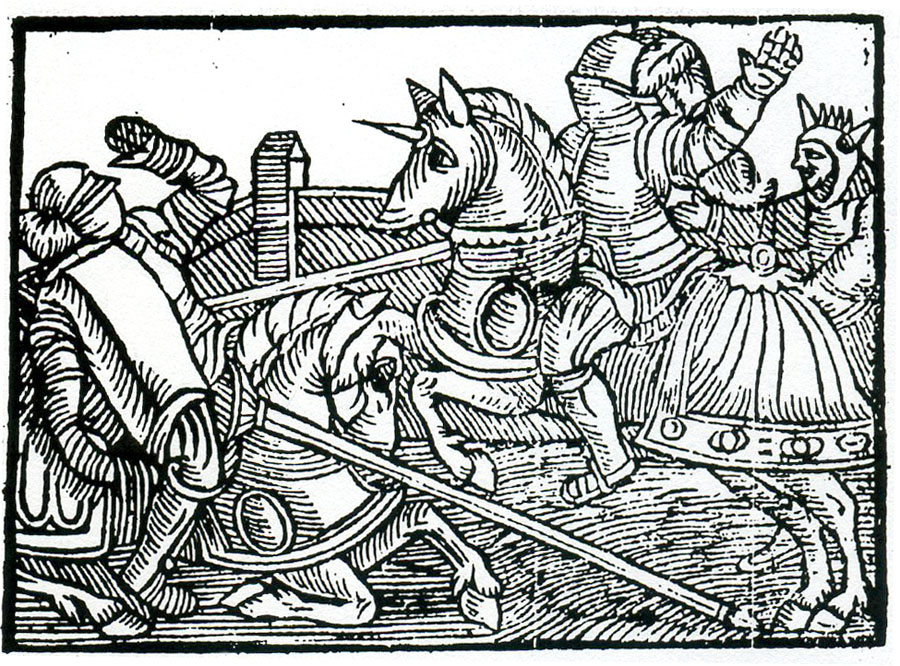
The mediaeval version is probably what comes to mind when we hear the word woodcut—something like this 1551 illustration from an edition of the popular book Fortunatus. (7)
Phenomenal German artist and mathematician Albrecht Dürer started as a woodcut artist, taking the technique to new heights. Thanks to Wikipedia I can show you both his pen & ink drawing of a rhinoceros, and the famous woodcut print made from it (1515). The drawing was not only further embellished in going from drawing to print, but also mirror-imaged or left-right reversed—of which, more later.
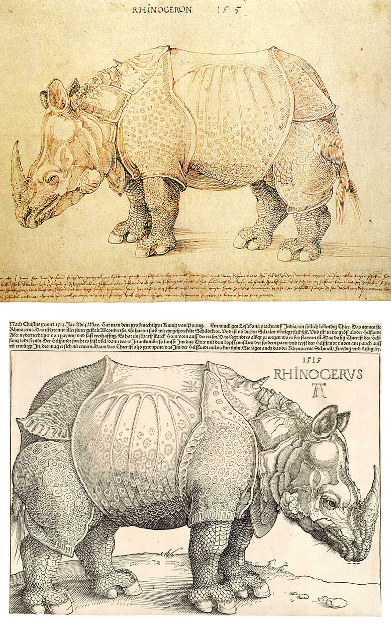
Dürer’s two rhinos. Above, pen & ink. Below, bestselling woodcut print.
To make a woodcut block, a drawing was made on a very flat wooden surface, either by drawing straight onto the wood, or tracing an existing picture from paper. The wood was then carved into by the block-maker—often not the same artist who did the drawing. Cutting the wood was a very specialised skill.
Printed images were made by applying ink to the wood surface standing out in relief above the cut-away areas. Any area of wood left flat and unworked would print solid black. Where the craftsman cut away lines and shapes from the wood was where the print would come out white.
In book illustration, the woodcut peaked before the 1700s. It was superseded by higher quality techniques of engraving and etching on metal. These intaglio methods needed a very different type of printing, and separate presses from text, so illustrations of this kind took up full pages, added in to books or periodicals during the binding process.
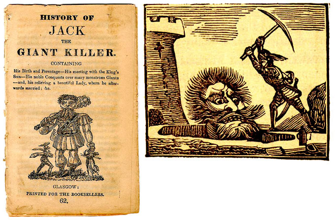
However, as illustration for cheap, popular printed material (ballads, chapbooks, almanacs etc.) the humble woodcut continued to thrive into the mid-19th century. Below is early superhero Jack the Giant Killer, from around 1820. Spoiler Alert: don’t read the cover of the chapbook too closely.
Wood engraving was the evolved descendant of the woodcut, originated by the English engraver Thomas Bewick in the 1780s-90s. His two great innovations were: working “against the grain” of the hard end of a boxwood block, rather than with the grain on the sides of the block or plank; and use of fine tools (burins) previously used by engravers on metal. This combination allowed for finer detail.
On the print shown below, “del & sculpt” means that Bewick both drew the picture and engraved it. (“Delineavit” in Latin = “drawn by,” “sculpsit” = “engraved by”.) Later on, with factory-like production of commercial wood engravings, this was rarely the case.
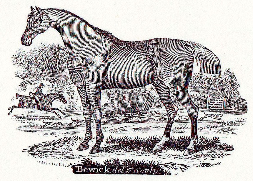
Early Thomas Bewick, published 1790
The Bewickian wood engraver achieved shading or the effect of grey tones mainly by various forms of line work. Parallel lines, often curved, and of varying thickness, were easier to make on wood than cross-hatching, which early on tended to be used sparingly if at all. Bewick pioneered the use of “white lines” and avoided (indeed, deplored) the time-consuming imitation of cross-hatched lines—though that technique came back later, as we shall see. Dots and irregular stipples were occasionally used, generally white dots on a black ground in the earlier days.
Though it soon found a place in the illustration of books, wood engraving only took off in a big way with the boom in illustrated weekly papers after 1832 and especially 1842. Being a relief method, the wooden blocks could once again sit alongside text on the printing presses. With the massively increased demand from The Illustrated London News and its many imitators, wood engraving was soon being done on an almost industrial scale. (8)
ILN page 1850, from https://www.umass.edu/AdelphiTheatreCalendar/img197f.htm
As The Encyclopedia of Ephemera notes: “By the 1880s, ruling machines were in common use; they allowed very accurate tints to be engraved, and with much greater speed and precision than could be achieved by hand.” (9)
Also, from the 1860s, increasing use was made of photographic techniques. Both pen-&-ink drawings and photographs themselves could be “fixed” photographically onto the wood blocks and copied directly by the engraver, though it altered the working surface detrimentally.
In imitating line drawings, the tedious replication of cross-hatched lines now came back in fashion. This could not be done directly, as engraving created white spaces (or lines), not black lines. Instead, each white square or “diamond” shape between the drawn lines had to be individually cut away.
Before long, critics including John Ruskin complained that wood engravers working for the magazines had lost any creativity they’d once had, being reduced to mere technicians—copyists, in a style called “fac simile”, “fac-simile” or eventually “facsimile.” This simply meant “making an exact copy,” and originally applied to the very precise copying of pen-and-ink drawings—right down to details like squiggles and, of course, cross-hatching. This was adapted for the close copying of photographs.
In imitating photographs, with better paper surfaces and better printing allowing finer lines closer together, the best wood engravings approached the fidelity of the photograph itself (See also 8). In copying photographs, paintings and wash drawings with grey tints, black dots created by cross-hatching with white lines now became more prevalent
The Prince of Prussia, below, was very likely engraved directly from a photo. He provides an example of both types of cross-hatching; black lines on his jacket, dots made by crossing white lines on his face.. (10)
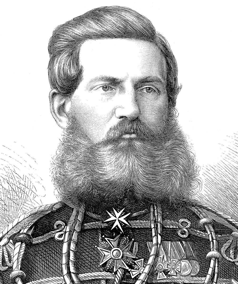
Prince William Frederick of Prussia, wood engraving from the ILN 1870 (detail) (from Wikipedia)
Owners of engraving companies not only gained influence over what was published but branched out directly into publishing themselves. Frank Leslie, a senior engraver on The Illustrated London News, went to the U.S.A. in 1848, started Frank Leslie’s Illustrated Newspaper in 1855, and got rich. We shall be meeting him again—or at least his paper.
Wood engravings also continued to be used in books—now increasingly so. Some of the best known are probably Sir John Tenniel‘s illustrations for Alice in Wonderland (1865). Tenniel’s drawings were engraved by the major commercial studio of the Dalziel Brothers, George and Edward — and one of Edward’s sons, Gilbert Dalziel, worked on the comic magazine Judy and owned its massively successful 1884 spin-off, Ally Sloper’s Half Holiday. (11)
Gustave Doré and his engravers, in the 1860s and 70s, provided the Bible, Dante’s Inferno, Don Quixote and many other books with highly sophisticated wood engravings. Notably these made extensive use of both black-line and white-line techniques. Dore’s name appears by convention in the bottom left hand corner of his illustrations, and the block-maker’s at bottom right.
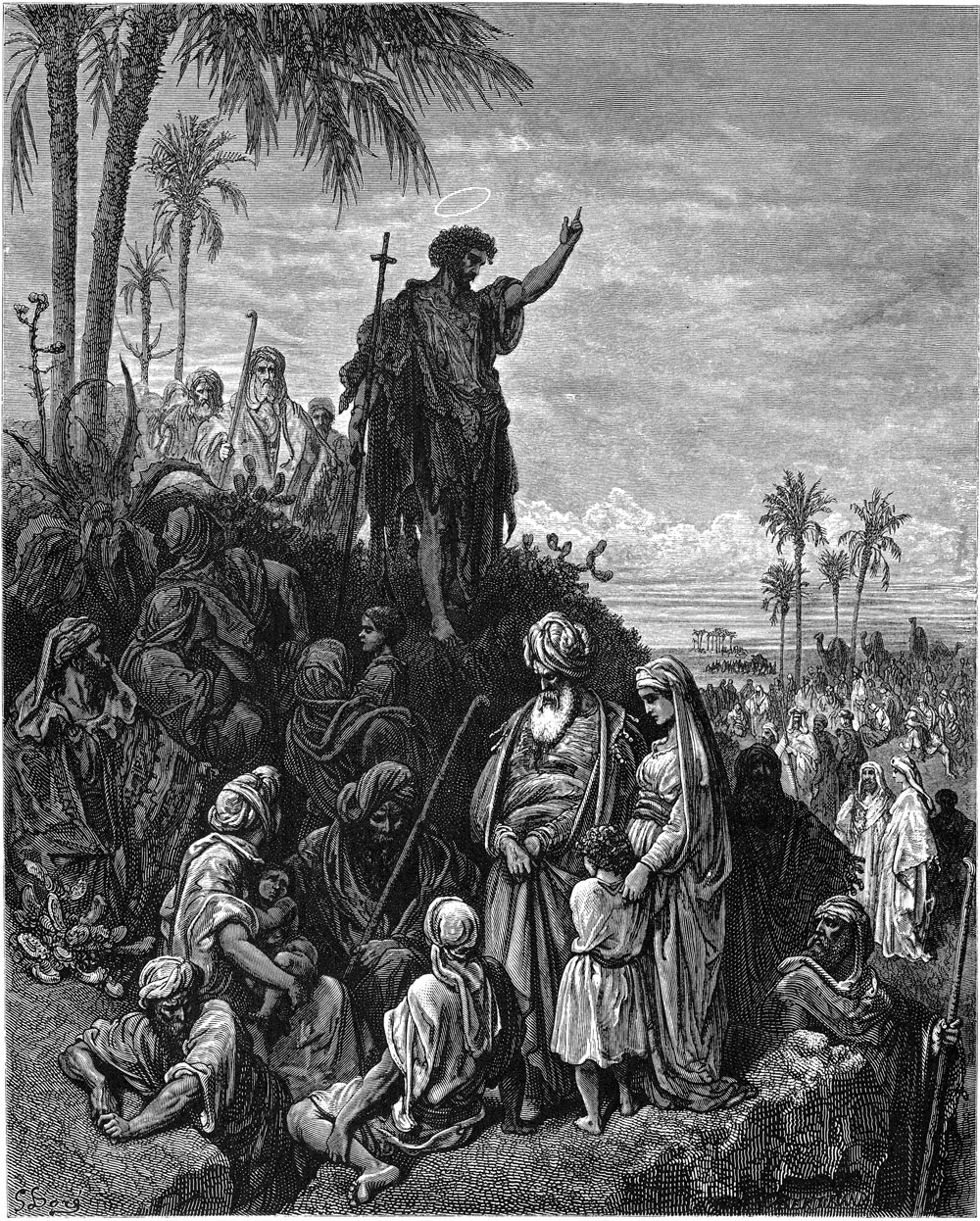
John the Baptist Preaching in the Wilderness by Doré
Colour wood engraving
The increasing level of detail possible in wood engraving made mass colour printing from wood blocks more feasible. From the late 1830s, George Baxter led the way in this. His prints, and those of his many followers, were based on an underlying black or grey image printed by an intaglio metal plate. Colours were then printed onto the key image, solely or mainly from wood-engraved blocks.
Later practitioners, notably Edmund Evans, abandoned the black or grey metal key plate, working solely with wood blocks. Known as chromoxylography, this method was increasingly used in the second half of the 19th century. Some illustrated books used a sophisticated variety, and many paperbacks and cheap pulp periodicals somewhat simpler versions.
In the weekly magazines, similar methods were pioneered by the Illustrated London News, starting with its 1855 Christmas edition. (A short-lived paper, The Coloured News, had published hand-coloured images in August and September that year, and stimulated the ILN to attempt actual colour printing.)
Here the wood-engraved blocks were increasingly joined by metal printing plates, etched by acid, for some or all of the colour work—in some ways anticipating the later photo-engraving process. By the 1870s, the better-off periodicals were using this method, sometimes called chromotypography, for occasional special editions. The Graphic, notably, regularly had colour pages in its Christmas and Summer special editions from 1875. In Paris rare attempts were made at colour gillotage / paniconographie, but chromotypography became a major speciality there in the 1880s.
I shall return to these key developments in colour printing in a future post.
Very often by the mid-19th century original wood engraving blocks were preserved, and the images actually printed from metal copies, originally made by stereotyping (new metal plates cast from papier maché moulds of the original formes) and increasingly by the higher quality electrotyping. To make an electrotype, a cast of the engraved wooden surface was made in wax (or other soft material) then coated with a fine layer of graphite—an electrical conductor. A thin copper (or zinc) replica of the original was made by dipping the wax cast in a bath of metal salts and running an electric current through it—copper (or zinc) atoms being deposited on the negatively charged graphite. The thin metal copy was strengthened before being used as a printing plate.
If you are thinking at this point, “All this engraving and electrotyping and what-not must have taken a lot of fairly skilled man-hours—and ended up pretty expensive”… hold that thought. I’ll be coming back to it. For now, let us note that engraving on wood—though it might take days to finish a picture—was at least a good deal faster than the old copper method (below). If it hadn’t been, the magazines could not have existed.
^^Table of Contents
Before wood engraving took off, 19th century books were largely illustrated by engravings done on copper plates, or by the cheaper, faster lithographs.
2. Copper (sometimes steel) engraving
This had started in the 1430s. It involved cutting an image with hard steel tools into a copper plate, sometimes assisted by acid etching. In this it appears similar to wood engraving, but there is a crucial difference—this is an intaglio method. To make a print, ink is applied to the plate then wiped off the surface. The lines or dots cut into the copper hold ink and transfer it to paper under high pressure—i.e. the areas lower than the surface will print black, not white as in wood engraving. On copper, a flat unworked area prints white, the opposite of the relief method on wood, where it prints black.
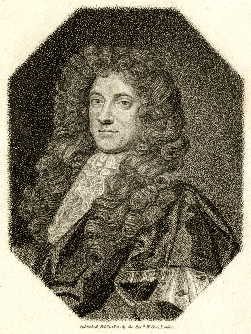
Copper engravings tended to be used more in high-end, small edition printing, for expensive books or prints to go on the wall or into a collector’s portfolio. Below is Robert Walpole, father of Lord Walpole, in an engraving from 1801—a copy of a painted portrait. The print in real life is just over 9 x 12 cm. The copper plate would have been the same size. Check out that dotted shading—stippling—every dot cut or etched by hand into copper. Every line carefully cut—hours, days or weeks of painstaking craftsmanship!

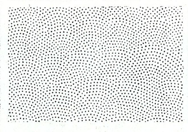
The pattern below is a typical stipple pattern of the kind William Blake learned to make during his apprenticeship as a copper engraver in the 1770s.
However I am cheating here—it is actually one of Ben Day’s dot patterns from over a hundred years later. While Ben Day was at the forefront of mechanical printing methods, some of his dots were decidedly backward-looking. Stippled patterns were key to Ben Day’s early success—of which, more later.
^^Table of Contents
3. Lithography
This was widely used in books from about 1820. Many periodicals also used B&W lithographs as illustrations and cartoons. After the wood engraving boom of the 1840s/50s, lithography continued to be used—especially, from the 1840s, as a colour method, chromolithography (see next section). (12)
In lithography, a drawing was made (or copied) in greasy ink on a flat block of limestone—about 10cm thick, heavy and cumbersome. Amazingly these blocks were actually used in mechanised printing presses (the foot-pedalled type giving way to the modern steam-driven variety) though they were later replaced by thinner, lighter metal plates using a similar grease/water method. (13)
Two things are particularly notable in the 1834 lithograph which I have scanned below. Firstly, the stippling here (seen in the close-up detail) is achieved by drawing on a rough stone surface with a greasy crayon or “chalk”—a much faster process, if giving less control, than making marks on copper.
1834 lithograph, original image size c. 23 x 15.5 cm
Secondly, the printed version would have to be drawn in reverse on the stone plate, as shown below. This applies to any image on a printing plate—text too. (14)
Above print, flipped left-right or mirror-imaged, as drawn on stone
Drawings could also be done on special paper, which allowed the greasy ink image to be transferred to the stone. From the 1860s, these “transfer papers” were increasingly used, the paper being made with grainy or other patterns which allowed for stippling or other variations in the lithographic image. Also, the paper drawing could be done the right way ’round, as it was to be reversed when transferred to the stone.
When an image had been completed on the block, the stone was treated with a watery mixture of weak acid and gum arabic, which chemically changed the surface layer of stone without appreciably eating it away. (This was called “etching” but was very different from the stronger acid-etching used in copper engraving and the making of “etchings” as such, and from the later photoengraving method (below)—all of which dissolved the metal to a greater depth.)
The image areas, covered by greasy ink, were protected from this chemical change. The non-image parts, once treated, had the property of attracting water. The original ink image was then washed off with a solvent, leaving a thin greasy layer bonded to the surface of the stone where it had been. The image thus remained on the stone as a flat water-repelling version of itself.
Now when the stone was wetted, the image repelled water, the non-image areas attracted it. Oil-based ink could be rolled onto the wet stone, adhering only to the image areas. The image could now be printed by repeatedly wetting and inking the stone.
Because the stone stays pretty much flat, lithography is a planographic technique—as seen in the Dalgin drawing earlier. As with copper plate engraving, because neither is a relief method, lithography required a separate print run from letterpress, with illustrated lithographed pages added in during binding. Alternatively, letterpress magazine pages could be run through another press, with lithographs printing onto blank spaces left between areas of text. Either method was an appreciable added expense. (15)
^^Table of Contents
4. Chromolithography (Colour Lithography)
A lithograph often had a second colour added, e.g. a pale yellowish ink, which needed a second stone to be drawn—then for landscapes, a three-colour combination of black with pale brown (earth) plus blue (sea and/or sky). These tinted lithographs were popular and led to the widespread adoption of multiple-colour chromolithography, at first for artistic prints, later book illustrations, postcards, greeting cards, cigar labels—and pictures to be inserted into the more expensive magazines. Vanity Fair, for example, only became a success after it started its famous series of caricatures in chromolithograph form (1869-1914). Though the technique was available from the 1840s, it really boomed in the 1880s and 90s. (Partly due to help from the Ben Day dot, as we shall see.)
Every colour added to a chromolithograph needed another stone to be made—drawn by hand—and a separate print run. The stones and images had to be very accurately positioned or “registered” so that the coloured images printed precisely on top of each other. One of the darker colours would be chosen as the “key” stone, and the others all lined up against this one. This is why the letter K—for key—is used for the colour black in the later four-colour CMYK printing, as seen in Part 3.
The craftsmen making them also had to work out how coloured inks would look when printed over each other. This accumulated knowledge would be passed on to printers working with newer techniques. (More next time in Part 5—Ben Day and colour.)
Below is an example from the entry on chromolithography in the famous German encyclopaedia, F.A. Brockhaus´ Konversations-Lexikon (1894 edition). The colour illustrations in this book were themselves printed lithographically. Nine colours are used here, shown in order of printing. Note how no green ink was used, despite all that vegetation.
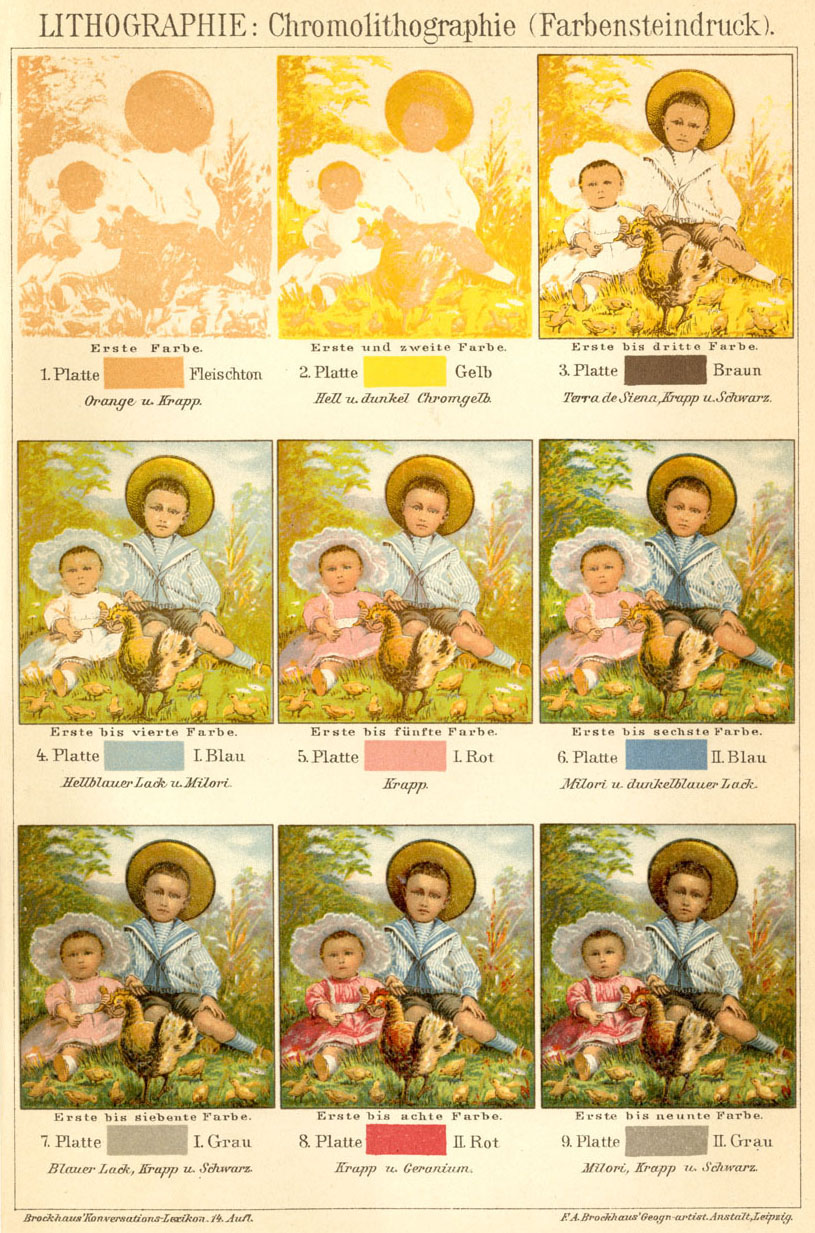
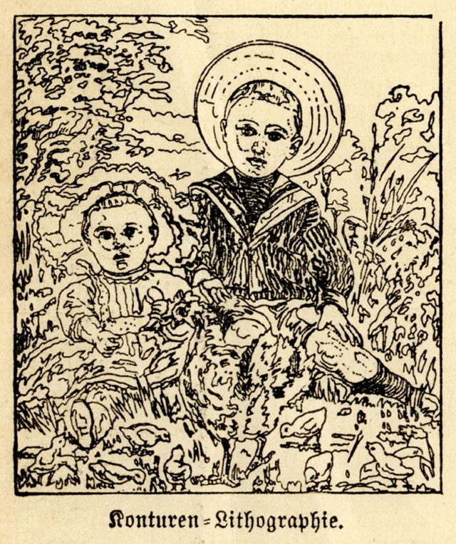
Also, no black was used in this picture, and most chromolithographs used no black ink. (If the job did call for black outlines, as later styles sometimes did, the black would be the “key”.) In order to make the block for each colour, an outline drawing (below) was copied lightly in non-greasy/non-printing red chalk—or “stained”—onto each of the nine stones, but only as a guide for the craftsmen. This is shown below. This might also be called the “key” drawing—in German, it was known as the “Konturen” drawing—i.e.”contours” or “outlines”.
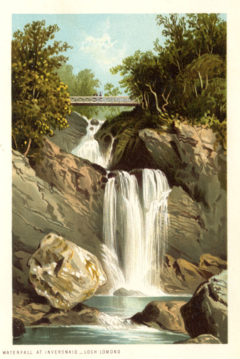
Below is my scan of another chromolithograph, this time a postcard of a scene in Scotland (date unknown).
As noted above, each colour of ink could in the main only print as its pure self—there were no graduated or “half” tones. In fact, for the higher end of the market, ways were found to create paler washes and—by scraping ink off the stone—the effect of a “white chalk” highlight. These however were complicated and time-consuming.
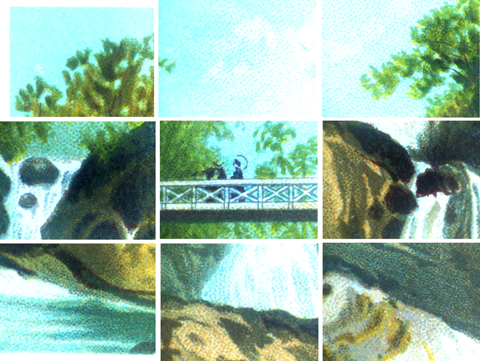
Overlapping of colours could be used to gain extra hues, and stippling was widely used to give the illusion of lighter tints (if on a white background) and in colour mixes. Unlike engravings, the drawing methods used on the lithographic stone did not readily lend themselves to drawing fine lines. Again, there were exceptions to this, and I will come back to the subject in part 5.
Below are nine details from the postcard image, showing stippling in many colours. Though instruments were tried to speed this up, it was essentially a hand-drawn process, using pen and ink. (16)
To sum up so far: when Ben Day launched his new process in 1879, wood engraving was the main method used to create (mostly) black & white illustrations; chromolithography was a very large and still-growing industry for making a variety of colour images. Copper engraving remained in use for expensive projects. I have barely mentioned aquatint and etching which were also used, largely for artistic prints. Gravure, another not very pertinent printing method (though classy, expensive and eventually widely used) was just being perfected in 1879…
….but so was another new process that was starting to change the world of printing radically at the same time that Ben Day’s new method came on the scene…
^^Table of Contents
5. Photoengraving.
The importance of photoengraving to the Ben Day story cannot be over-emphasised. This is the type of printing in which the Ben Day dot would have its biggest and most lasting success.
As mentioned above, Charles Gillot originated photoengraving — in the commercially feasible form which was to become an enduring success — in Paris, in 1872.
Photoengraving is often discussed as if it were the same thing as halftone (see note 6 again). In fact photoengraving of plain B&W artwork came first, and took some time to perfect. The later addition of the halftone method greatly added to the possibilities of photoengraving, but for our purposes it is necessary to keep ‘line work’ and ‘halftone work’ distinct. The Ben Day dot is part of line art photoengraving, though Ben Day is often mistaken for halftone — and vice versa.
This definition of the photoengraving process is adapted from Flader & Mertle, Modern Photoengraving(1948) (see note 3):
A method for the production of metallic printing surfaces in relief, usually for illustrating purposes from drawings, photographs etc., the process being characterised by the following steps:
- A photographic image of the subject is obtained by a camera—in this example, as a negative.
- This is transferred by photographic exposure directly onto the metal,
- which has been prepared with a light-sensitive coating,
- so that light from the “white” parts of the negative image hardens the coating
- which gives those parts of the metal a protective layer in the exact shape of the original image.
- The metal is exposed to acid, eating away (etching) the unprotected (non-image) areas making the non-image areas lower than the image areas.
- An image in relief has now been created on the metal
- and can be printed from.
Charles Gillot reportedly started the first commercial photo-engraving business in Paris in 1876. From the later 1880s, photo-engraving started to seriously challenge wood engraving as a way of reproducing pen-and-ink drawings. (17)
In 1893, the Illustrated London News company launched a new weekly, The Sketch, which is often cited as the first periodical to print all its illustrations using the photoengraving process. (See Beegan, note 8) However La Vie Moderne, launched in Paris in 1879 by a consortium including Charles Gillot properly deserves this credit.
This diagram (also adapted from Flader & Mertle) shows the photo-engraving process in very basic form:

Flader & Mertle’s diagram originally illustrated halftone dots of different sizes being photo-engraved on copper. The same basic steps apply to line art—that is, any black & white picture with no grey tones. Line art would normally use zinc plates, not copper, which was reserved for finer halftone work. Coarser newspaper halftones would also use zinc. (18)
This brief account of photoengraving makes it all seem too simple. Dalgin (1) has a more detailed account that gets closer to the messy, smelly industrial reality. His account of how things were done in 1946 is not far removed from when Ben Day first went into the business. (19)
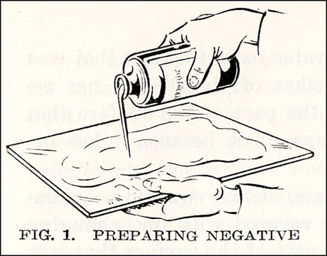
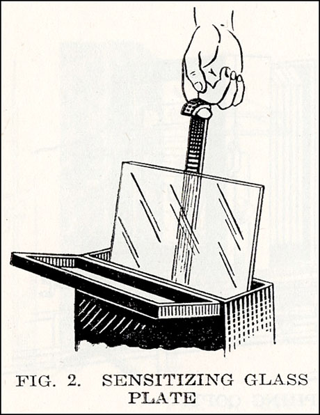
Dalgin’s Figure 1, below, shows the engraver making his own glass negative by pouring on a thick gummy liquid called collodion—a colourless, transparent solution of gun cotton in ether, which dries quickly.
In Fig.2 the coated glass is sensitised—soaked in a solution of silver nitrate, which is absorbed by the collodion layer, effectively turning it into a large piece of photographic film. This is the “wet plate” or “wet collodion” method, invented in 1851. Before this advance, photoengraving was not feasible. The sharpness and quality of the negative image was now greatly improved, and it could be peeled off its glass backing as a thin transparent layer.
In Fig.3 the glass/collodion plate is mounted in a large camera, and a negative image of the “copy” is made. The copy is the line art, or as Flader & Mertle’s glossary defined it in 1948: Copy—Popular but inept term for “original.”
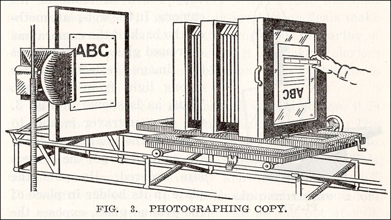
At this stage the negative can be made smaller or larger than the original copy. Line art would generally be reduced for printing. The negative has to be the same size as the image on the printing plate, though—i.e the same size as the final printed image.
Fig.4 (20)
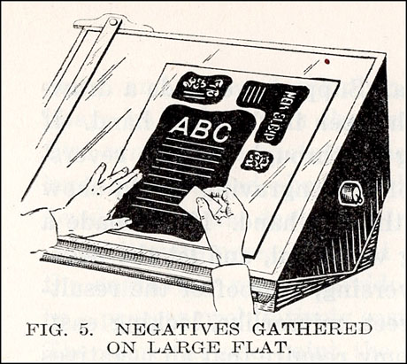
Fig.5:—After the negative has been peeled off the glass, using a solution of India rubber in benzene, it exists as a delicate sheet of dried collodion. This is generally laid down alongside other negatives on a “flat”, another large sheet of glass. For reasons of economy, several negatives are dealt with at one time.
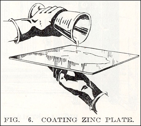
The printing plate now has to be prepared. Fig.6 shows an engraver coating a zinc sheet with bichromatised albumen. In the very early days a variety of bichromate-based coatings may have been used, but by the time photoengraving was in widespread use, this had become the dominant one.
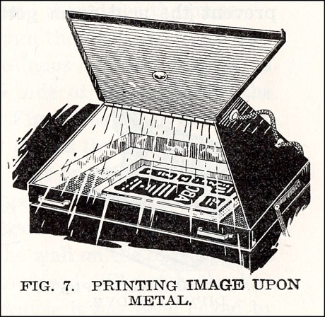
In Fig.7 the flat has been laid directly onto the zinc plate and they are being exposed to very bright light. This could take an hour or two. At this stage the negatives are upside down, therefore they are left-right reversed, and so is the image being made on the plate. As we saw before, this is necessary for the final printed image to come out the right way round.
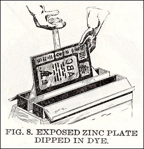
In our historical albumen-coated example, Fig.8 should actually show the plate being inked so the engraver can see the images. Instead Mr Dalgin shows a plate with light-hardened enamel image areas being dipped in dye—same principle, but a later development. Before this stage, there is hardly any visible difference between the light-hardened image areas and the still-soluble non-image areas of the albumen coating.
In either case, the images only show clearly after the non-image areas of the light-sensitive coating have been washed off with water (Fig.9). By analogy with a photographic print on paper, Dalgin calls this “developing” the plate.
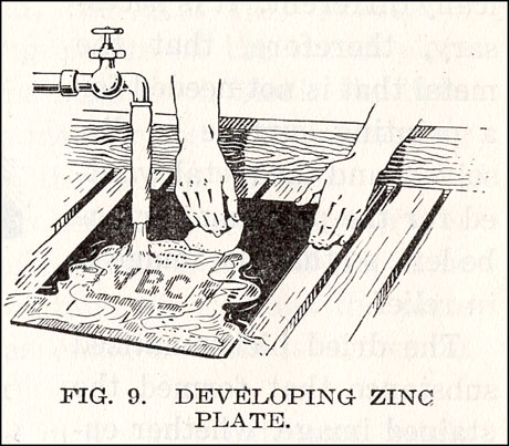
Fig.10 shows the plate being etched in an acid-bath. Before this its back surface has been painted with a protective layer of tar-like “asphaltum”, so as not to be dissolved away. Only the non-image areas on the front of the plate—unprotected by the hardened albumen—must be eaten away. The first etching is shallow and called “the first bite.”

There were usually three more “bites.” Fig.11 shows the plate being powdered between bites. The powder was the legendary Dragon’s Blood, a powdered dried resin gathered from various trees and palm fruit. At every stage of etching after the first bite, it was brushed four times over the plate, so as to protect all four sides of the raised metal areas from undercutting by the acid.
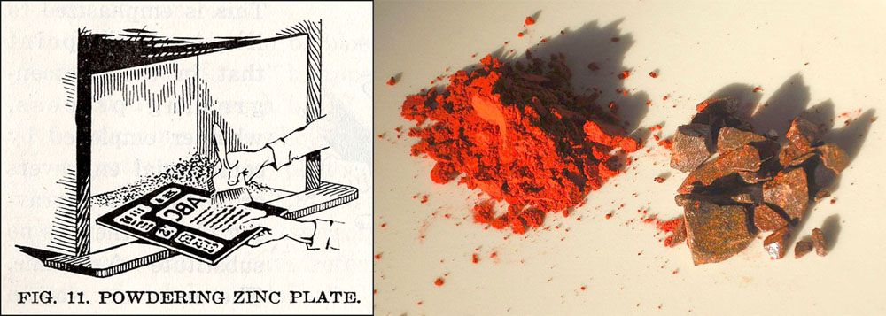
Dragon’s Blood photo by Andy Dingle (from Wikipedia)
What’s more, every time the powder was brushed on, the plate had to be heated over gas jets (Fig.12) to melt the resin, and solidify it into a protective layer on the metal. Before each of the 2nd, 3rd and 4th bites a cycle of four brushings/heatings/coolings was carried out—twelve in all. This could be half day’s work in itself, for a skilled craftsperson. If not done properly, the image areas on the metal would not be fit for purpose.

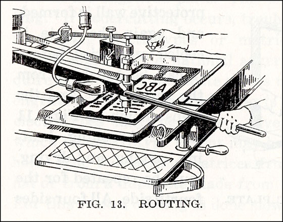
Fig.13 shows routing, in which unwanted metal is cut away, and larger etched (non-image) areas may be deepened. This was done with the aid of high-speed machines.
Below left is a completed zinc plate—or part of one—from 1879. The repeated circular marks made by the router can be clearly seen. On the right, I’ve flipped it and made a negative, which gives you an idea at least of what the printed image looked like. (21)
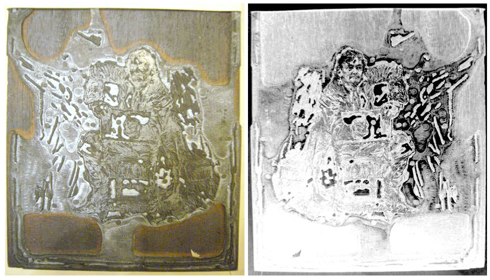
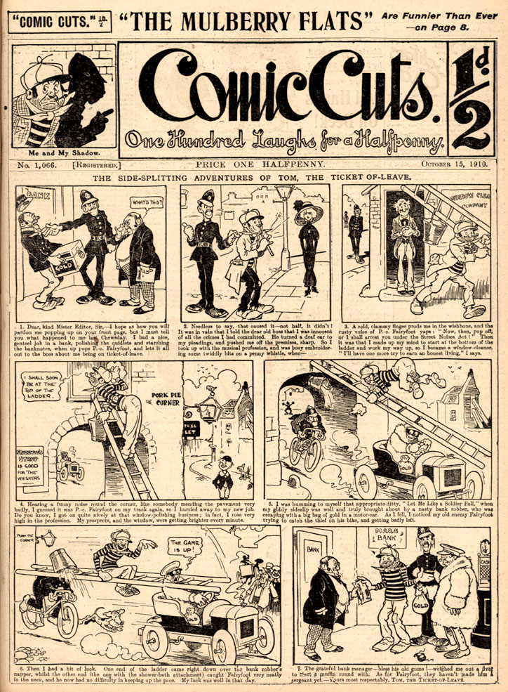
I say “zinc plate—or part of one” because, like Dalgin’s example above, this image was probably taken from a “flat” with several negatives on it. Thus the zinc plate also had several pictures on it, and was physically cut into pieces to separate them. The once-common term “cuts” for individual illustrations, as in Comic Cuts (1890 to 1953) originated in the days of hand engraving, when the illustration was literally cut into the copper or wood. In the photoengraving world, the term “cuts” persisted well into the 20th century, possibly because of this cutting up of plates. In letterpress, each cut was mounted on a wood block to achieve the same level as type in the forme.
Here’s something a bit more up-to-date, below—the black plate of a page from a Popeye comic book—no.13, according to its owner (22)—probably from 1950. Also flipped, on the right, looking more like the printed version.
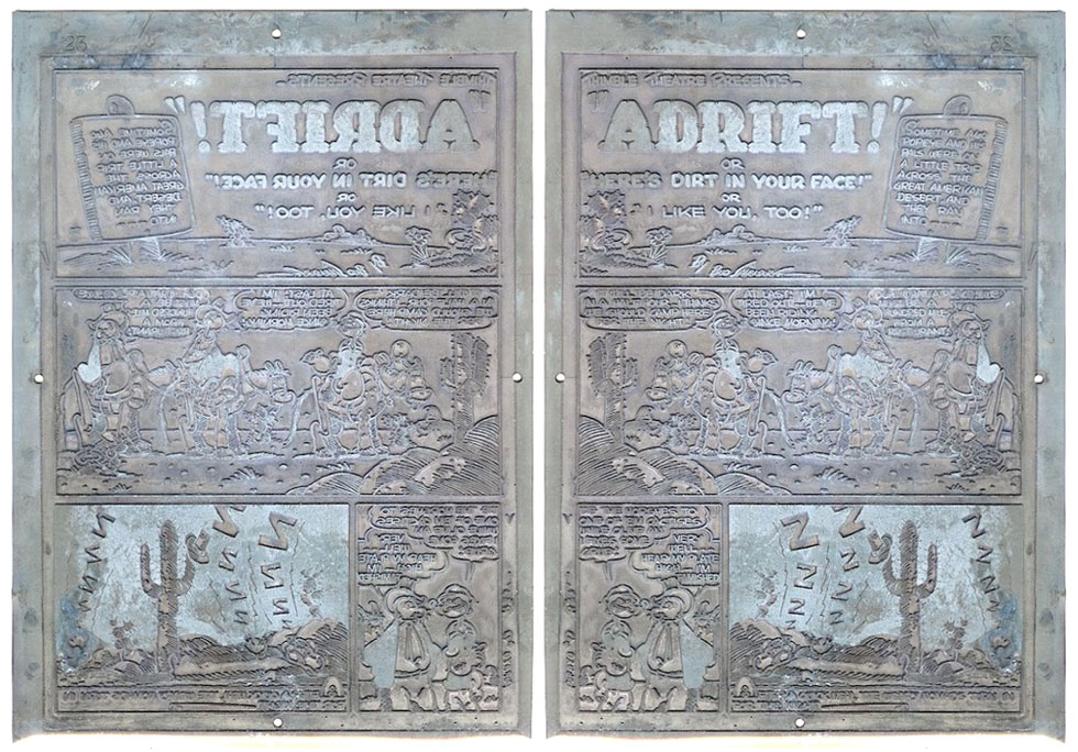
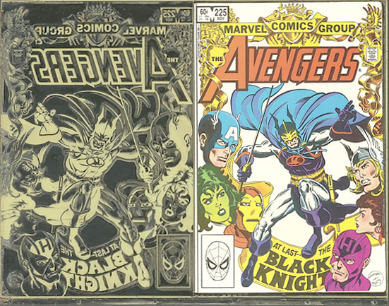
Like the original newspaper strips from which they evolved, comic books were printed by letterpress—at least for their first few decades. Final fun image, below: I don’t need to flip this one. The seller of this 1982 Avengers cover plate (again the black plate) had it mounted with a copy of the comic book cover. The legacy of the photoengraving revolution of the 1880s lived on for over a century.
^^Table of Contents
And revolution it was. Apart from the catastrophic employment statistics for wood engravers, this was also a big change for illustrators:
Brush or pen & ink line drawings were now reproduced without the intervening hands of the engravers.
Artists no longer had anyone to blame if their drawing didn’t come out well in print. On the other hand, wood engravers had also been known to improve deficient drawings. Illustrators and cartoonists were now on their own. In the longer run this led to a Golden Age of illustration, but at first there were many anxieties to be overcome.
In 1894, Henry Blackburn began his book The Art of Illustration with these words: The object of this book is to explain the modern systems of Book and Newspaper Illustration, and especially the methods of drawing for what is commonly called “process,” on which so many artists are now engaged.
He went on: The illustrator of to-day is called upon suddenly to take the place of the wood engraver in interpreting tone into line, and requires practical information which this book is intended to supply. (23)
Already by 1894 (and indeed much earlier) the photoengraving processes including line work and halftone were collectively being referred to as “process,” a name that would stick for a long time—long enough to attach to “colour process” when it arrived some time later. At this time, everything in “process” was still in black and white.
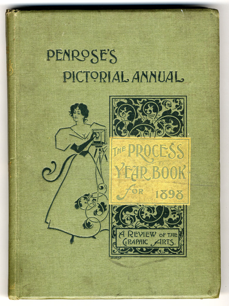
The catch-all term “process” really did take on a life of its own. Below is the 1898 cover of the influential publication later known as The Penrose Annual, which had started in 1895 and would run until 1982. Its official original title was The Process Year Book. (24)
Another implication of this revolution was that a previously published line art illustration—a copper or wood engraving, or zinc relief photo-engraved print—could now easily be copied by photographing it, and making a printing plate from the photo. Publishers/bootleggers were not slow to pick up on this, especially as international copyright laws were non-existent. As early as 1880, Mark Twain published his book A Tramp Abroad, containing over 300 illustrations prepared by the new “process.” These included—as reviewers noted at the time—several copies of previously published engravings. (25)
One of many artists contributing new pictures to A Tramp Abroad was a decidedly average illustrator called Ben Day. I will discuss this important book in another post.
But we should not meet Ben Day, unremarkable artist, just yet. It’s time to meet Ben Day, inventor of the famous dot… though I should make it clear that they are indeed one and the same person.
^^Table of Contents
Part (ii): The Ben Day Method
1. Earlier Inventions by Benjamin Day
Benjamin Henry Day Junior of West Hoboken, New Jersey, was nearly 40 in January of 1878 when he filed for a U.S. patent for his new shading medium. It was granted in April 1879. (26) It can be safely assumed that he was working on the new invention at least as early as 1877.
Though Day’s artwork had been published in major magazines like Frank Leslie’s and (according to Wikipedia) Harper’s Weekly and Vanity Fair, he probably knew he was not in the top rank of American illustrators. Luckily for him—and the printing world—he also had the inventing bug.
His first patent, as far as I can ascertain, was granted in 1864. U.S. Patent no. 42,530 was for “Improvement in Relief-Printing Plates.” This followed on from an 1860 patent (not Day’s) in which a chalk or hard clay surface was used to print from. Day’s improved method probably led nowhere much. Chalk- and clay-based printing never seriously challenged lithography. Author Mark Twain (him again) invested heavily in a method called Kaolotype, but famously lost his money.
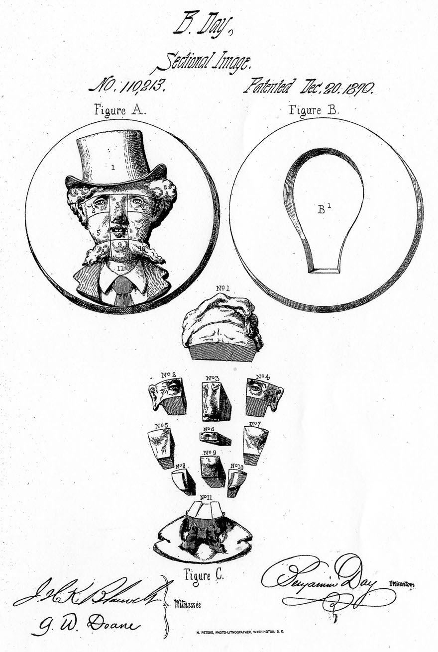
Ben Day’s next invention may not have troubled the bestseller lists either, though it could have been ahead of its time. “Improvement in Sectional Images” (patent granted December 1870) was described by him as “a new and grotesque… scientific and artistic toy…” He proposed making a series of fragmented heads with different features, which could be mixed up when fitted together, to produce “from a very few complete sets of features, a vast number of different images” for amusement or artistic study. A bit like Mr Potato-Head or those flip-cards where you fold a ballerina’s top half into place above the legs of the Incredible Hulk.
^^Table of Contents
2. U.S. Patent no. 214,493
His next patent was dated April 22nd 1879, and modestly entitled Improvement in Printing Films. With this document we see the arrival of the Ben Day shading method.
So this is when Ben Day patented his famous dots… ?
Well… almost. This patent, in its two-and-a-half pages of text and two pages of diagrams, doesn’t actually mention the word “dot” once. It was all about the line at this point—or nearly all. Over half-way through the text, Day does eventually mention the possibility of “stipple,” and we know of course that stippling means drawing dots. But the word stipple(s) / stippling appears only four times to line(s) / lining’s thirty, and the illustrations all show lines being used.
As far as I have been able to ascertain, it was 1900 before Day patented a dot pattern as such—though he was manufacturing stipple patterns as early as 1881. More on that in a later post.
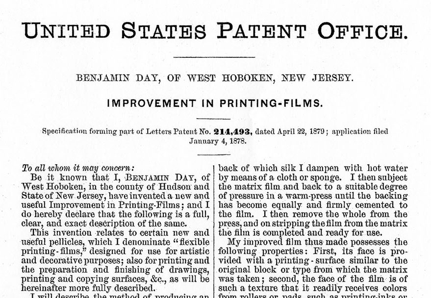
“This invention,” wrote Day in his opening remarks to Patent no. 214,493, “relates to certain new and useful pellicles [skins or membranes] which I denominate ‘flexible printing-films’ designed for use for artistic and decorative purposes; also for printing and the preparation and finishing of drawings, printing and copying surfaces, &c., as will be hereinafter more fully described.”
He goes on to describe how he makes one of his printing-films, in this case 6 x 8 inches in size (some later ones were much larger). He gets a series of lines engraved on a wood or metal block, then makes an impression from this by electrotype or pressure “in any suitable substance but preferably tin foil.”
This foil “matrix” is heated on a flat glass or metal surface to between 100 and 200 degrees Fahrenheit (27). He pours on a warm solution of fine glue or gelatine and glycerine, and continues to heat it until most of the water has evaporated and the mixture sets solid. He backs it with fine white silk which is cemented on by pressure, then peels the film off the matrix. It is then sewn onto a wooden frame.
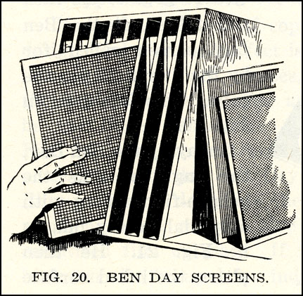
The film in its frame would later become known as a “screen,” probably due to its resemblance to a screen door. There may have been some analogy with the “halftone screen,” though that was made of glass and is quite a different animal. Dalgin (1) shows a Ben Day screen being taken off the shelf later in his book:
Day notes that his film is nearly transparent; has a surface with raised lines corresponding to the engraved lines of the original block, except flexible, yielding and elastic; and has a surface which readily takes printing inks or other colours from rollers or pads.
He likes silk for the backing, but says that “collodion or [any] other transparent flexible substance” would do. The commercially available version, later on, is known to have used a celluloid backing.
You will have noticed that all his patents so far have been for “improvements.” Why does Day call this patent “Improvement in Printing-Films”? He explains: “I am aware of the processes described in English patents Nos. 2,844 of 1867 and 109 and 2,538 of 1871; but these do not show a thin, tough, and transparent printing-film like mine, nor the process of producing the impression by the abrasive action of a stylus upon the back of the film.” These English patents are not as easy to find as the relevant U.S. ones, so for now that is all I can tell you.
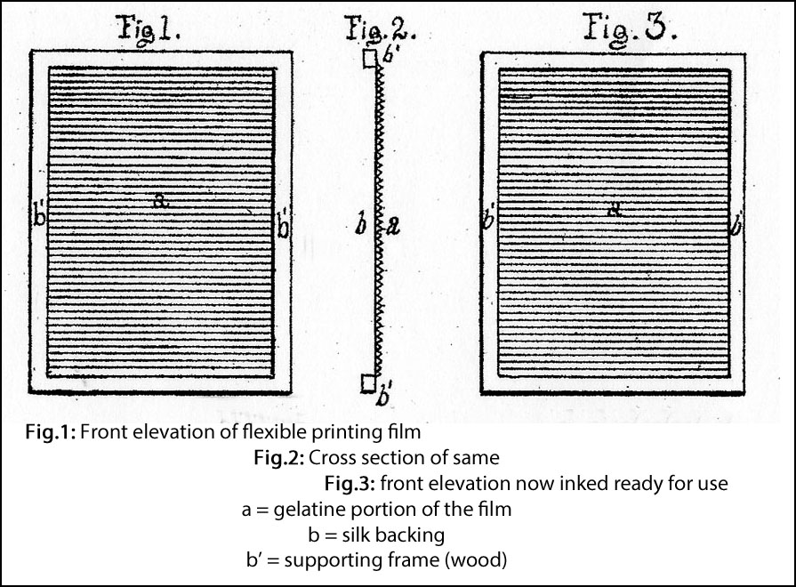
In explaining how his films are used, Day refers to his diagrams, reproduced below. Starting with Figures 1 to 3, he simply shows the film in its frame. I have paraphrased his own words slightly in captioning the pictures:
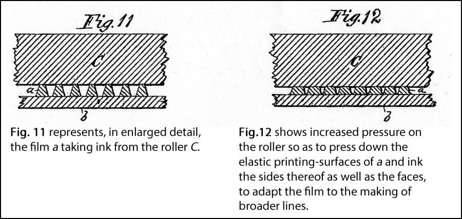
The narrative skips to Figs. 11 and 12, showing the inking of the film in close-up:
Now he describes transferring lines in ink onto a picture (Figs. 4 to 7, below). It is, he tells us, a picture “drawn in the usual way by hand upon stone or other suitable material.” This might indicate that Day saw lithographers as the main users of his method—more on this later.
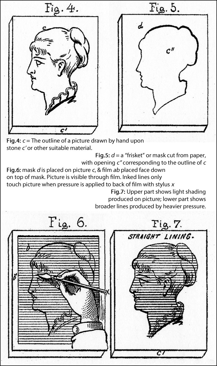
Figure 13 shows how the stylus is used to press the inked film down onto the stone or paper.
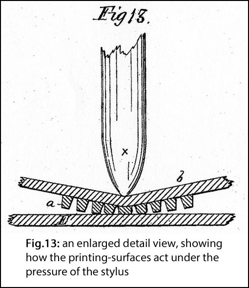
We are used to thinking of Ben Day patterns—the famous dots at least—as the epitome of mechanical shading, with complete, we might say mathematical, regularity. Certainly this was one of the features which Roy Lichtenstein was to exploit in the 1960s (and Roy did use lines as well as dots himself). Day was clearly aware of this as an advantage, but as seen below he was also keen to stress that his printed lines could be imbued with variety and character by the hand of the artist or craftsperson.
We look at the Ben Day method across a gulf of time, and we are wearing Lichtenstein-tinted spectacles. But we can attempt to put ourselves back in Ben’s own shoes—by looking at the direct evidence of his Letters Patent, and indirect evidence from his times—and ask…
^^Table of Contents
3. What did Ben Day Design his Printing-Films For ?
Some U.S. patents state if they are for a new design or a new method. Ben Day’s Patent no. 214,493 covers both. It is much more clear on the design (and manufacture) of the printing-films and the method of (im)printing lines than it is on what the method might be used for. I suspect that the imprecise language used in this patent would today be rewritten by a practiced attorney, so as to define far more specifically the purposes to which the method was foreseen to be put.
Starting with the name; it is clear that they are called “printing-films” because they are used to (im)print a pattern in ink onto a lithographic stone or a piece of paper, etc.—not because they are to be used in the printing industry. The name “printing-film” is intrinsically ambiguous and potentially confusing. (Before long, they were officially known as “shading mediums”—and by artists and printers, as “screens.”)
His introductory words on the subject are also typically ambiguous: “…printing-films… designed for use for artistic and decorative purposes; also for printing and the preparation and finishing of drawings, printing and copying surfaces, &c.”
Here when he says “printing” as in “printing and the preparation and finishing of drawings” does he mean (im)printing his patterns onto drawings, i.e. directly from his printing-film, or does he mean he mean “for commercial printing of drawings by lithography etc.”?
If the latter, why does he go on to say: “..and the preparation and finishing of printing… surfaces”? Here he must be referring to the surfaces of printing blocks/plates, so he would be repeating himself, effectively saying “my films can be used in commercial printing and in commercial printing.”
Either way, he makes usage in the actual printing business sound secondary to “artistic and decorative purposes.”
He later states: “…prints may be made, not only upon flat surfaces and various materials, such as paper, wood, metal, stone, ivory and glass, but also upon curved or irregular surfaces of every description of the same or other materials.”
In his final summing-up Day does not mention lithography or printing plates at all. He defines his process as “The method of lining, shading, stippling, hatching, graining, printing or tinting pictures or other objects in one or more colors…”
Admittedly, printing plates/blocks are “other objects,” but to me this conjures up a vision of a carved ivory walrus, decorated with a regular grid of fine lines, in a room with the prettiest window panes in town.
However throughout the document there are indications that he does see utility for his films in these areas:
- lithographic printing
- photoengraving of metal printing plates
- wood engraving
- drawing on paper
Lithography at first seems the most favoured of these. As noted above, Day’s diagrams show a drawing “on stone or other suitable material.” Day never states what will happen to the stone after his lines have been imprinted on it, though. Will it be used to print a black & white image? Could it contribute coloured lines to the printing of a chromolithograph? Perhaps he thinks this can simply be “taken as read.”
Just after the part about ivory and glass, and before his summing up, he has this to say:
“Another of the useful results of this invention, to be also described in one of my other applications for patent [my italics—see below], is the quick and rapid production of printing and copying surfaces for lithographic printing and the production of etched blocks for printing, and of copying-surfaces for the making of printing blocks by photographic agency.”
This is a very revealing paragraph. Firstly, it is the only clear indication in the whole document that Day foresees his films being used during the photoengraving process. By “etched blocks” and “printing blocks” he could mean metal plates, which were widely referred to as blocks in the early days.
Secondly, despite that “Another …” which again seems to relegate this to a secondary usage, it demonstrates that Day saw the lithographer as a significant user of his films.
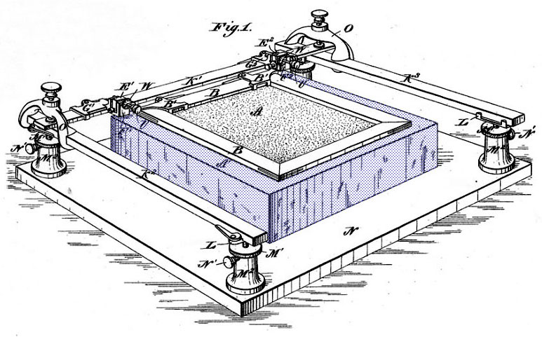
This is also borne out by a look at his next patent which I think must be the one he is referring to here, though he did not apply for it until July 1881. It was granted on November 29th that year. This was for an Adjustable Frame for Printing Films. (I will discuss this in more detail next time. The Adjustable Frame was as important to the success of Day’s shading medium as the printing-films themselves.)
As seen in the diagram below, the Adjustable Frame holds the shading sheet A and its own wooden frame B over the “lithographic stone A’, or other block upon which the drawing or design is to be fixed.” Again Day’s diagram clearly shows a stone block—which I have tinted purple for clarity—while his text allows the possibility that it could be a metal one. In his summing up he repeatedly refers to a “stone or block.”
I find it interesting that he doesn’t directly mention photoengraving on metal plates at all in this 1881 patent, and only very briefly in the 1879 one.
Returning to the 1879 document, Day does refer to wood engraving directly and more than once: “To produce such lines accurately by hand-drawing in the usual manner by any species of drawing instrument, or by means of graving tools in wood-engraving or other engraving, is a work of difficulty, involving much labor and the exercise of peculiar skill…”
Day is particularly proud of his cross-hatching. As he says: “To execute good cross hatching, either in drawing or engraving by hand… is one of the most difficult, laborious and expensive operations known to the artist.” I noted earlier that cross-hatching was a particularly difficult thing to achieve on wood, involving cutting out the white spaces between the black lines.
He says that his films could be “…cast with a different face or different character of lines, grain or stipple… thus effecting a vast saving in time and labor in the production of difficult artistic work.” He is offering “…greater rapidity, doing in one hour’s time… an amount of work that would require a month’s labour if executed in the usual manner.”
Details of a wood engraving from 1874
There is an obvious emphasis on Day’s method speeding up the production process. The lengthy time needed to engrave wooden blocks did of course contribute major delays and costs to the publishing business. But there is also such a lack of clarity in Day’s text that I find myself asking: “Production of what, exactly?”
Day must have known that imprinting his lines on their blocks would not have helped wood engravers very much, if at all.
They would still have had to carve away the wood around the lines, and they already had mechanical devices to help them engrave fine parallel lines. Given that wood engravers are very unlikely to use his printing-films, it’s strange that Day should mention wood engraving at all, let alone give it apparent emphasis… but I will return to this below.
With the benefit of hindsight, we know that the first big success of the Ben Day method was in the field of chromolithography. Here the speed and efficiency of his method was indeed a crucial factor. In my next post I will show evidence that by 1885 it was in almost universal use by colour lithographers. Day clearly anticipated this, at least to some extent.
It seems he was not so sure whether photoengravers would take up his method, though he probably had inklings. This is hardly surprising—whereas chromolithography was well-established, photoengraving was a very new technique. Day was certainly well-placed to take advantage of the possibilities when they opened up. Use of Ben Day shading mediums did become massively prevalent in the photoengraving of black & white line art and coloured illustrations.
This is reflected in the British ad below, from the 1898 Penrose Annual, in which Day’s UK agent puts “zinc” ahead of “stone.” (In the U.S. it looks as if “stone” was still privileged, as seen in the ad I showed at the top of this section.)
In my next post I will look in detail at where and how the Ben Day method fitted into both the photoengraving process itself and the printing industry in a wider sense. This included, from 1891, an explosion of colour printing in newspapers, which was only possible because of two advances—new types of printing press and the Ben Day method.
The history books tend to remember the innovative printing presses, and forget about the dots. I hope to make amends. Also, particularly for those who have been waiting patiently—this is of course where the comic strips come in.
Finally, back to the drawing board. You will have noticed that both the old advertisements I’ve shown mentioned “cardboard.” This refers to illustration board—drawing paper mounted onto a stiff backing—which professional illustrators routinely used for their finished work.
There are many references in the 1879 patent to “artistic purposes”, drawings, and artists at work. Day himself was an illustrator—did he think that his printing-films would be popular with artists, imprinting his patterns onto their drawings on board? Did he use them this way himself?
If we knew that, we might also find the answer to that nagging question, why did Day repeatedly refer to wood engraving in his patent text?
I quoted Henry Blackburn above, from 1894, re: photoengraving: “The illustrator of to-day is called upon suddenly to take the place of the wood engraver in interpreting tone into line…”
Is this where the emerging importance of photoengraving, Day’s detailed discussions of wood engraving and the slowness of its techniques, and his own work as an illustrator, come together?
Did Ben Day—responding to the same concern as Blackburn, but over fifteen years earlier—think that artists would now want to draw pictures that looked as much like wood engravings as possible?
Interesting questions. Perhaps a look at one of his own drawings from that time might help to answer them—for example, one of his illustrations from Mark Twain’s A Tramp Abroad, published in 1880.
In my view this picture answers those questions without any further words from me—though in a future post I will have more to say about this important book, and Ben Day’s contributions to it.
An illustration by Ben Day, 1880
^^Table of Contents
Coming Attractions
In future posts I will take a detailed look at more of Ben Day’s own black & white drawings. [EDIT: I did intend to, but this is still ‘on the back burner’… a long way back.]
I will also look at the Ben Day method in those two areas where it became hugely successful, but which Day’s own Letters Patent barely mention:
- photoengraving on metal plates
- printing in colour.
This will lead to a look at Ben Day in the comics, including: how did the Ben Day men get from this:

to this:

…in a few easy steps?
(Clue: there were quite a few steps, and it wasn’t easy.)
Plus: Some or all of:
- Who was Benjamin Henry Day Junior?
- How was his process used in the printing industry?
- How successful was it?
- How can the Ben Day dot be defined?
- Did comics still contain any Ben Day dots by the late 1950s / early 60s?
- Did Roy Lichtenstein really paint Ben Day dots?
Be seeing you.
^^Table of Contents
Acknowledgments: Thanks to Fiona McIntosh, Amy Pryor, Andy Bleck, Roger Sabin and Shevek Freeman.
Text Copyright © Guy Lawley 2015. If shared please credit me. No copyright claimed in images.
guy.lawley@btinternet.com
FOOTNOTES
(1) Advertising Production (New York, McGraw Hill, 1946) by Ben Dalgin, Director of Art and Reproduction at the New York Times.
Back to text—Intro
Back to text—Photoengraving
(2) From Girls’ Romances No.105 (Sparta Illinois/New York, Arleigh Publishing Corporation/DC National Comics, Dec 1964). Artwork attributed to Tony Abruzzo.
Back to text
(3) A list of sources for this essay (other than the perennially useful Wikipedia, Google, Google Books and Google Ngram) must start with a blog post by Phil Normand—TARZAN: the Sunday Comics, 1931-1933, part 2: Tarzan and the Ben Day Men, or The Mechanics of Color in the Sunday Comics at http://www.recoverings.com/blog/art-artists/tarzan-the-sunday-comics-1931-1933-part-2-tarzan-and-the-ben-day-men-or-the-mechanics-of-color-in-the-sunday-comics/. Mr Normand helpfully listed his sources, leading me to:
The Eighth Graphic Arts Production Yearbook (New York, Colton Press, Inc., 1948) ed. Leo H. Joachim
Printing Progress: A Mid-Century Report (Cincinnati Ohio, International Association of Printing House Craftsmen Inc., 1959) ed. Clifford L. Helbert
I also used:
Modern Photoengraving (Chicago/Cincinnati, Modern Photoengraving Publishers, 1948) Ed. Louis Flader & J.S. Mertle
Achievement in Photo-Engraving and Letter-Press Printing (Chicago, American Photo-Engravers Association, 1927) Ed. Louis Flader
Printing Art Vol.67 No.4 (Chicago, Dartnell Publications, 1938) Ed. John L. Scott
Back to text—Introduction
Back to text—Photoengraving
(4) Possibly the sole exception was the New York paper The Daily Graphic, 1873 to 1889. This did have numerous illustrations. Ahead of its time and not a long term success, I will return to this interesting hybrid later (note 15).
Back to text
(5) The earliest efforts at photography had included making images on metal (Niépce, 1822). The Daguerreotype had been around since 1839. Fox Talbot did crucial early work on printing from negatives onto paper, patenting his process in 1841. Photos in books were printed as Talbotypes, Autotypes, Woodburytypes and most successfully from 1868, Collotypes. None of these methods used a halftone screen. All the prints needed to be printed separately from the book’s letterpress text pages and added in during binding, or glued in—costly methods.
For a detailed account, see Photography in the printing press: the photomechanical revolution by Helena E. Wright in Presenting Pictures, 2004; ed. Bernard Finn (London, The Science Museum, co-produced with the Deutsches Museum and the Smithsonian) and online at the following link [thanks to David Haimson for finding the live link, Jan. 2024, and apologies to anyone who tried to follow the previous one after it ‘died’]:
Click to access 4.02.Pictures-Wright,Photography75ppiWEBF.pdf
Back to text
(6) History of the halftone: The coming of the halftone method (described in Part 2)—allowing grey tones of wash drawings and photographs to be mass-printed for the first time—went hand-in hand with the rise of photo-engraving, if about a decade delayed, at least in terms of widespread, commercial use.
Attempts had been made earlier, but from the 1860s onwards, new glass “halftone screens” succeeded in breaking up the continuous grey tones of photos or wash artwork into dots of graduated size—within the cameras which photo-engraving houses already used. This dotted image could be developed on a letterpress printing plate by photo-engraving, and by printing the dot pattern, a reasonable illusion of the original picture with its grey tones could be reproduced.

This is Senator Joseph Kennedy, JFK’s dad, from an old newspaper
The first halftone printed from a photograph in a newspaper was in 1880: “A Scene in Shantytown” by Stephen Horgan in the New York Daily Graphic (see also note 14). This used a lithographic technique though, rather than a true relief metal plate photoengraved halftone, and the floodgates did not open straight away.
Early printed halftone images were, in general, not impressive. Much hand-work had to done by engravers to achieve good results. Photo-engraving of line art had to be well established and the quality of printing presses, paper and ink all had to improve before mass printing of halftone images could really take off. In 1887 the Levy Brothers of Philadelphia started producing half-tone screens commercially for the first time. Through the 1890s halftones, especially from photographs, took an increasing share of the illustration space in magazines and newspapers.
Back to text—Arrival of Illustrated Press
Back to text—Photoengraving
(7) Fortunatus seen at www.michaelhaldane.com/FortunatusLink.htm
Back to text
(8) See The Mass Image: A Social History of Photomechanical Reproduction in Victorian London (Basingstoke/New York, Palgrave Macmillan, 2008) by Gerry Beegan. Highly recommended and to be cited again.
Back to text—Wood Engraving
Back to text—Photoengraving
(9) The Encylopedia of Ephemera: A Guide to the Fragmentary Documents of Everyday Life for the Collector, Curator and Historian (London, New York, 2000 & 2001, the British Library/Routledge) by Maurice Rickards and Michael Twyman
Back to text
(10) Does anyone else look at this picture and think “Bryan Talbot’s Luther Arkwright style”—or is it just me?
Back to text
(11) Ally Sloper debuted in Judy in 1867 and is often quoted as the first comic character to appear on a regular basis, predating the Yellow Kid (from 1894 or 1896, depending on your definition). Sloper also spawned toys, live stage versions, etc., and probably directly inspired W.C. Fields & Charlie Chaplin.
See: Roger Sabin, Ally Sloper, The First Comics Superstar? in A Comics Studies Reader (University Press of Mississippi, 2009) ed. Jeet Heer and Kent Worcester. Also online: http://www.imageandnarrative.be/inarchive/graphicnovel/rogersabin.htm
Back to text
(12) See The Essentials of Book Collecting by Robert F. Lucas http://www.trussel.com/books/lucas10.htm
Back to text
(13) Later versions of lithography “offset” the printed image onto rubber “blankets” before the ink finally transferred to paper. “Offset litho” is still very widely used today (2015) but it’s come a long way from the blocks of limestone that gave it its name.
Back to text
(14) Letterpress type was of course reverse-imaged. This is probably the origin of the expression “mind your p’s and q’s” since printers had to pay particular attention to letters which resembled each other in the mirror. Why not “b’s and d’s”? Used much more commonly, printers probably soon learned to recognise b & d without thinking. P’s & q’s might have been applied to “pints and quarts” in pub tallies as well, but I’m not sure I buy that.
Back to text
(15) As I mentioned in note 4, New York’s Daily Graphic was a hybrid. It had 8 pages printed from one large sheet. One side of this (4 pages) was printed by lithography, with the illustrated material, and the other side by letterpress. I don’t know if this extra expense contributed to the ultimate failure of the Graphic, though it was beset by other financial woes—see The World’s First Illustrated Newspaper, by Stephen Horgan in Penroses’s Annual, Vol 35, p.23 (London; Percy Lund, Humphries & Co. Ltd, 1933).
Back to text
(16) Can anyone see how many colours were used in printing this card? I tried to count them, but my brain started to melt.
Back to text
(17) One result of this was that many, many wood engravers became unemployed, or sought jobs in the new photo-engraving or “zincography” trade where they could. A lot of manual work was still needed in producing and “touching up” photoengraved plates. (see Beegan, note 8)
Back to text
(18) Flader & Mertle also had this to say about photoengraving: “[It] may be rated as one of the greatest inventions of all times. It superseded handcraft methods in the making of printing plates and substituted photographic and mechanical speed, accuracy and fidelity for the uncertain effects of human hands.” As big-wigs in the business of U.S. photoengraving, they were of course somewhat biased—though they had a point. Beegan (8) discusses the ambiguous implications of that supposed “accuracy and fidelity,” specially with respect to the halftone photograph in print.
Back to text
(19) See also, for example, the opening sentence from Zincography: A Practical Guide to the Art as Practised in Connexion with Letterpress Printing (4th edition, London, E. Menken, 1890s—the 5th edition was 1896, the 4th is undated) by Josef Böck: Before entering upon the subject of the requirements suitable for a zincographic atelier, it may be pointed out that the workshop itself should possess the means of being well ventilated, since, during the etching process, acid vapours are developed which are highly detrimental to health… Böck might have mentioned that ether and benzene fumes were not exactly pleasant either.
Back to text
(20) Figure 4: There is no figure 4 :O)
(There was in Dalgin’s book, of course. It showed an alternative type of camera, not around in Ben’s day.)
Back to text
(21) Original photo taken from http://archive.printeresting.org/2014/10/06/gillotage-the-lost-history-of-an-influential-technique/
Back to text
(22) Popeye plate: http://boards.collectors-society.com/ubbthreads.php?ubb=showflat&Number=3383420
Back to text
(23) The Art of Illustration (London, W.H. Allen & Co Ltd., 1894) by Henry Blackburn. In fact this “sudden” change was well under way long before 1894, as we see later when looking at certain illustrations published in 1880.
Back to text
(24) Articles in this issue included “Process” from the Photographic Point of View, False Standards and Conventions in Process Work and The Three-Colour Process—a Step-Child. There were also many advertisements using the term, e.g. for the magazine The Process-Pictogram (“The leading Process Publication of the World.”)
Back to text
(25) I don’t know if his publisher paid for these. I do know that Twain was very angry about Canadian publishers in particular bootlegging his books.
Back to text
(26) Patent documents were found using Google Patent Search. I also went to the web site of the U.S. Patents and Trademark Office, http://www.uspto.gov/.
Back to text
(27) If you work in centigrade… the boiling point of water, 100 degrees C, is 212 degrees Fahrenheit. The freezing point, 0 degrees C, is minus 32 degrees F. One starts to see why centigrade.
Back to text

It was very rewarding to read your excellent report. My father started as a lithographer and ended-up as an offset specialist, excelling in art books and painting reproductions as a chromist. He had the gift of memorizing colors and their hues. Thanks for making me to understand technically what his work was. There were no graphic schools or courses in Portugal, where he lived all his life and was professionally active well in his eighties, becoming the oldest graphic specialist in activity.
He was praised by Kodak, Agfa, Gevaert and Ilford technicians, being the first Portuguese to print with gold and also on silk. His name was Americo O. Esteves dos Santos.
Vasco Oswaldo Santos
Mississauga, ON, Canada
I am very happy to hear from you.
I thought people might be interested in this as history.
It is good to know that it also has this personal, family dimension for you.
Regarding the Daily Graphic… all of the illustrated weeklies, and there were certainly a fair number of them by that time when you include the story papers, used the same method (when you unfold the sheet, you can see that one side of it has all the illustrations, and the other side is all text). It must have been somewhat more expensive and time consuming, but it was certainly a well-established method.
George-Édouard-Amable Desbarats is an interesting figure. As you might know, he was a pioneer of photoengraving and published the first photo in a newspaper anywhere in the world in Canadian Illustrated News in 1869, and the first photo published in a newspaper in the US in the Daily Graphic in 1880 (that sounds a little late, seems like maybe I could come up with prior examples, but that’s the Library of Congress’s claim, and it does make me curious why he hadn’t done so in the Daily Graphic before that).
That aside, Desbarats sounds like someone who was constantly experimenting with printing techniques, and Daily Graphic also seems to have spent a lot of money on marketing (the infamous balloon attempt across the Atlantic is the most prominent example), and I would guess those two things had something to do with the Daily Graphic’s financial issues. It’s a great paper, though. Easily my favorite non-fiction periodical of the era.
Thanks for putting together a great resource here. I was recently startled to realize something very obvious. Ben Day of Ben Day Dots fame is the son of Benjamin Henry Day, co-publisher and likely the printer of the Brother Jonathan, and as such the man who published and printed the first comic book in America. Day Sr was instrumental in the development of the illustrated weekly in America, and the Brother Jonathan Extras were essentially the first, or among the first, cheap mass market paperbound books here too. An early book on the Day family lineage says “he was bred a printer”.
Obviously the same goes for his son. I love the symmetry of the father publishing the first comic book in America, and the son developing the method that would help enable so many comics to be printed in color.
Hi Mark.
Great to hear from you.
First, about the two Ben Days, father and son:
Yes, it’s an amazing story, isn’t it?
Occasionally I see confusion between the two men online.
I found out about Brother Jonathan a few years ago.
I drafted a biographical piece about Ben Jnr mentioning his father’s career and the link to ‘America’s first comic book’,
Obadiah Oldbuck, but cut it, as I was trying to keep my essays briefer (ha ha);
I planned to do a whole bio piece about the two men later; never happened.
Or not yet, anyway!
Secondly, about the printing of images on one side of the sheet only:
I’ve noticed that with the Graphic, the ILN etc as well.
I presume it’s because the setting up of the press is simpler when either text or images is being done separately; in particular, the ‘make-ready’ steps must be a good deal different between the two practices.
Having both images and text to deal with at one time would have been relatively difficult.
In principle though, they could have done it, when both the images and the text were in relief,
as with wood-engraved pictures and typeset text, in those two publications.
Many illustrated books set up the text and pictures together.
The New York Daily Graphic, for whatever reasons, chose to print the images by photolithography and the text pages by letterpress, IIRC.
In this case the necessity for the text and image sides to be separate was absolute, determined by the two different printing presses used.
I’m grateful to you for pointing out that the end result was to a large extent the same!
That particular point had escaped my notice.
It makes me wonder whether the ILN, for example, had one press (or a set of presses) permanently set up for text pages and another for images? (Both letterpress.)
Quite likely they did. It would have been a time-saver.
Finally, on halftones:
the fact that those guys experimented with them early on but published just a couple of examples tells me that their methods were almost certainly very time-consuming, complicated, and probably required a lot of touching up of the plates.
Not ‘market-ready’ in other words.
From what I’ve read, a lot of people were early pioneers but had the same kind of problems.
Guy
PS: Mark, I meant to ask, what is that ‘early book on the day family lineage’ which you mention?
I’ve read a couple of books specifically about the New York Sun, Day Senior’s newspaper;
Frank O’Brien’s 1918 (-ish) one and the recent ‘Sun and the Moon’ volume which is mainly about the Moon Hoax.
Am I missing another one?
PLMK.
And thanks again!
Wow, that Comic Cut from 1910 wasn’t funny at all! I’d want my half pence back. Comedy apparently wasn’t very bold in those days.
Digging into this for a book I’m writing and compared the stipple pattern in the Dec. 1900 patent with a Krazy Kat in 1922, and it’s a precise match. No surprise, but I was looking at the Krazy Kat recently and then reading this page to try to find the patent.
Hi Glenn. Very interesting to know that that particular Ben Day stipple was used on a 1922 Krazy Kat page.
Was this one of the colour pages? I assume Ben Day was more likely to have been used on a colour page.
I’m aware that your book is on the way and very keen to see it.
Following up on one of your references, I managed to find a copy of Helena E. Wright’s article “Photography in the printing press: the photomechanical revolution” online at:
Click to access 4.02.Pictures-Wright,Photography75ppiWEBF.pdf
Thanks. I also tried that link a few days ago, and when I went there I got this message on screen:
“Your connection isn’t private. Attackers might be trying to steal your information from http://www.artefactsconsortium.org (for example, passwords, messages or credit cards).”
So I backed off!
Did you continue to the site and find it safe to use?
OK, David found a safe and clean link (Thanks a lot) so text above updated.