

Captain America is copyright © 2016 Marvel, used for educational purposes, and under fair use.
See also:
- Part 1—Roy Lichtenstein—the man who didn’t paint Ben Day dots
- Part 2—Halftone dots, Polke dots, More Roy
- Part 3—CMYK / Four-colour comic book dots vs. RGB dots on screens
- Part 4—Pre-history, origins—Ben Day in the 19th century
- Part 5—Ben Day in lithography
- Part 5.5—French comic strips of the 1880s, & a forgotten Ben Day predecessor in letterpress
- Part 5.75—A Lithographic Protocomic (?) from 1885
- Part 6—Ben Day meets the Sunday Comics in the 1890s
- Part 6.1—Tarzan and the Ben Day Dots—secrets of 1930s comic strip colour
- Part 7—Ben Day Dots 1933 to 1937—the birth of the comic book
- Part 8 — 1930s to 1950s: The “Golden Age” of Comics — exit Ben Day, enter Craftint
- Part 9a — 1950 & 60s: The “Silver Age” of Comics, Part 1
- Part 9b — 1950 & 60s: The “Silver Age” of Comics, Part 2
guy.lawley@btinternet.com
~~~
The word register has at least six different meanings as a noun, according to the Concise Oxford English Dictionary—and another six as a verb.
And registration is defined as:
The action or process of registering or being registered.
Registration for voting, for example—that is, getting your name on the voting register (OED: “official list or record”)—has been in the news a lot recently.
The relevant meaning of the word register in printing, slightly adapted from the OED is this:
Noun: The exact correspondence of the position of colour components in a printed image.
Verb: To correspond exactly in position.
Or, in more everyday speech, “to line up precisely.”
The phrases in register and good registration are often used—as are out of register and bad registration (though, we might hope, not so often).
I touched on this in Part 3, showing some registration marks from a daily newspaper, like the CMYK mark below, and a poorly registered Captain America from a 1960s Marvel comic (top of page).

Original size of above image approx. 1cm square.
Following a further discussion of registration in Part 6.1, I thought I’d show you just how badly it could go wrong in 4-colour letterpress.
Below is the cover of the rare and desirable August 1952 comic, Diary Secrets no.13, as it should have looked—artwork reportedly by the highly esteemed Matt Baker.
(Click to enlarge an image, back button on your browser to return here.)

Below is the cover of the copy in my collection—after this message.
Trigger warning: if you are prone to migraines or epileptic seizures, or just of a nervous disposition, it might be better to skip the rest of this post.
These kittens will protect you from the horrors that are to come.

You might still want to put on your sunglasses…
Original size approx 18.7 X 25.6 cm, about 7.5 X 10 inches.

I don’t know if this copy was actually released into the wild, or whether perhaps someone rescued it from the waste bin. Maybe it only survived because a printer or a cleaner fancied a free read, or thought it was amusing.
Perhaps it was kept as a dire example to apprentice printers!
Here—if you can bear it—is a detail:

A classic dilemma for any young person, and it certainly looks pretty scary… but… was it love? Or was there some kind of psychedelic in that last ice cream float?
The back cover, of course, was printed at the same time, from the same plates—indeed was part of the same sheet of paper—and looked like this:
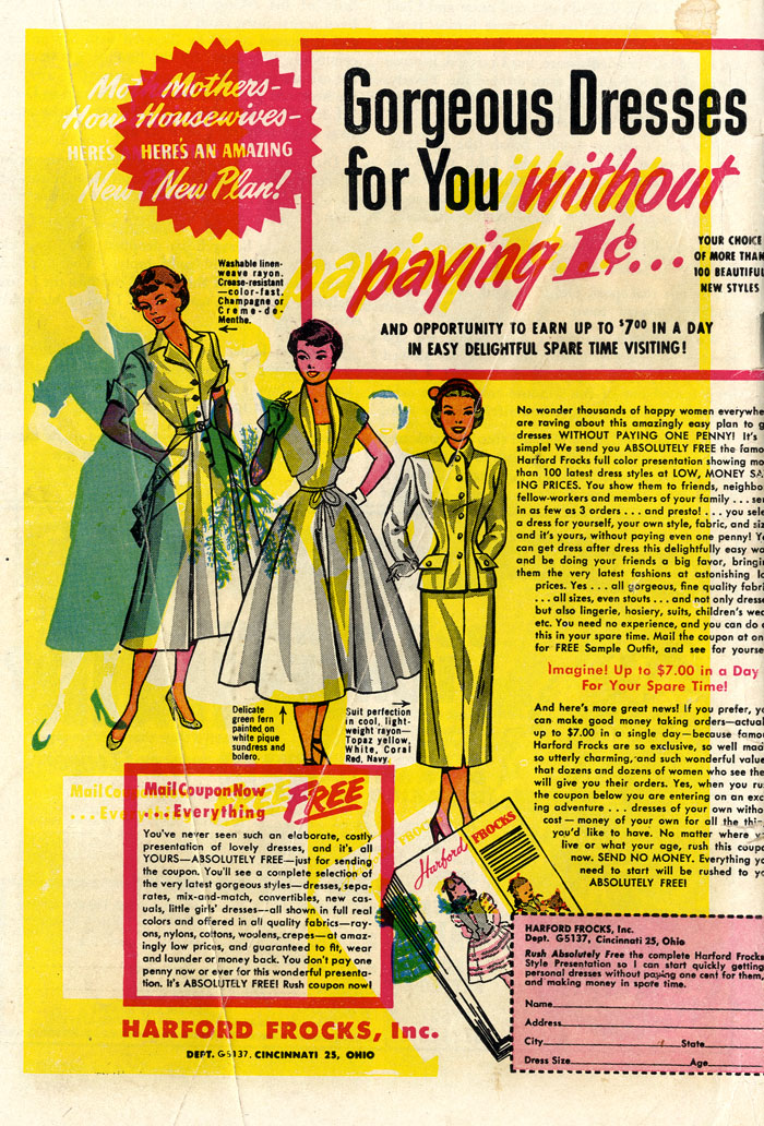
Mothers, housewives… are you feeling simply beside yourself? Well, looking at this won’t make you feel any better.
This detail below actually makes it easier to see what happened on the printing press:
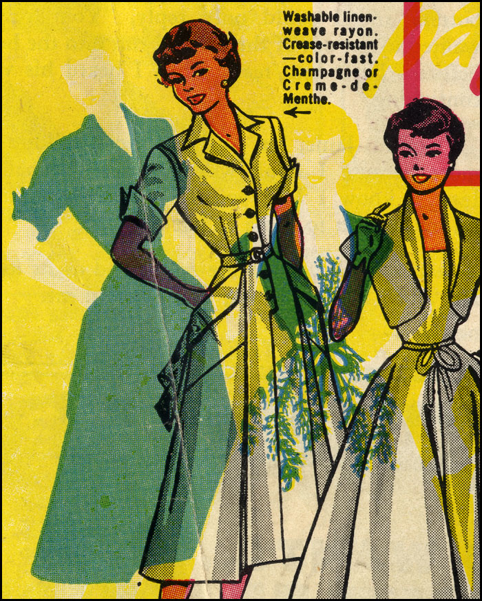
The red (magenta) and black plates have remained in fairly good register with each other, and so have the yellow and blue (cyan) plates. But somehow the two pairs of plates have come adrift from one another, by about 16mm.
As I said in part 6.1, this kind of thing was generally not the fault of the people who made the printing plates—the Ben Day operatives (or the engravers who made plates using other methods after Ben Day went out of favour, which I will discuss in Part 7).
Assuming the engravers had done their job well—producing precisely matched metal plates for the four colours—good registration was matter of lining up the printing plates on the press properly. Poor registration mostly happened because the plates slipped out of position during the very fast, high pressure movements of the cylinders on the presses.
The inside pages of my copy Diary Secrets 13 are mostly in good register—at least, by comic book standards. Comic book covers were printed on more expensive coated—or glossy—paper, on separate presses from their newsprint interiors.
It’s just as well that publisher St John had a printer who generally got the inside pages right, since the following year, 1953, they would be producing the first 3-D comics—like Joe Kubert’s Tor, below.

This page may look like another nightmare of poor registration, but of course it was supposed to look like that. The 3-D process—a handmade form of anaglyph—was in a way a very precise use of mis-registration of colours.
Two images—one red, one blue (or green)—had been meticulously produced to print precisely that way. If the colours didn’t line up—or misalign!—pretty much the way Joe Kubert designed them to, the 3-D process wouldn’t have worked properly.
When viewing the page through special red and blue glasses, the brain was tricked into seeing one image, of a purple (or brown) colour, which seemed to have layers of depth.

Finally, a reasonably well-registered image from inside Diary Secrets 13.
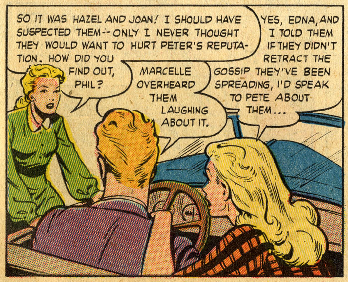
This is actually another teaser for Part 7.
How so?
Well, if you’re familiar with romance comics books of the 1960s—like the ones Roy Lichtenstein based many of his paintings on—you’ll expect to find tints made up of coloured dots. And dots there are—but a close look at this 1952 image will reveal quite a few lines as well. (Click to enlarge, back button on your browser to return here.)

In Part 7, I will be looking at the reason why. Not quite the secret history of comic book printing, but pretty darn close.
Before that, Part 6.3 will look back at another (closely related) 19th century Ben Day predecessor.
Be seeing you.
guy.lawley@btinternet.com
Text and original images copyright © The Legion of Andy 2016

Thank goodness for the kittens.